

Choose one clear technique and commit to it: full-drench for drama in well-lit rooms, an accent wall when you have one strong architectural feature, two-tone or colour-blocking for playful eclectic spaces, and a no-drill panel system when you rent or simply don’t want to touch a brush. Match the method to your light and your lease, then test before you buy paint.
TL;DR:
- Choosing a bold living room colour depends on the room’s natural light and desired mood, with jewel tones like emerald and navy being the most popular for well-lit spaces.
- Applying the 60-30-10 rule helps balance bold colours with neutrals and accents, ensuring the room remains visually cohesive and not overwhelming.
- Match bold walls with supporting textures and lighting, keeping wall finishes matte to retain pigment depth and layering lighting for consistent colour perception.
- For renters or those avoiding painting, modular no-drill panel systems provide a reversible, high-impact alternative that can be easily customized and moved.
- Testing large sample patches for at least 48 hours before committing prevents colour surprises and ensures the hue works with the room’s lighting and other design elements.
Table of Contents
- Bold living room colours: ten techniques that actually work
- How to choose a bold living room colour palette
- Pairing bold walls with furniture, finishes and lighting
- Renter-friendly ways to get bold colour without painting
- Bold colour palette recipes for the living room
- Designer checklist: what I check before a bold paint job
- Get bold walls without touching a paintbrush
- Sources
- FAQ
Bold living room colours: ten techniques that actually work
Bold living room colours reward planning more than confidence. Treating paint like a considered design decision, rather than an impulsive Saturday project, is what separates a room that looks curated from one that looks like an accident. The Decorilla design team frames bold paint as a statement piece in its own right, something you place deliberately rather than splash on and hope for the best.
Here are ten ways to apply that thinking to your own walls.
- Architectural contrast with trim. Paint the walls one bold hue and pick out skirting, architraves and door frames in a contrasting or complementary shade, considering the best color to paint interior doors for a polished look. Use semi-gloss on trim so the lines read crisp against a matte wall, and tape carefully. A wobbly edge on a bold colour is far more visible than on a neutral.
- Full-room saturation. Drench every wall in one deep tone. Stick to a matte finish so the pigment reads rich rather than patchy under changing light, and reserve this for rooms with decent natural light or strong artificial lighting to offset the density.
- Accent wall placement. Choose the wall with the fireplace, the window, or the ceiling feature. An accent wall without an anchor point just looks like an unfinished paint job.
- Two-tone splits. Break the wall horizontally, often at dado height, and use a picture rail or timber moulding to hide the join. The lower half can carry the boldest colour since it’s grounded by furniture.
- Colour-blocking. Map out geometric shapes before you paint. Use painter’s tape and a spirit level, and always paint the lighter colour first so touch-ups are easier.
- Painted built-ins. Decide whether you want joinery to disappear into the wall colour or contrast against it. Matching tones make a small room feel larger; a contrasting built-in becomes a feature in itself.
- Niches and alcoves. Confine your most saturated colour to a recessed nook. It contains the intensity and gives you a low-risk way to test a hue you’re not sure about on a full wall.
- Statement ceilings. A painted ceiling pulls the eye up and can make a room feel more intimate or more dramatic, depending on the tone. Save your boldest pigment for ceilings only in rooms with generous height.
- Pattern on a bold base. If you add pattern over a strong colour, keep it restrained and let it echo an existing architectural line rather than compete with the wall.
- Soft transitions. Carry a lighter tint of your bold colour into the hallway or adjoining room so the shift doesn’t feel abrupt when you turn a corner.
Pro Tip: Paint a large sample patch, at least a square metre, and live with it for 48 hours before committing. Colour that looks perfect on a swatch can shift dramatically once it covers an entire wall.
How to choose a bold living room colour palette
Start with light, not colour. A north-facing room can carry a saturated cobalt that would feel oppressive in a dim, south-facing space. Walk the room at 9am, midday and after dark with the lamps on before you shortlist anything.
Once you know what the light will do to a colour, define the mood you’re after and let that steer the palette:
- Calm and grounded — jewel tones like emerald, forest green or deep navy work well here, and designers are leaning into rich jewel tones as high-impact anchors heading into 2026.
- Warm and sociable — terracotta, burnt orange and mustard bring warmth without tipping into the garish.
- Energetic and bright — cobalt, fuchsia and chartreuse suit rooms that get plenty of natural light and don’t rely on the paint alone for atmosphere.
Once you’ve picked a direction, the 60-30-10 rule keeps the scheme from tipping into chaos: 60% dominant colour, 30% secondary, 10% accent.
Undertones decide whether a colour reads as sophisticated or slightly off. A “warm navy” with hidden green undertones can look muddy next to cool grey flooring. Test swatches against your actual skirting boards, not just on a white card, and check them again once the sun’s gone down.
Pairing bold walls with furniture, finishes and lighting
Decide early whether the wall or the furniture is doing the heavy lifting. A saturated wall paired with equally bold upholstery usually fights itself; pick one hero and let the other play a supporting role.
A few pairing rules make this easier to get right:
- Keep walls matte to hold pigment depth, and lift trim with a semi-gloss so architectural lines stay sharp, a distinction confirmed by paint colour research.
- Reserve high-gloss for small, contained surfaces like a painted niche, where shine reads as intentional rather than showroom-slick.
- Layer three light sources, ambient, task and accent, so the colour doesn’t shift mood entirely once the sun goes down.
- Bring in texture through velvet cushions, a timber coffee table or a woven rug to stop a flat colour from looking two-dimensional.
Pro Tip: If a finished room feels heavier than you expected, don’t repaint straight away. Add a pale, light-reflective throw or swap in a mirrored or brass accent first; it’s often enough to lift the whole space.
Renter-friendly ways to get bold colour without painting
Painting isn’t always an option, and it isn’t always the smartest one even when it is. Designers increasingly build a “colour story” through layered, non-permanent elements rather than committing an entire wall to permanent paint, which keeps the option open to change your mind later.
Start low-commitment and work up:
- Layer bold cushions, a statement rug and a piece or two of curated art before touching a wall at all.
- Try open shelving styled with colourful objects, which reads as a feature without a single hole in plasterboard.
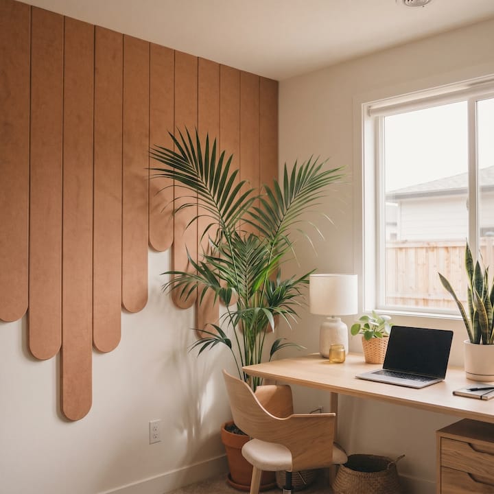
- For a full feature wall, a modular no-drill panel system gives you the sculptural, colour-drenched look of a painted wall using adhesive pads rather than screws or nails.
- These systems make sense wherever paint doesn’t: rental agreements that ban wall changes, textured surfaces you want without the mess, or simply wanting the freedom to take the colour with you when you move.
- Before locking anything in, lay a mock layout on the floor first, or trial a small peel-and-stick swatch, so you can see the scale against your actual furniture.
Bold colour palette recipes for the living room
Choosing a palette from scratch is the slowest part of any bold room. These five combinations are tested starting points, not rules.
- Jewel box: emerald walls, warm timber furniture, brass hardware. Best in formal lounges or rooms with higher ceilings that can absorb the drama.
- Moody blue: deep navy walls, a pale neutral rug, warm-toned lamps. Suits a cocooning, low-light lounge you use mostly in the evenings.
- Terracotta warmth: clay-toned walls, natural fibre textiles, a cluster of green plants. Works well in social, north-facing rooms that get good afternoon sun.
- Charcoal and mustard: charcoal walls anchored by a mustard sofa. A strong fit for modern, urban apartments with clean architectural lines.
- Cobalt and white: saturated cobalt against crisp white trim, best reserved for rooms with strong, consistent natural light that can carry the intensity all day.
Multiple trend roundups through 2025 and 2026 point to the same shift: expressive jewel tones and confident colour blocks are replacing the safe greige lounge that dominated the last decade.
Designer checklist: what I check before a bold paint job
Before any client commits to a colour, I run the same short list. View your sample in morning light and again once the lamps are on; colours behave differently under each. Confirm which surfaces are genuinely permanent (structural walls) and which you could change later (furniture, textiles, trim). Sort your lighting and key fabrics before paint day, not after, so the finished room doesn’t feel unbalanced. And if you’re renting, trial a removable feature wall before you even consider asking your landlord about paint.
— Michelle
Get bold walls without touching a paintbrush
If painting isn’t on the table, whether that’s a rental agreement, a fresh coat you don’t want to commit to, or simply wanting the freedom to change your mind next year, a modular wall panel kit gets you the same visual impact without a drop of paint. No drilling, no drying time, no landlord conversation required.
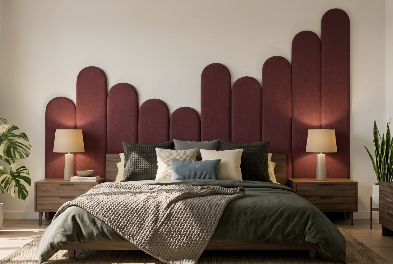
Because the panels are modular, you can build a compact accent arrangement or a full wall-to-wall statement, then take it apart and rearrange it when your taste shifts or you move house. Sample kits let you check a colour and texture combination against your actual room before you buy a full run, and the cost of a sample kit is credited towards a full kit if you go ahead. If a charcoal-and-brass jewel-tone wall or a saturated cobalt feature has caught your eye, the DwellForms™ Skyline Kit is the fastest way to test it this weekend, with no repainting required if you decide to change course later.
Sources
- Life is too short for beige — bold colour & personal maximalism in NZ homes (2026)
- How to Use Bold Paint Colors in Your Living Room
- 8 rooms, 4 ways to go big and bold with colour (Houzz NZ)
- 30 bold colour living room ideas
- 77 living room paint colour ideas
FAQ
What is the best colour for a living room?
There’s no single best colour. The right choice depends on your room’s natural light, ceiling height and the mood you want, though deep jewel tones like emerald and navy are currently the most requested bold options for rooms with reasonable light.
What are some bold colours for a living room?
Deep navy, emerald green, terracotta, mustard yellow and charcoal are common bold choices designers favor heading into 2026, each suited to a different mood and light condition.
What is the most popular living room colour right now?
Jewel tones, particularly deep navy and emerald, are leading the shift away from neutral, “safe” living rooms, with multiple 2025 to 2026 trend reports confirming the same direction.
How do I stop a bold colour from overwhelming my living room?
Apply the 60-30-10 rule: let your bold colour dominate 60% of the room, use a secondary neutral or complementary tone for 30%, and keep the remaining 10% for accents like cushions or hardware.
Can I get a bold feature wall if I’m renting?
Yes. Removable, no-drill panel systems like DwellForms™ let you create a colour-forward feature wall using adhesive pads instead of paint or drilling, and you can take the panels with you when you move.