
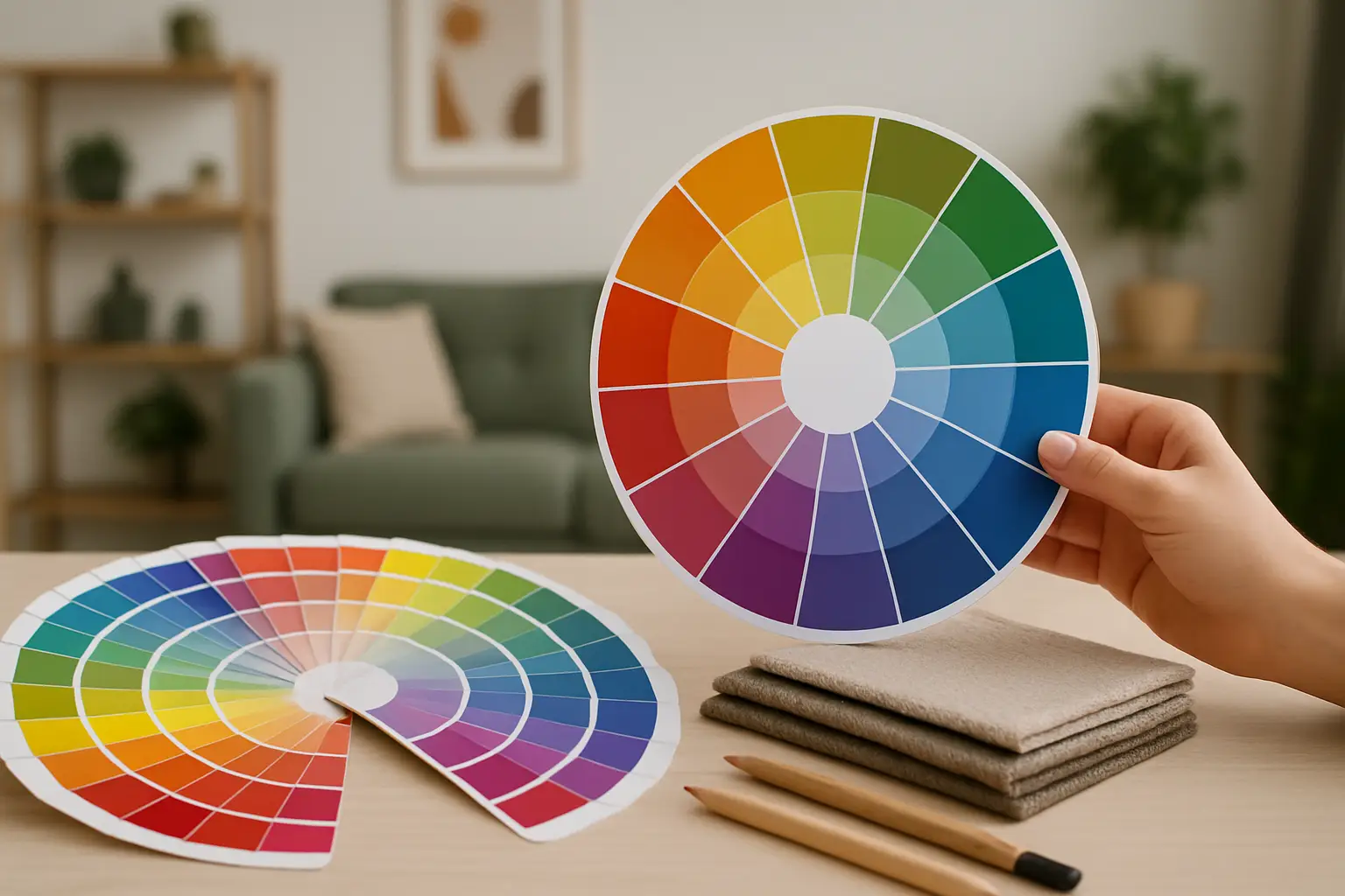
What is colour psychology? You know that feeling when you walk into someone’s place and instantly relax – or instantly want to leave? It’s rarely just the furniture. It’s the colour doing the heavy lifting.
If you’ve ever painted a room “nice and safe” only to realise it feels flat, or bought a bright piece of art and suddenly the whole space looks more expensive, you’ve already met colour psychology. It’s not mystical. It’s practical. And it’s one of the fastest ways to change how a home feels without changing the floorplan.
What is colour psychology in interiors?
Colour psychology in interiors is the study (and the everyday reality) of how colour influences human emotion, behaviour, and perception within a space. In plain terms: colour can make a room feel calmer, louder, warmer, fresher, more focused, more social, or more restorative.
In interiors, colour psychology isn’t about memorising a list that says “blue equals calm” and calling it done. It’s about how hue, saturation, and lightness behave in your specific room, in your specific light, with your specific life going on inside it.
A soft green in a sun-soaked Ponsonby villa doesn’t read the same way as that identical green in a south-facing Wellington flat. The colour hasn’t changed, but the experience has – and that’s the point.
Why colour psychology hits so hard in a home
Homes are repetitive environments. You see the same walls at 7am, 6pm, and on the weekend when you’re meant to be “switching off”. That repetition turns colour into a constant signal to your nervous system.
Colour also changes how we perceive shape and scale. Light colours can make edges dissolve and rooms feel airier. Deep colours can pull walls in and create a deliberate sense of enclosure. Neither is “better”. It depends whether you want a room to perform like an open-plan social zone or a private little retreat.
Then there’s contrast – the design lever people underestimate most. High contrast reads energetic and decisive. Low contrast reads soft and blended. If your place feels visually restless, it’s often contrast doing the damage, not the colour family itself.
The three levers that matter more than the colour name
Most colour advice gets stuck at the level of labels: blue, red, yellow. Interiors don’t work like a primary school colour wheel.
Hue: the general direction
Hue is what we casually call “the colour” – blue versus green versus terracotta. Hue sets the emotional theme, but it’s only the starting point.
Saturation: the volume knob
Saturation is intensity. A highly saturated cobalt will feel punchier and more stimulating than a dusty, greyed-out blue – even though both are “blue”. If you want colour without chaos, saturation is where you win.
Lightness: how much light the colour bounces
Lightness affects brightness and perceived space. Deep tones absorb light and add drama. Pale tones bounce light and feel open. In New Zealand homes where daylight can swing wildly by season, lightness is a real design decision, not a styling preference.
How different colours tend to behave (and when they don’t)
Yes, there are patterns – and they’re useful. But the trade-off is always context.
Blues and blue-greens: clarity, calm, control
Blue often reads calm because it’s associated with sky and water, and because cooler hues can visually recede. In a bedroom, that can feel like relief. In a home office, it can feel focused.
The catch: too much cool blue in low natural light can tip into chilly or sterile, especially if your finishes are also cool (chrome, grey flooring, stark white ceilings). If you want blue without the ice bath energy, bring in warmth through timber, brass, textiles, or a hit of peach, rust, or butter.
Greens: balance and restoration
Green sits in the middle of the spectrum, so it tends to feel stable. It’s a favourite for living areas because it can be both grounded and fresh.
The catch: greens are shape-shifters. They borrow from their undertones. A green with yellow undertone can feel sunny and citrusy. A green with blue undertone can feel moody and coastal. Under warm LEDs at night, some greens can go muddy. Test it where you’ll actually live with it – morning, afternoon, and evening.
Reds, rusts, and terracottas: energy, appetite, intimacy
Warm reds and earthy terracottas bring immediacy. They can make a room feel more social, more tactile, more human. They’re brilliant in dining spaces, entryways, and anywhere you want a sense of arrival.
The catch: saturation matters. A vivid true red can feel intense fast, especially across large wall areas. Earthy versions (rust, clay, paprika) give you the warmth with less visual shouting.
Yellows: optimism and momentum
Yellow is light in colour form. It reads like morning. Used well, it’s mood-lifting and slightly cheeky – perfect for kitchens, hallways, and any zone that needs energy.
The catch: the wrong yellow can look sickly under certain lighting, especially greenish fluorescents or very cool LEDs. Creamy, warm, slightly dirty yellows tend to be more forgiving than sharp lemons on big surfaces. Save the zesty yellow for art, lighting, or a smaller punch.
Pink, peach, and coral: warmth without heaviness
These shades are a cheat code for making a room feel friendly. They can soften hard architectural lines and make a space feel flattering – yes, even for a minimalist.
The catch: too pale and it can read sugary. Too strong and it can read juvenile. The sweet spot is often a grown-up, warm blush paired with confident contrast (ink, chocolate, olive, or a clean black).
Purples: creativity and edge
Purple is inherently less “default” in interiors, which is exactly why it works when you want personality. Plums can feel luxurious. Lilacs can feel airy and strange in a good way.
The catch: purple is sensitive to undertones. Many purples shift dramatically under warm lighting. If you’re committing to it, build a small palette around it rather than expecting it to behave like a neutral.
Colour psychology is also about placement
A common mistake is thinking colour is only paint. Colour placement is where the psychology becomes physical.
If you want a space to feel calmer, try keeping the strongest colour below eye line – rugs, low cabinetry, sofas – and let the upper half breathe. If you want drama, do the opposite: take the colour up and over, or use a large-scale artwork that sits in your natural sightline.
And don’t underestimate what a single room-defining piece can do. A large artwork with a clear palette acts like a visual anchor. It tells every other decision what to do: the cushion colour, the lamp finish, the tone of timber. That’s not decoration. That’s direction.
The NZ reality: light, seasons, and our open-plan habits
Colour psychology in interiors always has a local accent.
New Zealand light can be crisp and high-contrast. Many homes have big windows, white walls, and open-plan living that blends kitchen, dining, and lounge into one visual field. That means your colours travel – and they need to play nicely from multiple angles.
In winter, we also live with more artificial light. Warm lighting makes warm colours richer and cool colours duller. Cool lighting can make warm colours feel harsh. If you’ve ever loved a paint swatch in the shop and hated it at home by 8pm, that’s not you being fussy. That’s colour psychology meeting a downlight.
How to use colour psychology without overthinking it
You don’t need a perfect palette. You need a clear emotional brief.
Ask yourself: what do I want this room to do to me? Not “look like”. Do.
If you want to feel restored, you’ll likely want lower contrast, softer saturation, and fewer competing colours. If you want to feel energised, you’ll want clearer contrast, bolder saturation, and at least one decisive hero colour.
Start with one anchor and build out. That anchor can be art, a rug, or a sofa – but it should carry the emotional tone you want. This is why curated collections can be a shortcut: you’re not choosing from a thousand maybes, you’re choosing a mood with supporting players. Lifted+ does this through colour-forward, architectural-scale pieces and tight “Edits” that remove the filler and let you commit confidently (https://Liftedplus.com).
Then edit your neutrals. Neutrals aren’t banned, but they shouldn’t be the whole personality of the room. Use them like negative space in a graphic design layout – there to make the colour hit harder, not to avoid making a decision.
When colour psychology backfires (and how to fix it)
Sometimes the problem isn’t the colour. It’s the proportion.
If a room feels stressful, it’s often because there are too many similar-but-not-quite colours competing. Think three different whites, two greys, a beige, plus a random teal cushion. The fix is usually to reduce the palette and make the remaining colours more intentional.
If a room feels dull, it’s often because everything is mid-tone and mid-saturation. There’s no true light, no true dark, no moment of focus. Add one strong contrast element: a black-framed artwork, a deep-toned lamp, a saturated accent.
If a room feels cold, check your lighting temperature and your undertones. A “warm” paint next to a cool grey floor can still read cold. Add warmth through timber, textured textiles, and warmer accent colours.
Colour is feedback. If the room feels wrong, the room is telling you what needs adjusting.
A closing thought
Treat colour like a function, not a flourish. Choose it the way you choose a soundtrack: to change the mood on purpose. Your home doesn’t need to be safe – it needs to feel like you want to live there.