
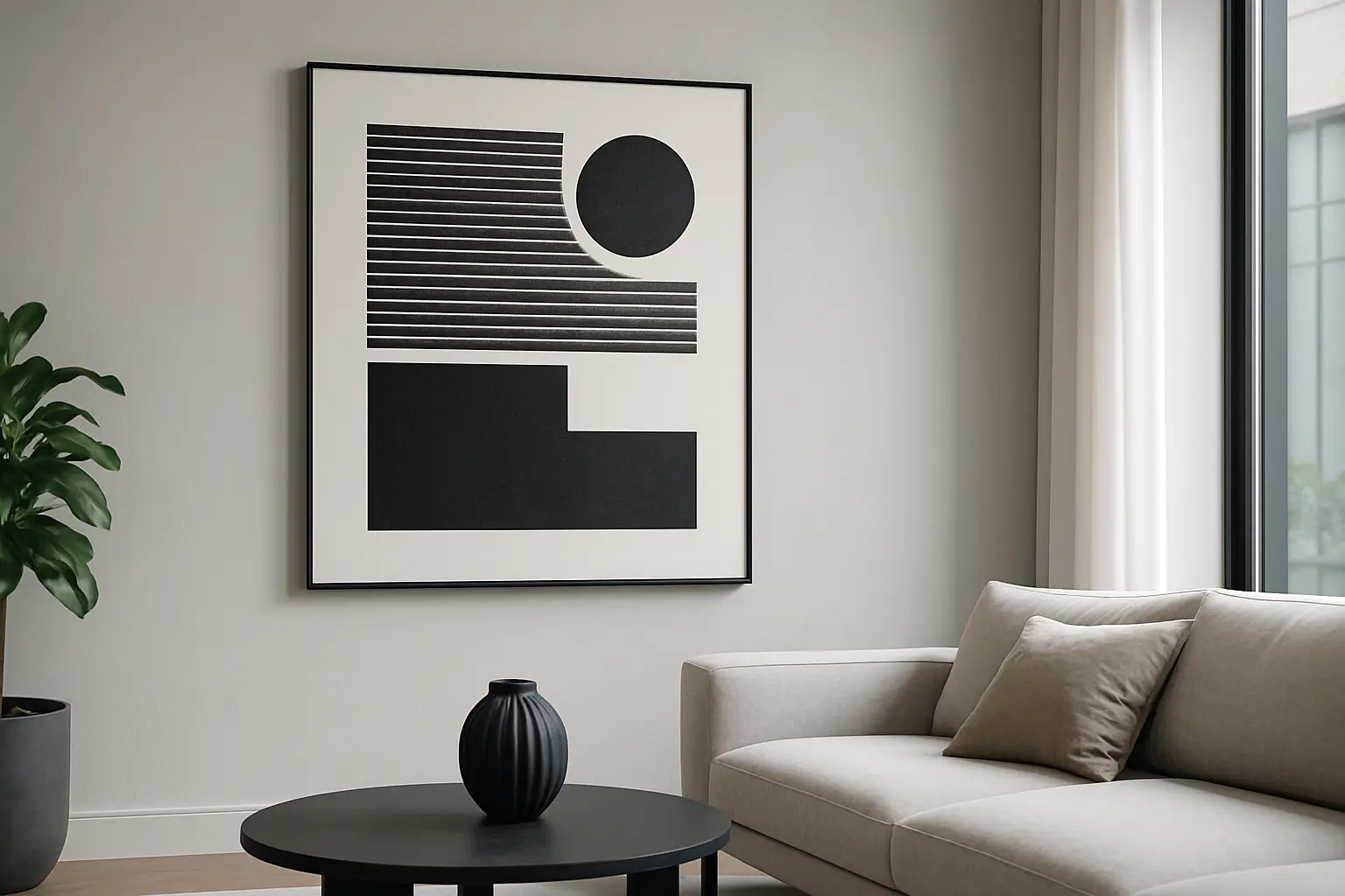
You know the moment. The plaster is crisp, the lines are clean, the joinery is doing its thing… and the room still feels strangely unfinished. Architectural spaces do that. They’re built to look intentional, which means anything you add has to earn its place.
The best wall art for architectural spaces isn’t “something nice for the wall”. It’s a decision. A room-defining anchor that can stand up to big voids, long sightlines, raking light, high studs, and all those hard-edged materials that make modern interiors feel sharp – and, if you’re not careful, a bit cold.
Table of Contents
What makes an architectural space different?
Architectural rooms have structure you can’t ignore. Think tall windows, exposed beams, strong ceiling lines, a fireplace that’s basically a sculpture, or a hallway that reads like a gallery. These spaces are already making a statement. If the art is timid, the architecture wins and the room can feel empty rather than calm.
There’s also nowhere to hide. In open-plan living, you see the same wall from the kitchen bench, the sofa, the dining table, and the entry. Your wall art isn’t a background detail – it’s a constant.
That’s why “best” here doesn’t mean most popular. It means what holds the space, sets the mood, and looks right in motion – day to night, different angles, different seasons.
Scale first. Always.
If you only follow one rule, make it this one: architectural spaces want art with presence.
Small pieces can work, but they have to be grouped with intention and given breathing room. More often, the win is a single large-scale artwork that reads from a distance. It gives the eye somewhere to land, especially in rooms with long blank walls, double-height voids, or wide spans above a sofa.
A practical NZ reality check: many new-builds and renovated villas have generous wall runs but also lots of glazing. That means the “available wall” is often one main hero wall. Go too small on that wall and the room feels like it’s waiting for the real feature to arrive.
Colour is not decoration. It’s architecture’s counterbalance.
Modern architectural interiors lean hard on whites, greys, black hardware, concrete tones, pale timber. Beautiful, but also visually similar. Colour in art isn’t just personality – it’s contrast and temperature.
If your home has cool finishes (concrete, stainless, charcoal, white walls), art with warm colour notes can bring back human energy. If your palette is already warm (oak floors, beige textiles, terracotta), a bold hit of electric colour can sharpen the whole space and stop it drifting into “nice”.
The trade-off: colour is decisive. That’s the point. In architectural rooms, a confident colour choice often looks more expensive than a safe one because it reads as designed, not default.
The best wall art for architectural spaces: what actually works
The “best” options tend to fall into a few categories – not as trends, but as tools.
1) One oversized hero piece (for long sightlines)
This is the cleanest move in open-plan homes and flats. One big piece simplifies the visual field. It also makes the room feel finished fast.
Oversized art works especially well above a sofa, along a long hallway, or on the wall you see the second you walk in. If your space has high studs, don’t be afraid of height – a taller format can echo the room’s vertical lines and stop the art floating awkwardly in the middle of the wall.
The “it depends” bit: if your room is already dominated by a strong architectural feature (a stone fireplace, a dramatic stair, a massive slider), the hero art has to either confidently compete or intentionally complement. Going medium and polite is where things fall apart.
2) A diptych or triptych (for rhythm and proportion)
Multiple panels can be the right kind of structured for architectural spaces. They mirror the repetition you already have in cladding lines, windows, or ceiling battens.
They’re also brilliant when one huge piece feels too heavy, or when you need to span a wide wall without a single “billboard” moment. The key is consistent spacing and alignment. Architectural rooms notice when things are slightly off.
Trade-off: multi-panel work needs careful hanging. If you’re not the “measure twice, drill once” type, factor in a template, laser level, or a pro hang.
3) High-contrast graphic work (for crisp modern interiors)
Some spaces want clarity, not softness. If your home has sharp lines and minimal detailing, graphic artwork – strong shapes, clean edges, confident negative space – can feel made for it.
This style also reads well from different angles, which matters in open-plan layouts. You don’t want a piece that disappears when you’re standing at the kitchen bench.
Trade-off: graphic art can amplify a room’s sharpness. If your space already feels a little “hard”, balance it with warmer lighting, timber, or textured textiles.
4) Colour-forward statement art (for mood and energy)
If your space is architecturally impressive but emotionally flat, this is the fix. Bold colour turns a room from showroom to lived-in – without clutter.
This is where curated drops and limited-run pieces shine. Instead of trying to build personality through lots of small objects (hello, visual noise), you let one artwork do the heavy lifting.
If you’re after that kind of decisive, architectural-scale energy without wading through endless options, Lifted+ curates statement wall art designed to hold a room – more colour, more mood, no filler.
Placement: make it look built-in, not “added later”
Architectural spaces reward alignment. Your art should relate to something – a sofa back, a console, a stair line, a door height.
Hang too high and the piece detaches from the room. Hang too low and it feels like it’s sliding into the furniture. There isn’t one magic measurement for every home, but there is a consistent principle: art should sit in the same visual system as the architecture.
In NZ homes with higher studs, the temptation is to chase the centre of the wall. Don’t. Chase the sightline. Where do your eyes naturally sit when you walk in, sit down, and move through the space? Hang for that experience.
Also consider reflection and glare. Big windows are gorgeous, but they can turn framed art into a mirror at certain times of day. If your room gets strong afternoon sun, matte finishes and thoughtful angles matter.
Material and finish: match the room’s level of “realness”
Architectural interiors often have high-integrity materials: timber grain you can feel, stone with movement, metal with a brushed finish. Your wall art should look equally intentional.
That doesn’t mean everything needs to be museum-grade, but it does mean avoiding anything that reads flimsy or overly glossy in a space that’s all about restraint and detail.
Texture can be a secret weapon. Even if you’re going bold on colour, a finish with depth helps the piece feel like it belongs alongside concrete, plaster, and timber rather than sitting on top of them.
How to choose art room by room (without overthinking it)
In a living room, prioritise scale and the main viewing angle. That’s where the art becomes the room’s anchor. In a dining area, you can go a touch more experimental – people are seated, the pace is slower, and a strong piece creates a sense of occasion.
In hallways and entries, think about movement. These are pass-through spaces, so the art needs clarity and confidence. If your hallway is narrow, a work that feels too busy can become visual clutter. Bold, simple compositions often land best.
For bedrooms, it’s mood first. Architectural bedrooms can feel like boutique hotels – which is great until it’s a little too sterile. A confident artwork with uplifting colour can soften the experience without turning the room into a scrapbook of bedside decor.
Common mistakes in architectural spaces (and how to dodge them)
The first is under-scaling. It’s the most common and the most fixable: go bigger, or group smaller works with discipline.
The second is trying to “match” everything. If your art is the same tone as your sofa, rug, and walls, it disappears. Architectural rooms need contrast to read as complete.
The third is using too many pieces to create impact. That’s how you end up with visual chatter. In a strong space, fewer, larger, more deliberate choices usually look more elevated.
The fourth is ignoring lighting. Art is only as good as the light on it. If your room has beautiful architectural lighting, use it. If it doesn’t, consider a picture light, a directional lamp, or a shift in bulb temperature to bring the work to life at night.
A better question than “what should I put here?”
Ask: what should this wall do?
Should it energise the room the moment you walk in? Should it warm up a cool palette? Should it slow you down at the end of the day? Architectural spaces are already doing the structural work. Your wall art gets to do the emotional work.
Pick a piece that can carry that responsibility, and the whole room changes. Not because you added “art”, but because you gave the space a point of view.