
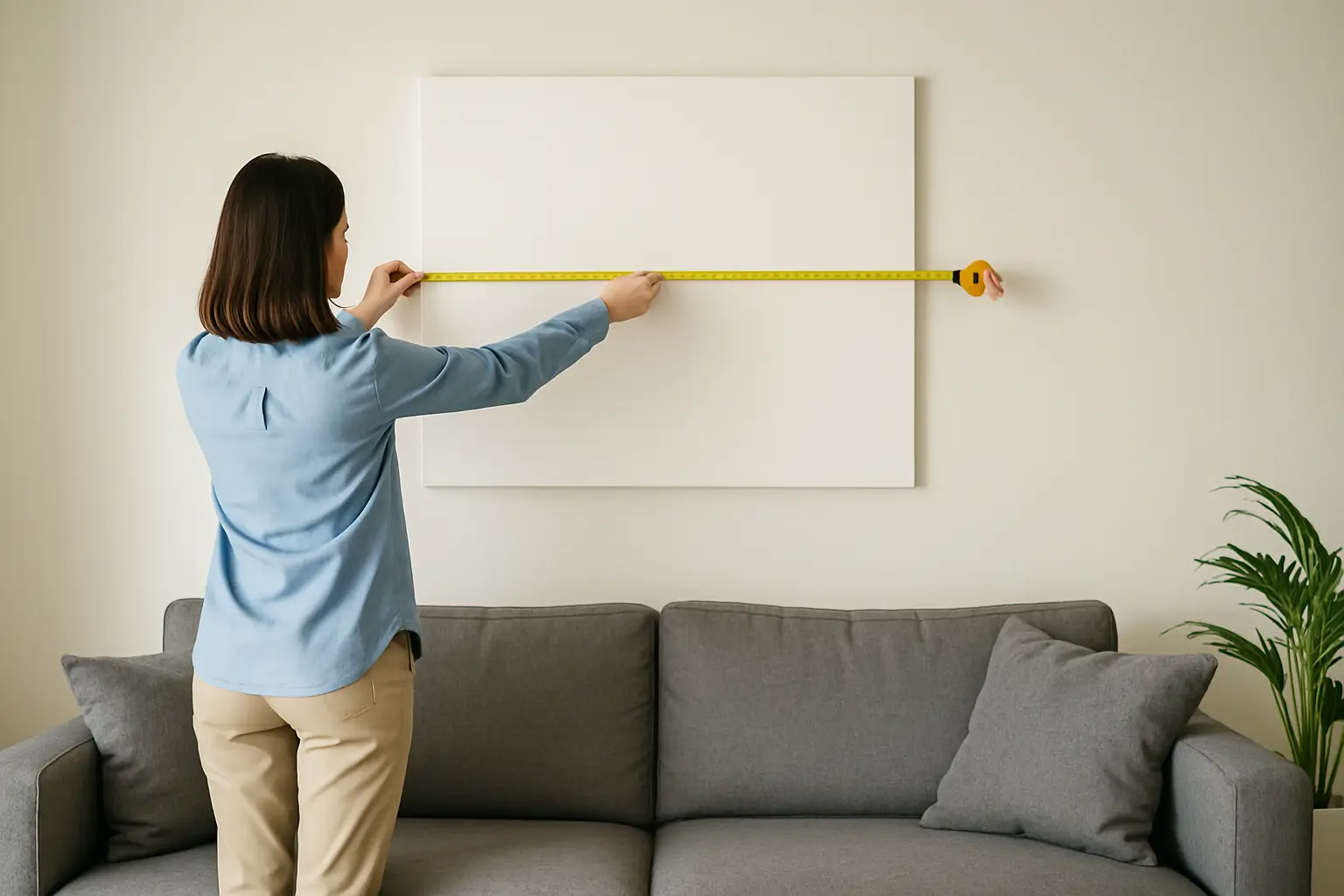
You know the moment. You hang the print, step back, and realise it looks like a postage stamp floating in a sea of wall.
That is not a taste problem. It is a scale problem.
If you want a room that feels designed (not decorated), wall art has to hold its own. Big art does the heavy lifting: it anchors furniture, balances architecture, and makes your colour choices look intentional rather than accidental. Small art can work too, but only when it is grouped with purpose.
This is the practical guide to the question everyone quietly Googles: how big should wall art be? Use it to stop second-guessing and start buying like you mean it.
Table of Contents
The rule that fixes most rooms
If your art is going above a piece of furniture (sofa, bed, sideboard, console), the simplest sizing rule is this:
Aim for art that is roughly two-thirds to three-quarters the width of the furniture beneath it.
So, if your sofa is 240 cm wide, you are looking for art around 160-180 cm wide. That could be one large statement piece, or two substantial pieces hung as a pair. Anything much smaller starts to read as timid – like you could not commit.
There is a trade-off here. Going closer to three-quarters feels bold and gallery-like, but it demands confident negative space around it. Closer to two-thirds feels safer and gives you more breathing room for lamps, shelves, or architectural features.
Height matters too (and most people ignore it)
Width gets all the attention, but height is what makes art feel properly scaled on a wall.
A good starting point is to place the centre of the artwork at around eye level, roughly 145-155 cm from the floor. That is a gallery standard because it works across most spaces.
But homes are not galleries. If your ceilings are high, you might need to go taller and larger to avoid the “floating frame” effect. If you are styling above a sofa or bed, the bottom edge of the artwork usually looks best about 15-25 cm above the furniture. Any higher and the art disconnects from the zone it is meant to anchor.
If you are hanging a taller piece, do not be afraid to let it occupy more vertical real estate. A big wall wants a big gesture.
How big should wall art be above a sofa?
Above a sofa is where under-sizing hurts the most, because the sofa is visually heavy. A little frame above it looks like an apology.
Use the two-thirds to three-quarters rule for width, then check the height against your ceiling line. In a standard-height room, a piece around 80-120 cm tall often lands well above a typical 85-95 cm high sofa back. In a room with higher ceilings, taller work (or a pair stacked vertically) stops the wall feeling unfinished.
If your sofa is long and low, go long and low with the art. Think panoramic proportions, or a strong horizontal piece. If your sofa is compact, you can go taller and create presence without needing huge width.
The trade-off: a single oversized piece is the cleanest, most architectural choice. A multi-piece arrangement can be flexible, but it requires discipline in spacing and alignment to look deliberate.
How big should wall art be above a bed?
Beds are wide, and headboards create a strong line. Your art has to match that energy.
If you are hanging above the headboard, the same width rule applies: two-thirds to three-quarters the width of the bed or headboard. For a Queen (around 153 cm wide) that puts you in the 100-115 cm wide range. For a King (around 183 cm) think 120-140 cm wide.
Height depends on your headboard height and the feel you want. A tall piece can make a bedroom feel more editorial and grown-up. A wide piece keeps things calm and grounded.
If you are deciding between hanging art and leaning it on a ledge or a low shelf, leaning works best when the piece is genuinely large. A small leaning frame can look temporary, like you are still moving in.
Dining rooms: go bigger than you think
Dining rooms can handle drama. They tend to have clearer wall space and fewer soft furnishings, so scale reads even more strongly.
If you have a sideboard, treat it like a sofa: art should be two-thirds to three-quarters of the sideboard width. If you do not have furniture on that wall, use the wall itself as your guide.
A practical approach is to imagine the wall divided into thirds and let the art occupy roughly the middle third to half, depending on how minimalist you want the room to feel.
The key dining-room consideration is viewing distance. You are often looking at that wall from across the table, so small work disappears. Large work turns into atmosphere.
Hallways and entries: scale to the pace
Hallways are not just corridors. They are mood-setters.
If your hallway is narrow, a massive piece can feel like it is leaning into you. In that case, choose a piece that is tall and not overly deep in frame, or run a vertical sequence that draws the eye forward.
If your entry is open, treat it like a moment. Big art near the front door tells people exactly what kind of home this is before they even take their shoes off.
For stairs, align the artwork to the angle of the staircase. You do not need to match it perfectly, but the arrangement should acknowledge the slope. One strong piece can work, but a measured run of pieces often looks best when each frame is consistent in size and spacing.
Blank walls: use the “60 percent” check
When there is no furniture to anchor your choice (think big empty wall opposite the lounge, or an open-plan expanse), you need a different rule.
A reliable check is to let the artwork (or the overall arrangement) occupy about 60 percent of the available wall width.
Measure the wall width, multiply by 0.6, and you have a target. It is not a law. It is a way to stop buying art that looks lost.
If the wall is broken up by windows, doors, or shelving, treat the largest uninterrupted section as your “available wall”. Art needs a clean field around it to read as intentional.
One big piece vs a gallery wall (choose your fighter)
A single large artwork is the fastest route to a room that feels architectural. It is decisive. It creates a focal point. It does not need explaining.
A gallery wall can be brilliant, but it has rules. The overall shape of the gallery wall matters more than any individual piece. If the gallery wall is too small, it will still look under-scaled, even if you have ten frames.
If you are doing a gallery wall, plan the outer boundary first. Decide the total width and height you want it to occupy, then fill that shape. Keep spacing consistent (usually 4-7 cm between frames). If you cannot commit to that structure, go for one big piece and let it do its job.
The masking tape trick that saves returns
Before you buy, mock the size on the wall.
Use masking tape or painter’s tape to mark the width and height of the piece you are considering. Stand back to where you will actually view it from (sofa position, doorway, dining chair) and check three things: does it look connected to the furniture below, does it balance the wall, and does it feel confident?
If it looks small in tape, it will look smaller in real life.
This is also where you can sanity-check frame thickness. A chunky frame adds visual weight and can make a slightly smaller piece feel more substantial. A slim frame looks modern and clean, but it will not rescue an under-sized print.
Ceiling height, light, and colour change the sizing
Scale is not just centimetres. It is visual weight.
Darker, moodier art can feel heavier, which means you can sometimes go a touch smaller without it vanishing. Light, airy art can read as less substantial, so it often needs more size to feel anchored.
If your room is very bright with lots of glazing, art can get visually washed out. Bigger work with stronger contrast holds up better. If your room is dim, larger art can still work, but you will want lighting that actually honours it – a picture light or a nearby lamp that throws gentle light across the surface.
And yes, colour is functional. Strong colour can lift the energy of a space, but it also draws the eye. If you are going bold, give the piece enough scale to feel like a deliberate choice, not a small accent trying to do a big job.
If you are still torn, choose the bigger option
Most people under-buy wall art because they imagine it will feel “too much”. Then they hang it, and it feels like nothing.
If you are deciding between two sizes and both technically fit, choose the bigger one – especially in open-plan living, above a sofa, or on a wall you see from multiple angles. Large-scale art is not extra. It is efficient. One strong piece can replace a scatter of small decor that clutters shelves and still does not anchor the room.
If you want a curated shortcut built for modern NZ interiors, Lifted+ specialises in statement-making, large-scale wall art designed to hold a room, not politely decorate the corners.
A final thought to take with you: buy art for the wall you have, not the wall you wish you had. The right scale makes your space feel finished, even before you add anything else.