
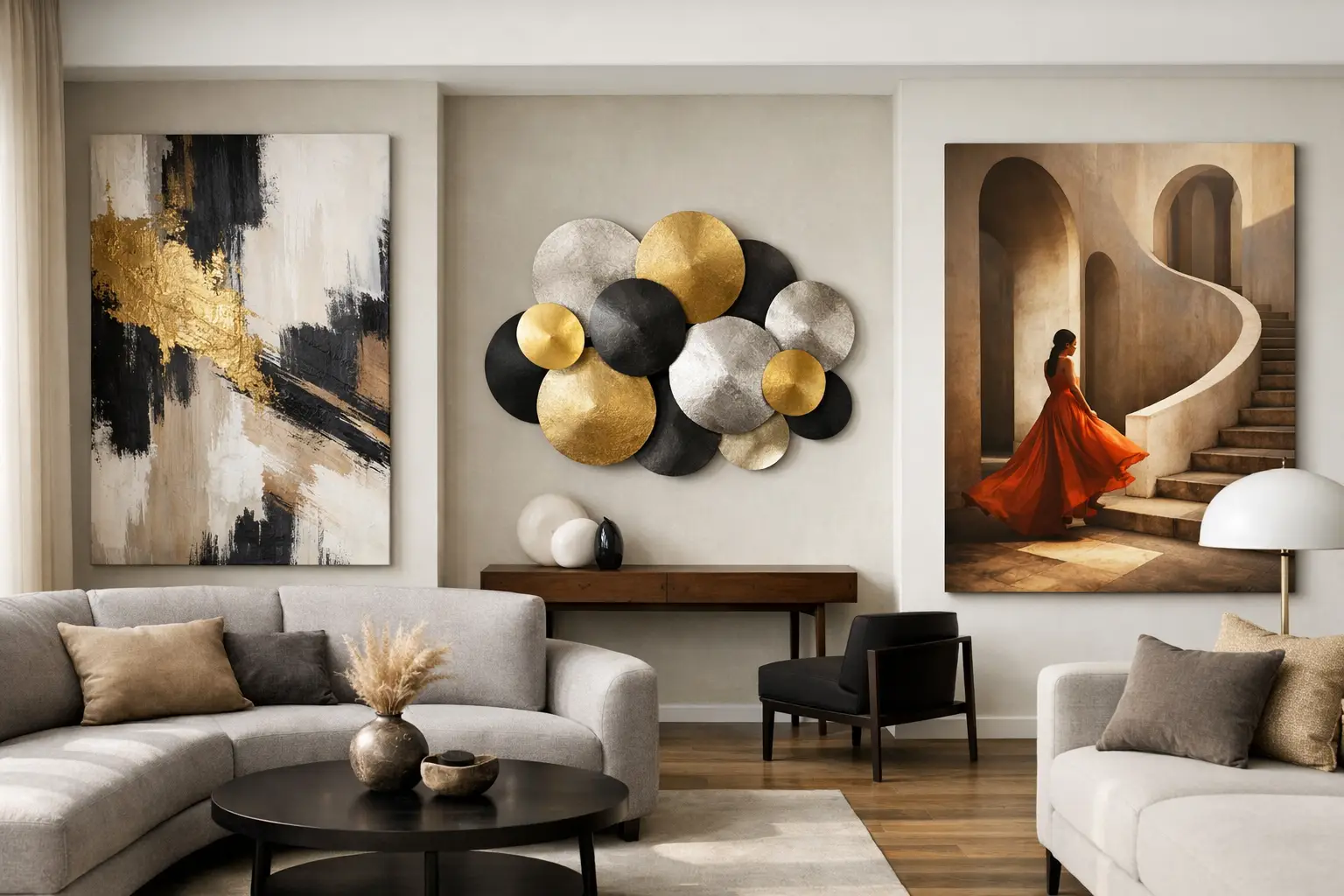
You can feel when a room is missing its anchor. The sofa is right. The lighting is considered. The rug does its job. But the walls are still behaving politely. The best statement wall art for modern interiors changes that in a second. It gives the room a point of view.
This is where many spaces go flat. People treat wall art as the final decorative layer, something to fill a gap once the furniture is in. Modern interiors work better when art is treated as structure. Not filler. Not an afterthought. A focal point that sets the emotional temperature of the room and tells every other piece how to behave.
Table of Contents
What makes the best statement wall art for modern interiors?
Scale comes first. If a piece is meant to hold a room, it needs enough visual weight to do it. That does not always mean enormous, but it does mean intentional. A small artwork floating above a long sofa rarely reads as confident. It reads as cautious.
The strongest statement pieces tend to do one of three things well. They bring architectural scale, they use colour with purpose, or they introduce a bold graphic rhythm that sharpens the entire space. The best ones do all three.
Modern interiors also ask for clarity. Too much detail can make a room feel visually noisy, especially if the furniture already has strong lines or sculptural forms. Statement wall art works hardest when the composition is decisive. Big gestures. Clean tension. Colour that knows why it is there.
That said, “modern” is not one look. A crisp inner-city flat, a warm timber-lined home, and a polished architectural renovation all need different energy. The right piece depends on what the room already has and what it still lacks.
Oversized abstract art gives a room authority
If your interior leans architectural, oversized abstract wall art is usually the strongest move. It adds presence without becoming literal, and it gives you freedom with the rest of the room. You are not decorating around a subject. You are building around mood, movement, and form.
This is especially effective in open-plan living spaces where a single work needs to command attention from multiple angles. A large abstract canvas can connect the lounge, dining area, and kitchen visually, creating one coherent atmosphere instead of three disconnected zones.
The trade-off is that abstract art has to be good. Weak abstract work can look generic very quickly. The best pieces have tension in the composition, restraint in the palette, and enough scale to feel deliberate rather than decorative. Look for works that feel composed, not busy.
In homes where the architecture is calm – plaster walls, oak tones, soft stone, black steel detailing – abstract art can provide the friction the room needs. A hit of cobalt, acid green, rust, or saturated red can stop the whole scheme drifting into expensive blandness.
Graphic colour pieces bring energy to modern spaces
Some rooms do not need softness. They need voltage. This is where graphic, colour-forward wall art earns its place.
Strong geometric forms, sharp contrasts, and saturated colour blocks can completely shift the mood of a room. They are particularly effective in spaces that need lift: a dining room that feels a bit too serious, a hallway that lacks identity, or a home office that should feel energising rather than dutiful.
Colour in statement art should never feel random. In a modern interior, it works best when it picks up an existing tone and pushes it further, or introduces one deliberate contrast that changes the room’s balance. Think deep blue against warm timber. Burnt orange against cool concrete. Pink against olive or oxblood. More mood. More life.
If the room already contains patterned textiles, sculptural lighting, or highly expressive furniture, the art needs to stay disciplined. Bold does not mean chaotic. One strong idea will always land better than five competing ones.
Black and white still works – if the form is strong enough
There is a lazy version of black and white wall art that exists purely to be inoffensive. Skip it. But black and white with scale, contrast, and shape can still be some of the best statement wall art for modern interiors.
This direction suits homes where the architecture already carries warmth through materials rather than colour. Think travertine, timber veneer, brushed metal, or soft wool textures. In those spaces, monochrome art can sharpen the edges and add seriousness without flattening the atmosphere.
The key is form. A black and white piece needs enough movement, composition, or graphic punch to justify its restraint. Thin, timid prints disappear. Large works with bold linework or high-contrast composition hold their own.
This is also a smart route for collectors who want a room to feel modern but not trend-led. While colour has immediate emotional pull, monochrome can offer longevity if the piece has genuine presence.
Textural and sculptural wall art adds depth
Not every statement piece needs to be a framed print or canvas. In fact, some of the most compelling modern interiors use wall art that behaves more like an object.
Relief surfaces, layered materials, dimensional forms, and tactile finishes add a different kind of impact. They catch light through the day, create shadow, and make the wall feel active. This works beautifully in pared-back spaces that rely on material contrast rather than pattern.
There is an important distinction here. Texture can look sophisticated or it can look crafty. The difference is usually scale, finish, and shape discipline. The best sculptural wall pieces feel architectural. They echo the language of the room rather than sitting on top of it.
This is a particularly strong option for bedrooms, entryways, and quieter sitting rooms where you want depth and presence without the direct intensity of bright colour.
How to choose statement wall art without playing it safe
Start with the role the piece needs to play. Is it there to energise a room, add gravity, soften hard architecture, or create contrast? If you only shop by colour or size, you will miss the bigger job the artwork should be doing.
Then assess the room honestly. If your furniture is low, linear, and restrained, the art can go bigger and bolder. If the room already has dramatic lighting, patterned upholstery, or strong joinery, the artwork may need cleaner lines to avoid visual traffic.
Placement matters as much as selection. Statement art should feel integrated with the architecture, not pinned on as an accessory. Over a sofa, the work should usually occupy enough width to relate properly to the furniture beneath it. In a dining space, a single large piece often has more authority than a busy salon hang. In an entry, art should set the tone immediately.
There is also the question of whether one piece is enough. Often it is. A truly strong work can carry an entire wall and make the rest of the room feel more resolved. Pairing it with sculptural lighting or a carefully chosen object can be more effective than adding extra artworks that dilute the impact.
The modern interior rule worth keeping
If a piece could work in absolutely any room, it is probably not a statement piece.
The best statement wall art has specificity. It asks something of the space. It creates direction. It may even divide opinion slightly, which is often a good sign. Rooms with personality are usually built on a few decisive choices, not a hundred universally liked ones.
That is also why tight curation matters. Too much choice makes people retreat to the safest option. A design-led edit does the opposite. It helps you see what kind of artwork can genuinely hold a room, especially when you are trying to create a home that feels expressive rather than beige by default. That is where a focused collection such as Lifted+ earns its keep.
Best statement wall art for modern interiors depends on mood
The final choice comes down to the feeling you want to live with every day. Oversized abstracts bring calm authority. Graphic colour pieces bring momentum. Monochrome works bring edge. Textural forms bring quiet depth.
None of these is universally best. The best piece is the one that changes the room’s energy on contact and makes everything around it look more intentional. That is the real test.
If your walls are still playing a supporting role, that is the opportunity. Choose art that leads. Let it set the pace, sharpen the mood, and give the room the conviction it has been missing.