

TL;DR:
- Aesthetic impact in interiors bridges visual appeal and genuine emotional resonance through harmonious elements like colour, form, and texture. It depends on the relationships between these elements, emphasizing authenticity, balance, proportion, contrast, and contextual appropriateness. Creating true impact involves trusting personal instincts, responding to seasonal light, and curating honest materials that reflect individual identity and environment.
A room can look perfect in photos and still leave you cold the moment you walk in. That disconnect, that invisible gap between visual polish and genuine feeling, is exactly what aesthetic impact is designed to bridge. Aesthetic impact in interiors refers to the visual and sensory appeal created by harmonious elements like colour, form, light, texture, and materials, influencing emotional responses and mood. This guide will help you understand what creates that resonance, how to recognise it, and most importantly, how to cultivate it in your own home.
Table of Contents
- Defining aesthetic impact: Beyond just good looks
- The elements that shape aesthetic impact
- The science and psychology of creating atmosphere
- Nuance and context: Designing with honesty and function
- Bringing it all together: Applying aesthetic principles in your home
- Why real aesthetic impact starts with feeling, not following rules
- Elevate your home’s aesthetic impact with Lifted+
- Frequently asked questions
Key Takeaways
| Point | Details |
|---|---|
| Aesthetic impact defined | It’s more than just looks—it’s how interiors feel and influence mood, through colour, texture, form, and material honesty. |
| Elements combine for effect | Balance, proportion, contrast, and function work together to shape the emotional experience of a space. |
| Colour and context matter | Understanding colour psychology and local seasons is key to designing interiors that truly resonate in New Zealand homes. |
| Honesty and function | Authentic materials and practical design choices prevent overdesign and foster meaningful aesthetic impact. |
Defining aesthetic impact: Beyond just good looks
There is a meaningful difference between a room that photographs well and one that genuinely moves you. The first is decoration. The second is aesthetic impact. Understanding this distinction changes how you approach every design decision you make.
Artistic impact in home interiors is not about accumulating beautiful objects. It is about the dialogue between elements, how colour speaks to form, how light reveals texture, how a material’s honesty earns your trust. When those relationships are working in harmony, a room communicates something beyond its contents.
“Aesthetic impact in interiors refers to the visual and sensory appeal created by harmonious elements like colour, form, light, texture, and materials, influencing emotional responses and mood.” — Encyclopaedia Britannica, Interior Design
Think about how this plays out in practice. A living room furnished entirely with expensive pieces but lacking any sense of scale, warmth, or material contrast will still feel flat. Conversely, a considered arrangement of modestly priced furniture, a piece of wall art placed with intention, and afternoon light falling across a textured linen throw can hold a room with quiet authority. The difference is not budget. It is the quality of the relationships between elements.
This is why aesthetic impact resists simple formulas. It asks you to think about how elements interact, not just what they individually look like. Colour, form, light, texture, and material honesty are the vocabulary. The way you arrange them is the language.
The elements that shape aesthetic impact
With a clearer sense of what aesthetic impact means, it helps to examine the specific elements responsible for producing it. These are the building blocks, and understanding each one gives you practical leverage over how your spaces feel.
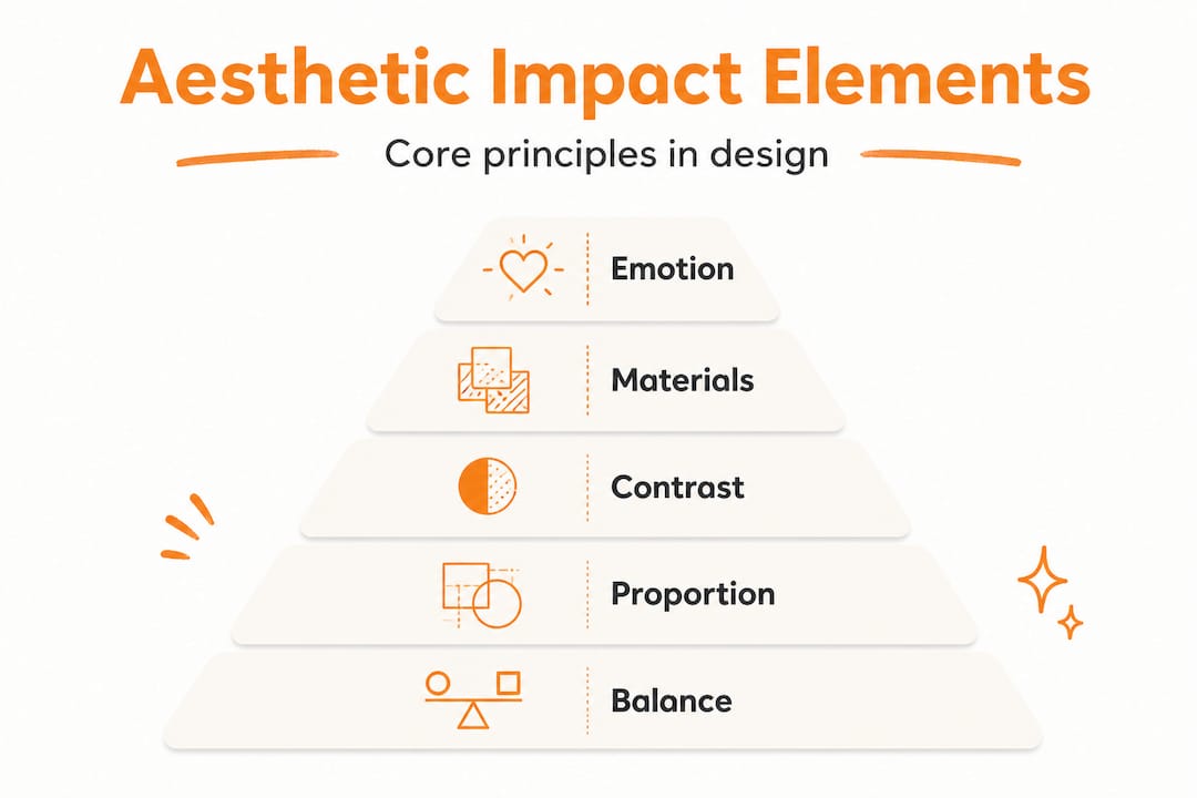
The key mechanics of aesthetic design include balance, proportion, contrast, and honesty in materials, with function integrating with aesthetics for appropriateness. Each of these operates both independently and in relation to the others.
Balance is not symmetry. A room can feel perfectly balanced with entirely asymmetrical arrangements, provided the visual weight is distributed thoughtfully. A large dark sofa on one side can be counterbalanced by a grouping of lighter objects on the other. The eye settles when nothing pulls too insistently in one direction.
Proportion refers to the scale relationships between objects and the space they inhabit. Oversized furniture in a small room creates a sense of pressure. Tiny accents in a large room disappear. Getting proportion right is often the single most effective thing you can do to improve how a space feels.
Contrast is what prevents a room from becoming visually monotonous. Without contrast, even beautiful elements blur into each other. A matte plaster wall beside a glossy ceramic vase. A dark timber frame against pale linen. These pairings create the visual tension that keeps attention alive.
Honesty in materials means allowing materials to be what they are. Timber that shows its grain, stone that shows its variation, raw metal that develops its own patina. When materials are allowed to behave authentically rather than being disguised or imitated, they carry a kind of credibility that adds depth to a space.
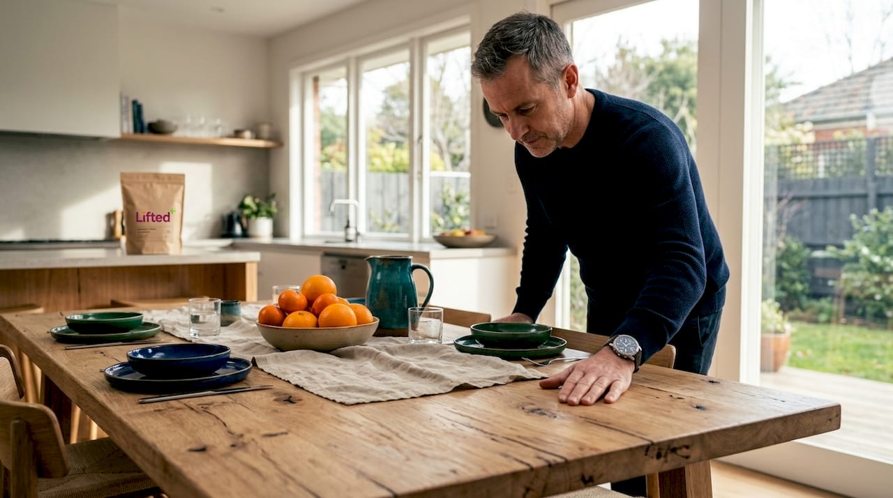
Here is how these elements interact with feeling and function:
| Element | Aesthetic effect | Functional consideration |
|---|---|---|
| Colour | Sets mood and perceived temperature | Affects sense of space and light |
| Form | Creates visual rhythm and sculptural presence | Determines usability and comfort |
| Light | Reveals texture and depth | Supports task and ambient needs |
| Texture | Adds tactile warmth and visual interest | Influences acoustic quality |
| Material | Conveys authenticity and weight | Determines durability and maintenance |
How does furniture shape home ambiance? Primarily through form and proportion. A low, curved sofa signals ease and softness. A tall, angular bookcase signals structure and focus. These choices are communicating something before you have even consciously noticed them.
Pro Tip: When assessing a room’s aesthetic balance, step back to the doorway and squint slightly. The blurred view strips away detail and reveals only visual weight and colour distribution. If something feels wrong at that level, no amount of styling will fully correct it.
The goal of timeless interior design is always to let these elements serve each other, not compete. When each element is doing its job, the room achieves a kind of quiet coherence that feels effortless, even though the thought behind it is anything but.
The science and psychology of creating atmosphere
Elements alone do not explain the full picture. The reason they work on us the way they do is rooted in how our minds and bodies respond to visual and sensory information. Colour psychology, in particular, is a well-documented driver of how spaces feel.
Research consistently shows that blue produces calm, generating favourable affective responses, while red stimulates arousal and can edge toward negative emotional states at high saturation. Warm neutrals, such as stone, sand, and warm white, are associated with elevated perceptions of luxury and comfort. These are not subjective preferences. They are measurable, repeated responses across diverse populations.
What does this mean practically? A bedroom decorated in saturated reds and electric yellows will always work against rest, regardless of how beautifully the individual pieces are selected. A reading nook in dusty blue or warm terracotta will feel inviting before you have sat down in it. The palette is doing emotional work long before you are consciously aware of it.
High saturation colours deserve particular attention. They are energising in small doses but genuinely overwhelming when applied broadly. A deep burnt orange cushion against a warm white sofa? Grounding and vibrant. An entire wall in the same tone? It can close the space in and create a kind of sensory pressure that works against ease. The principle is concentration: let bold colour earn its place through specificity.
New Zealand’s light is distinctive. The quality of southern hemisphere sunlight, particularly the sharp clarity of autumn and winter light, means that colours read differently here than they might in Northern European interiors. Deeper, earthier tones that feel heavy in low northern light come alive under our skies. Colour psychology in interiors is always best applied with an awareness of your specific light conditions.
Seasonal shifts also matter. The way you want to feel in a space changes as the year turns. Autumn and winter invite deeper, more enveloping palettes, rust, umber, charcoal, forest green. Spring and early summer call for lighter, more breathable combinations. Responding to those shifts is not following trends. It is being in dialogue with your environment.
Understanding the role of colour in interiors is ultimately about choosing palettes that serve the emotional purpose of each room, not just palettes that look appealing in isolation.
Nuance and context: Designing with honesty and function
Even with a solid grasp of elements and colour psychology, there are subtler factors that determine whether a space genuinely works. These are the nuances that separate competent design from something that feels truly right.
Appropriateness to context is a concept that encompasses social, economic, and environmental factors. It asks whether a design choice makes sense given where and how you live. Using locally sourced New Zealand timbers, native stone, or ceramics made by local artists brings a kind of contextual integrity to a space that imported imitation materials simply cannot replicate. It grounds your home in its place.
There is also the question of individual difference. Research indicates that preferences for angular versus curved forms vary between individuals, with noted differences across gender lines. Some people are instinctively drawn to the clean precision of angular forms; others find curved, organic shapes more welcoming. Neither is correct. The insight here is that a space designed purely to follow a trend may not resonate with the people actually living in it, which is precisely why personal preference should always have the final say.
The dangers of overdesign are real and worth naming. Overdesign happens when visual complexity overwhelms function, or when the desire to make something beautiful produces a space that is actually uncomfortable to inhabit. A beautiful dining table that seats six but cannot be approached without squeezing past the sideboard is not good design. A stunning approach to artistic design in NZ spaces always keeps lived experience at the centre.
Avoid these common traps:
- Choosing materials for their look alone, without considering how they age or interact with daily life
- Filling every surface in pursuit of visual richness, which produces chaos rather than depth
- Letting trend lead over personal resonance, producing spaces that feel borrowed rather than owned
- Applying high saturation colour too broadly, which research links to negative emotional responses
- Neglecting to consider how a space will feel under different light conditions throughout the day
Bringing it all together: Applying aesthetic principles in your home
Understanding aesthetic impact is one thing. Translating it into your own home is another. Here is a practical framework for approaching that process with clarity and confidence.
Following expert guidance on materials and preferences, the key is to prioritise honesty in materials and test your own responses interactively, since aesthetic preferences genuinely vary between individuals.
-
Assess one room at a time. Stand at the entry point and observe what the room communicates before you start moving things. Write down three words that describe how it currently feels, then three words for how you want it to feel.
-
Identify the dominant element that needs attention. Is it colour that feels wrong? Proportion? A lack of contrast? Naming the specific issue gives you a more precise starting point than a general sense of dissatisfaction.
-
Start with one considered change. Introduce a piece of wall art, a new textile, or a sculptural object. Live with it for a week before adding anything else. This gives your eye time to integrate the change and reveal what is needed next.
-
Layer texture and material. Once the foundational element is working, add a second layer through contrasting materials. Rough beside smooth, matte beside gloss, organic beside structured. These pairings build the visual depth that makes a room feel layered rather than flat.
-
Respond to the season. Swap out cushions, throws, or smaller decorative objects as the year shifts. This keeps your space in dialogue with the light and mood of the season without requiring a full redesign.
Pro Tip: Before making any significant purchase, place a sheet of paper in the colour or tone you are considering in the exact spot where the piece will sit. Observe it across different times of day. Light will change it dramatically, and this simple test saves costly mistakes.
Exploring interior styling trends in New Zealand and understanding how art shapes modern interiors are excellent next steps for refining your approach as your confidence grows.
Why real aesthetic impact starts with feeling, not following rules
Here is our honest perspective: the design industry has a tendency to worship rules. Grid systems, colour theory hierarchies, trend forecasts, all of it can become a kind of aesthetic authority that quietly replaces your own instinct. And that replacement is exactly where spaces start to feel borrowed.
Research on interior forms reveals contrasting views on curved versus angular preferences, noting the shift from a purely visual focus to a more modern understanding of sensory and emotional layering. In other words, even the experts disagree on what works. What they do agree on is that emotional resonance matters more than formal correctness.
Your home should feel like yours. Not like a design brief executed to specification. Not like a catalogue spread brought to life. The spaces that genuinely move people are the ones where the occupant’s sensibility is present in every corner, in the art they chose because it unsettled them pleasantly, in the worn timber they kept because it held memory, in the colours they returned to because they felt right rather than current.
Emotional colour science confirms what most people already sense intuitively: our responses to colour and form are deeply personal, shaped by memory, culture, and individual neurology. No rule can account for all of that. What rules can do is give you a framework to experiment within. The experiment, and the feeling you are chasing, that is yours alone.
Trust your own discomfort when something is not working. Trust your own recognition when something is. Those instincts are not arbitrary. They are the most sophisticated design tool you have.
Elevate your home’s aesthetic impact with Lifted+
Understanding aesthetic impact is the first step. The next is finding pieces that genuinely embody these principles, objects with real sculptural presence, honest materials, and the kind of grounded colour that shifts how a room feels rather than simply fills it.
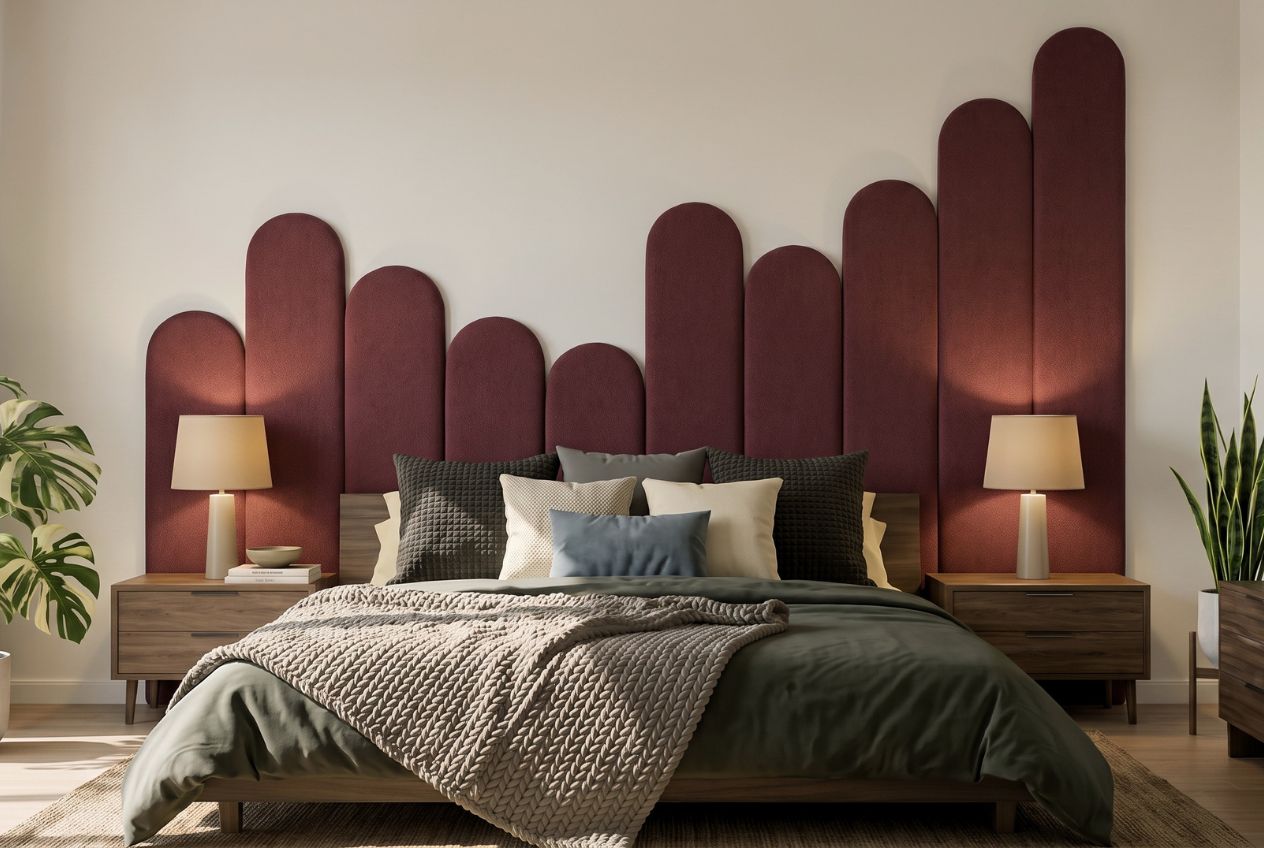
At Lifted+, we curate statement wall art and decorative pieces selected for their emotional and visual authority, not their trendiness. Each season brings a refined edit of artworks, textiles, and objects that respond to New Zealand’s distinctive light and shifting moods. If you are ready to move from decoration to genuine impact, shop our curated decor or explore our modern home decor NZ editorial for seasonal styling inspiration. Your home deserves pieces that hold the room.
Frequently asked questions
What does ‘aesthetic impact’ mean in interior design?
Aesthetic impact is the sensory and visual experience created by elements like colour, form, and texture, shaping how a space looks and feels simultaneously, not just how it appears in a photograph.
Which colours make a room feel calming or energetic?
Blue creates calm responses while red tones stimulate energy and arousal; warm neutrals such as stone and sand increase the sense of luxury and comfort within a room.
How can I avoid overdesigning my space?
Prioritise honesty in materials and keep function central to every decision; focus on how the space feels to live in, not simply how it reads visually.
Do seasonal trends matter for aesthetic impact in New Zealand homes?
Seasonal awareness genuinely refreshes interiors, particularly given New Zealand’s distinctive light quality, which transforms how colours and materials read across autumn, winter, and summer conditions.