
TL;DR:
- Creating a focused interior design inspiration list helps filter ideas that suit your space and lifestyle.
- In New Zealand, grounding interiors in earthy tones and local landscape colours fosters genuine harmony.
Scrolling through hundreds of saved images and still feeling no closer to a finished room is one of the most familiar frustrations in modern decorating. A focused interior design inspiration list cuts through that noise, giving you a clear framework to gather, filter, and act on ideas that actually suit your space and lifestyle. New Zealand homes carry a particular design advantage: a landscape rich in earthy tones, organic textures, and shifting seasonal light that makes grounded, nature-connected interiors feel genuinely at home here. This guide shows you exactly how to build that list and use it.
Table of Contents
- Key takeaways
- Your interior design inspiration list: criteria that actually work
- 1. New Zealand’s landscape as a living colour palette
- 2. Local architecture and architect-designed homes
- 3. Artisan markets, galleries, and craft studios
- 4. Resene colour charts as a design tool
- 5. Theatre, fashion, and unexpected visual culture
- 6. Vintage and second-hand pieces for authentic character
- 7. Statement pieces room by room
- 8. Mood boards versus shortlists: two approaches compared
- 9. Tailoring your list for your living situation
- My honest take on building an inspiration list
- Bring your inspiration list to life with Liftedplus
- FAQ
Key takeaways
| Point | Details |
|---|---|
| Start with one statement piece | Anchor your entire room around a single standout item, then repeat its colours in smaller accents for cohesion. |
| Look beyond digital platforms | Nature, local galleries, and architecture give you richer, more personal inspiration than algorithm-driven feeds. |
| NZ colour trends are your ally | Mossy greens, earthy Resene palettes, and indigo blues suit local light and landscapes beautifully. |
| Renters can transform spaces too | Reversible changes like bold artwork, rugs, and painted furniture refresh a room without structural commitment. |
| Shortlist by material and colour | Narrow your inspiration archive into a focused shortlist to convert ideas into deliberate design decisions. |
Your interior design inspiration list: criteria that actually work
Before you collect a single image, you need an honest understanding of what your space can carry. Room dimensions, natural light direction, and existing fixed elements like flooring or cabinetry all constrain your choices in ways that no amount of Pinterest saves can override. Measure your rooms. Note where morning and afternoon light falls. These are not preliminary tasks. They are the list itself.
Your personality and lifestyle shape the list just as much as the physical space. A home with young children needs materials that age gracefully. A rental that you hope to make feel genuinely yours calls for portable, high-impact pieces rather than structural changes. Be honest about how you actually live before you decide how you want things to look.
NZ 2026 colour trends point firmly toward complex hues paired with softer neutrals, with mossy greens, earthy Resene Twine walls, and organic black accents appearing across contemporary Kiwi interiors. Aligning your inspiration list with these local palette directions means your choices will feel coherent with the light quality and landscape outside your windows rather than fighting against them.
Pro Tip: Set a realistic budget range before you start collecting inspiration. Knowing whether you are working with $300 or $3,000 tells you which statement pieces are worth researching and which are pleasant distractions.
The single most clarifying rule designers recommend is to anchor every room around one standout item — a sculptural pendant light, an oversized artwork, a richly textured rug — and let everything else respond to it. This approach stops a room from becoming a catalogue of good intentions and gives it a clear centre of gravity.
1. New Zealand’s landscape as a living colour palette
The most original home decor ideas do not come from screens. They come from paying attention. New Zealand’s terrain offers one of the world’s most sophisticated natural colour libraries: the silver-green of native tī kōuka leaves, the deep ochres of coastal cliffs near the Catlins, the diffuse grey-blue of a Wellington harbour morning.
Biophilic design links interior colours directly to local landscape hues, and the results produce spaces with genuine warmth and harmony. The Waraki House, for example, uses paint colours that mirror sky, water, and foliage, creating rooms that feel like a natural extension of their surroundings rather than a sealed-off box.
Carry a small notebook or use your phone’s camera to collect colour observations on walks, at the beach, or in the bush. One or two observations per outing builds a deeply personal archive that no algorithm can replicate.
2. Local architecture and architect-designed homes
New Zealand has a strong tradition of architect-designed residential buildings that balance indoor-outdoor flow with considered material choices. Visiting open homes, heritage buildings, or local architecture tours gives you a sense of how space, proportion, and light interact in a way that photographs rarely convey.
Pay particular attention to how designers handle transitions: the point where timber flooring meets a tiled kitchen, or where a ceiling drops to define a reading nook. These moments hold the room together and are worth capturing in your inspiration list.
3. Artisan markets, galleries, and craft studios
New Zealand has a thriving community of ceramicists, weavers, printmakers, and furniture makers whose work carries a tactile quality that mass-produced decor simply cannot match. Visiting markets like the Christchurch Arts Centre or the Auckland Art Fair exposes you to texture, scale, and material combinations that feel genuinely current.

A handmade ceramic lamp base or a woven wall piece from a local artist can become the statement piece that anchors an entire room. These pieces also tend to hold their character across changing trends, which makes them worth the investment.
4. Resene colour charts as a design tool
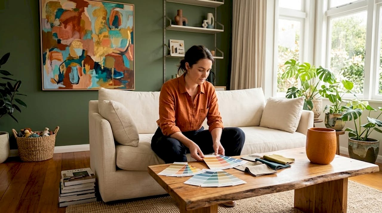
Resene produces some of the most carefully considered colour charts in the Southern Hemisphere, and they are free to pick up at any Resene ColorShop. Rather than treating paint selection as a final step, use the charts as an early inspiration tool. Pull a handful of strips in the tones that speak to you and arrange them next to fabric swatches, timber samples, or ceramic pieces.
Earthy, layered colour palettes produce warm, lived-in spaces that suit New Zealand’s natural environment, and Resene’s 2026 selections reflect exactly this direction. Twine, Palm Green, and deep indigo tones appear repeatedly in current local interiors and pair beautifully with natural linen and raw timber.
5. Theatre, fashion, and unexpected visual culture
Interior decor inspiration does not belong to the decorating world alone. Theatre set design — particularly for productions that work with limited budgets — solves exactly the same problem you face: how to make a space feel complete and emotionally resonant with a small number of carefully chosen elements. Watch how set designers use a single dominant colour on one wall to anchor an entire stage.
Fashion is equally useful for understanding texture relationships. The way a raw-edged linen jacket sits against a smooth silk lining translates directly to how a rough jute rug grounds a smooth plaster wall in a living room.
6. Vintage and second-hand pieces for authentic character
A room full of new purchases tends to feel assembled rather than lived in. Introducing one or two vintage or second-hand pieces — a mid-century timber sideboard, a retro ceramic lamp, a woven basket from a local op-shop — adds the kind of layered character that takes deliberate effort to achieve any other way.
These pieces work especially well in creative space design because they resist the tendency toward visual uniformity. A vintage piece does not match everything perfectly. It holds its own. And that tension is exactly what makes a room interesting.
7. Statement pieces room by room
Understanding which element anchors each room is one of the most practical applications of any interior design inspiration list. In the living room, the hierarchy usually belongs to a large artwork, an area rug with a strong colour or pattern, or a sculptural pendant light. Choose one. The others become supporting acts.
Layered lighting — a central fixture supported by sconces, picture lights, and floor lamps — is one of the few design decisions that changes how everything else in the room reads. Warm light deepens timber tones and enriches textile colours in ways that overhead fluorescents simply flatten.
In the bedroom, the statement piece is often a textile. A richly textured bedhead, an oversized linen quilt in a complex earthy tone, or a hand-knotted throw becomes the room’s visual anchor. In the kitchen, a painted hutch or a bold backsplash tile can carry the whole space.
Pro Tip: Once you have chosen your statement piece, repeat its colours in two or three smaller accents around the room. Cushions, ceramics, and small artworks work well. The goal is echo, not repetition.
8. Mood boards versus shortlists: two approaches compared
Not everyone thinks visually in the same way, and your inspiration list should reflect how your mind actually organises information. Mood boards work beautifully for people who think in images and respond to the feeling of a room as a whole. A physical mood board pinned to a corkboard, with paint chips, fabric swatches, and printed images, lets you step back and read the room before anything is purchased.
A material and colour shortlist suits people who think in categories. Rather than a board, you maintain a written or digital list of specific tones, textures, and material qualities that must appear in the finished room. Narrowing ideas by real encounters helps convert an inspiration archive into a deliberate room direction.
| Approach | Best for | Main strength | Watch out for |
|---|---|---|---|
| Mood board | Visual thinkers | Captures overall feeling quickly | Can become overly aspirational |
| Material shortlist | Analytical thinkers | Keeps decisions grounded and specific | Can feel dry without a visual reference |
| Single statement method | Anyone overwhelmed by choices | Creates immediate clarity and cohesion | Requires confidence in the anchor piece |
| Collected inspiration archive | Exploratory personalities | Builds a rich, personal design language | Needs regular editing to stay useful |
9. Tailoring your list for your living situation
Renters and homeowners face genuinely different design problems, and your inspiration list should account for this honestly. Renters benefit most from reversible updates like bold artwork, large rugs, removable wallpaper, and statement furniture that moves with them. A single well-chosen floor lamp can pull a rented living room out of the safe, polite middle without touching a wall.
Homeowners have the advantage of permanence. Investing in layered lighting installed in ceilings and walls changes how a home reads across every season and is worth prioritising over purely decorative purchases.
Small spaces benefit enormously from a single bold statement piece rather than multiple smaller accents, which tend to fragment the eye. One large artwork on a feature wall reads more powerfully than a gallery wall of twelve smaller prints, especially in a compact Auckland apartment or a Wellington terrace house.
Budget-conscious decorators in New Zealand have genuine options beyond the obvious. Painting a tired furniture piece in a complex earthy tone, sourcing a vintage rug at a local market, or commissioning a small original work from a Kiwi artist through an art market all produce results that feel considered rather than cost-constrained.
My honest take on building an inspiration list
I spent years collecting inspiration before I understood that accumulation is not curation. I had folders full of beautiful rooms and no clear direction for any of them. What changed things for me was the discipline of the single statement piece. I stopped looking for the perfect room and started looking for the one object that held a room. That shift was clarifying in a way that no amount of scrolling had been.
New Zealand’s earthy palette is something I have come to feel genuinely protective of. There is a particular quality of light here — softer than the Australian coast, more changeable than European cities — that rewards complex, layered colour choices. Mossy greens and warm ochres read completely differently in a Dunedin winter than in an Auckland summer, and that responsiveness is what makes them interesting to live with.
Mixing vintage and modern pieces taught me that modern interior design does not require uniformity. The best rooms I have spent time in have always had at least one element that refuses to match. That tension is what gives a space personality rather than polish.
My strongest advice is to step away from the screen and go look at something real. A walk through a local market or a visit to a gallery will give you more useful material for your inspiration list than two hours on any design platform.
— Michelle
Bring your inspiration list to life with Liftedplus
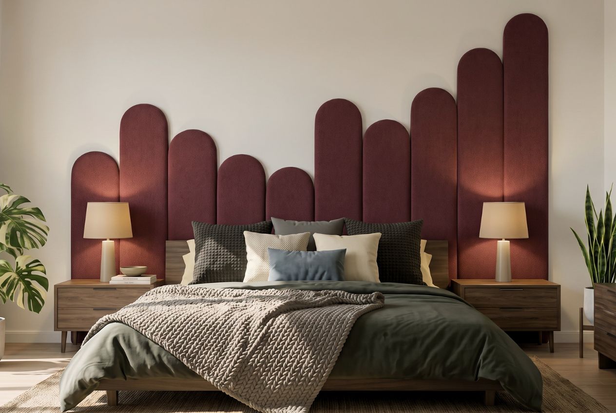
Once your inspiration list starts taking shape, the next step is finding pieces that can actually hold a room. Liftedplus curates vibrant, colour-led decor — from sculptural lighting to bold wall art — designed specifically to work in modern New Zealand interiors. The Liftedplus Mood Library is a practical starting point if you are still developing your visual direction, offering curated mood boards organised by colour palette and design approach. If you already know your statement piece direction, browsing the fresh NZ decor edit will show you how layered, colour-grounded pieces translate from inspiration to reality. Every piece in the collection is selected for form, presence, and the ability to anchor a space rather than simply fill it. Explore how decor personalises your space and find the piece that holds your room.
FAQ
What is the ‘one statement piece’ rule?
Designers recommend choosing a single standout item per room — such as an artwork, rug, or pendant light — and building the rest of the decor around its colours and shapes for a cohesive, grounded result.
How do I start an interior design inspiration list from scratch?
Begin by noting your room dimensions, existing fixed elements, and the quality of natural light in your space, then collect two or three colour or texture observations from real-world outings before adding any digital images.
What NZ colour trends should I consider for 2026?
Current NZ interior colour trends favour complex hues paired with soft neutrals, particularly mossy greens, earthy tones like Resene Twine, and deep indigo blues that suit New Zealand’s natural light and landscape.
Can renters build a strong design inspiration list?
Absolutely. Renters benefit most from portable, high-impact choices like oversized artwork, statement rugs, and sculptural floor lamps that create a strong visual anchor without altering the structure of the home.
How many items should be on my interior design inspiration list?
Keep your shortlist tight: three to five colours, two or three material qualities, and one statement piece per room. A focused list converts inspiration into decisions far more effectively than a broad archive.