
TL;DR:
- Tactile interiors focus on physical textures to create warmth, comfort, and sensory engagement in homes. Proper material choice, lighting at 2700K, and balanced layering following the 70-20-10 rule enhance tactile experience. Overloading with textures or neglecting acoustics can reduce the comforting effect of tactile design.
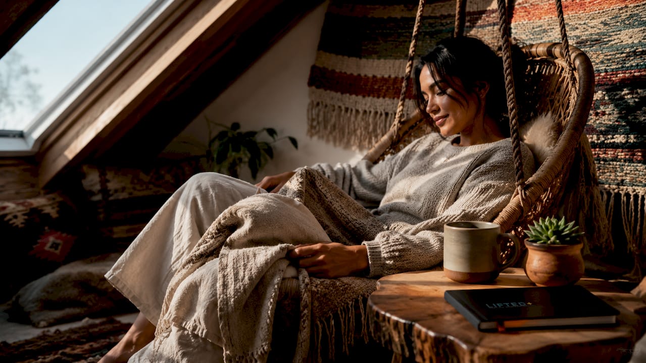
Tactile interiors are designed spaces that prioritise physical texture and touch engagement to create emotional warmth, sensory depth, and genuine comfort in the home. The term sits within the broader field of sensory design, which integrates all five senses, though touch and sight dominate practical home design for emotional wellbeing. Where a visually appealing room might look good in a photograph, a tactile interior feels right the moment you walk in. Rough linen against a smooth plaster wall, a warm timber floor underfoot, a ceramic lamp base that invites your hand. These are not accidents. They are deliberate choices that pull a space out of the polite, neutral middle and give it presence.
What are tactile interiors and why do they matter?
Tactile interiors are defined by the intentional use of physical texture to engage the sense of touch and shape emotional response. This is distinct from purely visual texture, such as a printed fabric that mimics weave but offers no real grain or resistance. Genuine tactile materials provide softness, warmth, and grain that create interactive bonds between a person and their space. That distinction matters because the body responds to real texture in ways that printed surfaces simply cannot replicate.
The concept of Haptic Luxury has emerged as a leading design trend for 2026, addressing the growing fatigue from screens and digital environments by introducing natural, grounding textures that regulate emotional responses and evoke comfort. Homes designed with a tactile focus offer a sensory counterbalance to the flatness of digital life. A rough-hewn stone surface or a deeply woven wool throw does something a screen never can. It grounds you physically in the room you are in.
Textured home design is not a new idea, but the intentionality behind it has sharpened considerably. Designers now plan tactile qualities from the schematic phase, not as an afterthought once walls are painted and floors are laid. Tactility integrated early in the design process produces spaces where lighting, texture, and spatial experience work as a single cohesive system rather than competing elements.
How to apply the 70-20-10 texture rule in your home
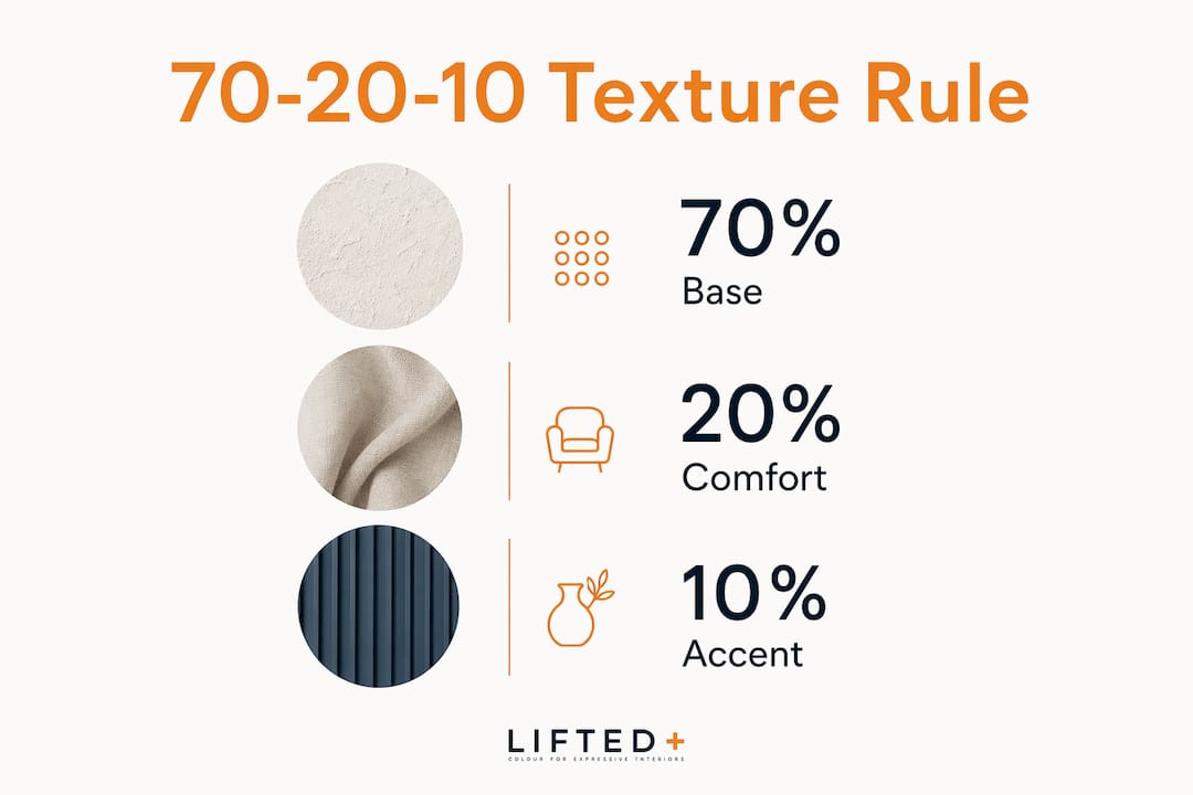
The 70-20-10 rule is the most practical framework for balancing physical texture in decor. It advises 70% smooth or matte surfaces as the base layer, 20% plush or soft textiles for comfort, and 10% hard, raw, or shiny accents to create contrast and visual interest. The logic is simple. Too much rough texture overwhelms the senses. Too little and the room feels cold and flat.
The table below shows how this rule applies across typical rooms.
| Room | 70% base (smooth/matte) | 20% comfort (plush/soft) | 10% accent (hard/raw/shiny) |
|---|---|---|---|
| Living room | Plastered walls, polished concrete floor | Linen sofa, wool rug | Ceramic lamp, brass handle |
| Bedroom | Painted walls, timber flooring | Velvet bedhead, cotton bedding | Stone bedside table, mirror |
| Dining room | Rendered walls, matte tiles | Upholstered chairs, linen curtains | Glazed pottery, raw timber table |
| Bathroom | Smooth tile walls, stone floor | Waffle towels, bath mat | Brushed metal tapware, clay vessel |
The rule is a guide, not a formula. A room with strong architectural bones can absorb a higher proportion of soft textiles without feeling chaotic. A smaller room benefits from restraint in the accent layer to avoid visual noise.
Pro Tip: Before committing to a material, hold a sample in your hand for thirty seconds. If you want to keep touching it, it belongs in your space. If you feel nothing, reconsider.
Choosing materials that bring tactile warmth and personality
Natural raw materials are the foundation of any well-considered sensory interior. Timber brings warmth and grain. Stone offers weight and cool resistance. Linen has a looseness that softens a room without making it feel precious. Each of these materials provides distinguishable tactile feedback that aids restoration and comfort in living spaces. The challenge with raw materials is that they require maintenance and can be difficult to source in consistent quality.
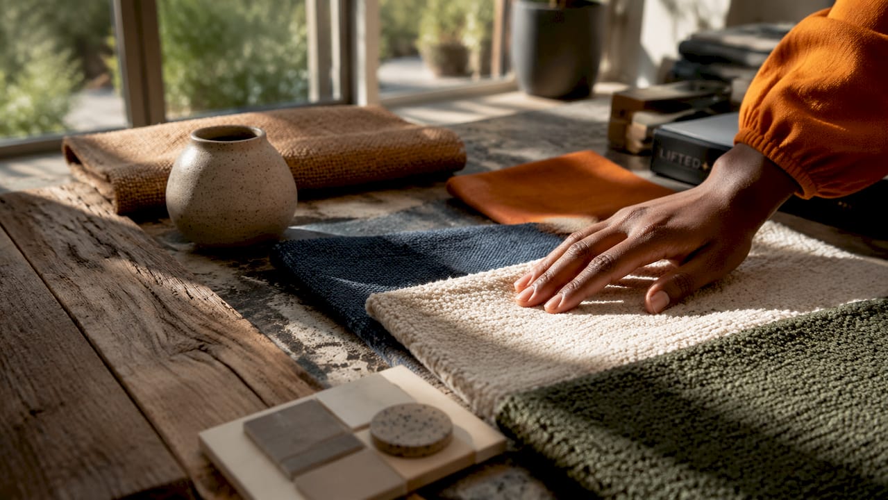
Customised upholstered pieces solve part of that problem. A bespoke upholstered sofa in a textured bouclé or a ribbed velvet gives you the sensory richness of natural fibre with the durability of modern construction. Natural living ideas from bespoke furniture makers show how sustainable material choices can deliver both tactile authenticity and longevity. The key is selecting upholstery that has genuine surface variation rather than a flat weave that reads as texture only from a distance.
The concept of Haptic Warmth extends beyond individual materials to the way they are combined. A smooth plaster wall next to a rough-sawn timber shelf creates a conversation between surfaces. That contrast is what the nervous system registers as warmth. Neither surface alone achieves the same effect.
Recommended tactile material types and their primary qualities:
Rough-sawn or wire-brushed timber: visible grain, warmth underfoot and underhand, ages with character.
Linen and bouclé upholstery: loose weave, soft resistance, absorbs light rather than reflecting it.
Unglazed or matte ceramic: cool to the touch, slightly gritty surface, grounding in small doses.
Wool and jute rugs: deep pile or coarse weave, defines zones, adds acoustic softness underfoot.
Natural stone and terrazzo: weight and cool resistance, high contrast with soft furnishings.
Rattan and woven cane: open weave, light and shadow play, tactile without visual heaviness.
Pro Tip: Avoid sourcing all your tactile materials from the same supplier. Variation in origin produces variation in surface character, and that inconsistency is exactly what makes a room feel collected rather than decorated.
Why warm lighting at 2700K matters for textured spaces
Lighting temperature is the silent partner of every tactile material in a room. Consistent warm lighting at 2700K is the standard for tactile-rich spaces because it amplifies the shadow and depth that texture creates. Cool white light at 4000K or above flattens surfaces. It removes the shadow that makes a rough plaster wall look dimensional and makes a linen sofa look like a flat shape rather than a layered object.
Inconsistent lighting across a room is one of the most common mistakes in textured home design. A warm pendant over the dining table paired with cool downlights in the kitchen creates a fractured sensory experience. The textures in each zone read differently under different light temperatures, and the room loses its cohesion.
Layered lighting supports tactile texture sequencing in three ways:
Ambient light at 2700K sets the base warmth and allows matte surfaces to absorb light softly rather than bounce it.
Task lighting with directional beams creates raking light across textured surfaces, deepening shadow and revealing grain.
Accent lighting placed low and close to textured walls or objects draws the eye to surface variation and adds physical depth to the room.
The Liftedplus guide to layering lighting at home covers this sequencing in detail, including how to match light temperature to specific material types. Getting the lighting right before finalising your material palette saves significant rework. Texture and light are co-dependent. One without the other is half a decision.
How to sequence and layer tactile elements for impact
Layering tactile elements follows a clear hierarchy, from large-scale base textures down to small finishing details. Large-scale textures like a stone fireplace or a limewashed wall anchor the space and establish the dominant sensory register. Smaller textures like woven baskets or ceramic handles provide finishing detail. Skipping the hierarchy produces rooms that feel either heavy or unresolved.
A practical sequencing approach works in five steps:
-
Establish the base layer. Choose wall and floor finishes with large-scale texture. Limewash plaster, rough-sawn timber boards, or honed stone tiles set the room’s sensory foundation.
-
Add the comfort layer. Introduce upholstered pieces, curtains, and rugs in soft, mid-scale textures. A bouclé armchair or a heavy linen curtain belongs here. This layer should account for roughly 20% of the room’s surface texture.
-
Place the accent layer. Select three to five objects with hard, raw, or shiny surfaces. A glazed ceramic vase, a brass wall sconce, or a rough-edged stone bowl. These create contrast against the softness of the comfort layer.
-
Introduce Tactile Interruptions. Tactile Interruptions are small, focused friction points within predominantly smooth environments. A single rough-textured cushion on a smooth linen sofa. A raw timber shelf bracket against a painted wall. These moments ground the nervous system and provide sensory breaks without disrupting the overall composition.
-
Edit ruthlessly. Remove any object that does not contribute a distinct tactile quality. If two pieces feel the same in your hand, one of them is redundant.
The Liftedplus guide on how to layer home decor applies this exact sequencing logic to real rooms, with examples across living, dining, and bedroom spaces.
Pro Tip: Photograph your room in black and white after layering. Without colour, you see only light, shadow, and surface variation. If the room looks flat in greyscale, it needs more textural contrast.
Common tactile design pitfalls and how to avoid them
Oversaturation is the most common error in multisensory interior design. When every surface competes for tactile attention, the room becomes exhausting rather than comforting. The 70-20-10 rule exists precisely to prevent this. If you find yourself unable to identify a clear base layer, the room has too many textures fighting for dominance.
Ignoring acoustics is the second major pitfall. Proper acoustic control accompanies good tactile design by balancing hard and soft surfaces. A room with stone floors, plaster walls, and glass windows will echo. Adding wool rugs, heavy curtains, and upholstered furniture absorbs sound and creates the warmth that tactile design promises. A cold, echoing room never feels tactile, regardless of the materials used.
Three further pitfalls to watch for:
Treating texture as purely visual. Printed textures and embossed wallpapers create visual interest but no genuine tactile feedback. They do not satisfy the hand the way a real woven surface does. Use them sparingly and always alongside genuine physical materials.
Ignoring personal texture preferences. Texture response is personal and cannot be fully curated virtually. What feels grounding to one person feels scratchy or cold to another. Always handle materials in person before committing to them at scale.
Separating lighting decisions from texture decisions. Layered tactile textures influence the visual temperature of a room, affecting how light is absorbed or reflected and thus impacting emotional response. Choosing materials under showroom fluorescent lighting and then installing them under warm domestic light produces unpredictable results.
Key takeaways
Tactile interiors succeed when texture, lighting, and material selection are planned together from the start, not assembled piece by piece after the fact.
| Point | Details |
|---|---|
| Apply the 70-20-10 rule | Use 70% smooth base, 20% soft comfort, and 10% hard accents to maintain sensory balance. |
| Choose genuine tactile materials | Real grain, weave, and surface variation create emotional connection that printed textures cannot replicate. |
| Set lighting to 2700K | Warm light at this temperature reveals texture depth and maintains sensory cohesion across the room. |
| Layer from large to small | Begin with wall and floor textures, then add upholstery, then finish with small accent objects. |
| Handle materials before buying | Texture response is personal. Physical interaction with samples before purchase prevents costly mismatches. |
The case for designing with your hands, not just your eyes
When I think about the rooms that have genuinely stopped me in my tracks, they were never the ones with the most considered colour palette or the most expensive furniture. They were the rooms where I wanted to touch things. A wall that looked rough from across the room and felt even rougher up close. A sofa that looked heavy and felt exactly that way when you sank into it. That alignment between what a room promises visually and what it delivers physically is what separates a designed space from a decorated one.
The shift toward Haptic Luxury in 2026 is not a trend in the seasonal sense. It is a response to something real. We spend the majority of our waking hours on flat, smooth, frictionless surfaces. Phones, keyboards, touchscreens. The home is the one environment where you can deliberately reintroduce physical variation, and the body responds to that with something close to relief.
What I find most designers get wrong is treating tactile design as a finishing layer. A textured cushion here, a woven basket there. Real tactile interiors are built from the floor up, with texture considered at every scale from the wall finish to the door handle. The emotional benefits of interior design are well documented, but they depend on this kind of intentionality. A room that has been genuinely thought through in three dimensions, not just two, holds you differently. It asks something of your body, not just your eyes. That is worth designing for.
— Michelle
Liftedplus: curated pieces for sensory-rich spaces
Liftedplus brings together colour-led furniture, sculptural lighting, and considered wall art to support the kind of layered, textural interiors this guide describes. Each piece is selected for form and presence, not just surface appeal.
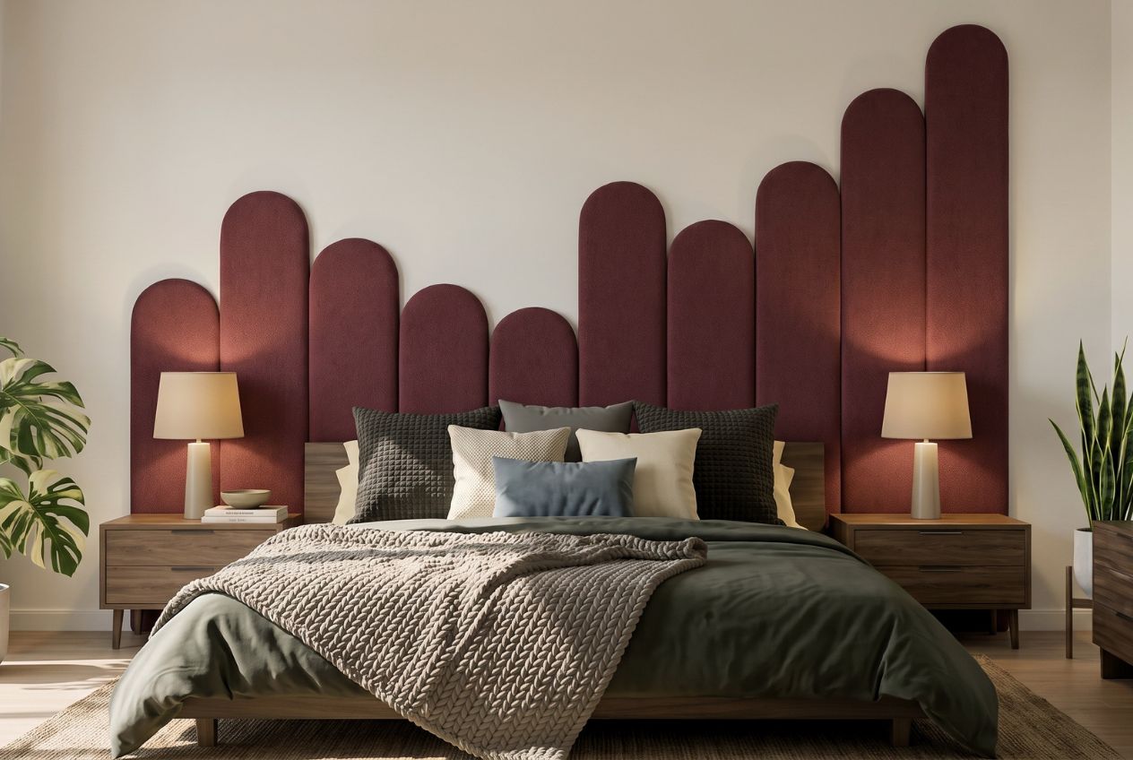
Whether you are building a tactile base layer with statement furniture or finishing a room with a hard accent that holds its own against soft upholstery, the Liftedplus collection gives you pieces with genuine physical character. The mood library is a practical starting point for mapping texture, colour, and lighting together before you buy. For a broader view of how decor choices shape the feel of a room, the Liftedplus guide on decor and mood covers the full picture.
FAQ
What is the definition of tactile interiors?
Tactile interiors are designed spaces that deliberately use physical texture and touch-engaging materials to create emotional warmth, sensory depth, and comfort. The approach sits within the broader field of sensory design and prioritises genuine material surfaces over purely visual texture effects.
What is the 70-20-10 rule for texture in interior design?
The 70-20-10 rule advises using 70% smooth or matte surfaces as the base, 20% plush or soft textiles for comfort, and 10% hard or shiny accents for contrast. This balance maintains sensory harmony and prevents visual overload in textured home design.
What lighting temperature works best with tactile materials?
Consistent warm lighting at 2700K is the standard for tactile-rich interiors because it deepens shadow and reveals surface grain. Cool white light at 4000K or above flattens texture and reduces the sensory impact of physical materials.
What are Tactile Interruptions in interior design?
Tactile Interruptions are small, focused friction points placed within predominantly smooth environments, such as a single rough-textured cushion on a smooth sofa. They ground the nervous system and provide sensory contrast without disrupting the overall composition of a room.
How do I avoid sensory overload in a textured interior?
Apply the 70-20-10 rule to keep texture proportions balanced, and always identify a clear base layer before adding comfort and accent textures. Acoustic control through soft surfaces like rugs and curtains also prevents a room from feeling cold or overwhelming.