
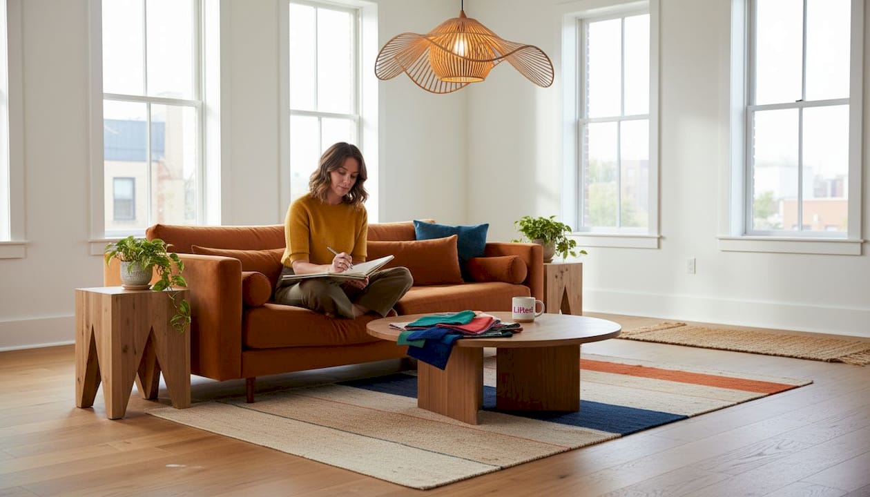
TL;DR:
- Presence in interior design arises from intentional choices in form, material, and restraint that make a space feel purposeful. It requires careful layering, balanced scale, and negative space to avoid visual clutter and create hierarchy. In New Zealand homes, current trends emphasize sculptural forms, expressive materials, and curatorial restraint to achieve authentic, enduring presence.
Most people walk into a beautifully designed room and feel something shift, without quite knowing why. The furniture isn’t necessarily oversized, the art isn’t screaming for attention, and yet the space holds. That feeling is presence, and it’s far more nuanced than simply choosing a bold sofa or a large canvas. True presence in interior design is the deliberate choreography of form, material, light, and restraint. For modern New Zealand homes, where open-plan living and architecturally varied spaces are the norm, understanding how to build presence is the difference between a room that just functions and one that genuinely resonates.
Table of Contents
- What is presence in interior design?
- Core principles for creating presence: form, layering, balance
- Common mistakes and NZ-specific challenges
- How presence shows up in 2026: trends and real-world examples
- Minimalism, maximalism and New Zealand’s signature approach
- Why presence is more than a trend in interior design
- Bring presence home: statement pieces, art, and lighting
- Frequently asked questions
Key Takeaways
| Point | Details |
|---|---|
| Presence is intentional | Creating presence relies on deliberate choices of form, balance, and focal point, not just bold items. |
| Layering adds depth | Combining textures, lighting, and curated groupings gives spaces sensory richness and visual interest. |
| Negative space is vital | Leaving some areas open ensures that presence feels crafted, not cluttered or overwhelming. |
| Scale and restraint matter | Choose statement pieces that suit your room’s size and use restraint to maintain harmony. |
| Embrace NZ style trends | In 2026, New Zealand homes feature sculptural forms and expressive materials for unique presence. |
What is presence in interior design?
Presence, in design terms, is the quality a room has when it feels intentional. It’s not loudness. It’s not a catalogue of beautiful objects placed side by side. It is the carefully managed tension between what you include and what you leave out, between weight and lightness, between the familiar and the unexpected.
In contemporary New Zealand homes, presence often anchors open-plan spaces that could otherwise feel undefined. A large kitchen that flows into a living area needs something to signal where one mood ends and another begins. A statement piece, a considered rug, or a distinctive pendant light does this without a single wall to help.
“Mechanics include realistic form evaluation (mass, volume, silhouette), layering textures and materials for depth, emphasis via contrast in colour, size, and placement, and balance of visual weight to avoid flat or overwhelming feels.”
The critical distinction here is between presence and visual clutter. Clutter is the accumulation of objects without hierarchy. Presence is hierarchy made visible. It requires a clear focal point, layers that support rather than compete with that focus, and enough negative space for the eye to rest and recover between moments of visual interest. Browsing fresh modern decor can help you see how these elements work together in practice.
The key elements worth understanding from the outset are:
- Layering: Building visual and textural richness through overlapping materials, tones, and forms
- Scale: Choosing pieces whose size relates meaningfully to the room around them
- Signature pieces: Anchoring the room’s identity with one or two objects of genuine character
- Negative space: The deliberate absence of objects, which gives presence room to breathe
Core principles for creating presence: form, layering, balance
Once you understand what presence means, the next question is how you actually build it. Experienced designers approach this through a few reliable frameworks that are just as useful for homeowners.
Form is where good design begins. Before you think about colour or texture, evaluate the mass, volume, and silhouette of every significant object in your room. A rounded, low-slung sofa carries a very different visual weight to a structured, high-backed chair. Neither is better, but they speak different languages. The key is ensuring the forms in your room are in conversation rather than conflict.
Layering is the practice of introducing visual richness through overlapping materials and textures. Think about how a timber coffee table reads against a woven wool rug, or how a linen throw adds softness to a leather bench. Each layer adds sensory depth. As design principles for NZ spaces suggest, starting with space planning and form before aesthetics, using odd-number groupings, and layering lighting and textures creates dynamic focal points with sensory depth.
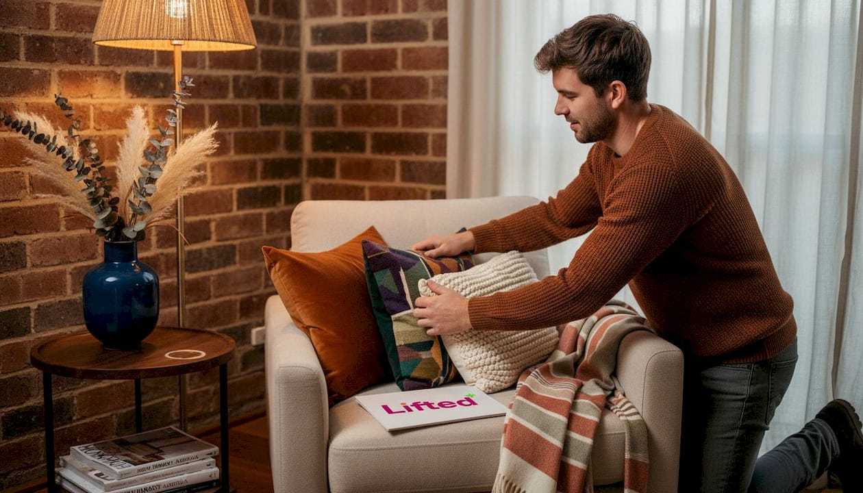
Balance is the distribution of visual weight across a room. This doesn’t mean everything needs to be symmetrical. In fact, asymmetric balance often feels more alive. The goal is that no single corner becomes visually heavy while another floats away with nothing to anchor it.
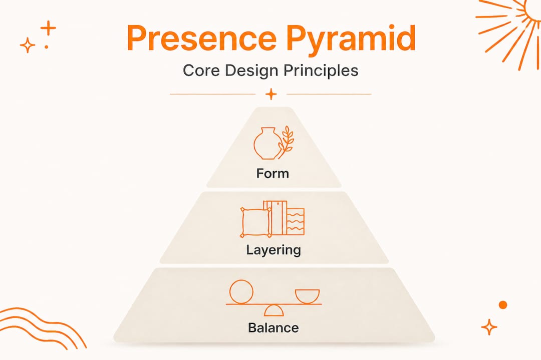
| Principle | What it does | Common mistake |
|---|---|---|
| Form | Sets the room’s visual language | Mixing incompatible silhouettes |
| Layering | Adds richness and sensory depth | Layering without a clear anchor |
| Balance | Creates harmony and rest for the eye | Stacking all visual weight on one side |
| Negative space | Allows presence to register | Filling every surface reflexively |
The 3-5-7 rule is one of the most practical tools in this process. Arrange objects in odd-numbered groupings: three candles on a shelf, five objects on a mantle, seven varied vessels on a sideboard. Odd numbers feel inherently dynamic, avoiding the static quality of matched pairs. You can explore how these artistic design tips apply across different spaces for further inspiration.
- Begin with your largest anchor piece and determine its relationship to the room’s architecture
- Layer secondary elements that complement the anchor’s form and material language
- Introduce textural contrast through soft furnishings, rugs, or smaller objects
- Add lighting that sculpts the space and reinforces the room’s mood
- Edit ruthlessly: remove anything that competes without contributing
Pro Tip: When selecting statement lighting selection, choose a fixture whose silhouette reads as sculpture. A pendant light that holds its own shape in an open-plan space does more work than a dozen ambient downlights.
Common mistakes and NZ-specific challenges
Understanding what presence is matters less if you don’t also understand the ways it goes wrong. These mistakes are particularly common in New Zealand homes, where the push toward open, modern spaces can sometimes sacrifice the very coherence that makes a room feel grounded.
The most frequent error is the oversized anchor. An enormous sectional sofa in a modest-sized lounge doesn’t create presence; it creates a blockage. The room can no longer breathe around the piece, and every other element is forced to compete or disappear. Oversized pieces overwhelm small NZ homes while the lack of negative space creates chaos, and mismatched scales make rooms feel scattered.
The opposite problem is equally limiting: a room so cautiously furnished that nothing holds the eye. Every piece has been chosen safely, and the result is a space that reads as polite but inert. This is bland minimalism in its most diluted form.
Common pitfalls to watch for:
- Scale mismatch: A small artwork on a large wall looks apologetic rather than considered
- Competing focal points: Two or three objects each fighting to be the centrepiece creates visual noise
- Unanchored layering: Adding texture and colour without a clear hierarchy to frame it
- Ignoring the floor plane: Rugs, flooring material, and negative floor space are as powerful as any vertical element
| Approach | Result | Better alternative |
|---|---|---|
| Oversized single anchor | Room feels blocked, other pieces shrink | Right-scaled anchor with supporting layers |
| Too many focal points | Visual confusion, no place to rest | One primary, two secondary focal points |
| No negative space | Chaotic, dense feeling | Edit to 70% filled, 30% breathing room |
| Matched pairs only | Flat, static, overly formal | Odd groupings with considered asymmetry |
Pro Tip: For small room colour ideas, use a single deeply saturated wall or a richly coloured piece of furniture to create presence without mass. Colour carries visual weight without consuming floor space.
If you’re working with a compact apartment, apartment colour advice offers targeted guidance on building presence in more constrained footprints.
How presence shows up in 2026: trends and real-world examples
Presence in New Zealand interiors has a distinctive character right now, shaped by both international design movements and the particular qualities of our built environment. Timber, stone, handcrafted ceramics, and considered lighting are central to it.
2026 trends emphasise sculptural forms, expressive statements, and materiality for immersive presence, as seen at NZ Design Week. The move is away from interchangeable, trend-driven pieces and toward objects that hold a specific gravity. Furniture is increasingly sculptural, with organic curves, solid forms, and material honesty taking priority over surface decoration.
“The most compelling rooms we saw in 2026 weren’t dressed; they were composed. Every element had a reason to be there, and that reason was felt before it was understood.”
Real-world examples anchor these ideas clearly. The award-winning Lammermoor project, widely cited as a benchmark in current New Zealand residential design, uses broad-grain oak throughout to create warmth and draw light deep into the interior. The timber doesn’t just appear in furniture; it defines the spatial experience. That is presence at its most purposeful.
Current trends shaping NZ interior presence in 2026:
- Organic sculptural forms in seating and lighting that prioritise silhouette over surface detail
- Expressive materiality including raw plaster, aged brass, and hand-thrown ceramics
- Curatorial restraint where fewer, better pieces carry more weight than abundant styling
- Layered lighting that moves from ambient to task to accent, creating depth and dimensionality
For a broader view of how these ideas are playing out locally, the current NZ styling trends guide brings these themes together in a practical context.
Minimalism, maximalism and New Zealand’s signature approach
New Zealand interiors tend to resist both the austerity of Scandinavian minimalism and the density of full maximalism. What emerges instead is something more nuanced: a design philosophy that values restraint but isn’t afraid of drama.
Minimalism achieves presence through what it removes. Negative space becomes the primary design element. A single, extraordinary chair in an otherwise spare room creates focus through contrast, the object’s form amplified by the stillness around it. Traditional principles of balance and harmony suggest that minimalism uses restraint and negative space, while maximalism anchors with large visual anchors to avoid overload. Both approaches build genuine presence when executed with intention.
Maximalism, by contrast, earns its presence through anchoring. A large visual anchor, whether that is a floor-to-ceiling bookcase, a mural-scale artwork, or a deeply toned feature wall, grounds the layering that surrounds it. Without that anchor, maximalist layering tips into clutter. With it, the room reads as curated and alive.
“The most liveable New Zealand interiors aren’t choosing sides between minimal and maximal. They are choosing moments. One moment of intensity, several moments of calm, and a considered path between them.”
Practical ways to blend both approaches in your home:
- Designate one surface or zone as your ‘expressive moment’: a boldly coloured cabinet, a dramatic artwork, or a striking sculptural lamp
- Keep the surrounding space deliberate and spare, so the focal element registers fully
- Use texture as a quiet form of maximalism: layering without visual noise through tone-on-tone combinations
- Revisit your timeless interior guide to find the balance that suits your specific space and lifestyle
The signature New Zealand approach embraces natural materials, honest craftsmanship, and a grounded colour palette alongside the occasional object of genuine boldness. It is not about following a formula. It is about knowing when to speak and when to let a space hold its own silence.
Why presence is more than a trend in interior design
Here is what we genuinely believe, after working with hundreds of New Zealand homes and studying the spaces that truly endure: presence is not something you shop your way into. It is something you design your way into, and that distinction matters enormously.
The interiors that feel most alive five or ten years from now won’t be the ones that tracked every trend in 2025 or 2026. They will be the ones whose owners asked a harder question: what does this room need to feel like itself? That question pulls the design process away from surface aesthetics and toward something more meaningful, the emotional resonance that makes a space genuinely yours.
What makes this challenging is that our instinct, when a room feels flat, is to add. Another cushion, another artwork, another light. But presence rarely arrives through addition alone. It arrives when you have the confidence to remove what doesn’t serve the room’s identity and replace it with something that does, even if that something is simply open space.
We’d encourage you to experiment. Move a single piece. Clear a shelf. Place one object of genuine character where three ordinary ones used to sit. Notice how the room responds. That responsiveness is presence beginning to form. Whether you are transforming your home with trends or working against them entirely, the underlying principle stays the same. Intentionality is what separates a room that functions from a room that feels like home.
Bring presence home: statement pieces, art, and lighting
Knowing the principles is one thing. Finding the right pieces to bring them to life is another entirely, and that’s where we come in.
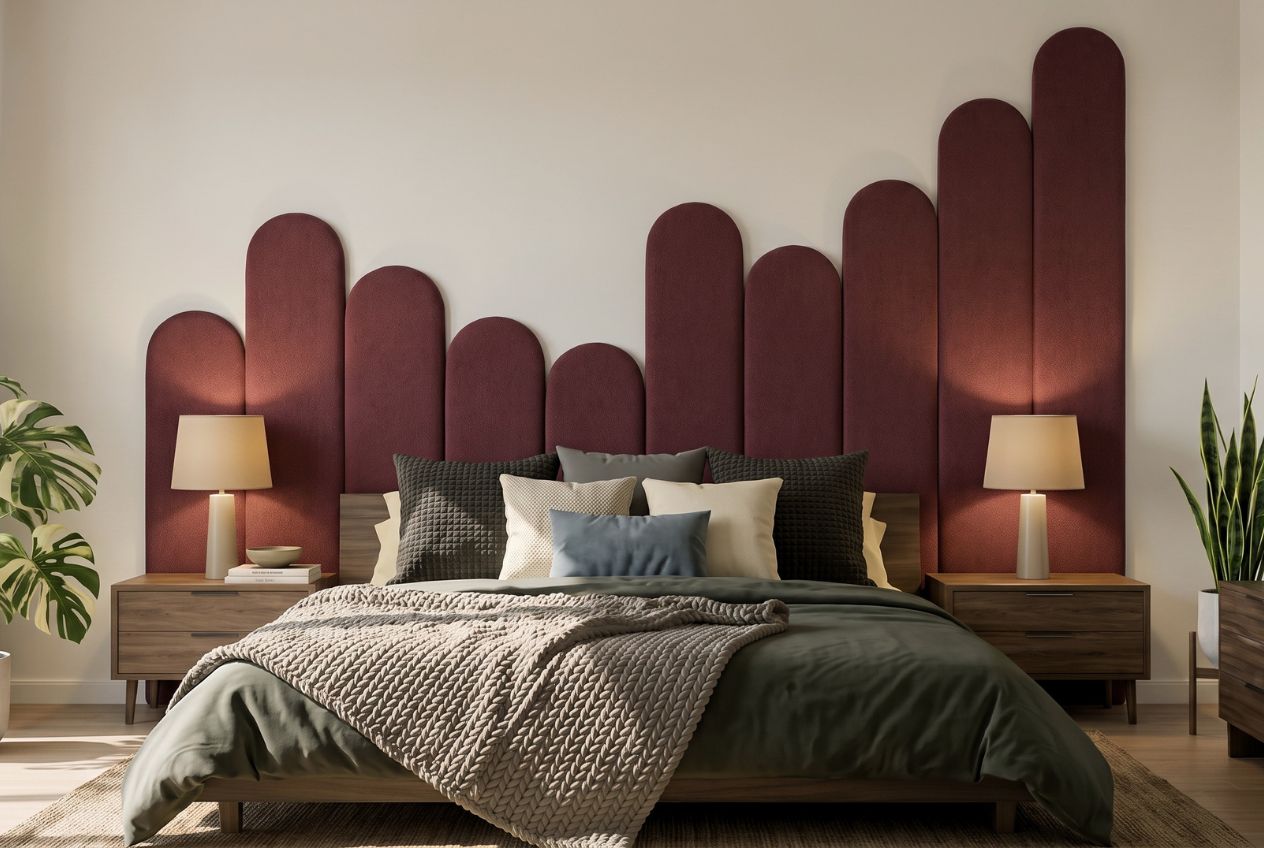
At Lifted+, we curate furniture, lighting, and wall art specifically chosen for their capacity to create presence in New Zealand homes. Whether you are looking for a piece that anchors an open-plan space or a work of art that brings shape to a quiet wall, every item in our collection has been selected for form, quality, and emotional weight. Explore our wall art range for pieces that hold a room without overcrowding it, discover statement lighting that sculpts and defines, or browse our colourful furniture collection to find the anchor your space has been waiting for.
Frequently asked questions
How do I add presence to a small New Zealand living room?
Choose one focal statement piece that suits the room’s scale, and protect the negative space around it. As small-space design principles confirm, oversized pieces overwhelm compact rooms, so restraint and right-sizing are essential.
What is the 3-5-7 rule in presence-focused interiors?
The 3-5-7 rule means grouping decorative objects in odd numbers, which creates naturally dynamic and visually engaging focal points. Odd-number groupings are a foundational principle in building intentional, coherent presence.
How does layering help enhance presence?
Layering materials, textures, and lighting adds sensory depth and visual richness that makes a room feel considered rather than assembled. Layering textures and materials is one of the core mechanics of creating meaningful presence.
What’s the difference between visual clutter and presence?
Presence uses restraint, hierarchy, and planned contrast to direct the eye clearly, while clutter results from too many competing elements with no anchor to organise them. The key is balance of visual weight so the room feels intentional rather than overwhelming.
Which trends dominate presence in NZ interior design for 2026?
Sculptural forms, expressive statement pieces, and layered materiality are defining presence in 2026. NZ Design Week highlights confirm that immersive, form-led interiors are the benchmark for contemporary New Zealand homes.