

Aim for artwork about 60 to 75% of your sofa width and hang it roughly 15 to 25 centimetres above the sofa back. That single ratio does more to settle a living room wall than almost any other design decision. Break it only when the ceiling soars, the room is deliberately spare, or the piece itself carries enough visual weight to hold the space alone.
TL;DR:
- Art panels or frames should be between 60% and 75% of the sofa’s width for balanced visual proportion.
- Hang art 15 to 25 centimeters above the sofa back, with a centerline at approximately 145 centimeters from the floor as a helpful guide.
- For larger or irregular rooms, consider scaling art to the full wall or higher heights, especially in double-height or spacious areas.
- Use mock-up templates and live testing for accurate sizing, and adjust based on furniture height, cushions, and room quirks.
- Modular panel arrangements like DwellForms™ can offer flexible, renter-friendly alternatives without drilling, matching proportion guidelines.
Table of Contents
- How wide should art be above a sofa: the proportion rules and worked examples
- How high to hang art above a sofa: height rules and centreline checks
- Layout options: choosing single pieces, panels and gallery walls
- Measure, mock up and test: a no-fuss step-by-step process
- Renter-friendly options and how modular DwellForms™ panels can achieve the same scale
- Visual weight, framing and lighting: making the measured size feel right
- Considering sofa height and backrest height in relation to art size
- Choosing art size based on room size and wall dimensions
- Harmonising art size with other furniture and décor elements in the room
- A practical note from Michelle at Lifted+
- See DwellForms™ kits and samples
- Sources
- FAQ
How wide should art be above a sofa: the proportion rules and worked examples
The two-thirds guideline exists because the eye reads furniture and wall art as one connected shape. Go narrower than 60% and the artwork looks stranded, an afterthought floating above the cushions. Go wider than 75% and the piece can overwhelm the sofa rather than complete it. The 2/3 rule for art above a sofa treats this range as a starting point, not a strict boundary, and that flexibility is part of what makes it useful.
Working the numbers is straightforward. Measure the sofa from arm to arm, then apply the percentage range:
- A 180 cm sofa suits art roughly 108 to 135 cm wide.
- A 200 cm sofa suits art roughly 120 to 150 cm wide.
- A 220 cm sofa suits art roughly 132 to 165 cm wide.
When you’re hanging a grouping rather than one canvas, the maths doesn’t change, but what you measure does. Treat the whole arrangement, including every gap between frames, as a single outer rectangle and fit that rectangle to the sofa’s width. A scattered cluster of small prints reads differently to one bold canvas, even at the same overall dimensions, because visual weight bends perception. A dense, dark grouping can feel larger than its tape measurement suggests, while a pale, airy triptych might need to sit closer to the top of the range to hold its own.
How high to hang art above a sofa: height rules and centreline checks
Height matters just as much as width, and it’s the measurement most people get wrong first. The reliable starting point is to hang the bottom of the frame 15 to 25 centimetres above the top of the sofa back, close enough that the art and furniture feel like one composition rather than two unrelated elements on the wall.
There’s a secondary check worth knowing, borrowed from gallery hanging conventions: a centreline around 145 centimetres from the floor. Art installation guidance from Archipro recommends this measurement for open walls where there’s no furniture to anchor against, and it’s a useful sense check even above a sofa. The key is measuring to the artwork’s centre point, not its top edge or the hanging wire, since that’s the true visual anchor the eye locks onto.
A few adjustments are worth building in from the start:
- High-backed sofas eat into the available gap, so measure from the actual top of the backrest rather than the floor.
- Low ceilings often call for sitting closer to the 15 cm end of the range so the art doesn’t crowd the cornice.
- Tall scatter cushions can visually shrink the gap even when your tape measure says otherwise, so step back and look before you commit.
Layout options: choosing single pieces, panels and gallery walls
Not every wall wants a single statement piece, and not every sofa suits a gallery cluster. The choice usually comes down to the wall’s proportions and how much visual movement the room can absorb.
- A single, generously scaled canvas or panel works best on a clean, uninterrupted wall where you want one confident focal point rather than several competing ones.
- A diptych or triptych suits longer, lower walls, particularly behind sofas with minimal arm height, since the horizontal split echoes the sofa’s own line.
- A gallery strip or cluster gives you room to mix formats, but it needs a clear anchor piece to build around, or the arrangement reads as scattered rather than curated.
Whichever format you choose, the gallery wall guidance from Houzz is consistent: measure the outside edges of the whole grouping and treat that as your single artwork when checking it against the sofa’s width. For spacing, 5 to 8 centimetres between frames tends to look intentional without letting individual pieces drift apart into unrelated fragments.
Measure, mock up and test: a no-fuss step-by-step process
Skipping the mock-up stage is where most sizing mistakes happen, and it costs nothing but an afternoon to avoid.
- Measure your sofa’s width and multiply by 0.6 and 0.75 to get your target art width range.
- Cut kraft paper or an old sheet to your proposed art dimensions and tape it to the wall.
- Step back to your usual seat and check the scale from where you’ll actually view it.
- Walk the room to check sightlines past lamps, windows and doorways, and watch how afternoon light hits the spot.
- Adjust the paper template up, down or sideways until the balance feels settled, then mark your fixing points.
- Check the final position with a spirit level before committing to anything permanent.
Pro Tip: Leave the paper template up for a full day and night. Morning light and lamp glow both change how a space reads, and what looks right at 10am can feel off by evening.
Renter-friendly options and how modular DwellForms™ panels can achieve the same scale
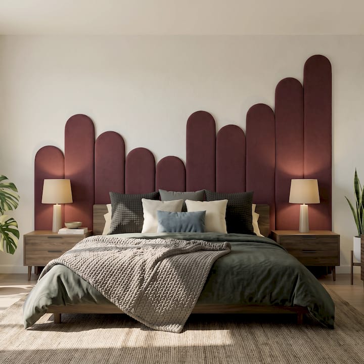
Not every wall can take a drill, and not every lease allows one. Lightweight command-style hooks and picture strips can work for smaller, lighter pieces, but always check the manufacturer’s load rating first: a piece that looks light can still exceed what an adhesive strip is rated to hold.
This is where DwellForms™ by Lifted+ offers a genuinely different route into the same proportion zone. Because the kits are modular, you can:
- Build a panel arrangement to fill the same 60 to 75% width zone a framed piece would occupy.
- Rearrange or resize the layout later without leaving holes behind.
- Take the panels with you when you move, since they lift off cleanly rather than staying fixed to one wall.
- Start with a colour sample kit to test a shade against your sofa and light before committing to a full arrangement.
Always check your tenancy agreement and the product’s own installation instructions before applying any adhesive system, and test a small section first if you’re unsure how your wall surface will respond.
Visual weight, framing and lighting: making the measured size feel right
Measurements get you close, but perception does the rest of the work. A dark, thickly framed piece reads larger than its dimensions suggest, while a pale or frameless work can feel almost weightless on the same wall. According to wall art curating guidance, colour and contrast shape perceived scale as much as the frame itself does, so it’s worth adjusting your measured width slightly once you know which direction your piece leans.
A few practical notes on finishing touches:
- A slim, pale frame or no frame suits a piece you want to feel lighter than its actual size.
- A boxier, darker frame adds presence to a piece that might otherwise feel too small for the wall.
- Avoid hanging directly in a sun path, since UV exposure fades pigments and warps paper over time.
- Picture lights can add intimacy to a single statement piece, though lighting choices for art matter as much as the frame in how the whole arrangement presents.
If you’re considering something genuinely oversized, check doorways, stairwells and lift access before ordering. Architectural Digest’s styling advice notes that large-scale pieces can fit the wall perfectly and still be a logistical headache to get into the room.
Considering sofa height and backrest height in relation to art size
The sofa itself is doing more work in this equation than most people give it credit for. A low-slung sofa with a shallow backrest leaves more open wall above it, which can tempt you toward a taller piece than the width calculation alone suggests. That’s not necessarily wrong, but it changes the balance: a tall, narrow canvas above a low sofa can look stretched unless the width still sits within the 60 to 75% range.
A high-backed sofa flips the problem. Less wall is available before you hit the 145 cm centreline check, so your art has a smaller vertical window to work within, and the 15 to 25 centimetre gap becomes even more important to protect. Squeezing a large piece into that gap usually looks cramped rather than intentional.
Backrest height also affects how the art reads from a seated position, which is where most people actually experience it. Sit down and look up: if the bottom of the artwork feels uncomfortably close to your eyeline or the top of the cushions, the piece may need to move higher, even if it technically satisfies the standard height range. Reclined sofas and deep sectional backs are worth checking this way before you finalise any fixing points, since their proportions vary more than a standard three-seater.
Choosing art size based on room size and wall dimensions
A sofa-width calculation gives you a solid starting figure, but the room around it can push that figure up or down.
A larger, open-plan living area behaves differently. Here, art sized only to the sofa can look undersized against the surrounding wall, particularly if the ceiling is tall or the wall extends well beyond the sofa’s arms on either side. In these rooms, it’s worth checking the art against the full wall, not just the furniture beneath it, since a piece that satisfies the sofa proportion perfectly might still look lost against six metres of blank plaster.
Ceiling height plays its own role. Double-height rooms or those with raked ceilings often support artwork above the usual proportion range, since the extra vertical space needs something to anchor it. This is one of the clearest cases for departing from the standard rule: when the architecture itself is unusually generous, a bolder, taller piece can hold the room in a way a modestly sized canvas never could.
Harmonising art size with other furniture and décor elements in the room
Art above the sofa doesn’t exist in isolation, and treating it as the only decision in the room tends to backfire. Side tables, floor lamps, shelving units and rugs all contribute to the same visual language, and a piece sized perfectly for the sofa can still clash if everything else in the room is either much smaller or much larger in scale.
Look at the room’s other focal points before finalising your art size. A statement floor lamp beside the sofa, for instance, adds its own vertical line, and an oversized canvas next to it can create a crowded corner rather than a considered one.
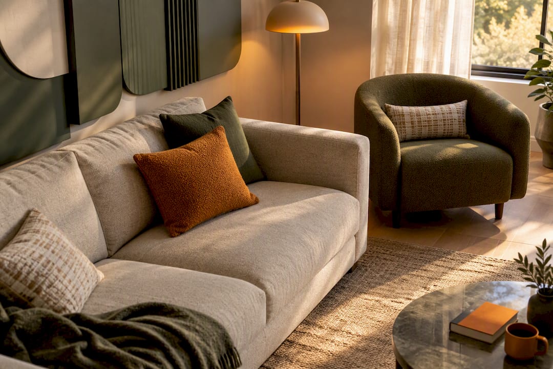
Colour and texture matter here too. A piece that echoes a cushion tone, a rug pattern or a nearby armchair fabric ties the room together in a way raw dimensions never fully capture. This is where a colour-led panel arrangement, rather than a single framed print, can offer more flexibility: you can build the shape and shade to answer the rest of the room rather than hunting for a single artwork that happens to fit.
A practical note from Michelle at Lifted+
The proportion rules in this guide are a genuinely reliable starting point, but they’re a starting point, not a verdict. Every sofa, wall and room carries its own quirks, and the only way to know if a size truly works is to tape something up and live with it for a day or two before you commit to anything permanent.
— Michelle
See DwellForms™ kits and samples
If you’d rather build colour and shape into your feature wall than search for a single framed piece, DwellForms™ Core Kits offer a way to fill this kind of space without drilling, painting, or permanent commitment. The panels install with adhesive pads and can be lifted away if you move or change your mind.
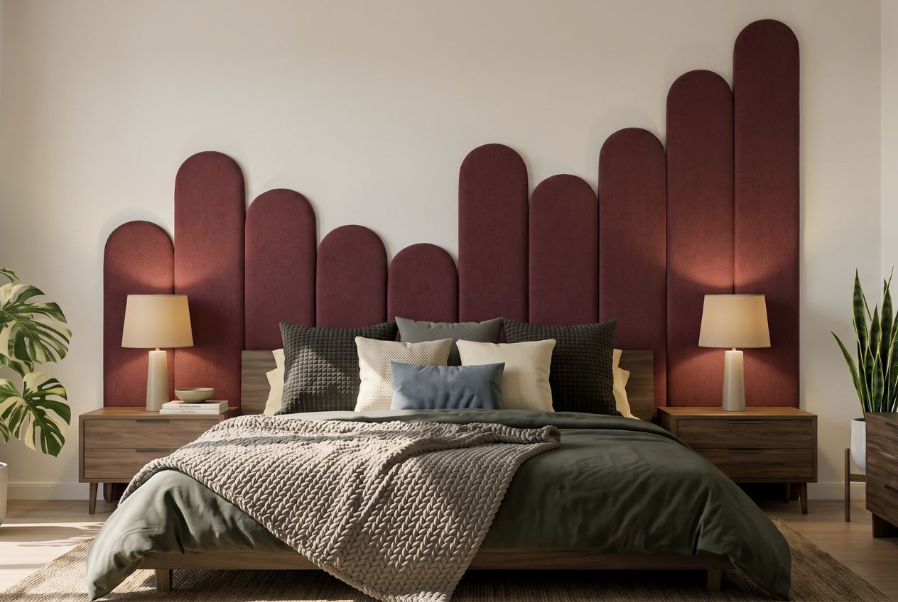
- Start with a DwellForms™ Colour Samples kit to test a shade against your sofa before ordering the full set.
- Move up to a DwellForms™ Core Kit once you’ve settled on a colour and scale that suits your wall.
- Extend an existing arrangement later with a DwellForms™ Extension Kit rather than starting over.
Browse the current range and find the colour that suits your space at DwellForms™ Core Kits.
Sources
Measurements and installation guidance in this piece draw on Rossetti Art, Archipro, Houzz and Architectural Digest.
- Living Room Wall Art: The 2/3 Rule Above a Sofa + Layout Examples
- Art installation (Archipro guidance)
- An insider’s guide to creating a gallery wall (Houzz NZ)
FAQ
What size should art be above a sofa?
A 200 cm sofa, for example, suits art roughly 120 to 150 cm wide, as outlined in guidance on the 2/3 rule.
What are the rules for hanging art above my sofa?
The main rule is to hang the bottom of the frame 15 to 25 centimetres above the top of the sofa back, so the art and furniture read as one grouping. A secondary check is a centreline around 145 centimetres from the floor, which works well for open walls without furniture nearby, according to art installation guidance.
What artwork to put above a couch in a living room?
There’s no single correct choice: a bold single canvas, a diptych or triptych, or a curated gallery cluster can all work, depending on the wall’s shape and the room’s overall scale. Whatever the format, measuring the whole grouping’s outer edges against the sofa’s width, as recommended in gallery wall guidance, keeps the layout balanced. Renters who want colour and shape without framed art can also fill this zone with a modular panel arrangement like DwellForms™.
What is the 70/30 rule in art?
It sits comfortably inside the wider 60 to 75% range described in sizing guidance for sofa art, and placement or visual weight can still justify going slightly above or below it.