
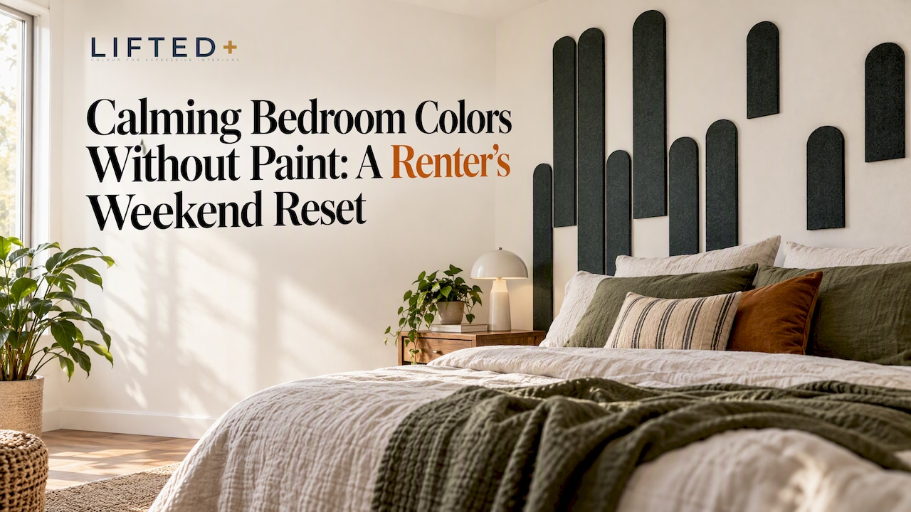
The fastest route to a calmer bedroom is soft blue, sage green or warm greige, introduced through large textiles or a removable feature panel rather than small accents. These muted, nature-linked hues tend to be associated with calmer, more restful rooms, and you can layer them in without touching a wall. For renters, that means colour confidence without a single hole in the plaster.
Key Takeaways
Calm bedroom colors like soft blue, sage green, and greige, introduced through removable textiles or panels, create a restful environment ideal for renters and non-permanent spaces.
| Point | Details |
|---|---|
| Muted colors are most calming | Opt for middle to lighter values of blue, green, and greige to maintain openness and avoid closing in small or dark rooms. |
| Large textiles impact room feel | Feature walls, large rugs, and curtains have a stronger visual and calming effect compared to small accents. |
| Lighting transforms color perception | Warm, dimmable lighting significantly influences the room’s calming effect, regardless of wall color. |
| Test colors with samples first | Order color samples or textile pieces, then live with them for a few evenings before committing to a full wall or larger elements. |
| We recommend Liftedplus panels | Our modular DwellForms™ PET felt panels offer a renter-friendly, removable, and customizable way to create a calm, cohesive space. |
Table of Contents
- Calm colour palette options you can introduce without paint
- Non-paint ways to add colour: fabrics, art, rugs, and removable wall panels
- Lighting, texture and sheen: how these shape calm
- How to test and apply your calm palette in one weekend
- Step-by-step installation and removal for DwellForms™ panels
- Combining DwellForms™ panels with other non-paint elements
- Maintenance and care for DwellForms™ panels
- Author perspective: renter-friendly colour confidence and where DwellForms™ fits
- Try colour without commitment: order samples or a core kit
- FAQ
- Sources
Calm colour palette options you can introduce without paint
Muted, greyed tones carry calm more reliably than bright, saturated ones. An experimental residence-hall study of 443 students found that blue interiors were linked to calmer mood ratings and were the most preferred colour overall, ahead of green, violet, orange, yellow and red. That preference shows up again in sleep research, where blue and green bedrooms are often recommended for rest, with green favoured for its grounding, outdoorsy feel.
Three families do most of the work in a calm bedroom:
- Soft blue: powder and bluish-grey tones that feel airy on bed linen, sheer curtains or a throw rug.
- Sage green: muted, slightly greyed greens that read as natural rather than loud, strongest in bedding, cushions or a large framed botanical print.
- Greige and pale lavender: warm, flexible neutrals with a calming undertone, useful for rugs, curtains or a feature wall that needs to sit quietly behind furniture.
Stick to middle to lighter values rather than deep, saturated versions, particularly in a smaller or darker room where a heavier tone can close the space in. Designers echo this, favouring muted undertones and layered texture over flat, washed-out pastels when building what they call a sanctuary space. For more palette combinations that work in a rental, our guide to renter-friendly colour palettes runs through eight further options.
Pro Tip: Buy the duvet, curtain or rug first, then match smaller accessories to it. Working the other way round almost always ends in a mismatched room.
Non-paint ways to add colour: fabrics, art, rugs, and removable wall panels
Impact scales with size, not with how many small objects you own. In rough order of visual effect:
- A feature wall panel or a large tapestry, because it covers the most visible surface in the room.
- Full-width curtains or an oversized fabric headboard, which frame the whole bed wall.
- A large rug, which sets the room’s base tone from the floor up.
- Bedding and throws, the easiest and cheapest layer to change.
- Artwork and framed prints, best used to sharpen a colour story already in place.
- Lampshades and ceramic accessories, which finish the look rather than carry it.
A single large piece generally shifts how a wall reads more noticeably than scattering small accents around it, which is why it is recommended to start at the top of that list rather than the bottom. This is where DwellForms™ earns its place: modular PET felt panels that install with tested adhesive pads, come in colour samples before you commit, and lift off again with minimal wall impact when used carefully. As a rule of thumb, a panel grouping or rug needs to cover roughly a third of the visible wall or floor before the eye registers a genuine colour shift, which is why a handful of small swatches rarely reads as a finished feature wall.
If you rent, keep receipts for any colour samples you order and photograph the wall before and after installation. Tested adhesive pads are designed to come away cleanly, though no adhesive on any wall surface can be called entirely damage free, so it is worth checking your tenancy agreement before committing to a full kit.
Lighting, texture and sheen: how these shape calm
Colour only does half the job. Lighting changes how a hue reads and how your body responds to the room in the hour before sleep. Simulations across 24 bedroom lighting scenarios found that cool colours like light blue can increase melanopic lux, the light measure tied to circadian disruption, under certain light settings, though reducing evening light intensity kept levels within recommended thresholds. In other words, a cool-toned room can still wind down well if the evening light is warm and dim enough.
A warm, low-intensity bulb matters more than the paint colour on the wall. Lighting guidance from Philips Hue recommends amber, candle-like tones around 2,700K or warmer for the hour before bed, with smart or dimmable bulbs making the transition easy to repeat nightly.
Small swaps that support a calm palette:
- Swap bedside globes for warm 2700K bulbs rather than daylight-toned ones.
- Add a dimmer or a smart bulb so evening light drops in intensity, not just colour.
- Choose fabric lampshades over glass or metal for a softer, diffused glow.
- Favour matte sheens on furniture and soft textiles over glossy, reflective surfaces, which can bounce light and amplify stimulation even in a calming hue.
How to test and apply your calm palette in one weekend
You do not need to commit to anything before you know it works in your actual room, under your actual lighting.
- Friday: pick one colour family, soft blue, sage or greige, and either order a colour sample or buy two large textile pieces, such as a duvet and a curtain set, in that tone.
- Saturday: swap the pieces in, switch bedside lamps to warm, dimmable light, and run the shoulder-drop test for three evenings: walk in, pause, and notice whether your shoulders physically drop as you settle into the space.
- Sunday: decide whether to add a feature panel or another textile layer based on how the room felt, and if the sample worked, move on to ordering a DwellForms™ Core Kit or more colour samples to extend the palette.
Pro Tip: If the room still feels flat after three nights, the issue is usually lighting intensity rather than colour. Dim it further before changing the palette again.
If the room ends up feeling too dark, swap in a lighter value within the same family rather than abandoning it. If a partner dislikes the tone, test it on one wall or one large textile first rather than the whole room. If a landlord questions the plan, lead with the fact that nothing is painted, drilled or permanently fixed.
Step-by-step installation and removal for DwellForms™ panels
Installing a DwellForms™ feature wall is designed to fit inside an afternoon, not a renovation weekend. Start by cleaning the wall surface so it is free of dust and grease, since the tested adhesive pads bond best to a smooth, clean surface. Lay your chosen panels out on the floor first to confirm the pattern and colour placement, then work from the centre of your planned layout outward, pressing each panel firmly against the wall for the recommended hold time rather than relying on light pressure.
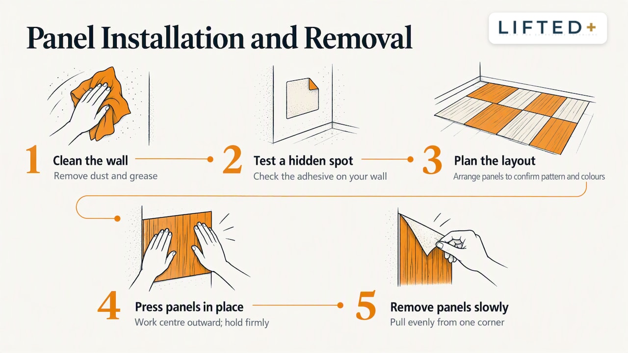
Several well-known pull-tab adhesive systems were tested before a nano-adhesive pad option was selected for its secure hold while minimising residue and surface marking, and for performing noticeably better than a popular mainstream tab brand trialled. No adhesive can be guaranteed completely damage free on every wall type, so it is worth doing a small test patch in a hidden spot first, particularly on textured or freshly painted plaster.
Removal follows the same unhurried logic: pull each panel away slowly and evenly from one corner rather than tearing it off in one motion, which gives the adhesive pad the best chance of releasing cleanly. Because the kits are modular, you can take panels with you to a new home, rearrange them into a different layout, or store unused pieces for later. That portability is the whole point of a renter-friendly feature wall: the colour moves with you, the wall does not change.
Combining DwellForms™ panels with other non-paint elements
A panel wall works best as one layer in a broader palette rather than the only colour decision in the room. Anchor the main bed wall with your DwellForms™ panels in soft blue, sage or greige, then echo that same undertone in your bedding and curtains so the eye reads one calm story rather than several competing ones. Repeating a tone across at least two large surfaces, the wall and the bed, does more for a cohesive feel than adding several small accessories in unrelated colours.
Texture earns its keep here too, adding the tonal richness that experts recommend for a warm, timeless home, rather than leaving the space feeling flat. A smooth felt panel paired with a nubby linen throw or a woven rug adds the tonal richness that designers point to when building a restful room, rather than leaving the space feeling flat. For further texture pairing ideas, our interior styling guide covers warm, tactile layering in more depth.
Keep artwork and lampshades as the finishing layer rather than the starting point. A single framed print in a complementary tone, or a ceramic lamp base that picks up the greige in your panels, sharpens a palette that is already working rather than trying to create one on its own.
Maintenance and care for DwellForms™ panels
PET felt panels are forgiving day to day. A light vacuum brush attachment or a soft, dry cloth run over the surface every few weeks keeps dust from settling into the felt’s texture, and a slightly damp cloth handles the occasional mark without soaking the adhesive pads behind it.
Avoid harsh chemical cleaners or anything abrasive, since felt is a soft material and a rough scrub can flatten its texture over time. If a panel edge starts to lift, press it firmly back into place rather than leaving it to curl, since a lifted edge collects more dust and looks tired faster than a flush one.
Because the kits are modular, a single marked or faded panel can be replaced or repositioned without reworking the whole wall, which keeps the feature looking considered rather than patched together. Store any spare panels flat, away from direct heat, if you take a layout apart for a while between homes.
Author perspective: renter-friendly colour confidence and where DwellForms™ fits
Most advice about calming bedrooms assumes you can pick up a paintbrush whenever you like. Renters rarely have that freedom, and treating colour as something you borrow rather than commit to permanently changes how confidently you can use it. We built DwellForms™ around that reality: modular panels made from recycled PET felt, installed with tested adhesive pads, and sold as colour samples first so you can test a hue before you buy into a whole wall.
That sample-first approach matters more than most people expect. A colour that looks calming in a product photo can feel entirely different under your own lighting, and the only honest way to know is to try it on your actual wall. For anyone starting that process, our installation and styling guidance walks through the same weekend approach described above.
— Michelle
Try colour without commitment: order samples or a core kit
The simplest way to find out whether a calm palette works in your bedroom is to order DwellForms™ Colour Samples in soft blue, sage or greige before committing to anything larger. Live with the sample for a few evenings, run the shoulder-drop test, and if the tone earns its place, move on to a DwellForms™ Core Kit for the full feature wall.
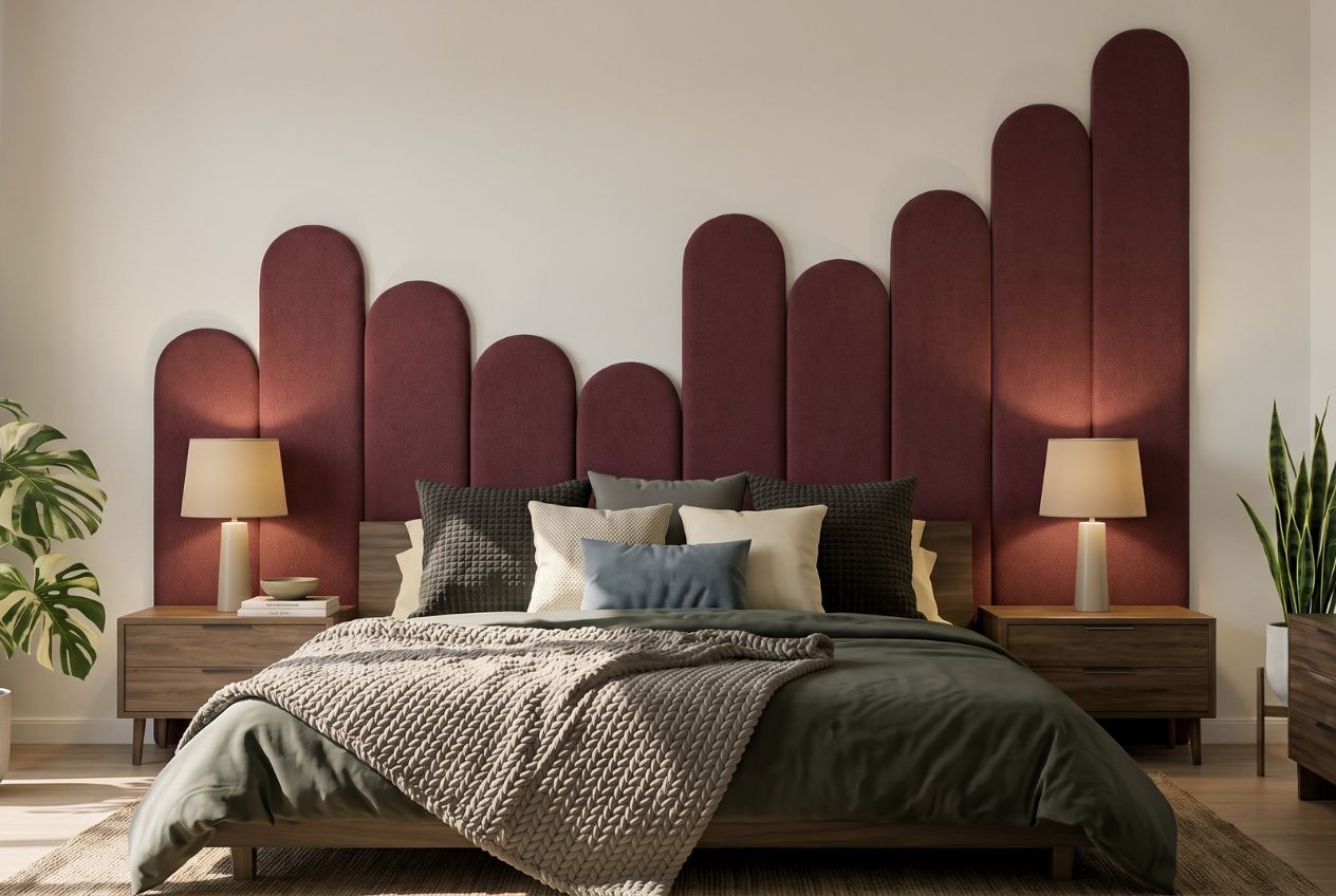
Every kit installs with our tested adhesive pads rather than screws or construction adhesive, so there is nothing to patch when you move. Panels unclip, pack flat and travel with you to your next place, which is the whole idea behind colour without commitment. If you want to go bigger later, Extension Kits let you build on a Core Kit without starting again from scratch.
FAQ
What is the calmest colour for a bedroom?
Soft, muted blue is often recommended as a calming colour for a bedroom, with an experimental residence-hall study finding blue interiors linked to calmer mood ratings and most preferred overall among colours tested. Sage green follows closely behind for its grounding, natural feel.
What colours are good for calming in a bedroom?
Soft blue, sage green, warm greige and pale lavender are some of the noted calming colour choices, since sleep research frequently links blue and green bedrooms to more restful sleep. Choosing middle to lighter values within these families keeps a smaller room feeling open rather than closed in.
What colours should I avoid in a bedroom?
Highly saturated reds and bright yellows tend to increase alertness rather than support rest, and sleep research suggests high-saturation hues may be linked to lower average sleep quality. Stark, blue-toned whites can feel sterile and overly bright under certain lighting, so a softer, warmer neutral usually works better.
What are the top three bedroom colours?
Soft blue, sage green and warm greige form the strongest trio for a calm bedroom, backed by research on mood and colour preference and sleep-focused colour guidance. Each works well introduced through bedding, curtains or a removable feature wall rather than paint.
Does lighting affect how calming a bedroom colour feels?
Yes, lighting changes how any colour reads and how your body responds to it before sleep. Simulated lighting scenarios found that warm, lower-intensity evening light keeps circadian-relevant light levels in a healthier range, even when the room uses cooler colours like light blue.
Sources
- What Color Light Helps You Sleep? | Sleep Foundation
- Psychology or Physiology? Choosing the Right Color for Interior Spaces to Support Occupants’ Healthy Circadian Rhythm at Night (MDPI)
- Interior color and psychological functioning in a university residence hall | Frontiers in Psychology
- Designers pick the best hues for a sanctuary space | Homes & Gardens
- Bedroom lighting ideas | Philips Hue
Recommended
- No Paint Needed: 8 Renter-Friendly Color Palettes For NZ Rentals
- Weekend Color Blocking Decor For Renters: Paint Or No Drill Panels
- Renter Friendly Home Decor: 9 Ideas That Work
- How To Decorate Without Painting Walls
This article is for general information and inspiration only. Product performance and results may vary depending on individual circumstances, surfaces and installation.