

Yes, you can mix decorative wall panels with art, and the combination often reads better than either alone when you anchor the composition, choose one dominant colour or theme, keep your spacing even, and lean on renter-friendly fixings rather than anything permanent. DwellForms™ panels, installed with adhesive pads rather than drilling, give you a flexible backdrop to test against. Before you commit a single piece to the wall, lay the arrangement out on the floor first.
Key Takeaways
Mixing decorative wall panels with art creates a balanced, cohesive feature wall that enhances visual interest and is renter-friendly using adhesive installation.
| Point | Details |
|---|---|
| Use an anchor element | Choose either a bold artwork or a large panel arrangement as the focal point to support the rest of the composition. |
| Follow the two-thirds rule | Cover roughly two-thirds of the wall with art or panels, balancing larger and smaller pieces for a unified look. |
| Maintain consistent negative space | Keep even gaps between elements to create a neat, considered appearance rather than clutter. |
| Layer for depth | Add mirrors, shelves, or sculptures in front of panels to introduce dimension without visual clutter. |
| Start with DwellForms kits | Use modular, no-drill DwellForms Core Kits to quickly establish a stylish, renter-friendly feature wall. |
Table of Contents
- Essential visual rules and ratios for mixing panels with art
- Layout approaches: anchoring, layering and frame choices
- Hanging and mounting: renter-friendly methods for panels plus art
- Styling: colour, texture and lighting to unify panels and art
- Step-by-step plan: measure, mock up, mount and edit
- Maintenance and cleaning advice for panels and artwork together
- Choosing artwork styles that complement DwellForms™ panel designs
- Tips on combining three-dimensional panels with two-dimensional art
- Adapting layouts for different rooms
- Why a colour-first, renter-friendly approach changes how you display art
- DwellForms™: modular, no-drill panels and where to start
- FAQ
- Sources
Essential visual rules and ratios for mixing panels with art
A wall that mixes panels and art needs a hierarchy, otherwise your eye has nowhere to land. A balance guide is to let one element, usually your panel arrangement or a single commanding artwork, carry most of the visual weight, with the remaining pieces supporting it rather than competing. It is a balance guide, not a tape-measure rule, but it stops a wall from feeling like two separate decisions bolted together.
Scale matters just as much as balance. Designers often suggest covering roughly two-thirds of a chosen wall with your art or panel arrangement, reserving a salon-style hang for larger walls where a single piece would otherwise look stranded. If your panels already claim a generous portion of the wall, a smaller, well-placed artwork can finish the composition without a second grouping sprawling beside it.
Eye level still governs where things sit. A familiar eye-level guide can help when centring artwork on a plain wall, but panels can shift that visual centre, so treat it as a reference point to adjust from, not a fixed line.
- Treat visual weight as a guide between your dominant feature and supporting pieces.
- Use the two-thirds rule to judge whether a single piece or a salon hang suits the wall.
- Adjust the eye-level guide when a panel’s shape moves the natural focal point.
- Keep gaps between elements consistent so the eye reads one arrangement, not several.
Keeping consistent negative space is one of the most reliable ways to avoid clutter, according to gallery-wall guidance from House Beautiful, which notes that even gaps between pieces make a mixed collection feel considered rather than accidental.
Layout approaches: anchoring, layering and frame choices
Every strong mixed wall needs an anchor, something the eye returns to before it wanders. That anchor can be a single bold artwork or a dominant panel arrangement; trying to give both equal weight usually dilutes the effect. Once you have chosen which one leads, everything else should visibly support it.
A salon-style gallery wall can work beautifully alongside panels, provided you resist the urge to fill every gap. Curators advise finding a visual or intellectual relationship between pieces rather than forcing everything to match, and that principle holds when panels join the mix: let a textured panel section sit within the salon grouping as one more “piece” rather than a separate zone.
Layering adds depth without adding clutter. A small mirror, a narrow shelf holding a single object, or a sculptural form placed in front of a panel can introduce dimension that flat art alone cannot. Designers recommend mixing objects like mirrors and three-dimensional pieces with framed work for exactly this reason.
- Choose one anchor, either a standout artwork or a dominant panel shape, and build around it.
- Let a panel section sit inside a salon hang as one compositional element, not a competing block.
- Add a mirror, shelf or small sculptural piece for layered depth in front of a panel.
- Keep frame styles controlled: one consistent material or finish ties a varied collection together.
Frames should serve the artwork itself rather than draw attention away from it. When panels already bring strong texture and colour to the wall, simpler frames, in a single consistent finish, usually read better than a mix of ornate styles competing for attention.
Hanging and mounting: renter-friendly methods for panels plus art
Permanent fixings are the one thing to avoid if you want your feature wall to come with you when you move. DwellForms™ panels are designed around adhesive installation rather than drilling, which lets you build a panel backdrop without putting a single hole in a rental wall. We tested adhesive options to find an approach that minimises wall marking. No adhesive is entirely damage-proof, so it still pays to test a small, inconspicuous area first and follow the manufacturer’s guidance for removal.
Deciding where art goes, on the panel itself or directly on the wall beside it, usually comes down to weight. Lightweight prints and smaller framed pieces can often sit on or near panels using low-profile adhesive hooks, while heavier framed art is better supported by the wall using a picture rail or a weight-rated hanging strip rather than relying on the panel surface.
- Use adhesive pad-mounted panels as your base layer before adding any art.
- Reserve heavier framed pieces for wall-rated hanging strips or a picture rail, not the panel surface.
- Lean lighter prints or leave them propped on a shelf if you are still testing a layout.
- Always test adhesive on a small, hidden patch of wall before committing to the full arrangement.
Pro Tip: Photograph your wall before removing any panel or hook, so you have a reference if you need to touch up the surface later.
Styling: colour, texture and lighting to unify panels and art
A colour-led approach is what turns a mixed wall from busy to cohesive. Choosing one dominant colour family, say a warm terracotta panel paired with art that echoes the same tone in a smaller dose, gives the eye a reason to connect the pieces instead of reading them as separate decisions.
Texture does similar work. The tactile, felted surface of a panel contrasts naturally against the smoother finish of framed glass or a stretched canvas, and that contrast is more effective than trying to match textures exactly. Real Simple’s styling advice favours building a collection gradually, starting with pieces you genuinely love rather than buying a whole wall’s worth at once, which also gives you time to judge how colour and texture are working together.
Negative space still matters once colour and texture are sorted. A small wall crowded with panel and art together will feel cramped no matter how well the colours match, so it is often better to simplify than to add one more piece.
- Pick one dominant colour family and let panels and art echo it in different amounts.
- Pair the texture of a felted panel against a smoother framed or canvas piece for contrast.
- Leave genuine breathing room around each element, especially on a smaller wall.
- Use warm, low-heat LED lighting rather than direct spotlighting near art on paper.
Pro Tip: Indirect LED strip lighting behind or beside a panel highlights its sculptural shadow lines without throwing heat onto nearby artwork.
Step-by-step plan: measure, mock up, mount and edit
Getting from idea to finished wall is mostly a matter of sequencing. Working through it in order saves you from mounting something twice.
- Measure the wall and decide which element, panel or artwork, will act as the anchor.
- Cut paper templates to scale, or photograph pieces and resize them digitally, to test the layout before touching the wall.
- Lay out panels first if they form the backdrop, since art placement usually follows their shape.
- Photograph each arrangement from a distance and compare versions before fixing anything permanently.
- Mount panels using their recommended adhesive pads, checking level and spacing as you go.
- Add artwork last, using wall-rated strips for heavier pieces and lighter adhesive hooks for smaller prints.
- Step back and edit: remove anything that crowds the composition rather than adding to it.
That final editing step is the one people skip most often, and it is usually the difference between a wall that feels curated and one that feels cluttered.
Maintenance and cleaning advice for panels and artwork together
Felt panels and framed art need different care, so it helps to treat them separately even when they share a wall. A soft brush attachment or a dry microfibre cloth lifts dust from a felt panel’s surface without flattening its texture; avoid wet cleaning, which can mark the felt. Framed art and glass benefit from an occasional wipe with a dry or barely damp cloth, kept well away from the panel itself to avoid any moisture transfer between surfaces.
Check adhesive pads periodically, particularly in humid rooms or bathrooms adjacent to a feature wall, since changes in temperature and moisture can affect how well any adhesive holds over time. If a panel edge starts to lift, press it back into place promptly rather than leaving it, and avoid placing unframed paper art directly against panel edges where repeated contact could cause wear.
Rotating artwork occasionally, rather than leaving the same piece in place for years, also helps you spot any issues early and keeps the wall feeling current without redoing the whole arrangement.
Choosing artwork styles that complement DwellForms™ panel designs
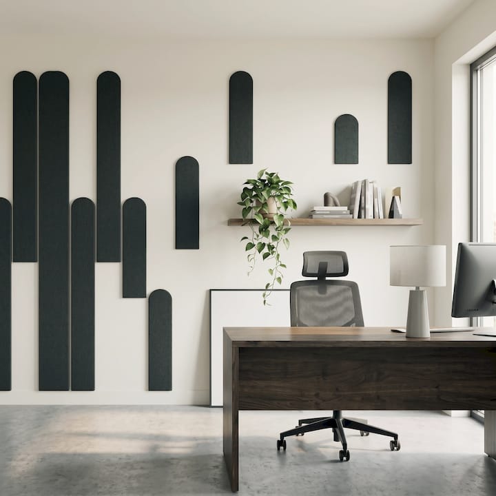
DwellForms™ panels bring strong geometric or sculptural shape to a wall, which means artwork doing the same thing in competition tends to fight for attention. Simpler, more graphic prints, botanical line drawings, or a single bold abstract piece usually sit better against a panel’s dimensional surface than another visually busy piece would.
Colour is the easier bridge. A panel in a saturated tone pairs naturally with art that picks up one accent from that same palette rather than matching it exactly, which keeps the wall feeling intentional without looking overly coordinated. Neutral or monochrome prints also work well against a bold panel colour, letting the panel carry the visual weight while the art adds quiet contrast.
Scale should echo the panel’s own proportions. A tall, narrow panel arrangement suits a correspondingly vertical piece of art more than a small square print, which can look lost beside it.
Tips on combining three-dimensional panels with two-dimensional art
Panels bring shadow, depth and a sculptural presence that flat art simply cannot, and the two work best when you let each do what it does well rather than trying to flatten the panel’s effect. Mounting a flat print directly over a heavily textured panel section usually hides the panel’s best feature, so it often works better to position art beside or around a panel rather than layered on top of its most dimensional areas.
Lighting helps separate the two without creating visual confusion. A side light that catches the panel’s raised edges, combined with even, indirect light across any framed art, lets both read clearly rather than merging into one flat shape from a distance.
Distance also changes how the combination reads. Stand back further than you think you need to when judging whether a flat piece and a dimensional panel are working together, since depth differences that look fine up close can flatten out or clash from across a room.
Adapting layouts for different rooms
A living room feature wall can usually support a bolder panel and art combination, since it is viewed from a distance and often anchors the whole room’s colour scheme. Larger panel arrangements with a correspondingly substantial artwork or small gallery grouping tend to suit this kind of open sightline.
Bedrooms call for a gentler approach. Because the wall is often viewed up close, from bed height, a smaller panel section paired with one or two quieter artworks usually feels calmer than a large, busy arrangement.
Home offices benefit from a mix that supports focus rather than distraction: a single anchor panel with one piece of art, positioned so it is visible without pulling attention away from a desk, tends to work better than a dense salon wall in a space meant for concentration.
Why a colour-first, renter-friendly approach changes how you display art
Committing to colour on a wall you do not own has always felt risky, and that risk is exactly what keeps so many rentals painted in the same safe neutrals. A removable, colour-led panel system changes that equation: you get to try bold colour without asking a landlord’s permission or facing a bond deduction for a patch job.
That same flexibility changes how we think about displaying art. A wall built from reconfigurable panels is not a finished decision, it is a living canvas you can rearrange as your taste, your art collection or your address changes. Colour without commitment is not a compromise. It is a genuinely different way to make a space feel like yours.
— Michelle
DwellForms™: modular, no-drill panels and where to start
If everything above has you picturing a wall but not quite sure where to begin, DwellForms™ Core Kits are built to give you an instant anchor arrangement, installed with adhesive pads rather than drilling, so you can start layering art against a finished backdrop without a renovation.
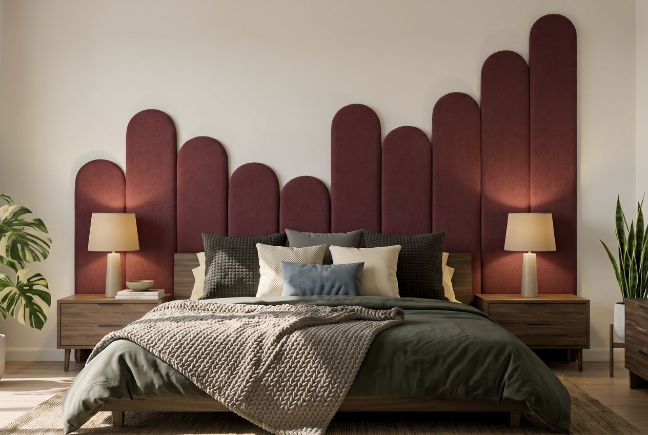
If you are not yet sure which colour will sit best with your existing art or frames, our DwellForms™ Colour Samples let you test combinations against your actual wall before committing to a full kit. Once a core arrangement is working, DwellForms™ Extension Kits let you widen the composition later without redoing what is already up, and our installation guides walk through the no-drill process step by step. Browse the product pages when you are ready to see how a renter-friendly feature wall could look in your own space.
FAQ
What is the 70/30 rule in art?
A useful balance guide is to let one dominant element, such as a large artwork or panel arrangement, carry most of a wall’s visual weight, with smaller supporting pieces filling the rest. It helps prevent a mixed wall from feeling like two competing displays rather than one considered composition.
Can you mix wall art styles?
Yes, mixing styles works well when pieces share a visual or thematic link, such as colour, subject matter or frame finish, rather than matching exactly. Curators note that gallery walls succeed when pieces relate to each other in some way, even when the styles themselves differ.
Can you put pictures on wall panels?
Lighter prints and small framed pieces can often sit on or near panels using low-profile adhesive hooks, while heavier framed art is generally better supported on the wall itself using a rated hanging strip or picture rail. Testing the weight limit of any adhesive fixing before committing a valuable piece is worth doing.
What is the rule of 57 for hanging art?
An eye-level guideline suggests centring artwork near the viewer’s natural line of sight. When a dimensional panel sits nearby, that centre point often needs adjusting slightly to account for the panel’s own visual weight.
How do I keep a mixed panel and art wall from looking cluttered?
Keeping consistent gaps between elements and resisting the urge to fill every bit of space can help the wall feel less cluttered. Designers consistently point to even negative space as what separates a curated wall from a crowded one.
Sources
- How to Style a Gallery Wall the Right Way, According to Designers
- How To: Add Art To Interiors Schemes | Artsy
- 5 Easy, Unexpected Ways to Bring More Art Into Your Home
Recommended
- Renters: Test Wall Panel Color Ideas For 3 Days Without Drilling
- Wall Panels Vs Art Prints: Renter-friendly Feature Walls Made Easy
- Keep Your Bond: No Drill Recycled Plastic Wall Art For Renters
- Weekend Color Blocking Decor For Renters: Paint Or No Drill Panels
This article is for general information and inspiration only. Product performance and results may vary depending on individual circumstances, surfaces and installation.