
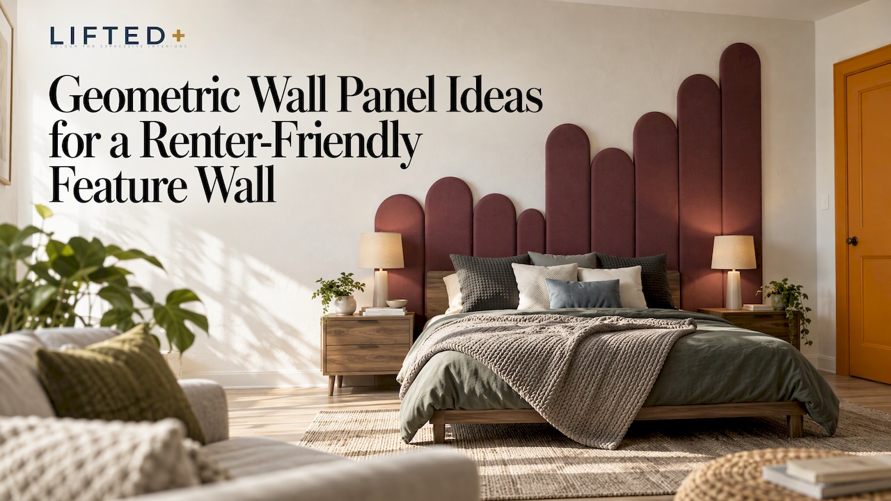
A blank wall is rarely a design choice. It is usually the result of a lease clause, a tight budget or simple decorating fatigue. Geometric wall panels answer all three: they turn a flat, polite surface into something with rhythm, shadow and shape. The trick is choosing a pattern, a scale and a colour story that suit your wall, and an installation method that suits your living situation.
This guide walks through the geometric ideas that work best in New Zealand homes, how to size and place them, how to style them room by room, and how to get the look as a removable, no-drill wall decor project.
Key Takeaways
- One confident geometric feature wall usually reads better than textured surfaces on every wall in the room.
- Pattern scale decides mood: larger shapes feel calm and architectural, smaller repeats feel busier.
- Traditional 3D panels are glued to flat, primed walls, which rules them out for most rentals. Removable felt panels are a different route to the same impact.
- Colour does most of the work. Test shades in your own light before committing to a full wall.
- Pair the wall with simple furniture and warm lighting so the geometry stays the hero.
Table of Contents
- Start with the problem: the wall that does nothing
- Geometric wall panel ideas worth considering
- Why traditional 3D panels rarely suit renters
- Choosing scale, layout and placement
- Colour: where geometric walls come alive
- Styling geometric panels room by room
- Keeping the room balanced
- Practical considerations for homeowners and renters
- Our perspective
- Ready to try it on your own wall
- Frequently asked questions
- Sources
Start with the problem: the wall that does nothing
Most of us know the wall. It sits behind the sofa or the bed, painted a safe off-white, holding a single framed print that looks slightly lost. You want it to feel personal, but paint is off the table in a rental, wallpaper is a gamble, and drilling into a plasterboard wall you do not own feels like asking for trouble.
Geometric panels solve this because pattern creates structure. A grid of repeating shapes gives the eye something to follow, so the wall looks designed even before you add art or furniture. It is colour without commitment, and texture without renovation, provided you choose a system that does not demand permanent changes.
Geometric wall panel ideas worth considering
Geometry is a broad church. These are the families of pattern that work best in everyday homes, with notes on the mood each one creates.
Hexagons and honeycomb clusters
Hexagons are friendly geometry. The six-sided shape tessellates without gaps, so a cluster can spread across a wall in an organic, slightly irregular outline rather than a rigid rectangle. Try them in a tonal range of one colour for a gentle gradient, or in three contrasting shades for something livelier. They suit hallways and home offices, where you want energy without formality.
Triangles and diamonds
Triangles bring direction. Arranged point-up and point-down they form a zigzag, and grouped in larger sets they create faceted, almost crystalline surfaces. Diamonds feel more traditional and tailored, particularly in a two-tone scheme. Both reward bold colour pairings: a deep teal against warm terracotta, say, or ink blue against soft blush.
Linear and slatted compositions
Parallel lines are the quietest form of geometry, and often the most sophisticated. Vertical lines lift the eye and suggest height; horizontal lines widen a narrow wall. Linear arrangements work well behind a bed or console, where they frame furniture instead of competing with it. If you love the look of timber slats, a linear felt kit gives you the same rhythm in colour instead of grain. You can see how we approach this in our Linear Feature Kit.
Skyline and stepped silhouettes
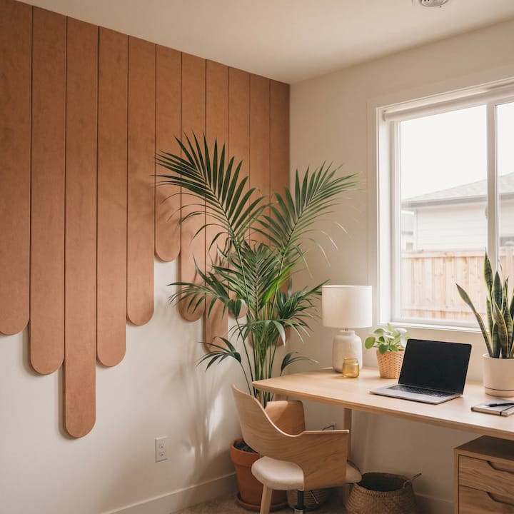
Varying the height of the shapes creates a skyline, a sculptural profile that reads like architecture rather than wallpaper. Stepped arrangements are excellent behind a sofa, because the rising and falling silhouette echoes the cushions and lamps in front of it. Our Skyline Kit is built around this idea.
Chevrons, waves and arches
Chevrons add movement, waves soften a room full of straight lines, and arches bring a gentle architectural nod. These are good choices in spaces that feel boxy, such as apartment living rooms, because the curves or angles break up the right-angled geometry of the room itself.
Wood-inspired geometry
Timber geometric feature walls, built from lattice strips cut at angles, have returned in recent years, and the warmth they bring is easy to understand. The catch is that real timber needs cutting, fixing and, usually, permission. If you love the idea, translate it: choose earthy felt colours such as caramel, walnut-adjacent browns and soft greens, and let the pattern supply the geometry. You get the warmth of wood without the saw.
Why traditional 3D panels rarely suit renters
It helps to know what the conventional route involves. A Houzz NZ feature on dimensional wall treatments describes 3D wall panels as modular, often supplied in set sizes such as 60 x 60 centimetres, commonly made from MDF or gypsum plaster, and fixed with tile adhesive onto walls that are perfectly flat and properly primed. That is a renovation project, not a weekend refresh, and it is a fixed result.
For homeowners planning a long-term finish, that permanence may be exactly right. For renters, apartment dwellers, and anyone who moves every few years, it is not. That is the gap removable wall design fills: the visual weight of sculptural panels, with the flexibility to rearrange them, take them down and pack them for the next place.
Choosing scale, layout and placement
Pattern is only half the decision. Scale and placement decide whether the wall feels deliberate or accidental.
Size the shapes to the wall
Larger shapes generally read as calmer and more considered, while smaller repeats read busier, and very small units can make a wall look tiled. As a rough guide, step up in scale when the wall is large and the room is open, and step down when the wall is narrow or you want a more intricate, textural effect. A panel-planning guide for square panelling suggests that shapes of roughly 400 to 700 millimetres on the long side sit in a comfortable middle ground for traditional wall panelling. Treat it as a starting point for the eye, not a rule for felt kits, which come in their own dimensions.
Centre the pattern on something
A geometric wall looks best when it is anchored to something real: the bed, the sofa, a console, a desk. Centre the composition on that piece of furniture instead of on the wall itself, particularly if a door or window interrupts the surface. Where a doorway splits the wall, consider two smaller groupings that mirror each other, instead of one pattern forced across the gap.
Leave breathing room
A feature wall does not have to run edge to edge. A composition that stops short of the ceiling, skirting and corners, with a generous margin of plain wall around it, often looks more intentional than a full-bleed pattern. It also makes the project forgiving: you are arranging a shape, not covering a surface.
One wall, not four
The same Houzz NZ piece advises that a single standout feature wall tends to work better than a room full of textured surfaces. We agree. Let one wall carry the pattern and keep the others quiet, and the room gains a focal point instead of visual noise.
Colour: where geometric walls come alive
Geometry gives you structure; colour gives you personality. This is the step people most often skip, defaulting to white or grey because it feels safe, and it is where a feature wall either sings or sits flat.
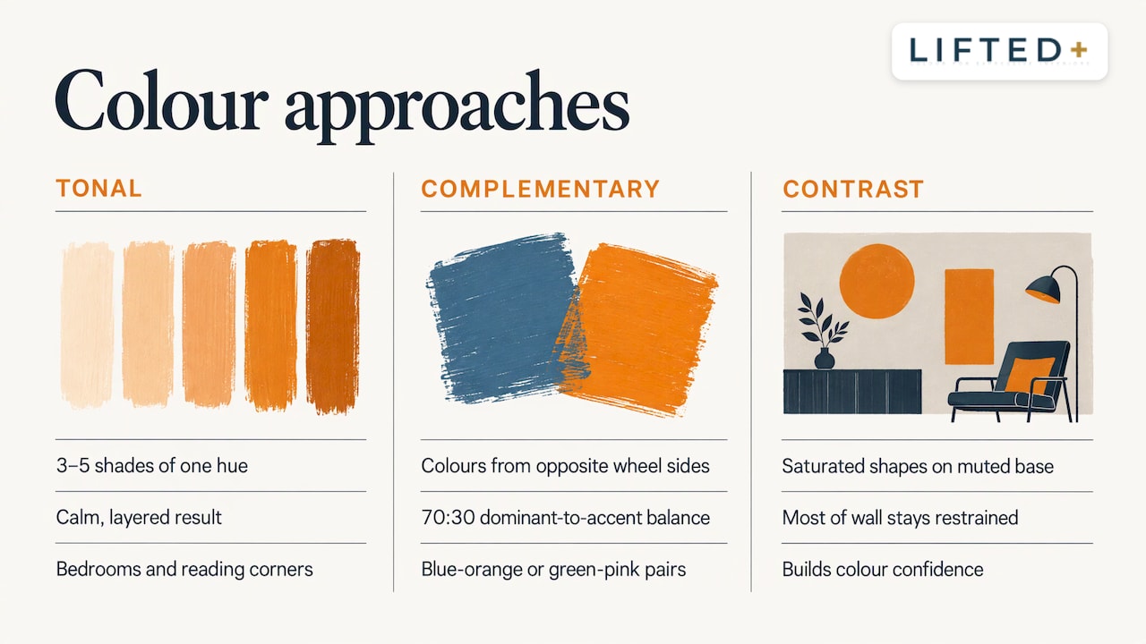
Three approaches work reliably:
Tonal. Choose three to five shades of a single hue, from pale to deep. The result feels calm, layered and sophisticated, and it suits bedrooms and reading corners.
Complementary. Pair two colours from opposite sides of the colour wheel, such as blue and orange, or green and pink. Keep one dominant and the other as an accent, roughly 70 to 30, so the wall does not shout.
Contrast against calm. Use one saturated colour in a few shapes against a muted base. It is the easiest way to build colour confidence, because most of the wall stays restrained.
Texture matters as much as hue. Interiors writing in New Zealand has recently pointed to a move toward tactile, tone-on-tone finishes that emphasise silhouette and age gracefully, rather than slick new surfaces. Felt suits that mood: it absorbs light softly, so colours look rich rather than glossy.
If you are nervous, test first. Our colour samples let you hold the shades against your own wall, in your own morning and evening light, before you order a full kit. Sample kit purchases are credited towards a full kit order. For more on testing shades, see our guide to wall panel colour ideas, and for combinations, our practical guide to mixing colours in interiors.
Styling geometric panels room by room
Living room
Put the pattern behind the sofa and keep the furniture simple. A stepped or skyline composition suits this wall well. Pull one or two colours from the panels into cushions or a rug, but resist matching everything: a wall that is echoed twice is a theme, and a wall that is echoed ten times is a costume. A sculptural lamp or a pendant light beside the wall adds shadow play as the day moves on.
Bedroom
Behind the bed is the natural position, with the pattern centred on the headboard. Go softer here: tonal palettes, linear patterns or gentle hexagons. Our guide to bedroom statement walls covers sizing and symmetry in more detail, and bedside tables in a complementary shade can tie the scheme together.
Hallway
Hallways are narrow, so horizontal or diagonal movement can make them feel wider, and a bold colour turns a pass-through space into a moment. Because you see the wall at close range, texture is particularly noticeable here.
Home office
The wall behind your desk is the one that appears on video calls, which makes it a good candidate. Choose a pattern with some energy but a limited palette, so it looks polished on camera and does not tire you out across a working day. A geometric wall also gives a spare-room desk the feeling of a dedicated workspace.
Dining nook or entry
Small zones can carry the strongest ideas. A compact cluster of hexagons or triangles, framed with a mirror or a piece of wall art, gives an entry or dining corner a point of view. For a deeper dive into pairing panels with art, see our piece on wall art for modern NZ homes.
Keeping the room balanced
The risk with any bold wall is that the rest of the room starts competing with it. A few habits keep the balance.
Keep the large furniture plain. A solid-coloured sofa or bed in a neutral or deep tone lets the pattern be the story. Limit other patterns to one or two small touches. Choose lighting that grazes or washes the wall softly, instead of spotlighting it harshly, because shadow is part of what makes a dimensional surface interesting. And leave some wall empty: the plain wall beside your feature wall is what makes the feature wall look like a feature.
If you want to widen your view on how finishes and shapes are evolving, current interior design trends offer a useful counterpoint, though your own taste should always lead.
Practical considerations for homeowners and renters
The right method depends on whether the wall is yours to alter.
Homeowners can choose permanent treatments such as plaster relief, fixed 3D tiles or timber lattice, and these are worth the effort when you plan to stay. Many homeowners still prefer a removable system for a rarely finished spare room, for a nursery that will change in two years, or because they want to try bold colour before committing to a permanent version of it.
Renters and apartment dwellers need to check the lease first. Many tenancy agreements restrict fixings, so read yours, and if in doubt, ask your landlord or property manager before you put anything on a wall. Removable products are designed to sit within those limits, but results always depend on the wall surface, paint condition and how the product is applied and removed.
People in temporary or changing spaces, such as short-term lets, shared houses or a first flat, benefit most from modular design: a kit you can expand, reconfigure and carry with you. We cover that in how to reuse modular wall panels in your next home.
A word on adhesives. We tested several adhesive options while developing DwellForms™, including a well-known pull-tab system, and deliberately set one popular brand aside. The nano-adhesive pads we selected performed significantly better in our own testing at minimising damage to walls. No adhesive is completely damage-proof, though, so always follow the installation guidance, apply to clean, dry, sound surfaces, and test a small area if you are unsure about your paint.
Our perspective
Walls are the largest canvas in any home, and most of us leave them blank because the rules around them feel rigid. We think that is backwards. Colour should not require a signed approval, and personality should not depend on whether you own the walls.
That is why we designed DwellForms™ in New Zealand as a colour-led, modular system: precision-cut PET felt made from 100% recycled plastic, arranged into sculptural patterns that give a renter-friendly feature wall real architectural presence. Panels attach with adhesive pads we selected after testing, so there is no drilling, no paint and no permanent renovation, and the kit can be rearranged or taken to your next home.
We would rather you start small and be bold than wait for the perfect house. Pick one wall, choose one colour you are slightly nervous about, and let the geometry give it a frame. That is how a plain wall becomes yours.
Michelle
Ready to try it on your own wall
If you would like to see these ideas in felt, start with a DwellForms™ Core Kit, which gives you a complete composition for one wall. Not sure which pattern suits you? Our Choose My Kit tool narrows it down.
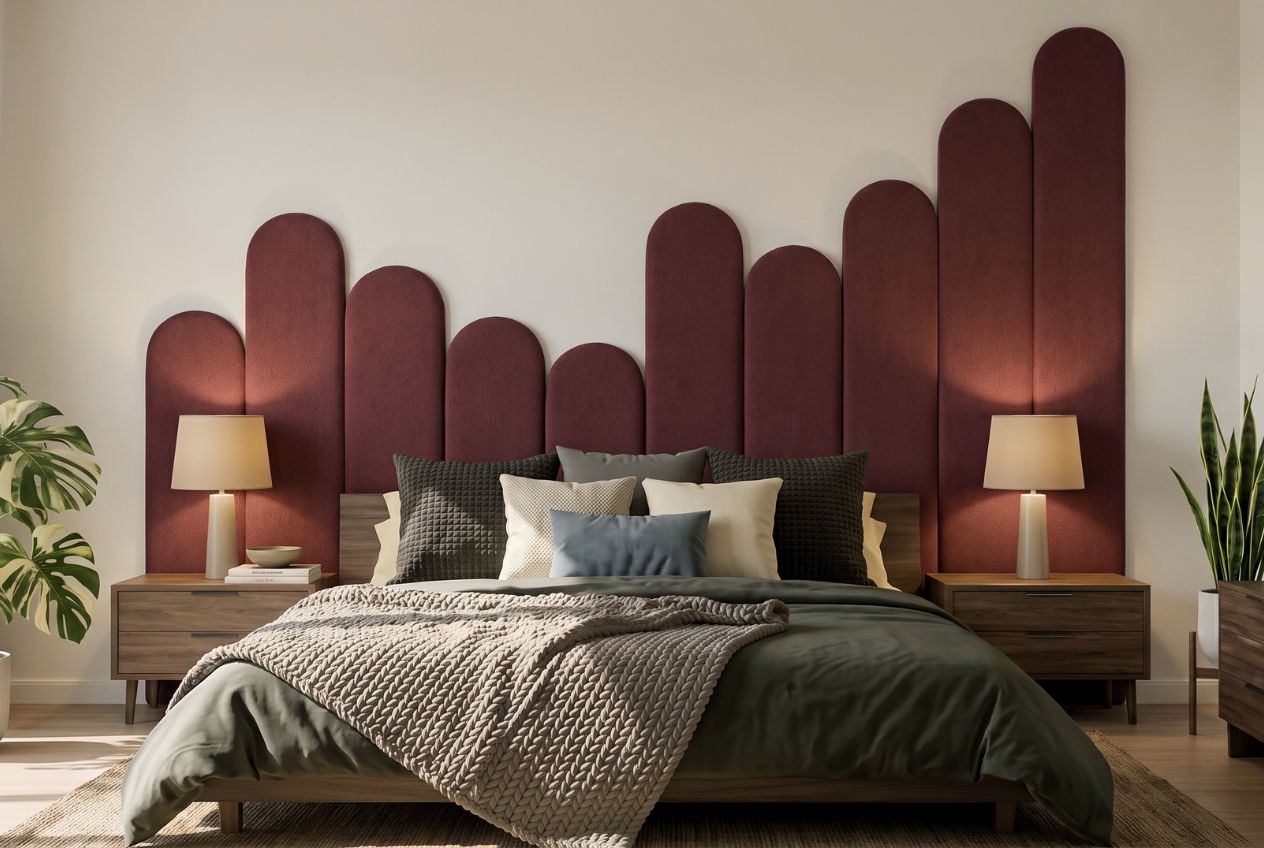
Want to grow the design later? Extension Kits let you widen or extend the pattern as your wall, or your next wall, demands.
Frequently asked questions
Can I put geometric wall panels on a rental wall?
Often yes, if you choose a removable system and your tenancy agreement allows it. Read your lease and talk to your landlord or property manager if the wording is unclear. Removable panels are designed to avoid drilling and paint, but results depend on your wall surface, so follow the installation guidance.
How many geometric walls should a room have?
One is usually enough. A single feature wall gives the eye a place to rest, while pattern on every wall can make a room feel crowded. If you want more, repeat a single colour from the feature wall on a smaller scale elsewhere.
Which colours work best for geometric panels?
Tonal palettes feel calm and layered, while complementary pairs feel energetic. If you are unsure, begin with one saturated shade against two quieter ones. Looking at physical colour samples in your own light is the most reliable way to decide.
Will geometric panels make a small room feel smaller?
Not if you control scale and colour. Lighter or mid-tone shades, a pattern that stops short of the edges, and a single feature wall all keep a small room open. Linear patterns can add a sense of height or width depending on their direction.
Sources
- 13 Ideas to Shift Your Walls Into a New Dimension | Houzz NZ
- Square Wall Panelling: Grid Sizes and Layout Maths | WallPanelPlanner
- Textured tones | UNO Magazine
- Singapore Home Renovation & Interior Design Trends | Aesthetic Havens
Recommended
- 12 Geometric Wall Decor Ideas For Renters With No Drill PET Panels
- Renters: Color Led Modular Wall Panel Patterns Installed In A Weekend
- Add Depth Without Drilling: 10 3D Wall Decor Ideas For Renters
- 10 Best Renter Feature Walls: No-drill, Removable Ideas
This article is for general information and inspiration only. Product performance and results may vary depending on individual circumstances, surfaces and installation.
