

Choose neutrals when you want a quiet backdrop, choose colour when you want a room to have a personality, and for most homes the best answer is a neutral base with one confident colour moment. The mistake is treating it as a vow. Colour on a wall can now be as reversible as a cushion, which is why the old question, “Will I tire of it?”, matters far less than it used to.
This guide covers what actually counts as a neutral, what each approach does to a room, where resale and rental limits come into it, and how to combine the two without the result looking accidental.
Key Takeaways
- Neutrals calm a room and keep options open; colour gives a room energy and makes it feel like yours.
- Strictly, only black, white and grey are true neutrals. Beige, taupe and greige are near-neutrals with a trace of hue, and that undertone shows up next to colour.
- A neutral base with one or two colour moments, repeated in smaller amounts elsewhere, is the most reliable way to build a cohesive home.
- Test any colour in your own light, at different times of day, before committing.
- If paint isn’t an option (renting, resale planning, commitment nerves), removable wall design lets you have colour without commitment.
Table of Contents
- What counts as a neutral, really?
- What neutrals do well
- What colour does that neutrals can’t
- Neutral versus colour at a glance
- The real question: how permanent is the colour?
- How to blend neutrals and colour so it looks intentional
- Test colour in your own light first
- Five low-risk ways to add colour to a neutral room
- Why a removable wall feature suits the neutral-versus-colour question
- Our view: neutrals are a canvas, not a destination
- Start with colour samples, then build
- FAQ
- Sources
What counts as a neutral, really?
People use “neutral” loosely, so it helps to be precise. A colour guide from New Mexico State University describes three true neutrals: black, white and grey. They are achromatic, meaning they have no hue of their own. Black comes from light being absorbed, white from light being reflected, and grey from a mix of the two.
In a design context the list stretches. The Spruce includes beige, greige, taupe, ivory, cream and brown, and even lists near-neutrals such as navy, olive or blush pink. That wider family is what most of us mean when we say a room is neutral: soft, muted, low in saturation.
The practical consequence is undertone. A beige with a yellow cast and a grey with a blue cast are different colours the moment you place something vivid beside them. Neutrals tend to pick up the complementary hue of whatever saturated colour sits next to them, so a grey wall beside a bright red sofa can look faintly green. Choose your neutral with the colour you plan to use in mind, not in isolation.
What neutrals do well
A neutral room is easy on the eye. Pale, low-saturation schemes read as calm, and research summarised in a University of Leeds white paper reports a general consensus that weaker colours give a room an impression of calmness, while stronger ones give an impression of excitement.
Neutrals also play well with others. Furniture, timber, art and textiles from any decade will sit comfortably against a soft white or warm greige, which makes a neutral base forgiving if you buy pieces over time.
There is a market logic too. Bayleys agent Cristina Casares, quoted by OneRoof, notes that buyers tend to either love or hate strong colour, which is why staged homes still lean neutral. If a sale is on the horizon, a restrained base is a sensible starting point, and it is exactly where reversible colour earns its keep.
The risk of a neutral room is not that it looks bad. It is that it looks like nobody lives there. Designers describe the fix as texture: the owner of a Remuera home profiled by Your Home and Garden kept a white base but layered hides, sheepskins, faux fur, stripes, gloss and matte to avoid a sterile, one-dimensional feel.
What colour does that neutrals can’t
Colour is the first thing you register on walking into a room. The Leeds paper cites design practitioner Lennon’s view that it speaks louder than almost any object in the space. That is why a single coloured wall can change a room more than a new sofa.
It also carries mood. Warm colours tend to stimulate and energise, cooler ones to calm and relax, according to the same white paper. New Zealand interior designer Nicola Ross puts it plainly: reds and oranges energise, blues and greens soothe, and earthy browns and terracottas convey comfort. If you want a space to feel a particular way, colour is the most direct tool you have. We go deeper on this in our guide to colour psychology in interior design.
The trend currents run this way as well. OneRoof’s 2024 round-up describes dopamine decorating, where bright, optimistic hues bring joy, alongside maximalist mixes of strong colour, material and texture that make a home individual. Pocketspace Interiors founder Laura Heynike is quoted there saying homeowners are ready to leave the pared-back look behind. If you want the current thinking, see our take on bold colour interior design trends for 2026.
Neutral versus colour at a glance
| Neutral interior | Colourful interior | |
|---|---|---|
| First impression | Calm, clean, understated | Energetic, personal, memorable |
| Strength | Flexible backdrop for any furniture | Instant character and mood |
| Watch for | Can feel flat without texture | Needs a plan for repetition and balance |
| Resale | A familiar, low-risk look | Divides opinion when it is permanent |
| Best handled by | Layering texture and tone | Keeping colour removable or contained |
The last two rows are where most readers get stuck, and where the choice has become easier than it looks.
The real question: how permanent is the colour?
Most of the fear around colour is a fear of permanence. A painted feature wall means tape, cut-ins, two coats, and a repaint before you move out or sell. Wallpaper is harder still. That cost is why people default to beige: it is the decision that can never be wrong.
Separate the two decisions. Your base (walls, floors, large furniture) is expensive to change, so keeping it neutral is sensible. Your layer (art, textiles, lighting, wall features) is cheap to change, so that is where colour can be bold. When the layer includes the wall itself, you have moved the most dramatic colour tool from the permanent column to the changeable one.
This is the idea behind what we call colour without commitment, and it applies whether you rent, own, or live somewhere you expect to leave. Landlord rules, body corporate limits and resale plans stop being obstacles and become design parameters.
How to blend neutrals and colour so it looks intentional
Pick a handful of colours and vary the quantity
Interior designer Vanessa Webb, quoted by Now to Love, recommends choosing a small set of colours and using them in different amounts: a vivid cobalt covering the walls in one room, for example, but only an accent in the adjoining spaces. That repetition is what makes colour read as a scheme rather than a series of impulses. Our practical guide to mixing colours in interiors walks through the proportions.
Match the weight, not just the hue
Colour expert Becky, interviewed by Essence Magazine, explains that every colour has a light reflectance value (LRV), from 0% for black to 100% for white. Choosing several colours with a similar LRV is a trick for a cohesive home-wide palette. In plain terms: colours of similar lightness sit together happily even when their hues differ, so a dusty teal and a terracotta of similar depth can share a room and neither shouts over the other.
Let warm timber and texture do the joining
Neutrals and colour often need a bridge. Warm timber, wool, a textured rug or a woven throw do this work, which is why designer rooms so often combine a bright wall with natural materials. The Remuera home above is a neutral example of the same principle: texture is what stops calm from turning blank.
Think about what sits next to the colour
Resene’s Karen Warman, speaking to Now to Love, points out that light levels, adjacent spaces and existing elements such as joinery, carpet and furniture all affect the colours you choose. Open-plan living is where this bites hardest, because one wall is visible from three zones. Our notes on a colour palette for open plan living cover that.
Keep colour restful where you rest
Bold does not have to mean loud. A saturated, deep colour in a bedroom can feel enveloping rather than frantic when the rest of the room stays soft. We explain how in styling bold interiors that still feel calm.
Test colour in your own light first
The most common reason a colour disappoints is that it was judged under shop lighting. Becky’s advice in Essence Magazine is to put large A4 samples on the wall and live with them for around two months, checking morning, afternoon and evening. That is a long time, but a New Zealand room can swing from cool, bluish southern light to warm late sun within a day, so one glance tells you very little.
Two habits help. First, look at the sample beside your actual floor, curtains and furniture, not against a white sheet of paper. Second, check it at night under your own lamps. If you go the sample-pot route, plan for the leftovers: here is what to do with old paint once you have chosen.
The same logic applies to textile colour. A swatch is an honest preview of felt in a way a screen never is, which is why we offer colour samples (more on that below).
Five low-risk ways to add colour to a neutral room
If you are standing in a beige lounge wondering where to begin, work from the easiest change to the most committed.
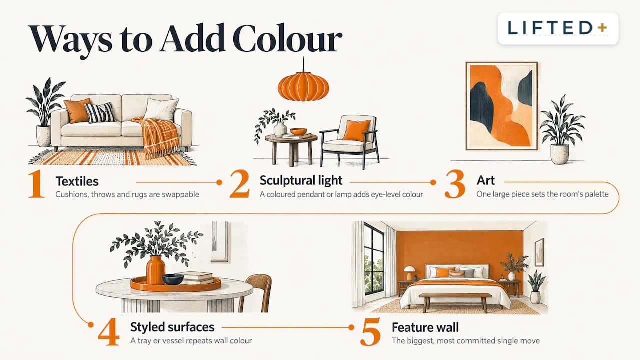
Start with textiles. Cushions, throws and a rug are cheap, swappable, and, as Vanessa Webb notes, a good way to keep a scheme versatile because they can change with the seasons.
Add one sculptural light. A coloured or sculptural pendant or table lamp gives colour at eye level and in the evening. Take a look at our pendant lights and table lamps for ideas.
Hang art with a colour agenda. One large piece with a strong palette will set the scheme for everything else in the room. Browse our wall art or read our guide to wall art for modern NZ homes for how to pitch scale and mood.
Style the surfaces. A coloured tray on the coffee table or a vivid vessel on a sideboard repeats the wall colour and links the room together. Our decorative trays are made for exactly this.
Treat one wall as the feature. This is the biggest single move, and the one traditionally tied to paint. It is where a removable system changes the calculation.
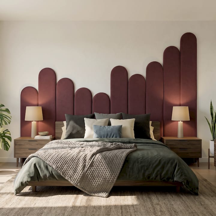
Why a removable wall feature suits the neutral-versus-colour question
The problem a feature wall solves is the one at the heart of this debate: how to have a calm, flexible home and still have a room with a point of view. DwellForms™ wall kits are our answer. They are modular panels cut from PET felt made from 100% recycled plastic, designed to fit with no drilling, no paint and no wallpaper, and to be removed, rearranged and taken to your next home.
In practice that suits three situations. If you rent, the wall can carry colour within landlord limits. If you own and expect to sell, you can keep the base neutral and the colour moveable. If you simply get bored (the Reddit-style confession behind many searches on this topic), you can rearrange or extend the layout rather than repaint.
We fix the panels with adhesive pads. We tested several pull-tab and adhesive options, deliberately set aside one popular brand, and chose our nano-adhesive pads because they performed significantly better in our own testing at minimising damage to walls. No adhesive is completely damage-proof, and wall surfaces vary, so we recommend reading our installation guidance for your wall type before you start.
Our view: neutrals are a canvas, not a destination
We love a good neutral. We just don’t think it should be where a home stops.
Neutrals are the safe, polite middle. They are lovely for calm, and sensible when you don’t know how long you’ll be somewhere. But too many homes end up neutral by default, because colour felt like a commitment that couldn’t be undone. That is the problem we built DwellForms™ to answer.
A neutral base gives colour room to breathe. A single sculptural wall in a confident hue, in felt that adds texture as well as colour, can pull a space out of that safe middle without asking you to pick up a paintbrush or a drill. Because the panels are modular, you can reconfigure them, add an extension kit as your confidence grows, and take the whole wall with you when you move.
Our advice is to start with one wall, one colour family, and one room where you feel like yourself. Order colour samples first, look at them in your own morning and evening light, and let the room tell you how bold to go.
Michelle
Start with colour samples, then build
If you would like to see how a colour behaves in your own room, begin with our DwellForms™ Colour Samples. Sample kit purchases are credited towards a full kit order, so choosing carefully costs you nothing extra.
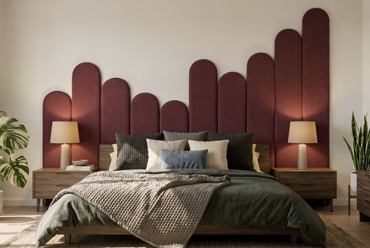
When you know your palette, the DwellForms™ Core Kits give you a complete feature wall, and the Extension Kits let you grow it across a wider wall or into a second space. Not sure where to put it? Our idea piece on bold living room colours with no-drill options is a good place to look.
FAQ
Are neutrals considered colours?
Strictly speaking, black, white and grey are achromatic, meaning they have no hue, which is why colour theory treats them differently from true colours. In interiors, though, “neutral” also covers beige, taupe, cream and greige, which carry a trace of hue. They behave as colours when set beside something vivid, picking up undertones from it.
Is a neutral home better for resale?
Neutral palettes are still favoured when homes are staged, because buyers can find strong colour polarising, as one Bayleys agent told OneRoof. The practical approach is a neutral base with colour in removable pieces, so you can enjoy it now and take it with you later.
Can I use bold colour in a small room?
Yes, but start with a single wall or a contained feature rather than every surface, and test the colour in the room’s own light first. Pairing a strong accent with a calm, soft base lets the room feel curated rather than crowded. Our tips for colourful interiors that actually work go through small-room examples.
How do I add colour to a minimalist home?
Keep the discipline and change the palette: fewer objects, but each in a deliberate colour. One strong wall feature and a few matching accents will do more than a scattering of small items. See minimalist home, but make it colour for how.
Sources
- A Guide to Color, New Mexico State University
- What Are Neutral Colors?, The Spruce
- Is the colour of your home making you happy? White paper, University of Leeds
- How to use colour in your home, Now to Love
- More is more: 2024’s hottest design trends, OneRoof
- Get Colourful At Home, Essence Magazine
- A grand Remuera home filled with soothing tones and texture, Your Home and Garden
Recommended
- Colour Psychology For Interiors, Explained
- A Guide To Colour Psychology In Interior Design
- Tips For Colourful Interiors That Actually Work
- Mixing Colours In Interiors: A Practical Guide
This article is for general information and inspiration only. Product performance and results may vary depending on individual circumstances, surfaces and installation.
