
TL;DR:
- Colour influences mood, perception of space, and emotional response before furniture is noticed.
- Understanding undertones and natural light helps optimize colour choices for different rooms and seasons.
- Bold colours and intentional palettes create more memorable and genuine interiors than neutral, safe tones.
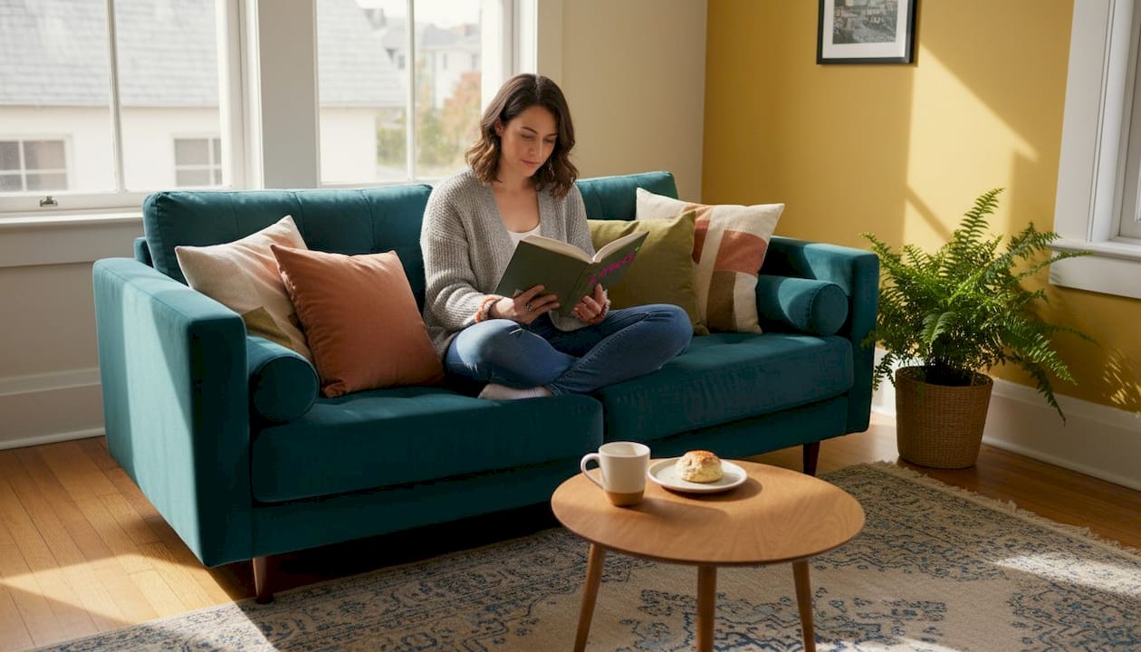
Most people assume a room comes alive through furniture choices or carefully sourced accessories. The truth is more immediate than that. Colour lands first. Before you register the shape of a sofa or the grain of a timber floor, your nervous system has already responded to the palette on the walls, the tones in the textiles, the warmth or coolness radiating from every surface. Colour influences mood, perception of space, and functionality in ways that go far deeper than aesthetics. Understanding how to work with colour, rather than around it, is the difference between a room that merely looks pleasant and one that genuinely feels alive.
Table of Contents
- Why colour matters in interior design
- How colour transforms space and mood
- Common pitfalls and how to avoid them
- Curating colour: Practical steps for New Zealand homes
- Our perspective: Why bold colour choices make a lasting impression
- Ready to transform your space with colour?
- Frequently asked questions
Key Takeaways
| Point | Details |
|---|---|
| Colour shapes mood | The colours you choose can energise, relax or focus a room’s occupants. |
| Lighting and undertones matter | Always assess how lighting and subtle undertones affect colour before committing. |
| Avoid common mistakes | Overusing bold colours or mismatching undertones can quickly overwhelm a space. |
| Practical planning works | Creating a colour plan suited to your light and lifestyle brings balance and impact. |
Why colour matters in interior design
Colour is not decoration. It is architecture for the senses. Walk into a room washed in deep terracotta and you feel the walls draw closer, the atmosphere thicken with warmth. Step into a space painted in pale sage and the air seems to expand, the mind quietens. This is not imagination. It is psychology, and it has been shaping human environments for centuries.
The colour psychology in interiors conversation is grounded in both biology and culture. Warm colours, the reds, oranges, and yellows, trigger alertness and energy. They echo fire, sunlight, and physical warmth. Cool colours, the blues, greens, and soft violets, reference water, sky, and open landscape. They slow the pulse, gently. Neither category is inherently better. Each serves a different purpose depending on the room, the occupant, and the time of day.
“Cool colours like blue and green promote calm and focus, while warm colours like red and yellow energise but can fatigue if overused.” This distinction is foundational to every considered interior.
Here is a quick orientation to how the main colour families behave in a residential setting:
- Blues and greens: Promote calm, focus, and a sense of spaciousness. Ideal for bedrooms, studies, and bathrooms.
- Reds and oranges: Stimulate energy and appetite. Work well in dining spaces but can overwhelm if used too broadly.
- Yellows: Lift mood and invite optimism, though saturated versions in low light can cause visual fatigue.
- Neutrals (warm and cool): Provide flexibility and continuity, but require careful undertone alignment to avoid a flat or disconnected result.
- Deep, saturated tones: Create intimacy and drama. Think forest green, midnight blue, or burnt sienna on a feature wall.
Colour also carries cultural weight. In New Zealand, the landscape itself, the bush, the volcanic earth, the silver light off the Tasman, informs an intuitive colour sensibility that is distinct from European or North American interiors. Leaning into that local palette, rather than importing trends wholesale, tends to produce spaces that feel genuinely rooted.
The first impression a room makes is almost entirely chromatic. Before proportion, before furniture arrangement, before lighting design, colour sets the emotional register. Get it right and everything else you add feels intentional. Get it wrong and no amount of beautiful objects will rescue the space.
How colour transforms space and mood
Colour does not simply sit on a surface. It interacts with light, with adjacent colours, and with the architecture of the room itself. This is where many well-intentioned design decisions unravel, because a colour chosen from a swatch in a paint shop can behave entirely differently once it is on four walls under your specific ceiling height and window orientation.
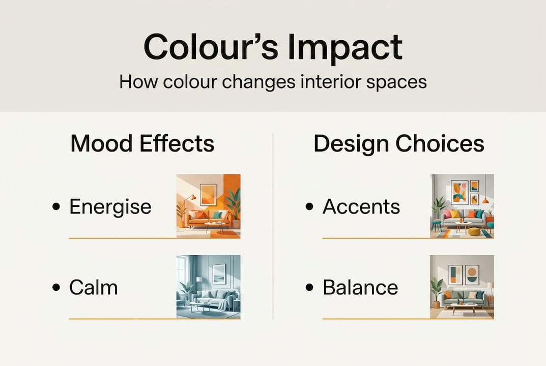
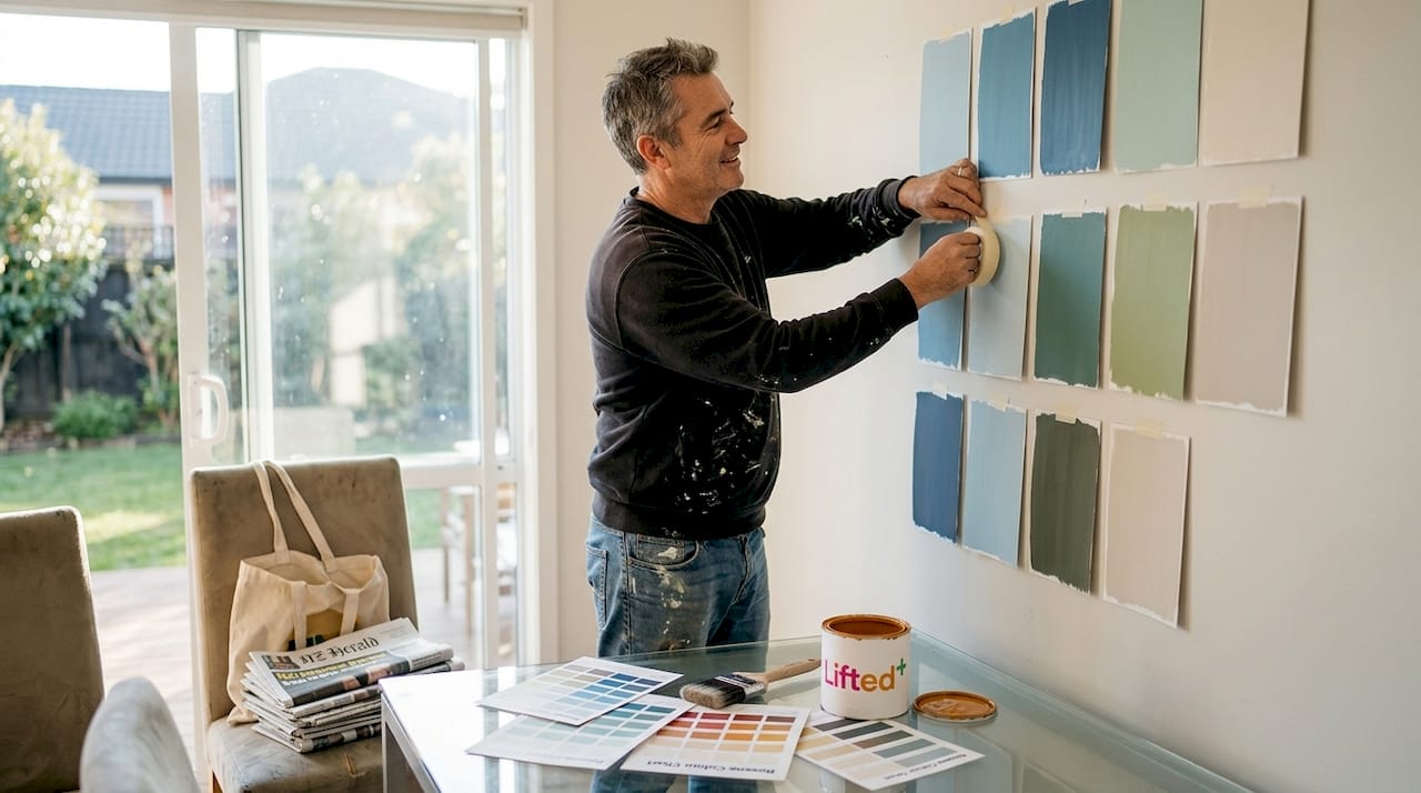
Undertones are the hidden variable most people overlook. Every colour carries a subtle base hue beneath its surface identity. A white may lean pink, green, or yellow. A grey may pull blue or brown. A yellow-biased green can appear outdated under cool light, while the same green with a blue undertone reads as fresh and contemporary. Understanding undertones allows you to make a room feel bigger, warmer, or more grounded without changing the furniture at all.
Here is a comparison of how colour groups behave across key spatial variables:
| Colour group | Perceived room size | Mood effect | Best application |
|---|---|---|---|
| Light, cool tones | Expands | Calm, airy | Small rooms, bathrooms |
| Light, warm tones | Slightly expands | Welcoming, soft | Living areas, hallways |
| Dark, cool tones | Contracts | Intimate, focused | Studies, feature walls |
| Dark, warm tones | Contracts | Cosy, dramatic | Dining rooms, bedrooms |
| Saturated brights | Neutral to contracting | Energising, bold | Accent pieces, single walls |
Before you commit to a colour direction, work through these steps:
- Identify the primary function of the room and the mood you want it to support.
- Note the direction your windows face and the quality of natural light throughout the day.
- Pull the undertones from your existing fixed elements, flooring, cabinetry, and bench tops.
- Select two or three candidate colours and order large swatches or sample pots.
- Observe each swatch at morning, midday, and evening light before deciding.
For small living room colour ideas, this process is especially important because the margin for error is smaller and the visual impact of each choice is amplified.
Pro Tip: Paint a large sheet of white card with your sample colour and move it around the room at different times of day. A fixed swatch on the wall only shows you one angle under one light condition. The moving card reveals the full range of how that colour will live in your space. This approach is also recommended when choosing paint colours for rooms with complex or shifting light.
Common pitfalls and how to avoid them
Even experienced decorators make colour mistakes. The most common ones are not about taste. They are about process, specifically about skipping steps or making decisions in isolation rather than in context.
The pitfalls worth knowing before you begin:
- Ignoring undertones: Choosing a colour by its surface identity without checking its undertone leads to clashes that are hard to diagnose once the room is complete.
- Over-saturating a space: A single vivid wall can anchor a room beautifully. Four vivid walls can make it feel relentless. Avoiding saturated yellow or red in low light is particularly important in south-facing New Zealand rooms that receive limited direct sun.
- Treating each room in isolation: A home is a sequence of spaces. Colours that work individually can create visual whiplash when seen in succession from a hallway or open-plan layout.
- Chasing trends without anchoring: A colour that reads as current in a magazine may not suit your architecture, your light, or your lifestyle. Trends are a useful reference, not a brief.
- Neglecting the ceiling and floor: These are the largest surfaces in any room. Treating them as afterthoughts undermines even the most considered wall palette.
The corrective strategy for most of these is the same: build from a base palette first. Choose two or three neutrals that share undertone alignment and use them across your fixed surfaces. Then introduce minimalist colour use as a foundation, layering in bolder accents through textiles, wall art, and decorative objects. This approach gives you flexibility without sacrificing cohesion.
For rooms where you want genuine energy and presence, using colour for energy through a single statement piece, a sculptural lamp in deep amber, a wall hanging in rust and ochre, is often more effective than painting the whole room.
Pro Tip: When choosing accent colours, pull from a tone already present in your base palette but push its saturation up two or three levels. This creates visual drama while maintaining an underlying harmony that feels considered rather than accidental.
Curating colour: Practical steps for New Zealand homes
New Zealand light is particular. It is bright, often directional, and changes character dramatically across seasons. The strong UV index intensifies colour perception outdoors, but interiors, especially in older homes with smaller windows, can feel quite different. Colour and undertone alignment is essential for continuity and function across these variable conditions.
Here is how New Zealand daylight and seasons should inform your palette decisions:
| Season | Light quality | Palette recommendation |
|---|---|---|
| Summer | Bright, high contrast | Cooler tones to balance intensity; crisp whites and soft blues |
| Autumn | Warm, golden, lower angle | Earthy terracottas, amber, and warm neutrals |
| Winter | Flat, diffuse, grey-toned | Deeper, warmer tones to add presence; avoid cold greys |
| Spring | Fresh, variable, increasing | Sage greens, soft yellows, and light warm neutrals |
To develop a colour plan that holds across all of these conditions, work through this process:
- Begin with your optimistic palette ideas and identify the emotional register you want each room to carry.
- Map your fixed elements and pull their undertones into a reference sheet.
- Select a base palette of two to three neutrals with aligned undertones.
- Choose one or two accent colours per room that amplify the mood without overwhelming it.
- Plan your lighting for mood in parallel, because warm bulbs shift cool colours and cool bulbs flatten warm ones.
- Build a visual reference using interior design mood boards to test how your selections work together before committing.
Room by room, ask three questions before finalising any colour decision: What is this room for? What time of day is it most used? What feeling should a person carry when they leave it? Those three questions cut through the noise of trend cycles and personal preference drift, and anchor your choices in something durable.
Our perspective: Why bold colour choices make a lasting impression
There is a quiet pressure in contemporary interior culture to default to white, to grey, to the safe and the neutral. We understand the appeal. Neutrals are forgiving. They photograph well. They do not commit. But they also do not hold a room. They do not give a space its own gravity or pull a visitor into a particular feeling.
We believe New Zealand homes are uniquely positioned to carry bold colour with confidence. The landscape here is not timid. The light is not polite. And yet so many interiors retreat into palettes that could belong anywhere, and therefore feel like nowhere in particular.
A single piece in a deeply saturated, considered hue, a wall hanging in burnt sienna, a ceramic lamp in forest green, does more for a room’s identity than a full suite of beige furniture. It signals intention. It says this space was chosen, not just assembled. The bold colour trends emerging in 2026 reflect exactly this shift: away from the safe middle, toward spaces that have something to say.
Restraint is a tool, not a virtue. Use it when it serves the space. But do not confuse restraint with timidity.
Ready to transform your space with colour?
Colour is the most immediate design decision you can make, and the most transformative. Whether you are starting from scratch or rethinking a room that has never quite landed, the right palette changes everything about how a space feels to live in.
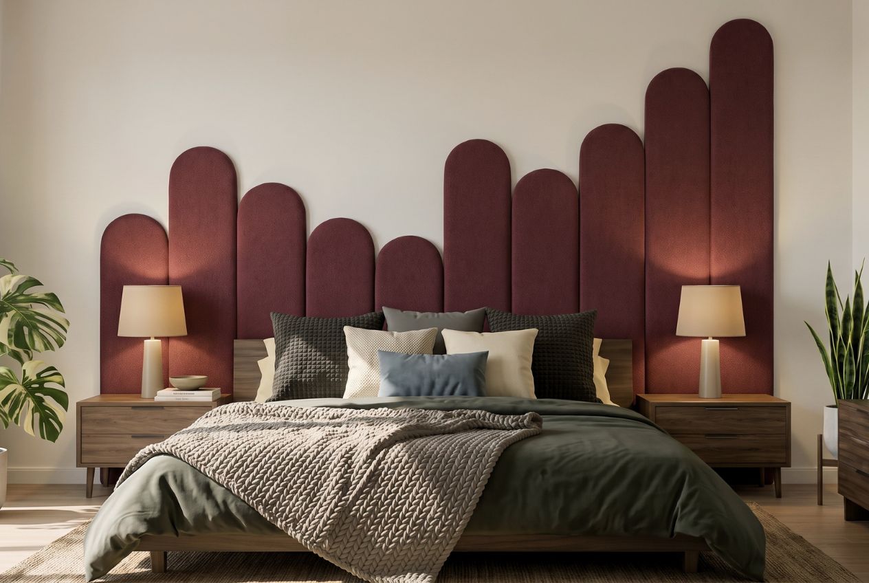
At Lifted+, we curate pieces that bring colour to life in the home, from sculptural lighting in grounded autumnal tones to wall art that anchors a room with presence and intention. Our colourful homeware shop is designed to make bold, considered choices easy. Explore our design mood boards for seasonal inspiration, or read more about how personalised decor for mood can shift the entire feeling of your home. Your space deserves more than safe. Let colour do the work.
Frequently asked questions
How do I choose the right colour for a small room?
Opt for lighter, cooler colours to expand the feel of interiors and always test swatches in your room’s natural light before committing to a full application.
What is a colour undertone and why does it matter?
A colour’s undertone is its subtle base hue, and it determines how the colour reads under different lighting and alongside other tones in your space. Undertones shift colour dramatically under changing light, which is why two whites or two greys can look entirely different on the same wall.
Are bold colours harder to use in New Zealand homes?
Bold colours thrive in New Zealand’s strong daylight but require careful attention to undertones and lighting to avoid overwhelming the space. Saturated colours without light consideration can cause visual fatigue, particularly in rooms with limited natural light.
How can I create flow with colour between rooms?
Stick to a harmonious base palette across your home and introduce accent colours thoughtfully within each individual space. Neutrals need undertone alignment to maintain visual continuity as you move from room to room.
Recommended
- Colour That Lifts: Make A Room Feel Alive – Lifted+ | More Colour. More Mood. More Life.
- How Colour Can Make A Room Feel Bigger – Lifted+ | More Colour. More Mood. More Life.
- Colour Psychology For Interiors, Explained – Lifted+ | More Colour. More Mood. More Life.
- Interior Design Trends Bold Colour 2026 – Lifted+ | More Colour. More Mood. More Life.
- Harness colour in office furniture for staff wellbeing
- How color transforms window treatments: guide for spaces – Fabric Store in Columbia, SC | Drapery Making Services