
TL;DR:
- Texture in home decor adds both visual interest and tactile warmth, transforming flat spaces into inviting environments. Professionals recommend balancing surfaces with the 70-20-10 rule, limiting to three major textures, and repeating materials to create cohesion. Properly layered texture enhances color perception, mood, and comfort, making rooms feel lived-in and complete.
Texture in home decor is the tactile and visual quality of surfaces that transforms a flat, lifeless room into a layered, welcoming environment. Knowing why use texture in home decor matters is the difference between a space that looks assembled and one that feels genuinely lived in. Designers like Melanie Calder Russo and Alyssa Anselmo treat texture as a foundational decision, not a finishing touch. The 70-20-10 rule gives homeowners a professional framework for distributing smooth, soft, and hard surfaces across a room. Texture also changes how colour reads on a wall, how light moves through a space, and how a room feels the moment you step into it.
Why use texture in home decor: the core reason
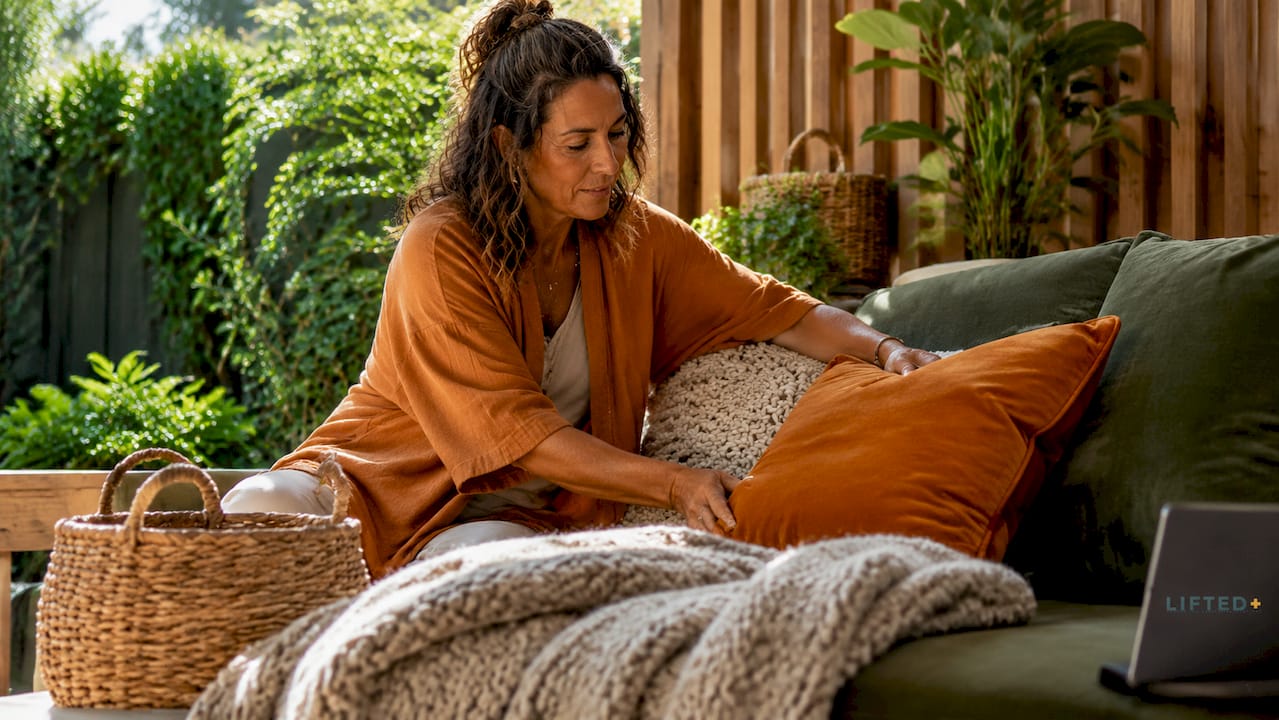
Texture is the primary tool for creating a space that appeals to touch as well as sight, making rooms feel welcoming rather than staged. A room furnished entirely in smooth, uniform surfaces reads as cold and corporate, regardless of how beautiful the individual pieces are. Texture introduces tension, contrast, and warmth that no paint colour or furniture silhouette can replicate alone.
The role of texture in interiors goes beyond aesthetics. Matte surfaces absorb light and deepen colours, while glossy surfaces reflect light and brighten them. This means the same paint colour on a rough plaster wall versus a polished panel will read as two entirely different shades. Texture is, in effect, a colour tool as much as a surface choice.
Neutral colour schemes rely on texture to prevent blandness, because without surface variation, a room in whites and taupes simply disappears. Texture differentiates surfaces and adds character without requiring colour energy. This is why so many Scandinavian and Japanese interiors feel rich despite their restrained palettes.
What types of texture work in home decor?
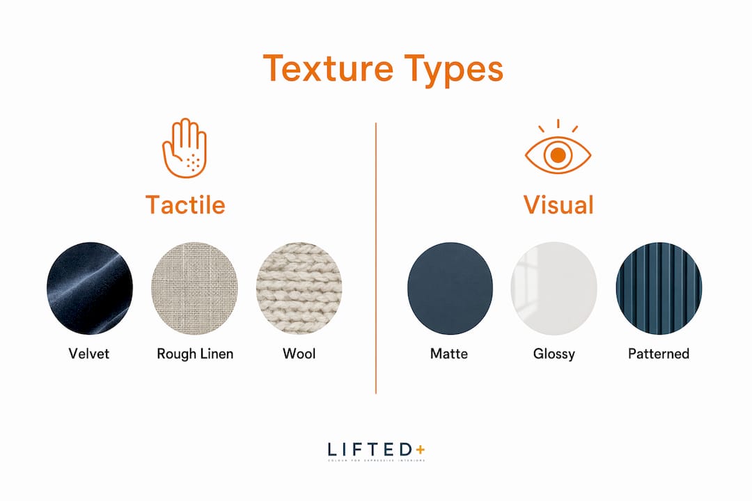
Texture in interior design falls into two categories: tactile and visual. Tactile texture is what you feel when you run your hand across a linen cushion, a raw timber shelf, or a woven jute rug. Visual texture is what your eye reads as surface variation, such as a matte brick-effect wallpaper or a printed fabric that mimics the grain of stone.
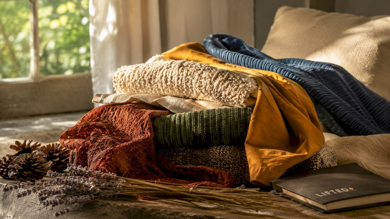
Both types influence mood. Soft, plush textures like velvet cushions and wool throws signal warmth and comfort. Hard, raw textures like exposed concrete, polished brass, and natural stone introduce energy and edge. Smooth, matte finishes calm a space down. Shiny, reflective surfaces like lacquered furniture or mirrored glass add brightness and a sense of movement.
Contrasting textures create depth and prevent the visual monotony that makes a room feel flat. Pairing a rough linen sofa with a polished side table, or a raw timber floor with a plush area rug, gives the eye something to travel between. That contrast is what holds a room together and makes it feel considered.
Pro Tip: When you introduce a new texture, ask whether it contrasts with at least one other surface already in the room. If everything reads the same, the space will feel static no matter how well the colours coordinate.
Understanding how texture interacts with lighting and spatial scale is what separates a thoughtful interior from a merely decorated one. A heavily textured wall treatment that looks stunning in a showroom can overwhelm a small bedroom. Scale awareness is part of texture literacy.
How to use texture effectively: rules that actually work
Professional designers follow a clear set of principles when layering textural elements in home design. These rules are not rigid formulas, but they give you a reliable starting point.
The 70-20-10 rule
The 70-20-10 rule for texture distributes surface types across a room in deliberate proportions. Seventy per cent of surfaces should be smooth or matte, forming the calm backdrop. Twenty per cent should be plush or soft, adding warmth and comfort. Ten per cent should be hard, shiny, or raw, providing the accent that gives the room its edge. A living room applying this rule might feature painted plaster walls and a smooth linen sofa as the dominant layer, a wool rug and velvet cushions as the secondary layer, and a single polished brass lamp or raw stone sculpture as the accent.
Limit major textures to three
Designers recommend no more than three major texture types per space to maintain cohesion and avoid visual chaos. More than three competing surface qualities fragment the eye and make a room feel restless. Three textures, chosen with intention, tell a unified story. Think of it as a chord rather than a crowd.
Repetition builds cohesion
Repeating specific materials throughout a space creates a cohesive narrative rather than disconnected décor. If you introduce rattan in a side table, echo it in a pendant light or a small basket. If raw timber appears on the floor, bring it back in a shelf or a frame. Repetition is what makes a room feel designed rather than assembled. Liftedplus explores this principle in depth in their guide to layering decor objects like a professional stylist.
Scale and distance
Texture must be evaluated from typical room distance, not just up close. Fine weave details in a fabric may disappear entirely when viewed from across the room. A large-scale stone cladding that reads beautifully at arm’s length can overwhelm a small space when you step back. Always stand at the room’s entry point and assess how a texture reads from there before committing.
Pro Tip: Bring fabric and material samples home and pin them to the wall or drape them over furniture. Live with them for two days before deciding. Texture reads differently under your own lighting than it does in a showroom.
Why mixing textures matters more than colour alone
The importance of texture in home styling is often underestimated because colour gets most of the attention. Colour is immediate and emotional, but texture is what makes a space feel physically real. A room can have a beautiful colour palette and still feel hollow if every surface reads the same way.
Texture planning is a foundational design decision equal in importance to colour and proportion. Professionals who treat texture as a final decorative add-on consistently produce interiors that look correct but feel incomplete. The sensory experience of a room, how it makes you feel when you sit in it, is shaped more by surface variation than by any other single element.
Texture also invites physical engagement. A room with a chunky knit throw draped over an armchair, a smooth ceramic vase on a rough timber shelf, and a woven rug underfoot communicates comfort before a single person sits down. That invitation is the role of texture in modern interiors. It makes a space feel inhabited and generous rather than pristine and untouchable.
“Texture is what makes a room feel like it belongs to someone. Colour tells you what mood the room is in. Texture tells you that someone actually lives there.”
For rooms built around a neutral palette, this matters even more. Without colour contrast to carry the visual interest, texture becomes the entire story. A cream-on-cream room with a plaster wall, a linen sofa, a wool rug, and a woven cushion reads as sophisticated and layered. The same room with all smooth surfaces reads as a showroom floor. The guide to colourful interiors that work explores how texture and colour reinforce each other when both are handled with intention.
Common texture mistakes and how to fix them
Most texture problems fall into one of two categories: too much or too little. Both produce unsatisfying results, but for different reasons.
Too many competing textures create visual noise. When rough stone, shiny metal, heavy velvet, woven rattan, and distressed timber all appear in the same room without a unifying logic, the eye has nowhere to rest. The fix is to edit ruthlessly. Remove any texture that does not repeat at least once elsewhere in the room.
Too few textures produce flat, lifeless spaces. A room furnished entirely in smooth, matte surfaces feels sterile. Even a single textural accent, a jute rug, a linen cushion, a raw ceramic bowl, can pull a space out of the polite, safe middle. The benefits of texture in decor are most visible in rooms that previously had none.
Mismatched scale is the subtler mistake. A delicate grasscloth wallpaper in a large open-plan living area will disappear entirely. A heavily embossed feature wall in a small study will feel oppressive. Scale must match the volume of the space.
Ignoring texture when choosing colour produces clashing results. A bold colour on a high-gloss surface reads very differently to the same colour on a matte finish. When you select paint, fabric, or tile, always consider the finish alongside the colour.
Pro Tip: Before committing to a texture combination, photograph the room and convert the image to greyscale. Without colour, you can see whether the surface variation alone creates enough visual interest. If the greyscale image looks flat, add more contrast.
Key takeaways
Texture is a foundational design element that shapes how a room feels, reads, and functions, requiring deliberate layering of smooth, soft, and hard surfaces in balanced proportion.
| Point | Details |
|---|---|
| Texture transforms perception | Matte and glossy finishes change how colour reads, making texture a colour tool as much as a surface choice. |
| Follow the 70-20-10 rule | Distribute 70% smooth, 20% plush, and 10% hard or raw surfaces for a professionally balanced room. |
| Limit to three major textures | More than three competing surface types fragment the eye and make a space feel restless rather than considered. |
| Repetition creates cohesion | Echoing a material across two or three points in a room builds a unified story and avoids disconnected décor. |
| Evaluate texture from room distance | Fine details disappear and large textures can overwhelm; always assess from the room’s entry point before deciding. |
Texture is the thing i always notice first
When I walk into a room, I notice texture before I notice colour. I notice whether the sofa looks like it would feel good to sit in, whether the rug looks like it would feel warm underfoot, whether the walls have any life in them at all. Colour tells me the mood the room is going for. Texture tells me whether it actually got there.
The rooms I remember most are never the ones with the most striking colour palette. They are the ones where someone clearly thought about how every surface would feel, not just how it would look. A rough linen cushion against a smooth painted wall. A raw timber shelf holding a smooth ceramic. A wool rug on a polished concrete floor. Those combinations have a physical presence that photographs cannot fully capture.
What surprises most people when they start layering textures deliberately is how quickly a room changes character. You do not need to repaint or refurnish. A jute rug, two linen cushions, and a single ceramic object can shift a room from cold to considered in an afternoon. The sensory impact of furniture textures on a room’s atmosphere is something I think more homeowners should explore before they reach for the paint brush.
My honest advice: start with what you already have. Stand in your room and ask which surfaces all read the same way. That is where texture is missing. Add one contrasting element and see what happens. You will not go back.
— Michelle
Bring texture to life with Liftedplus
Liftedplus curates furniture, wall art, and lighting designed to introduce surface presence and sculptural form into modern New Zealand interiors. Every piece is chosen for its ability to hold a room, not just fill it.
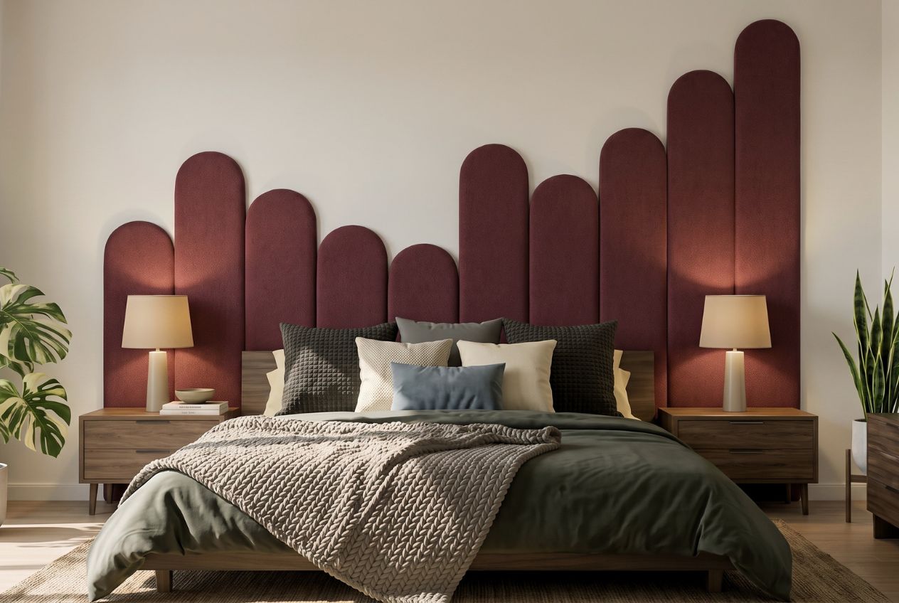
Whether you are working with a neutral palette that needs surface variation or a colourful scheme that needs grounding, the Liftedplus collection gives you textural elements that carry weight and character. Explore how decor shapes mood and style in your home, or browse the full Liftedplus shop for curated pieces that bring depth and warmth to any space. If you are renting and want texture without permanent changes, the renter-friendly decor guide is a practical starting point.
FAQ
What is texture in home decor?
Texture in home decor is the tactile and visual quality of surfaces, including materials like linen, timber, stone, velvet, and metal. It shapes how a room feels physically and how surfaces read visually under light.
Why mix textures in home decor?
Mixing textures creates depth, contrast, and warmth that colour alone cannot achieve. Contrasting surfaces like rough with smooth or plush with hard give the eye movement and make a space feel layered and considered.
How many textures should a room have?
Designers recommend a maximum of three major texture types per room to maintain cohesion. More than three competing surfaces create visual noise and make a space feel restless rather than intentional.
Does texture affect how colour looks in a room?
Matte surfaces absorb light and deepen colours, while glossy surfaces reflect light and brighten them. The same paint colour will read differently depending on the texture of the surface it is applied to.
Can texture work in a small room?
Texture works well in small rooms when the scale is appropriate. Fine, subtle textures like linen or soft plaster add warmth without overwhelming the space. Large-scale or heavily embossed surfaces should be used sparingly in compact rooms.