
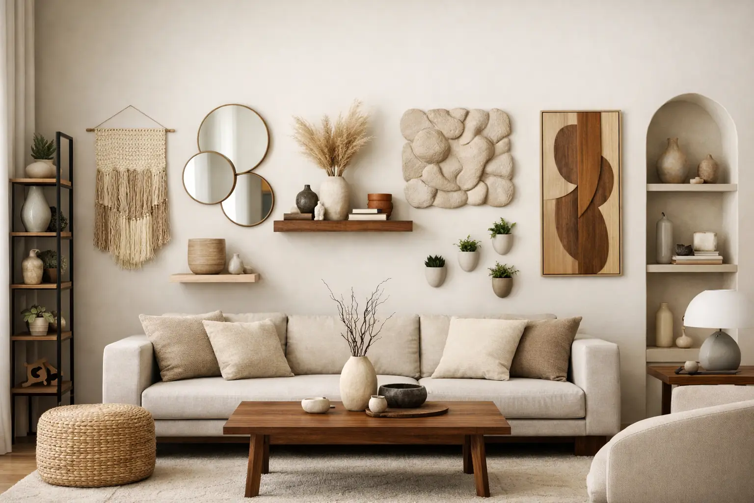
A perfectly arranged gallery wall can look good. It can also look like you gave up halfway to making a real decision.
That is the tension with gallery walls in modern interiors. They fill space, but they do not always hold it. In homes with clean lines, strong materials and open-plan layouts, a cluster of smaller frames can read as visual noise rather than intention. If your room already has architectural confidence, it usually needs one clear move, not fifteen smaller ones competing for attention.
That is why more design-aware homeowners are moving towards gallery wall alternatives for modern homes that feel bolder, calmer and far more resolved. Less filler. More presence.
Table of Contents
Why gallery walls often miss in modern spaces
The issue is not that gallery walls are wrong. It is that they belong to a specific visual language. They work best when a room leans eclectic, layered or collected over time. In a contemporary flat, renovated villa or architectural new build, they can easily feel busy.
Scale is often the first problem. Modern rooms tend to have taller ceilings, wider wall spans and fewer visual interruptions. A scattering of A4 and A3 frames can look undersized against that backdrop. Instead of becoming a focal point, the wall starts to feel fragmented.
The second issue is mood. A gallery wall pulls your eye in multiple directions. That can create energy, but it can also reduce the sense of clarity that makes a modern interior feel strong. If you are trying to create a room with atmosphere, confidence and restraint, one decisive gesture often does more than a patchwork of smaller ones.
This does not mean every wall needs one oversized artwork and nothing else. It means the better question is not, “How do I fill this wall?” It is, “What should this room revolve around?”
The strongest gallery wall alternatives for modern homes
1. One oversized artwork
This is the most obvious alternative, and still the most effective. A large-scale artwork gives a room a centre of gravity. It simplifies the visual field, sets the palette and creates impact without clutter.
The reason it works so well in modern homes is proportion. A substantial piece can match the scale of open walls, long sofas and generous ceiling heights. It feels architectural rather than decorative.
There is a trade-off, of course. Going large demands commitment. You are not hiding behind a mix of frames and filler pieces. But that is exactly the point. A room with one strong artwork feels considered because it is.
If your instinct is to play safe, go slightly bigger than feels comfortable. Undersized art is one of the fastest ways to make a modern room feel unresolved.
2. A diptych or triptych
If one artwork feels too singular, try a diptych or triptych. Multiple panels give you rhythm and scale without the visual chatter of a full gallery wall.
This approach suits people who want structure rather than symmetry for its own sake. It can soften a large blank wall while still feeling clean and disciplined. In dining rooms, hallways and above long furniture, repeated forms create a strong horizontal flow.
The key is cohesion. The pieces should clearly belong together through palette, composition or subject. Randomly grouped works are exactly what you are trying to avoid.
3. Sculptural wall lighting
Not every wall needs art. Sometimes it needs glow, shape and shadow.
Sculptural wall lighting is one of the smartest gallery wall alternatives for modern homes because it changes the room both visually and atmospherically. During the day, it acts as a design object. At night, it reshapes the mood entirely.
This is especially useful in spaces where a gallery wall would feel too busy or too expected, such as entryways, bedrooms or narrow transitional zones. A pair of wall lights can frame a bed, punctuate a hallway or bring softness to hard architectural surfaces.
It depends on the room, though. If you already have layered lighting and your wall is begging for colour, art may still be the better move. But if the space feels flat after dark, lighting will do more heavy lifting than frames ever could.
4. A painted feature panel
There is a reason colour-forward interiors feel more alive. Colour changes the emotional temperature of a room faster than almost anything else.
A painted feature panel or colour-blocked section of wall can replace a gallery wall beautifully, particularly in smaller homes where you want impact without adding objects. It gives the eye a focal point and can define zones in open-plan layouts or studio spaces.
The effect is cleaner than hanging multiple frames, and often more modern. Deep rust, electric blue, olive, oxblood, warm coral – these are not background shades. They create mood, not just decoration.
The risk is choosing a colour that feels detached from the rest of the room. A feature panel works best when it connects to furniture, textiles or lighting rather than appearing as a one-off statement.
5. A wall-mounted shelf with edited objects
If you like the layered feel of a gallery wall but want more flexibility, a slim picture shelf or floating ledge can be the answer. The difference lies in restraint.
Instead of packing it with frames, treat the shelf as a composition of fewer, stronger pieces: one artwork, a sculptural vessel, perhaps a small lamp or object. This gives you dimension without descending into clutter.
It is also practical for people who enjoy shifting things seasonally or as their taste evolves. You can move pieces around without patching and repainting the wall every few months.
That said, shelves can quickly become messy if every object is fighting for attention. Edit hard. Negative space is part of the design.
6. A large mirror with presence
A mirror is not just a functional fallback. In the right shape and scale, it can anchor a room as effectively as artwork.
This works particularly well in darker homes, compact dining areas or narrower hallways where you want to bounce light and expand the sense of space. An oversized mirror with a bold form – rounded, asymmetric, sharply framed – can feel more contemporary than a traditional arrangement of prints.
The important thing is to avoid mirrors that look apologetic. If it is going to replace art, it needs personality. Think sculptural silhouette, deliberate placement and enough size to matter.
7. Textile art or wall hangings
For homes that risk feeling too hard or polished, textile-based wall pieces bring warmth in a way framed prints cannot. Woven panels, quilted works or large fabric installations add softness, texture and a slightly unexpected edge.
This is a strong option in bedrooms and quieter living spaces, where acoustics and comfort matter as much as appearance. In rooms full of timber, concrete, glass or stone, textile art can stop the space from tipping cold.
It is less suited to every interior style. If your home is crisp, glossy and minimal in a very high-contrast way, textile pieces can either feel beautifully grounding or oddly out of sync. Material balance matters.
8. A statement wall object
Modern interiors do not always need something framed. A wall-mounted object can do the job with more confidence.
Think sculptural forms, ceramic installations, folded metal, carved timber or a singular design object that reads almost like functional art. This approach works because it creates depth and shadow, not just image.
For rooms that already have enough printed surfaces or colour, a sculptural wall object adds interest through form instead. It can be especially effective in homes where the architecture is simple and the furnishings are strong.
The only caution is proportion. A small object floating on a large wall has all the same issues as undersized art. If you are making a statement, make one.
9. Let the wall stay quiet
This is the option people forget. Not every blank wall is a problem.
In some homes, the strongest move is to leave space around the pieces that already matter. A dramatic sofa, a coloured pendant, a beautifully detailed dining setting, a sculptural chair – these elements need breathing room. Cover every wall and the whole room loses tension.
Modern interiors often rely on contrast between activated areas and calm ones. A quiet wall can sharpen everything around it. If the room already has enough shape, pattern or colour, adding more to the wall may simply weaken the composition.
How to choose the right alternative for your space
Start with what the room lacks. If it lacks focus, go for oversized art. If it lacks warmth, textile pieces or sculptural lighting may be stronger. If it lacks mood, colour on the wall can change everything. If it lacks depth, choose something three-dimensional.
Then look at scale. This is where many decisions fall apart. Small gestures disappear in modern rooms, especially above long sofas, sideboards or beds. Your wall treatment should relate to the architecture and furniture, not just fit into the empty gap.
Finally, be honest about your appetite for change. Some choices are flexible, like shelves and movable objects. Others are more committed, like large-scale art or painted panels. Neither is better. It depends on whether you want your room to evolve slowly or land with conviction now.
At Lifted+, this is the thinking behind curated, architectural-scale pieces and colour-led Edits. The goal is not to decorate every surface. It is to create a room that feels held by a few strong decisions.
A modern home does not need more things on the wall. It needs the right thing, at the right scale, with enough confidence to shift the whole room.