

TL;DR:
- Accessories are the key to transforming a room from well-furnished to beautifully finished by adding personality and visual interest. Choosing and arranging accessories with attention to scale, grouping, and negative space creates cohesion, rhythm, and depth in modern interior design. Functional items like mirrors and lighting also shape perception, making thoughtful accessory placement essential for a lively, balanced space.
There is a quiet truth that most interior design conversations skip over: the rooms that stop you in your tracks rarely owe their magic to the sofa or the dining table. They owe it to what sits beside them, above them, and in the spaces between. If you have ever furnished a room thoughtfully, stood back, and still felt something was missing, you are not alone. Accessories are the element most often underestimated and most often responsible for the difference between a room that feels finished and one that simply feels furnished.
Table of Contents
- Why accessories matter in modern room design
- Fundamental principles for choosing accessories
- Creating harmony: Accessories as tools for rhythm and cohesion
- Functional accessories: Mirrors, lighting, and optical tricks
- Curating a modern New Zealand home: A practical approach
- The real difference: Why accessories are the unsung heroes of design
- Elevate your space with unique accessories from Lifted+
- Frequently asked questions
Key Takeaways
| Point | Details |
|---|---|
| Accessories complete the look | Thoughtfully placed accessories bring warmth, personality, and focus to any room. |
| Group, layer, and edit | Create visual harmony by grouping items, varying heights, and leaving breathing room between objects. |
| Function can be stylish | Mirrors and lighting, when used intentionally, can expand space and enhance ambience. |
| Mixing styles works | Blend modern and classic accessories for richer, more interesting spaces. |
| Regular refresh keeps things vibrant | Seasonal or occasional updates to accessories help prevent stagnation and keep your home’s look evolving. |
Why accessories matter in modern room design
Modern New Zealand homes tend toward clean lines, open-plan layouts, and a restrained material palette. That restraint is beautiful, but it can also leave a room feeling cool, unfinished, or oddly impersonal. Furniture provides the structure, but it rarely provides the story. That is where accessories step in.
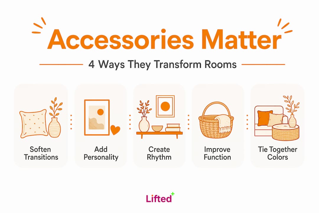
Accessories provide the “finishing touches” that complete a room narrative by adding personal interest, guiding the eye, softening transitions, and introducing moments of focus beyond furniture.
Think about what that means in practice. A well-placed ceramic vessel on a shelf draws your eye to a corner that would otherwise disappear. A piece of art in modern interiors creates a sightline that anchors the whole wall. A woven throw softens the geometry of a linen sofa and introduces warmth without a single structural change.
Accessories do four things that furniture simply cannot. They soften hard transitions between surfaces and materials. They provide focal points that give the eye somewhere to rest. They encourage exploration, pulling you deeper into a room. And they inject personality, the particular quality that makes a space feel like it belongs to someone rather than a catalogue. For artistic NZ interiors, this is not an optional layer. It is the layer that makes everything else cohere.
Fundamental principles for choosing accessories
Understanding why accessories matter is one thing. Knowing how to choose and place them is another. There are a few principles that separate a room that feels considered from one that feels randomly assembled.
Scale is everything. An accessory that is too small on a surface gets lost, visually swallowed by the surrounding space. An accessory that is too large dominates and crowds. Undersized accessories often feel “lost”, while oversized pieces can overwhelm a surface, and both problems trace back to poor scale and visual weight rather than the accessory itself being wrong. Before you buy, consider the surface area you are working with and aim for pieces that feel proportionate to it.
Grouping creates visual confidence. Scattered individual items rarely read well. A repeatable methodology for using accessories is to build small vignettes, anchor with one larger element, then layer smaller pieces with height variation and controlled overlaps to create a collected look. This approach gives even modest accessories a sense of intention and presence.
Here is a simple step-by-step approach to building a vignette:
- Choose one anchor piece that is the tallest or most visually substantial item in the group.
- Add a mid-height piece beside or slightly in front of it, ideally in a contrasting texture or material.
- Introduce a low, flat element such as a tray, a book, or a small sculptural object at the base.
- Step back and assess. Remove anything that competes with the anchor rather than supporting it.
- Leave deliberate negative space around the grouping so it can breathe.
Editing is a skill, not a compromise. Many people resist removing accessories because each piece feels meaningful. But negative space is not emptiness. It is the pause that makes the rest of the room legible. Layering decor objects works best when you are willing to remove as much as you add.
| Common mistake | What it looks like | How to fix it |
|---|---|---|
| Too many small items | Surfaces feel busy and restless | Group into vignettes, remove half |
| Mismatched scale | One tiny vase on a large shelf | Replace with a larger anchor piece |
| No height variation | Flat, uniform arrangement | Add tall, mid, and low elements |
| Ignoring negative space | Every surface is covered | Clear at least one third of each surface |
Pro Tip: When styling a shelf or console, try the “rule of three.” Group objects in odd numbers, vary the heights noticeably, and ensure at least one item introduces a different material or texture from the others.
Creating harmony: Accessories as tools for rhythm and cohesion
Once the basics are in place, accessories become something more sophisticated: tools for creating visual rhythm and a sense of cohesion across an entire room. This is where the real craft of interior styling lives.
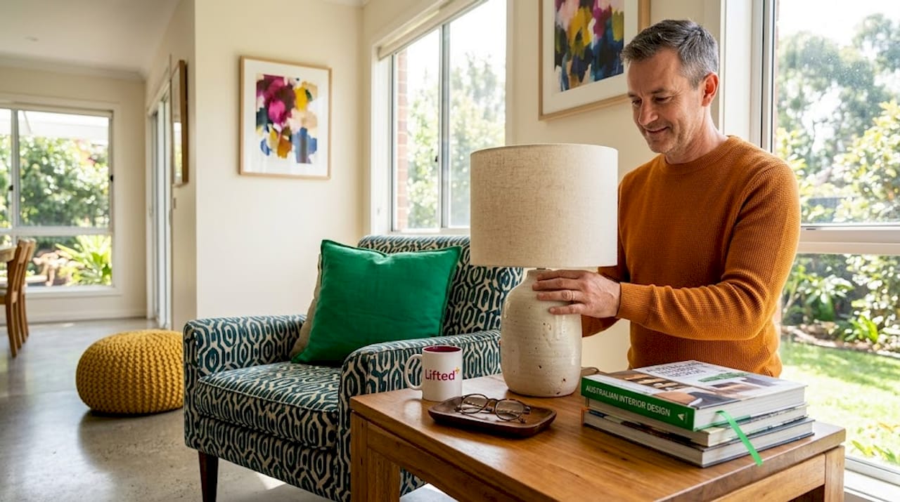
Interior styling professionals commonly frame accessories as strategic tools for contrast, warmth, rhythm, and visual cohesion, using technical evaluation such as scale, negative space, and sightlines rather than pure aesthetics. That distinction matters. It shifts the conversation from “does this look nice?” to “does this serve the room?”
Rhythm in a room is created by repetition with variation. Repeating a colour in three different places across a room, for example, a terracotta vessel, a cushion, and a framed print, creates a visual thread that ties the space together without making it feel matchy. Contrast, meanwhile, is what gives a room energy. A matte ceramic beside a polished brass object. A soft textile against a hard stone surface. These pairings create the kind of tension that makes a room interesting to inhabit.
Consider how accessories connect the elements of a room that might otherwise feel unrelated. A rug anchors a furniture grouping. A pendant light draws the eye upward and establishes vertical presence. A cluster of objects on a coffee table creates a centre of gravity in an open-plan space. Each of these moves supports the contemporary NZ home style that feels both curated and genuinely lived in.
To assess whether your accessories are working as a cohesive system, try these evaluations:
- Stand at the entrance to the room and identify where your eye travels first, then second, then third. Is that a sequence you intended?
- Check whether any surface is doing all the visual work while others sit empty and unresolved.
- Look for colour or texture that appears only once. A lone element rarely reads as intentional. Repeat it or remove it.
- Assess the current NZ styling trends for seasonal cues that can inform your palette refresh without requiring a full overhaul.
The goal is a room that rewards attention. Every corner should offer something, but nothing should shout over everything else.
Functional accessories: Mirrors, lighting, and optical tricks
Not all accessories are purely decorative. Some of the most powerful tools in a stylist’s kit are functional objects that also reshape how a room feels spatially and atmospherically.
Lighting and mirrors can be treated as functional accessories that manipulate perception of depth and space, and location matters enormously. A mirror placed opposite a window does not just reflect light. It doubles the sense of openness in the room, making a modest living area feel considerably more generous. A mirror positioned at the end of a hallway extends the perceived length of the space and draws the eye forward.
Lighting works in a similarly transformative way. A floor lamp positioned in a dark corner brings shape to the air around it, softening the geometry of the room and creating warmth that overhead lighting simply cannot replicate. Wall-washing lights, those positioned to skim light across a textured surface, add depth and drama that make a flat wall feel architectural.
Here is how to use functional accessories with intention:
- Place mirrors to reflect your best light source, whether that is a window, a pendant, or a well-positioned floor lamp.
- Use lighting tips for NZ homes to layer your light sources rather than relying on a single overhead fixture.
- Consider arranging lighting fixtures at different heights to create visual hierarchy and a sense of intimacy.
- Choose mirror frames as design objects in their own right. An arched rattan frame or a sculptural brass surround contributes to the room’s aesthetic even when you are not thinking about its reflective function.
Pro Tip: In smaller New Zealand apartments or open-plan spaces, a large mirror on a side wall can visually widen the room without any structural change. Pair it with a warm-toned lamp nearby and the effect is both spatial and atmospheric.
Curating a modern New Zealand home: A practical approach
All of this theory becomes most useful when it is translated into a clear, repeatable process. Whether you are starting from scratch or refining a room that already has good bones, the following framework gives you a way to approach accessorising with confidence.
- Assess your room honestly. Walk through it as a visitor would. Note where your eye goes, where it gets stuck, and where it finds nothing to hold its attention. These are your opportunities.
- Select with restraint. Fewer, larger pieces with texture-led warmth serve modern New Zealand spaces better than an accumulation of small items. Choose pieces that have presence, not just prettiness.
- Arrange by grouping and height. Apply the vignette methodology. Anchor, layer, and leave space. Resist the urge to fill every surface.
- Edit ruthlessly. Remove anything that does not contribute to the room’s story. This is not about minimalism for its own sake. It is about clarity and intention.
- Refresh seasonally. Accessories are the easiest element to update, and rotating them keeps your space feeling alive and personal. Swap a summer-weight textile for something richer in autumn. Introduce a new sculptural object when the room begins to feel stagnant.
Research supports the idea that mixing modern and classic forms by item category adds genuine depth. People respond differently to modern versus classic shapes depending on the object type, which means a contemporary sofa can sit comfortably beside a classically inspired ceramic or a vintage-style print without any visual conflict.
For modern NZ decor ideas that avoid the sterile, one-note look that can plague minimalist spaces, texture is your most reliable tool. Linen, ceramic, timber, glass, and woven materials each bring a different quality of light and touch to a room. When you style shelves with a mix of these materials, the result feels collected and considered rather than decorated.
Pro Tip: Before adding anything new to a room, spend one week removing items instead. The clarity that emerges will show you exactly what the space needs, and what it does not.
The real difference: Why accessories are the unsung heroes of design
Here is something we have observed consistently: the rooms that feel most alive are rarely the ones with the most expensive furniture. They are the ones where someone made deliberate, courageous choices about the objects that surround that furniture.
Most people under-accessorise out of fear of getting it wrong, or over-accessorise because editing feels like loss. Both responses come from the same place: treating accessories as decoration rather than as design decisions. Visual noise from over-accumulating small items is one of the most common issues in residential spaces, and the solution is almost always the same: group, layer by height, and leave deliberate negative space so accessories support the room’s focal point rather than competing with it.
The rooms that hold you, the ones you remember long after you have left them, are almost always defined by how their accessories were handled. Not by the sofa. Not by the floor. By the layering techniques applied to the objects that live alongside the furniture.
Our honest view is this: if your room feels unfinished, do not buy more furniture. Buy fewer, better accessories, and place them with intention. The difference between a room that feels designed and one that feels truly lived in is almost always found in that layer.
Elevate your space with unique accessories from Lifted+
If this guide has sparked the urge to rethink your own space, the next step is finding accessories that are genuinely worth placing. Not filler, not trend-driven afterthoughts, but pieces with real presence and artistic weight.
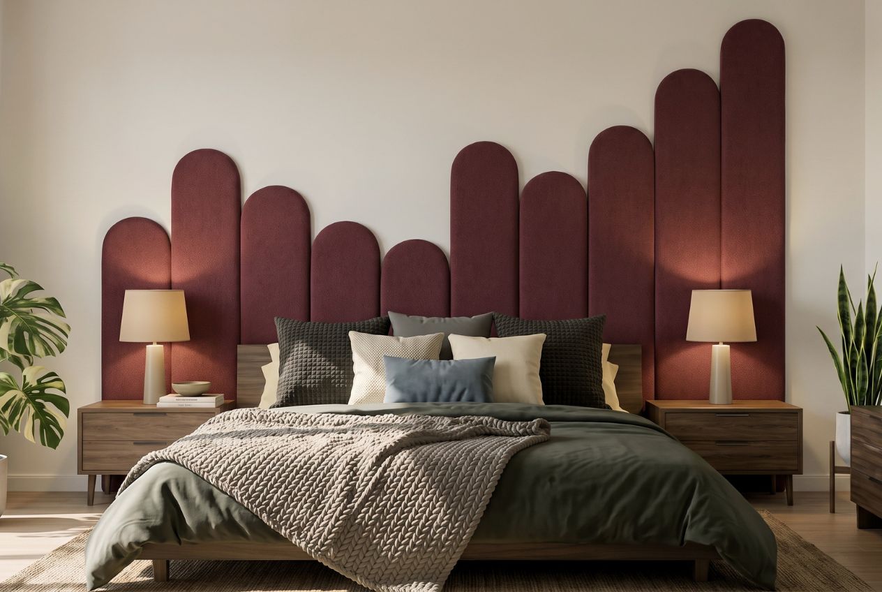
At Lifted+, we curate statement wall art, colourful furniture, and modern lighting options specifically for New Zealand homes that want to feel vibrant, considered, and complete. Our seasonal collections are built around sculptural form and grounded colour palettes, giving you the tools to transform blank corners, empty walls, and underworked surfaces into moments that hold the room. Explore the full range and find the pieces that belong in your space.
Frequently asked questions
How do you avoid clutter when accessorising a room?
Group accessories into small vignettes, vary their heights, and always leave negative space so the eye has room to rest. Building vignettes with one anchor piece and layered smaller elements creates a collected look without visual overwhelm.
What is the best way to choose accessory colours for a modern space?
Pick accessories that complement your dominant palette but add at least one item with contrasting colour or texture for visual interest. Texture-led warmth and fewer, larger pieces prevent a modern room from feeling one-dimensional.
Are mirrors and lighting really accessories in décor?
Yes, both can be used as functional accessories to reflect light and alter how spacious or lively a room feels. Mirrors and lighting manipulate perception of depth and space, making them among the most powerful tools available.
Can I mix classic and modern accessories in one room?
Mixing styles adds genuine depth, and it is supported by research showing that preferences for modern versus classic forms vary by item category, meaning the combination often works better than strict stylistic consistency.
How often should I update my accessories?
Refresh accessories seasonally, or whenever the room begins to feel stagnant, to keep your space feeling personal and alive. Because accessories are the most flexible layer of a room, they are also the easiest and most rewarding element to evolve over time.