

Mixing panel colours well comes down to three decisions: how much of each colour you use, whether their undertones agree, and how your own light treats them. Get those right and a blank rental wall becomes a renter-friendly feature wall that looks designed, not decided on a whim. Get them wrong and even good colours fight each other.
This guide is about colour combinations on modular wall panels, not about blending paint in a tin. If you came looking for a paint mixing chart, this isn’t that page. If you want to put three, four or five colours together on a wall you can’t paint or drill, read on.
Key takeaways
- Give each colour a job. A dominant colour, a supporting colour and a small accent give a mixed arrangement a clear hierarchy.
- Check undertones before you check hues. Warm and cool shades fight each other faster than bright and muted ones do.
- Your light decides the result. Look at your panels in morning, afternoon and lamp light before you commit.
- Test first. Colour samples and a few days of living with a layout will tell you more than any chart.
- Removable wall design lets you adjust. A palette that misses can be rearranged, extended or taken to your next home.
Table of Contents
- Why mixing panel colours feels harder than it is
- Start with a hierarchy: the 60-30-10 idea
- Read undertones before hues
- Let your light have the final say
- Build your mix in four moves
- Where the panels should go
- Borrow your palette from the place you live
- Palettes to try
- Mixing panels with art and mirrors
- Our perspective
- Try your palette before you commit
- Frequently asked questions
- Sources
Why mixing panel colours feels harder than it is
Most of us have been taught to fear colour in a rental. The walls are white or a tired beige, the lease says no painting, and the safest choice is one framed print and a lot of restraint. The trouble is that restraint, repeated across a whole home, is what makes rentals feel temporary.
Panels change the equation because the colour is physical and movable. You are not committing to a shade for years. You are arranging pieces, standing back, and moving them. That freedom is exactly why a little structure helps: with no cost to experimenting, it is easy to keep adding colours until the wall turns noisy.
The structure below is borrowed from interior designers and adapted for modular felt panels. It works whether you are mixing two shades or six.
Start with a hierarchy: the 60-30-10 idea
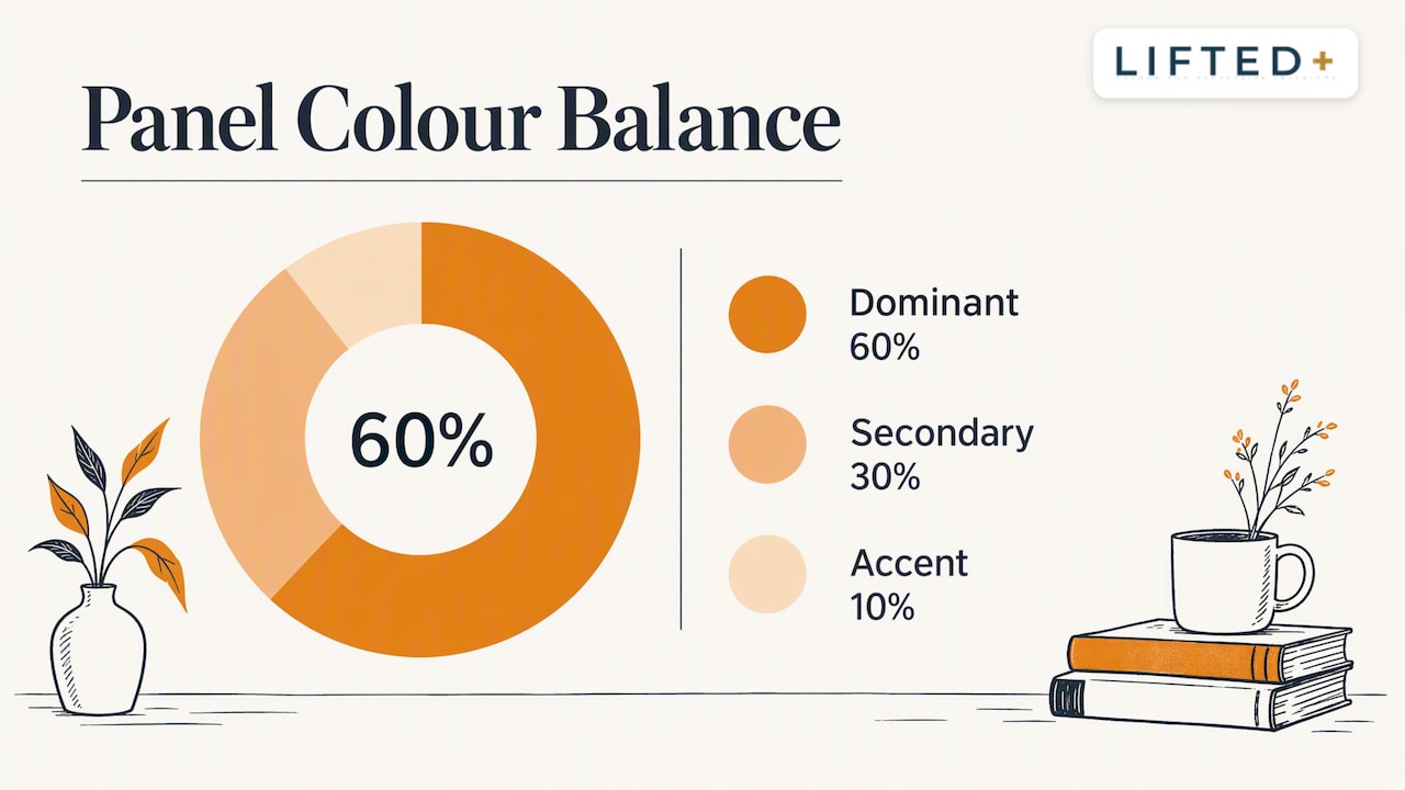
The most useful starting point is the 60-30-10 rule. It suggests choosing three main colours and giving each a purpose: roughly 60 per cent to a dominant base, 30 per cent to a secondary colour, and 10 per cent to a vivid accent. It is a reliable starting point for visual hierarchy rather than a strict law, and it translates neatly to panels.
On a panel wall, it might look like this:
| Role | Share of the arrangement | What it does | Example in a lounge |
|---|---|---|---|
| Dominant | About 60% | Sets the mood, quiets the wall | Soft putty or warm clay panels |
| Secondary | About 30% | Adds depth and rhythm | Deep forest green or ink blue |
| Accent | About 10% | Draws the eye, adds energy | Saffron, coral or a clear pink |
The percentages refer to the panel surface, but remember the room too. Your sofa, curtains and floor already hold colour. If the room is busy, let the panels take the 30 or even the 10, and keep the dominant role with the walls and furniture you already own. For a deeper look at how that balance carries across walls, panels and soft furnishings, this piece on balancing dominant and accent colours is worth a look.
The accent is the shade people hesitate over, and it is also where the personality lives. Keep it small and let it repeat once elsewhere in the room, a cushion, a vase, a book spine, so it reads as intention.
Read undertones before hues
Two greens can be miles apart. One leans yellow and feels like a fern in sunlight; another leans blue and feels like deep water. Place them side by side and the room will tell you something is off, even if you can’t say what.
That is undertone, and it is the quiet reason many mixed schemes go wrong. Designers describe the current mood in neutrals as a move away from cool greys toward warmer, grounding shades. In one survey reported by Domino, 93 per cent of the designers questioned agreed that cool “millennial grey” was out for 2026. Homes and Gardens reports the replacements as warmer neutrals such as greige, taupe and putty, with earthy greens and deeper browns joining them.
Why does that matter for panels? Because many rental walls are cool white or grey, and a warm-leaning panel palette can look wonderful against them, while a cool palette can look flat and clinical. Neither is wrong. What matters is that you choose on purpose.
A practical way to read undertones:
- Hold each colour sample against a plain white sheet of paper, not against the wall.
- Ask whether it tips toward yellow or red (warm) or toward blue or green (cool).
- Group the samples by temperature. Most good mixed palettes are mostly one temperature, with one deliberate exception.
If you want a no-paint way to train your eye, our short guide on reading warm versus cool colours walks through three quick tests, and our piece on warm and cool lighting explains why the bulbs in your lamps shift everything.
Let your light have the final say
Colour is never fixed. A terracotta panel in a north-facing New Zealand flat can look brown and heavy at 3pm and glow at dusk under a warm lamp. Homes and Gardens notes that designers wish people understood this: choosing a colour is less about the perfect hue and more about how its temperature reacts to the light in your specific home.
So test where the panels will live. Prop them up, or temporarily fix a few in place, and check them at three times of day: morning, mid-afternoon, and evening with your usual lamps on. Notice which colours sink and which sing. A dark colour that disappears in a shaded hallway may be exactly right in a bright living room.
Sheen and material matter too. Paint specialists point out that perceived colour depth is shaped by reflectivity as well as pigment, which is why the same shade can feel different in matte and in a higher sheen. Felt is a naturally matte, soft surface that absorbs light, so deep colours read rich and velvety rather than glossy. If your palette needs a touch of sparkle or contrast, bring it from a mirror, a metallic frame or a ceramic piece nearby.
Build your mix in four moves
Here is the approach we suggest to anyone planning a mixed-colour panel wall.
1. Choose the anchor
Pick the dominant colour first. Look at what is already in the room: the floor, the curtains, the largest piece of furniture. If the room is already full of colour, choose a dominant panel shade that quietly agrees with it. If the room is neutral, you have more freedom to be bold.
2. Add a supporting shade
Choose a second colour that sits beside the first on the colour wheel, or that shares its undertone. This is the 30 per cent, the colour that gives the arrangement depth. Analogous pairs, such as a clay and a rust, feel calm. Contrasting pairs, such as a teal and a clay, feel lively.
3. Place the accent last
Leave the accent until the other two are on the wall. Then try it in two or three positions. Near an edge it feels like a punctuation mark. In the middle it becomes the focal point. Close to the ceiling line it draws the eye upward, which can help in a low-ceilinged flat.
4. Live with it for a few days
The best advice we can give is the least glamorous: wait. Colours that look exciting at 9pm on a Saturday can feel loud by Tuesday morning. Our walkthrough on testing wall panel colour ideas for three days is built around this exact habit.
Where the panels should go
A mixed palette needs a stage. Designers advise that a successful feature wall draws attention to something already there, such as an alcove or a chimney breast, rather than being a random splash on a flat empty wall. If your rental has no natural focal point, treat the wall as part of the whole room’s scheme instead of an isolated moment.
In practice, rental homes often offer a few useful anchors:
- The wall behind a bed, where the headboard gives the arrangement a natural centre.
- The wall behind a sofa, especially when the panels are about two thirds the width of the sofa.
- A hallway or entry wall, where a bold mix has room to be dramatic because you only pass through.
- A desk wall in a home office, which gains from colour that energises without competing with a screen.
If you are considering a bold look for a short stay, our notes on colour blocking for renters compare paint with no-drill panels, and our feature wall ideas without paint offer more starting points.
Borrow your palette from the place you live
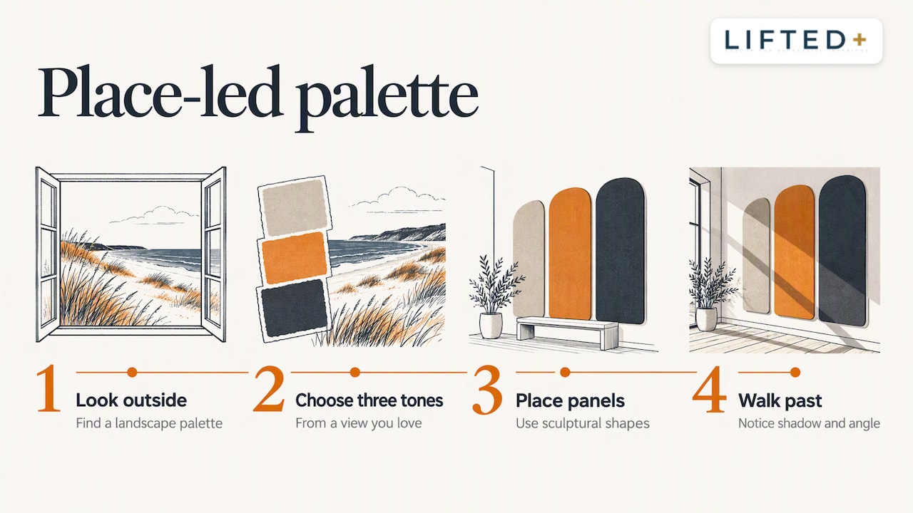
A useful trick from architecture is to stop staring at colour charts and look outside. In an interview with Resene’s magazine, architect Gerald Parsonson describes a coastal Te Horo bach where the palette was drawn from its dune landscape. That site-responsive thinking works at apartment scale too: even bold, contrasting colours feel pulled from a place rather than scattered.
In New Zealand, the local palette is generous. Think of pōhutukawa red against deep green, schist-grey and lichen yellow, kōwhai on bush shade, the pale sand and driftwood of a Canterbury beach, or the muted olive of a Central Otago hillside. Choose three tones from a view you love and you will have a palette that feels like home before you have placed a single panel.
The same source notes that designers sometimes use different colours on the edges of structural battens than on their faces, creating shifting depth when viewed from an angle. Our panels are cut to sculptural shapes, so shadow and angle do something similar. Walk past your arrangement and see how it changes. That subtle movement is part of what makes a mixed wall feel alive.
If your home has period character, colour decisions deserve extra care. This guide to choosing colours for heritage homes shows how to respect architectural detail while still adding colour, and that thinking applies equally to villas and bungalows where panels sit beside original timber and plaster.
Palettes to try
These are starting points, not rules. Adjust them to your light and the colours you already own.
Warm and grounded
A dominant putty or sand, a secondary terracotta, and a small accent of deep green. This is calm and earthy, and sits well against cool white rental walls because the warmth balances them.
Coastal and cool
A dominant soft grey-blue, a secondary deep navy, and an accent of warm coral. The single warm note stops the scheme from feeling cold.
Confident and playful
A dominant rich plum, a secondary dusty pink, and an accent of mustard. Best in a room with plenty of daylight, where deep shades will not turn heavy.
Quiet but considered
Two near neighbours in a single hue, such as a light and dark sage, with a tiny accent of rust. This is the safest route for first-time colour mixers who want impact without noise.
For wall layouts and colour inspiration across a whole room, our practical guide to mixing colours in interiors and tips for colourful interiors that actually work go further.
Mixing panels with art and mirrors
Panels do not have to carry the whole wall alone. A framed print, a mirror or a piece of limited edition art can serve as the accent, which lets the panels stay in the quieter dominant and secondary roles. Pull one colour from the artwork into the panels and the two will feel related.
The risk is competition. If the art is very busy, simplify the panel palette to two shades. If the panels are bold, give the art space around it. We explore this balance in mixing wall panels with art and in our ideas for curated art display.
Our perspective
We built DwellForms™ because we believe a rented home should be allowed to feel like yours. Too many interiors sit in the safe, polite middle: pale walls, careful furniture, nothing that says who lives there. Colour pulls a room out of that middle, and it should not require a bond dispute to try it.
What we see again and again is that people are not short of courage. They are short of a way to be wrong cheaply. A panel arrangement lets you place a green, step back, decide it is too sharp, and swap it for something softer. That freedom is the real product, more than any single shade.
Our advice is to commit to a hierarchy, keep your undertones friendly, and let the wall change over time. We chose nano-adhesive pads after testing several options, including one popular brand of pull-tab system that we deliberately set aside because the pads we selected performed significantly better in our own testing at minimising damage to walls. No adhesive is completely damage-proof, and not every wall surface suits it, so check your lease and test a small area first.
— Michelle
Try your palette before you commit
If you are still weighing colours, start small. Our colour samples let you hold the real felt against your own wall and light, and sample purchases are credited towards a full kit order. When you are ready, the Core Kits give you a complete arrangement, and Extension Kits let you grow it, or add an accent, later. The panels are made from 100% recycled PET felt, and because they are removable, they can come with you when you move.
Frequently asked questions
How many colours should I mix on one panel wall?
Three is a dependable number: a dominant, a secondary and an accent, following the 60-30-10 idea. You can go to four or five if some are close neighbours, such as two greens, but the arrangement still needs one clear lead colour. If the wall starts to feel busy, remove a colour rather than adding another.
Can I mix warm and cool colours?
Yes, with intention. Keep most of the palette in one temperature and use the opposite as a small accent, such as a warm coral against cool blues. Equal quantities of warm and cool tend to compete, particularly in rooms with cool white walls.
Will bright colours make a small flat feel smaller?
Not necessarily. Deep or saturated shades can make walls feel closer, but one bold wall with calmer surroundings often adds depth rather than taking it away. Keep the other walls light and let the panels act as the single feature.
What if I choose colours I later dislike?
That is the advantage of removable wall design. You can swap, rearrange or extend the panels, and order colour samples first to reduce the risk. Allow a few days of living with the layout before deciding.
Sources
- How the 60:30:10 rule can help with your interior design, Homebuilding
- 93% of Designers Agree This Color Is Out for 2026, Domino
- What’s Replacing Gray? The New Neutrals Designers Are Turning to in 2026, Homes and Gardens
- Light reflectance values and paint colour selection, Resene
- 9 questions with Gerald Parsonson, Resene Black White magazine
- How to use a feature wall, DIY Guides
Recommended
- No Paint Needed: 8 Renter-Friendly Color Palettes For NZ Rentals
- Mix Wall Panels With Art For Renters Who Want Colour Without Drilling
- Weekend Color Blocking Decor For Renters: Paint Or No Drill Panels
- Mixing Colours In Interiors: A Practical Guide
This article is for general information and inspiration only. Product performance and results may vary depending on individual circumstances, surfaces and installation.
