
TL;DR:
- Vibrant interior design uses saturated colors, sculptural forms, and intentional contrast to create expressive, lively spaces. It emphasizes balance with textures, Neutral anchors, and visual relief zones to maintain livability. Art and sculptural decor offer flexible focal points, allowing rooms to evolve without permanent commitment.
Vibrant interior style is defined by saturated hues, sculptural forms, and mood-first design that pulls a space out of the safe, polite middle and into something genuinely felt. It represents a significant shift after 20 years of muted tones dominating residential design, with colours like emerald green, mustard yellow, and burnt orange now anchoring rooms with presence and intention. This is not decoration for decoration’s sake. Vibrant interior design is about creating spaces that express who you are, shape how you feel, and hold their own long after the trend cycle moves on. The key is knowing how to balance that intensity with texture, proportion, and visual breathing room.
What are the defining features of vibrant interior design?
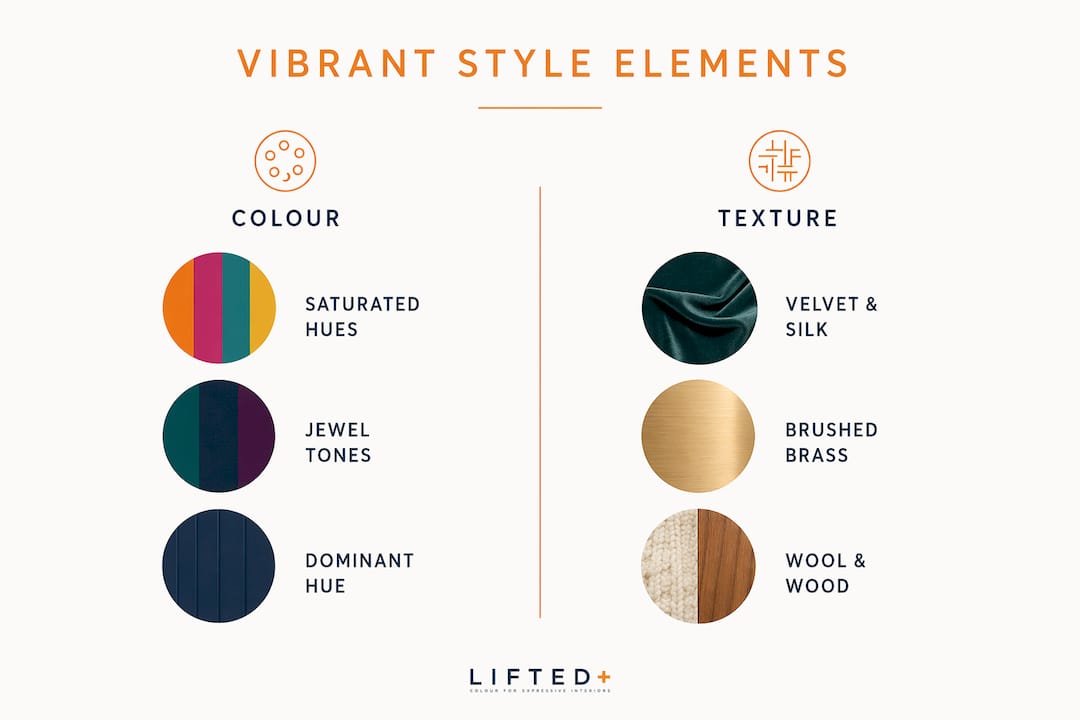
Vibrant interior style is characterised by saturated hues, sculptural forms, and a deliberate emotional atmosphere. It is not about throwing bold colours at a wall and hoping for the best. The approach demands intention: every colour choice serves a mood, every form earns its place in the room.
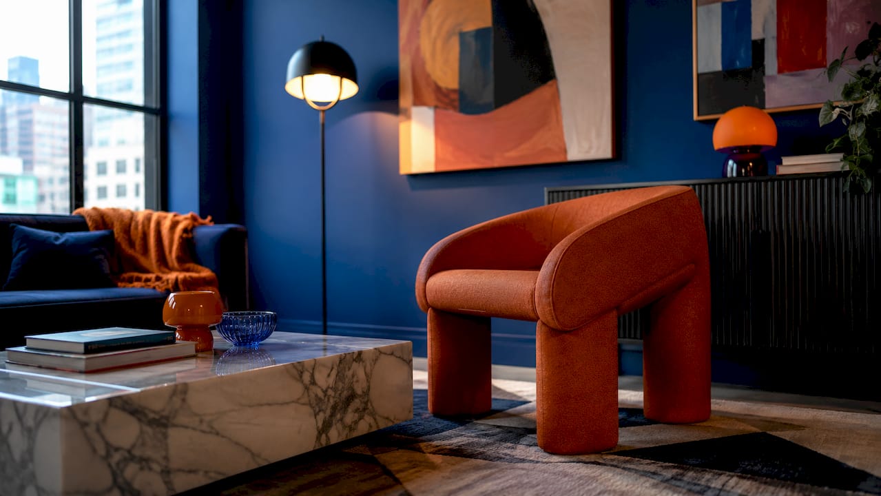
The concept of grounded contrast sits at the heart of this style. Designers pair vibrant palettes with earthy textures and neutral architectural anchors so the boldness reads as confident rather than chaotic. A room dressed in jewel tones needs a counterweight. Burnt orange velvet on a sofa lands differently against raw linen walls than it does against white gloss cabinetry.
Colour proportion matters as much as colour choice. The most effective vibrant rooms use one dominant hue as a focal point, supported by one or two complementary tones and a grounding neutral. Think of it as a composition, not a collection.
| Vibrant palette | Balancing neutral | Grounding texture |
|---|---|---|
| Emerald green | Warm white or oatmeal | Raw linen, rattan |
| Mustard yellow | Charcoal or slate | Matte plaster, wool |
| Burnt orange | Terracotta or sand | Velvet, aged timber |
| Cobalt blue | Pale grey or cream | Brushed metal, cotton |
| Deep plum | Warm beige | Silk, dark wood |
Pro Tip: Start with your dominant colour and choose your neutral before you select anything else. The neutral sets the temperature of the whole room and determines whether your vibrant hue feels warm and grounded or cool and electric.
How can art and sculptural decor enhance vibrant interiors?
Art and sculptural decor are the most flexible tools in vibrant interior design. A large-scale artwork or a sculptural furniture piece can define the entire personality of a room without requiring a single coat of paint. That flexibility matters enormously, particularly for renters or anyone who wants their space to evolve over time.
The role of art here goes beyond decoration. Colour and pattern in murals or wall art add warmth, personality, and a sense of narrative that colour alone cannot achieve. A piece of vibrant wall art introduces bold hues into a space while also telling a story, creating an emotional anchor that furniture rarely manages on its own.
Sculptural furniture works differently. A chair with an unusual silhouette in a deep jewel tone becomes a focal point that shapes how the rest of the room is read. It brings shape to the air around it. The role of sculptural accents in a vibrant interior is to give the eye somewhere specific to land, which actually makes the overall composition feel calmer and more considered.
The practical advantage of art and sculptural pieces is that they are movable and replaceable. You can shift a statement chair from the living room to the bedroom, swap a large print for a new season’s work, and let your space grow with you rather than locking you into a single vision.
Pro Tip: Choose art that shares at least one tonal value with your dominant wall or furniture colour. You do not need an exact match. You need a conversation between the piece and the room so the art feels placed, not dropped.
What balances and textures are essential for livability in vibrant spaces?
Texture is the invisible engine of vibrant style. Materials like velvet, silk, metal, and wood influence how light moves through a space and how saturated colours are perceived. A cobalt blue wall in a matte finish reads as grounded and moody. The same blue in a gloss finish feels electric and expansive. Neither is wrong, but they create entirely different atmospheres.
The principle of tonal consistency is more useful than colour matching. Mixing matte and reflective surfaces grounds vibrant hues by giving the eye variation in depth and finish rather than a single flat field of colour. This is how a room full of bold colour can still feel calm.
Visual relief zones are a critical design strategy for preventing sensory exhaustion. A neutral rug in an otherwise saturated room gives the eye a place to rest. An unadorned architectural element, a plain ceiling, or a stretch of bare wall performs the same function. Without these zones, even a beautifully composed vibrant interior can feel relentless after an hour.
| Texture | Effect on vibrant colour | Best paired with |
|---|---|---|
| Velvet | Deepens and enriches hue | Jewel tones, deep plum, emerald |
| Rattan | Warms and softens | Mustard yellow, burnt orange |
| Brushed metal | Adds cool contrast | Cobalt blue, teal |
| Matte plaster | Grounds and quiets | Any saturated hue |
| Aged timber | Adds organic warmth | Terracotta, rust, olive |
| Wool | Absorbs light, adds calm | Bold reds, deep greens |
Pro Tip: If your room feels overwhelming, add texture before you remove colour. A wool throw, a rattan side table, or a matte ceramic vase will absorb visual energy and restore balance without sacrificing the boldness you worked to build.
How do designers create cohesion and rhythm across vibrant rooms?
Cohesion in vibrant interiors comes from rhythm and tone, not from matching colours room to room. A home where every space shares the same palette quickly becomes monotonous. The goal is a linked narrative: each room has its own personality, but they all speak the same tonal language.
Designers achieve this by translating a palette through proportion and material language rather than repetition. If your living room is anchored by a deep emerald sofa, the hallway might carry that same green in a smaller form, perhaps a ceramic piece or a framed print, while the bedroom shifts to a warmer olive. The family resemblance is there without the repetition.
Practical strategies for colourful interiors that work across multiple rooms include the following approaches.
Use one consistent material throughout the home, such as aged timber, brushed brass, or matte ceramic, to create a through-line that connects rooms without relying on colour alone. Repeat a single accent colour in small doses across every room so the eye picks up the thread as it moves through the space. Let large colour fields, entire walls, cabinetry, or ceilings, carry the dominant hue rather than scattering it across accessories. This simplifies the composition and gives each room a decisive base.
Treating colour as an organiser rather than an accessory is more effective than adding colour through cushions and throws. Painting an entire ceiling in a warm terracotta or committing to deep green cabinetry in a kitchen creates a structural colour statement that the rest of the room can respond to clearly.
What practical steps can you take to create vibrant interiors at home?
The most common mistake in vibrant interior design is starting with a colour rather than a feeling. Vibrant homes blend drama with functionality, and that balance begins with emotional intent. Ask yourself what the room should feel like before you decide what it should look like.
Once you have your emotional anchor, use colour as an organising principle. Choose one dominant hue and commit to it on a large surface. From there, build outward with complementary tones and grounding textures. The bold colour trends for 2026 point toward autumnal palettes, deep terracottas, warm ochres, and forest greens, all of which lend themselves to this layered, grounded approach.
Here is a practical sequence for incorporating vibrant style into your home.
- Define the mood. Choose one word that describes how you want the room to feel: warm, energised, contemplative, celebratory. Let that word guide every decision.
- Select your dominant colour. Choose a saturated hue that serves your mood and commit it to a large surface, a wall, a sofa, or cabinetry.
- Choose your neutral anchor. Pick a neutral that either warms or cools your dominant colour and apply it to the surrounding architecture.
- Layer texture before you layer colour. Add velvet, rattan, wool, or timber to give depth and visual variation before introducing a second accent colour.
- Introduce art or sculptural pieces. Use a large-scale artwork or a statement furniture piece to add personality and a focal point. Explore vibrant decor ideas for art-led approaches that work particularly well in New Zealand homes.
- Create visual relief zones. Identify one or two areas in the room where the eye can rest: a neutral rug, an unadorned wall, or a simple architectural feature.
- Edit rather than add. Once the room is dressed, remove one thing. Vibrant interiors earn their power through confidence, not accumulation.
Pro Tip: Affordable ways to experiment with vibrant style include swapping cushion covers for jewel-toned alternatives, adding a single large-format print in a bold palette, or painting one internal door in a saturated hue. These are low-commitment moves that let you test a colour’s presence in your specific light conditions before committing to larger surfaces.
Key takeaways
Vibrant interior style succeeds when bold colour is grounded by tonal consistency, purposeful texture, and deliberate visual relief rather than applied at random.
| Point | Details |
|---|---|
| Start with emotional intent | Define the mood of the room before selecting any colour or decor. |
| Use grounded contrast | Pair saturated hues with earthy textures and neutral anchors to maintain livability. |
| Texture before more colour | Add velvet, rattan, or timber to absorb visual energy before introducing a second bold hue. |
| Art and sculpture as entry points | Large-scale art and sculptural pieces introduce bold colour flexibly and without permanent commitment. |
| Cohesion through tone, not matching | Connect rooms through shared tonal language and material choices rather than repeating the same colour. |
Why I think most people approach vibrant interiors the wrong way
Most people who want a vibrant home start by buying things. A bold cushion here, a colourful vase there, a print they love from a market. The room ends up feeling busy rather than bold, and they conclude that vibrant style is not for them. It is not the colours that failed. It is the sequence.
The rooms that genuinely hold you, the ones that feel alive without feeling exhausting, always start with a decision about atmosphere rather than aesthetics. Studio Telha Clarke’s Melbourne penthouse, Vivace, is a good example. The discipline of refinement alongside bold colour is what makes it liveable. Every bold choice is answered by something quieter. The drama is real, but so is the calm.
What I have found, working with vibrant colour across many spaces, is that texture does more heavy lifting than most people expect. You can keep an intensely saturated room feeling grounded simply by varying the finish and weight of your materials. Matte plaster next to velvet next to aged timber creates a kind of visual rhythm that the eye reads as rest, even when the colours are anything but restful.
The other lesson worth holding onto: do not rush the edit. A vibrant interior is not finished when everything is in place. It is finished when you remove the one thing that was competing for attention. That restraint is what separates a bold space from a chaotic one.
— Michelle
Discover vibrant decor at Liftedplus
Liftedplus curates colour-led furniture, wall art, and lighting designed specifically for modern New Zealand homes. Whether you are building a vibrant interior from scratch or adding a single statement piece to an existing space, the Liftedplus collection brings together sculptural form and grounded colour palettes that hold a room with presence.
For renters or anyone who wants to experiment without permanent commitment, the rental-friendly decor ideas guide offers ten approaches that work beautifully within vibrant styling. The Liftedplus Mood Library also provides curated mood boards to help you find your tonal direction before you buy a single thing. Bold living starts with a clear vision, and Liftedplus is built to help you find yours.
FAQ
What is vibrant interior style in simple terms?
Vibrant interior style is a design approach that uses saturated colours, sculptural forms, and mood-driven choices to create expressive, emotionally rich living spaces. It is the deliberate opposite of neutral, minimal interiors.
How do I stop a vibrant room from feeling overwhelming?
Include visual relief zones such as a neutral rug, a plain wall, or unadorned architectural features to give the eye a place to rest. Varying textures like matte plaster, velvet, and timber also absorbs visual energy and restores calm.
What colours define vibrant interior design?
Jewel tones and earthy saturated hues define the style most clearly, including emerald green, mustard yellow, burnt orange, cobalt blue, and deep plum. These colours work best when paired with a grounding neutral and varied textures.
Can I achieve vibrant style without repainting my walls?
Large-scale wall art, sculptural furniture, and statement textiles introduce bold colour without permanent changes, making them ideal for renters or anyone testing a palette before committing to a full renovation.
Is vibrant interior design suitable for small spaces?
Vibrant style works well in small spaces when colour is applied to a single dominant surface and balanced with lighter neutrals and varied textures. A small room with one deeply coloured wall and considered lighting can feel more alive than a larger room dressed in safe tones.
Recommended
- How To Style Bold Interiors That Still Feel Calm – Lifted+ | More Colour. More Mood. More Life.
- How To Style Modern Interiors: A 2026 Guide
- A Guide To Styling With Optimistic Colours – Lifted+ | More Colour. More Mood. More Life.
- Interior Design Trends Bold Colour 2026 – Lifted+ | More Colour. More Mood. More Life.