
TL;DR:
- Accent walls allow homeowners to add depth and personality to a space without complete room overhauls. When placed strategically, they create focal points and reinforce existing architectural features, promoting cohesive and intentional design. Incorporating accent walls into layered, thoughtful palettes enhances modern NZ interiors while minimizing risks of trend obsolescence.
Most people assume that transforming a room requires repainting every surface, committing to a new palette, and hoping for the best. That assumption keeps a lot of beautiful design decisions permanently on hold. Understanding why use accent walls changes that entirely. A single wall, treated with intention, can anchor the whole room, introduce depth and mood, and give your space a personality it simply did not have before. For New Zealand homeowners working with modern interiors and considered colour palettes, accent walls offer something rare: genuine impact with a manageable level of risk.
Table of Contents
- What is an accent wall and why does it matter in your home?
- How to choose and balance colours with the 60-30-10 rule
- Materials and cost considerations: paint vs wallpaper for accent walls in New Zealand
- Strategic placement: where and how to use accent walls effectively
- Making your accent wall artistic and cohesive: repeating colour and texture
- Accent walls in the context of modern New Zealand interior design trends
- Why accent walls work best as part of an intentional design plan, not in isolation
- Explore modern home decor to complement your accent wall
- Frequently asked questions
Key Takeaways
| Point | Details |
|---|---|
| Accent wall purpose | Accent walls create a focal point and add depth without overwhelming the whole room. |
| Colour balance | Use the 60-30-10 colour rule to harmonise your accent wall with your room. |
| Cost choice | In New Zealand, paint accent walls are generally cheaper than wallpaper accents. |
| Strategic placement | Select a natural focal wall like behind a bed or fireplace for best impact. |
| Colour repetition | Repeat accent colours in décor items to integrate the wall cohesively. |
What is an accent wall and why does it matter in your home?
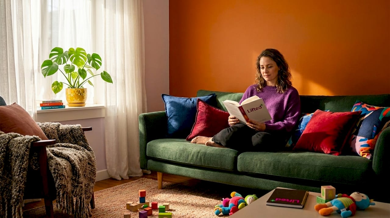
An accent wall is one wall within a room that differs from the others in colour, texture, or material. That difference is deliberate. It creates a clear focal point and adds visual interest without requiring you to rethink the entire room. The rest of the walls recede, and the accent wall steps forward. It holds the room.
The most effective placements tend to be walls that already carry some architectural weight. Think behind a bed where the headboard sits, behind a fireplace, or along the primary sightline as you enter a living area. These positions work because the eye is already travelling there. You are not manufacturing a focal point so much as reinforcing one that already exists.
This is also why accent walls appeal so strongly to homeowners who want to update a space without wholesale change. Committing to a full room repaint in a deep forest green or a terracotta that leans almost rust is a significant decision. A single wall lets you test that colour, live with it, and assess whether you want more or whether that one surface is exactly enough. Consider the modern accent wall principles that guide this kind of considered placement.
The core benefits of an accent wall include:
- Establishing a visual focal point that anchors furniture arrangement
- Adding depth and dimension to rooms that feel flat or unresolved
- Introducing personality and character without overwhelming the space
- Allowing you to experiment with bold colour, texture, or pattern at lower risk
- Drawing attention away from less attractive architectural features
How to choose and balance colours with the 60-30-10 rule
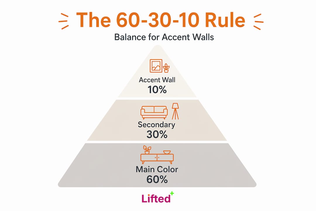
Colour is where accent walls either land beautifully or unravel entirely. The most reliable framework designers use is the 60-30-10 colour ratio: 60% dominant wall colour throughout the room, 30% supporting colour in furnishings and soft goods, and 10% accent colour carried by that feature wall or key accessories.
The logic behind this ratio is proportion. When your accent wall represents roughly ten percent of the visual field, it reads as intentional punctuation. It does not fight for dominance. It simply draws the eye at the right moment, in the right amount.
One of the most common mistakes is choosing an accent colour in isolation, often because it looked striking in a store or on a paint swatch. A far stronger approach is to identify a colour already present in the room, perhaps in a cushion, a rug, or a piece of art, and amplify it on the wall. This creates cohesion. The accent wall feels discovered rather than imposed. For help building balanced colour palettes from the ground up, it helps to start with what you already own and love.
Light also plays a significant role. A warm terracotta can glow in afternoon light and feel flat at midday. A deep sage reads entirely differently under artificial lighting in the evening. Observe your chosen wall at multiple points during the day before committing.
Consider these colour principles when planning your accent wall:
- Select a colour that echoes something already present in your existing decor
- Test paint samples across at least 30cm x 30cm patches before deciding
- Warmer tones create intimacy; cooler tones tend to feel more expansive
- Finish matters: matte absorbs light and reads as softer; satin or eggshell adds subtle reflectivity
- Avoid chasing trend colours that will feel dated in two seasons
Pro Tip: If you are uncertain about committing to a deep colour, paint a large piece of card or board in your chosen shade and move it around the room at different times of day before touching the walls.
Materials and cost considerations: paint vs wallpaper for accent walls in New Zealand
Before you settle on a treatment, it is worth understanding what each option actually costs in the New Zealand market. Interior painting typically costs $25 to $55 per square metre, while wallpaper supply and installation runs between $50 and $120 per square metre. For a standard bedroom feature wall of roughly nine to twelve square metres, that is a meaningful difference.
Paint is faster, easier to change, and gives you near-unlimited colour choice. For homeowners who want to refresh a space every few years, it remains the most practical option. A quality interior paint applied over a well-prepared wall can look exceptional and last well over a decade.
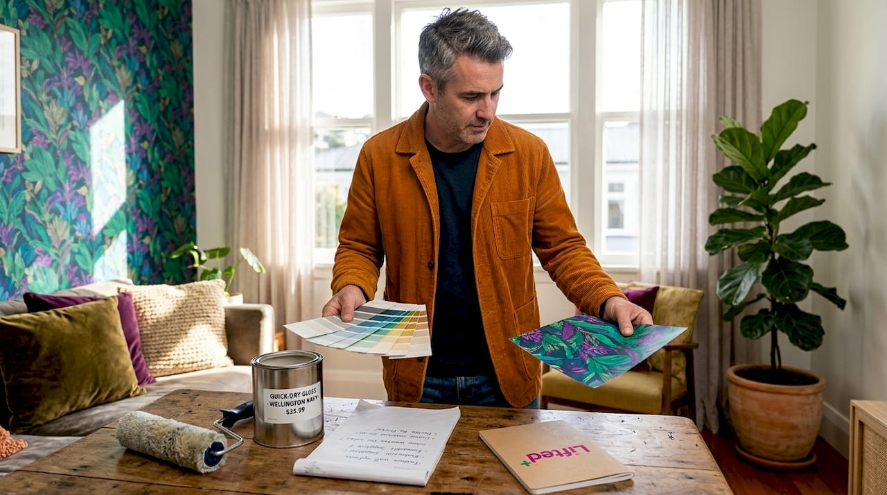
Wallpaper brings something paint cannot: tactile texture, pattern, and visual complexity. A textured wallpaper in a warm ochre or a botanical print in muted greens adds layers of interest that a flat paint finish simply cannot replicate. It is a higher-commitment choice, both financially and in terms of installation time. Wall condition also matters significantly. Poorly prepared surfaces will telegraph every imperfection through wallpaper in a way they might not under paint.
| Treatment | Approximate NZ cost per m² | Texture options | Ease of change | Best for |
|---|---|---|---|---|
| Paint | $25 to $55 | Limited | High | Colour focus, flexibility |
| Wallpaper | $50 to $120 | High | Moderate | Pattern, depth, texture |
| Temporary wallpaper | $15 to $40 | Moderate | Very high | Renters, low-commitment looks |
For renters or anyone wanting to experiment without permanence, temporary peel-and-stick wallpaper has improved dramatically in quality and range. It offers a genuine design option without the risk of bond disputes or removal damage.
Pro Tip: If your walls have minor imperfections, a textured wallpaper will hide them far more effectively than a high-sheen paint, which tends to amplify any unevenness under direct light.
Strategic placement: where and how to use accent walls effectively
Knowing where to place your accent wall is as important as knowing what to put on it. Placement determines whether the wall feels purposeful or arbitrary. When it is right, you barely notice the decision. The room simply feels resolved.
Follow these placement steps for the strongest result:
- Identify the wall your eye travels to first when entering the room.
- Consider what sits in front of that wall: a bed, a sofa, a fireplace, a significant piece of furniture.
- Assess the sightlines from adjacent rooms or hallways where the wall will be partially visible.
- Confirm that the chosen wall has minimal interruptions: fewer doors, windows, or awkward angles.
- Decide whether you want the wall to recede with a deep tone or advance with something warm and saturated.
One less obvious idea worth considering: the ceiling. Treating the ceiling as a subtle fifth wall, with a slightly deeper tone than the surrounding surfaces, adds a sense of enclosure and intimacy that feels considered without being obvious. It works particularly well in dining rooms and bedrooms where you want the space to feel sheltered.
Multiple accent walls in a single room rarely work unless they are handled with exceptional skill. More often, they create competition. The eye does not know where to rest. For accent wall placement tips applied to specific room types, the principle stays consistent: one strong wall, well chosen, beats three competing for attention.
Making your accent wall artistic and cohesive: repeating colour and texture
An accent wall only holds a room when the rest of the space speaks the same visual language. Isolation is the enemy of good design. Repeat the accent palette at least two to three times elsewhere in the room through cushions, a throw, artwork, or a piece of furniture to integrate the wall into the whole composition.
This principle of repetition is what separates a random bold decision from a considered design moment. When your deep slate wall is echoed in the tone of a linen cushion and the frame of a nearby artwork, the room feels curated. When it stands alone against furnishings that share no visual relationship, it reads as a mistake someone has not yet corrected.
Texture adds another dimension to this. A wall treated with a limewash finish or a fine textured plaster brings tactile presence that paint alone cannot. That same sensibility, carried through in a woven rug or a sculptural ceramic, builds a cohesive material story across the room. Consider exploring cohesive colour repetition through artwork that bridges your wall treatment and the rest of your furnishings.
Key principles for artistic cohesion include:
- Echo the accent wall’s dominant hue in at least two other decorative elements
- Match the emotional weight of the wall: a bold dark wall needs confident furnishings, not timid neutrals
- Choose art whose palette references the wall rather than clashing with it
- Use the adjacent trim and ceiling as quiet anchors that let the wall speak without competition
Pro Tip: If your accent wall is a warm earthy tone, introduce one matte black element nearby. The contrast sharpens the warmth of the wall and gives the whole arrangement more presence.
Accent walls in the context of modern New Zealand interior design trends
Design conversations in New Zealand have shifted noticeably in recent years. The once-popular notion of the single standout wall sitting against stark white surroundings is giving way to something richer. Homeowners are increasingly drawn to layered, immersive colour environments where tones move across walls, ceilings, and furnishings in a continuous conversation.
Designer Chad Dorsey advises against standalone accent walls when trends shift towards total immersion and layered design. That is not a dismissal of accent walls. It is an argument for using them more intelligently. An accent wall embedded within a layered palette, where the adjacent walls carry a related but lighter tone, reads as far more sophisticated than one bold wall marooned in white.
This matters for New Zealand homeowners because our light, our architecture, and our relationship to natural materials all favour a grounded, considered approach to colour. Deep ochres, warm terracottas, and muted sage greens feel at home here. They work particularly well as accent treatments when the surrounding palette echoes them in softer registers.
“When an accent wall functions as part of a broader design intention, it stops being a trend choice and starts being a design decision.”
Trends worth considering in 2026 include:
- Moving from isolated bold walls to tone-on-tone rooms with a single surface stepping forward
- Incorporating natural material walls, stone veneer, or textured plaster, as the accent rather than painted colour alone
- Using accent walls in modern NZ design trends that favour autumnal palettes and grounded earthy tones
- Treating colour as continuous rather than contained, letting accent walls breathe into adjacent spaces
Why accent walls work best as part of an intentional design plan, not in isolation
Here is something that rarely gets said clearly enough: a bold wall chosen without a plan is not a design decision. It is a guess with a paintbrush. We have seen it many times. A homeowner is inspired by something they encounter online, they choose a deep colour, they paint one wall, and then they wonder why the room feels unresolved. The wall is fine. The room around it was never considered.
The problem is not the accent wall itself. It is the belief that a single dramatic surface will do all the work. Accent walls work best when they are part of an intentional overall plan, not just a single bold paint choice. The wall should move the eye towards something worth seeing. It should reinforce the room’s function and mood. It should feel like the natural consequence of every other decision in the space.
Think of an accent wall the way a composer thinks of a crescendo. It has power precisely because of what surrounds it. The quiet passages make it land. Without that context, it is just noise.
The homeowners who use accent walls most effectively are the ones who plan backwards. They start with the mood they want the room to hold, then choose a palette that serves that mood, then identify which surface would carry the deepest or most complex colour most naturally. The wall is the last decision, not the first. When you approach it that way, the result never feels arbitrary. For deeper thinking on intentional design planning, start with the room’s architecture and let the colour follow.
Chasing trends is the other common trap. Accent wall colours that peak in a particular season can feel dated within a couple of years. Choosing a colour because it connects to something enduring in your own aesthetic, something you would return to regardless of what is trending, will serve your space far longer.
Explore modern home decor to complement your accent wall
Your accent wall sets the tone. Now the rest of the room needs to answer it. At Lifted+, we curate modern home decor for NZ interiors that works precisely in this way: furniture, lighting, and wall art selected for colour weight, sculptural presence, and their ability to hold a room alongside a considered feature wall.
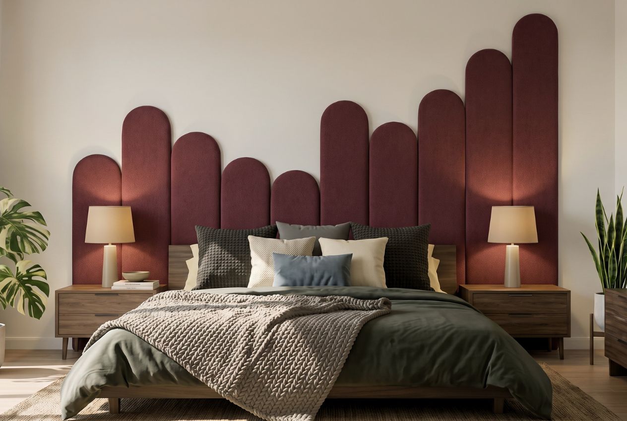
Whether you are repeating an earthy tone through a statement art piece or grounding a bold wall with a beautifully weighted light fitting, every element in our collection is chosen to support how decor personalises your space rather than compete with it. If you are ready to move beyond the single wall and consider the room as a whole composition, explore our home decor styles for NZ spaces and find the pieces that will carry your palette all the way through.
Frequently asked questions
What is the easiest wall to make an accent wall in my home?
Choose a wall that naturally draws the eye, such as behind your bed, fireplace, or primary seating area, so the contrast feels intentional rather than accidental.
Can I use multiple accent walls in one room?
Multiple accent walls tend to compete for attention and leave the space feeling visually inconsistent. It is best to limit them to one or two carefully selected, high-impact positions.
Is painting an accent wall cheaper than wallpaper in New Zealand?
Yes. Painting costs $25 to $55 per m² compared to $50 to $120 per m² for wallpaper supply and installation, making paint the more cost-effective choice for most homeowners.
How do I make sure my accent wall fits with the rest of the room?
Repeat the accent colour at least two to three times around the room in cushions, artwork, or furnishings so the wall feels integrated rather than isolated.
Are accent walls still relevant in 2026?
Accent walls remain a strong design tool, particularly for experimenting with bold colour at lower risk. The most considered approach now is to embed them in layered designs rather than treating them as standalone statements.