
TL;DR:
- Achieving vibrant, cohesive interiors involves understanding undertones, purposeful seasonal palettes, and strategic placement of colour.
- Choosing colours that match your home’s natural light and architecture ensures harmony and long-lasting appeal, especially in variable New Zealand conditions.
Achieving vibrant, cohesive interiors is one of the more quietly frustrating challenges facing design-conscious New Zealand homeowners. The goal is clear: a home that feels warm, expressive, and distinctly yours, built around colour-led interior inspiration rather than safe, forgettable neutrals. Yet most rooms end up either too muted to excite or too busy to settle into. The difference almost always comes down to three things: understanding undertones, choosing a seasonal palette with purpose, and knowing exactly where colour earns its place. This guide walks you through all three, with practical criteria, 2026 trend insights, and expert-backed layering techniques tailored to New Zealand homes.
Table of Contents
- Key criteria to choose your seasonal colour palette
- Popular seasonal palettes for vibrant NZ interiors
- Comparing colour palettes: warm cocooning vs earthy vibrancy
- Practical layering tips for a vibrant, cohesive interior
- Making the right choice: matching palettes to your lifestyle and space
- Fresh perspective: why undertone consistency transforms colour-led interiors
- Find curated decor to bring your vibrant NZ interior to life
- Frequently asked questions
Key Takeaways
| Point | Details |
|---|---|
| Undertone consistency | Choosing a consistent warm or cool undertone family is essential for a harmonious interior colour palette. |
| Layering strategy | Layer walls, trims, ceilings, and accents in varying tones and finishes to create depth and avoid monotony. |
| Adapt to NZ light | Consider your home’s natural light direction and intensity to select colours that maintain warmth and character. |
| Seasonal palettes | Use popular seasonal palettes like Dulux Evoke for autumn/winter warmth or earthy vibrant tones for year-round impact. |
| Curated decor integration | Extend your palette into furniture, lighting, and artwork for a cohesive and personalised design statement. |
Key criteria to choose your seasonal colour palette
Before you pick a single shade, you need a decision-making framework that suits the particularities of New Zealand living. Good colour-led interior inspiration is not about following a trend verbatim. It is about reading your home accurately and choosing colours that behave well inside it.
The most important first step is identifying your home’s dominant undertone. As colour analyst Abby Button explains, the same logic used in personal colour analysis applies directly to walls: start by identifying whether your space leans warm or cool, and then select shades within that undertone family. This prevents the “almost right but never quite working” effect that plagues so many DIY colour schemes.
New Zealand’s natural light is famously changeable. The quality of light in Auckland’s humid north differs markedly from the crisp, cool brightness of Wellington or the golden-hour intensity of Central Otago. Your undertone choices must account for this. Warm undertones in terracotta, amber, and burnt sienna tend to hold their richness even in flat, overcast light. Cool undertones in sage, slate, and dusty blue can feel stark without enough layering to support them.
Beyond undertones, undertone selection guidance reminds us that layering within an undertone family creates harmony rather than monotony. The practical hierarchy looks like this: walls carry the base tone, trims and ceilings offer a slightly lighter or deeper variation, and accents introduce controlled punctuation. Matching paint finishes to material textures, think a satin wall beside a raw timber shelf, adds the kind of dimensionality that separates a well-designed room from one that just has nice colours.
Pro Tip: Test paint samples at three different times of day: morning, midday, and evening under artificial light. New Zealand homes, particularly those with south-facing rooms, can shift a colour two or three tones depending on the hour. What looks like a warm ochre at noon can read as a muddy brown by 7pm.
For deeper guidance on building a palette that works architecturally, the team at Lifted+ has put together a practical approach to modern interior design that integrates colour hierarchy with furniture and lighting decisions.
With the selection criteria clear, the next step is to explore the seasonal palettes making an impact in New Zealand interiors right now.
Popular seasonal palettes for vibrant NZ interiors
Two palette families dominate 2026 seasonal conversations in New Zealand: warm, expressive cocooning tones and grounded earthy vibrancy. Both draw on New Zealand’s landscape as a reference point, but they serve different emotional registers.
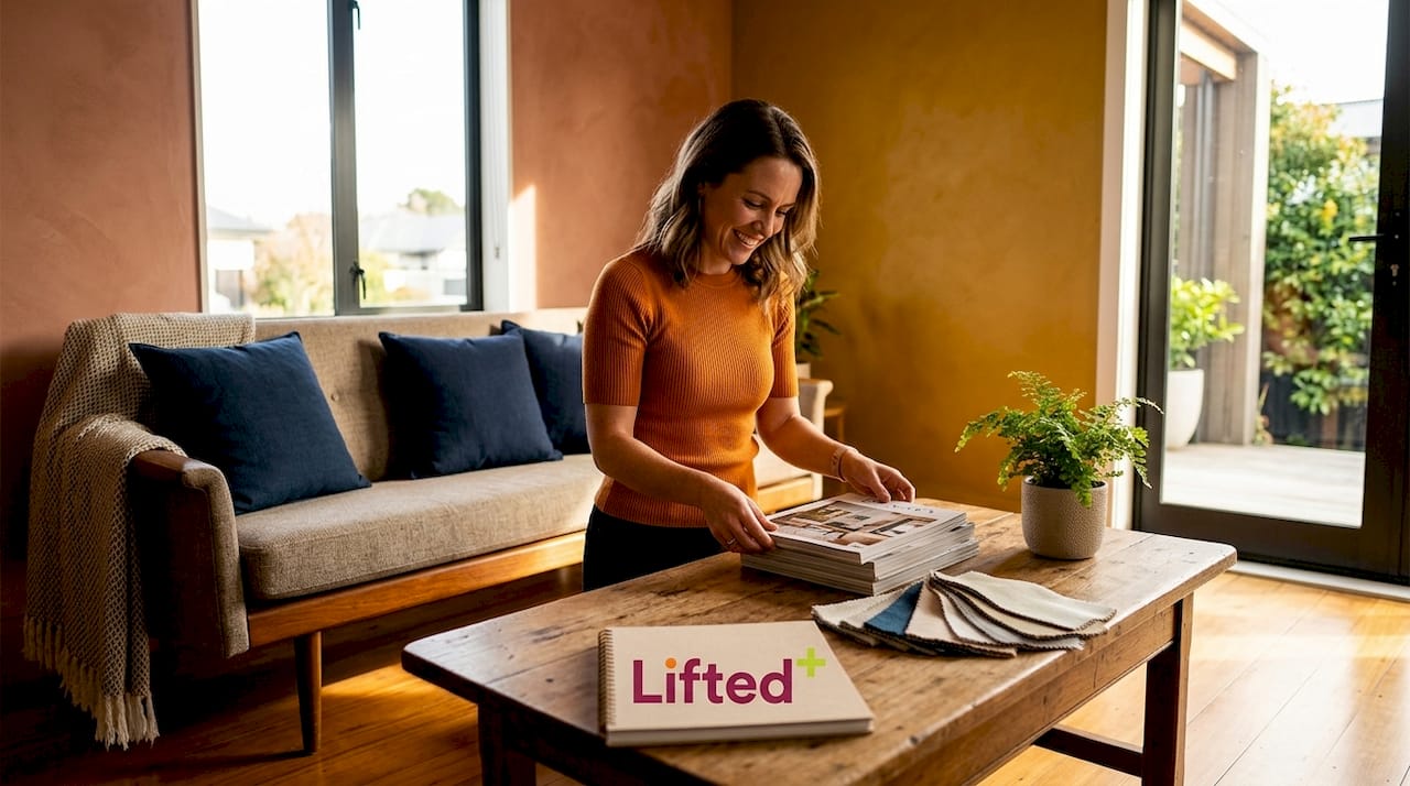
Dulux’s Autumn/Winter 2026 “Evoke” collection is built around cocooning and emotional warmth, using clay pinks, muted oranges, and warm mustards as versatile bases, with deeper accents in red, aqua, and purple to add tension and contrast. This palette is designed specifically to shift interiors away from the cool minimalism that dominated the last decade, toward something more expressive and emotionally present. It works beautifully in living rooms and bedrooms where comfort is the primary goal.
Resene’s 2026 direction leans into ochres, olive greens, and stone greys, shades that feel genuinely rooted in the New Zealand landscape. Their recommendation for layering for depth is one of the most practical pieces of seasonal advice available: use the lightest tone on walls, introduce a slightly deeper or cleaner white on trims and ceilings, and bring accent colours into doors, alcoves, and built-ins. This creates considered depth without the risk of visual overload.
Here is how the two palette approaches compare at a glance:
| Palette family | Key tones | Best suited rooms | Mood effect |
|---|---|---|---|
| Dulux Evoke (warm cocooning) | Clay pink, muted orange, warm mustard | Bedroom, lounge, dining | Comfort, intimacy, retreat |
| Resene earthy vibrancy | Ochre, olive green, stone grey | Kitchen, hallway, study | Grounded, sophisticated, alive |
| Accent options (both) | Deep red, aqua, purple, warm terracotta | Feature walls, cabinetry, doors | Focal drama, visual rhythm |
Earthy palettes remain particularly strong for NZ interior styling trends in 2026 because they age gracefully. A room built on olive and stone in 2026 will still feel intentional in 2030. Trend-chasing with saturated, ultra-specific shades is far riskier over a longer horizon.
Pro Tip: Use warm mustard or ochre in a room that receives morning light but little afternoon sun. The colour will absorb and amplify early light beautifully, making the space feel energised when you most need it to.
Comparing colour palettes: warm cocooning vs earthy vibrancy
Understanding which palette suits you requires more than aesthetic preference. It requires an honest look at your home’s architecture, scale, and how you actually live inside it.
The warm cocooning approach works best in rooms designed for rest and retreat. Its muted oranges and clay pinks create emotional warmth without demanding attention, and the deeper accent tones add just enough tension to prevent the scheme from reading as flat or timid. For New Zealand homes with smaller rooms or limited glazing, this palette is particularly forgiving. It softens a space rather than shrinking it.
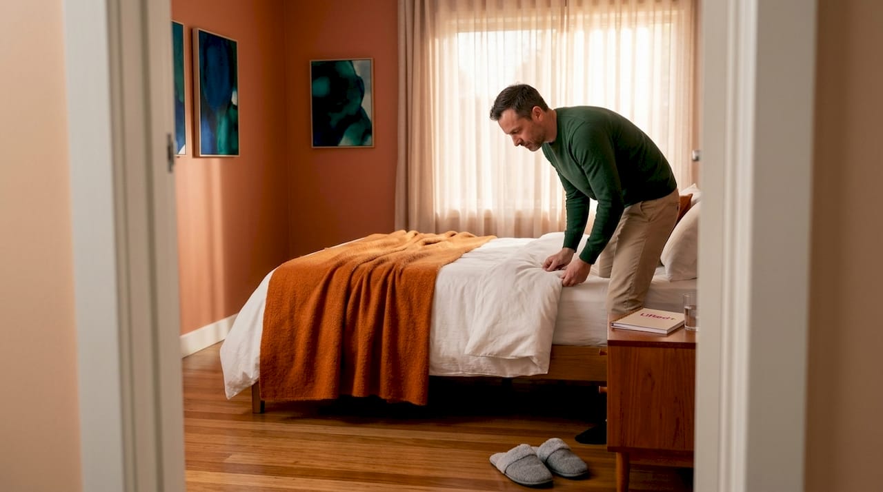
Earthy vibrancy, by contrast, carries more architectural confidence. Deep greens, soft charcoals, and warm oranges layered with soft neutrals create what designers describe as a “lived-in depth,” a quality that makes a room look considered rather than decorated. This palette rewards scale. Open-plan kitchens, generous hallways, and double-height living areas carry earthy, saturated tones with more authority than a compact bedroom ever could.
| Consideration | Warm cocooning | Earthy vibrancy |
|---|---|---|
| Best room scale | Small to medium | Medium to large |
| Natural light requirement | Low to moderate | Moderate to high |
| Mood delivered | Comfort, intimacy | Sophistication, energy |
| Risk factor | Can read as dull without accents | Can feel heavy without neutrals |
| Accent colour intensity | Medium, deep tones sparingly | Bold, used with restraint |
The common mistake with both approaches is reaching for contrast colours too frequently. A bold teal door or a deep terracotta alcove holds the room precisely because everything around it is quieter. Overuse turns a focal point into noise. Reserve your strongest colour decisions for bold colour applications where they can genuinely do their job.
Practical layering tips for a vibrant, cohesive interior
Layering colour is a skill, not an instinct. Most people understand the concept of base colours and accents, but far fewer know how to sequence them effectively across a room. Here is a practical approach.
-
Begin with your largest surface. Paint walls in your base tone, whether warm clay or soft ochre, and let it settle for at least 48 hours before making further decisions. Colours shift significantly once they dry and once furniture and natural light interact with them.
-
Coordinate trims and ceilings with intention. Resene guidance recommends walls in the lightest tone, with trims and ceilings introduced in a slightly different white or a marginally deeper variation of the same hue. This defines architectural edges without breaking the room’s tonal continuity.
-
Introduce accent colours in structural elements rather than soft furnishings first. Doors, cabinetry, and built-in joinery hold colour with more permanence and authority than cushions or throws. A deep olive door in a warm-toned hallway anchors the palette in a way a cushion never could.
-
Apply what designers call colour choreography: repeat a colour or tone across multiple elements in a room to create visual rhythm. A terracotta lamp beside a terracotta ceramic vase beside a warm-toned artwork creates continuity without matchy-matchy sameness.
-
Layer material textures within the same undertone family. A room built on warm tones benefits from raw timber, linen, and brushed brass, not chrome, cool stone, or bright white polyester. Material choices carry undertones just as paint colours do.
Pro Tip: Think about mood lighting as the final layer of colour. Warm-toned bulbs amplify earthy palettes beautifully in the evening. Cool LEDs flatten them. The right globe can make your palette sing at night just as it does at midday.
Making the right choice: matching palettes to your lifestyle and space
Choosing a seasonal palette is ultimately an act of self-knowledge. The most technically correct colour scheme will feel wrong if it does not align with how you actually live.
Consider your home’s light orientation first. A north-facing New Zealand living room receives generous, warm light for much of the day. It can handle cooler undertones, sage, dusty blue, warm grey, without the palette feeling cold. A south-facing room, however, needs the warmth built into its base tones to compensate for flat light. As Wellington Decorators note, NZ’s changing light conditions demand warmer undertones and deliberate layering to ensure colours feel comfortable across the full day.
Think honestly about how you use each room. A home where entertaining is central benefits from bolder, more energetic accent colours, deep burnt orange, olive, teal, placed in communal spaces. A home that is primarily a retreat benefits from muted, enveloping tones in living and sleeping areas, with bolder colour limited to hallways and bathrooms where it can surprise without overwhelming.
Colour should feel like an extension of personality, not a performance. The best interiors are the ones where colour choices seem inevitable, as though the home could not have been any other way.
Large, open spaces carry saturated colours with ease. Smaller, cosier rooms respond better to muted earthy hues that add warmth and texture without pressing in on the space. And wherever you land on the palette spectrum, carry a thread of your favourite tone through the furnishings, artworks, and objects you choose. A timeless vibrant interior is built on repetition and restraint working together.
Fresh perspective: why undertone consistency transforms colour-led interiors
Here is something most colour guides quietly skip over: the single most common reason a colour-led interior fails is not a bad palette choice. It is undertone inconsistency.
When you mix warm and cool undertones in the same space, even with colours that look harmonious on a sample chip, something subtle breaks down. The room never quite settles. Shades that should amplify each other instead compete. A warm terracotta wall beside cool-undertoned timber joinery and a bluish-white trim produces exactly this tension. Nothing is technically wrong with any individual choice. Together, they create visual dissonance that is hard to name but impossible to ignore.
The principle is the same one that makes seasonal palettes work in personal colour analysis: identify the undertone family first, warm or cool, and only then select your specific shades. This is the step most people skip because it feels abstract. But it is the step that determines whether your palette feels designed or merely assembled.
Undertone consistency also solves what we call the “adaptation problem” in New Zealand homes. As light shifts across the day, colours that share an undertone family shift together harmoniously. Colours that do not share an undertone can look acceptable at noon and genuinely uncomfortable by dusk. Consistency gives your palette resilience across those transitions.
This principle extends beyond paint. The undertone of your timber floors, your stone benchtops, your upholstery, all of it needs to sit within the same family for the room to feel resolved. It is the difference between a room that holds together and one that pulls apart at the seams. Once you begin seeing undertones as the architecture beneath the colour, the design decisions get considerably easier. Explore interior styling trends in NZ through this lens and you will start reading spaces in a completely different way.
Find curated decor to bring your vibrant NZ interior to life
You have the palette knowledge. Now it is time to bring it into the room with pieces that earn their place.
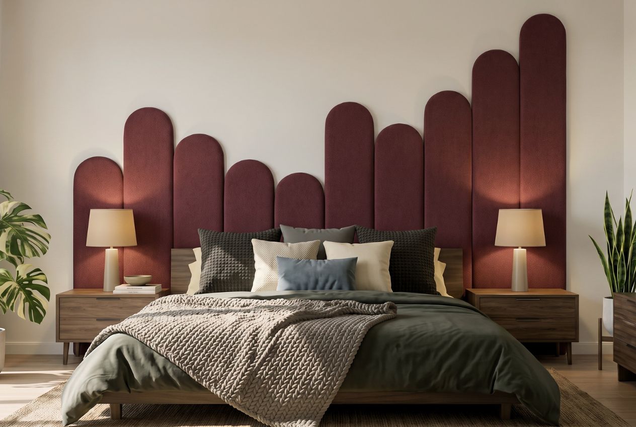
At Lifted+, every piece in our modern home decor NZ range is selected with colour-led interiors in mind. From sculptural lighting that amplifies warm undertones to colourful furniture built around 2026’s earthy and cocooning palettes, our curation is designed to complement the layering approach described throughout this guide. We also offer a strong selection of wall art for modern homes that works as both a palette anchor and a focal point, giving your seasonal colour scheme the artistic presence it deserves. Explore the range and find the pieces that make your palette feel inevitable.
Frequently asked questions
What is the best way to start choosing a colour palette for my NZ home?
Begin by identifying whether your home’s natural light and existing features favour warm or cool undertones, then select colours within that family for cohesion. Colour analyst Abby Button recommends this undertone-first approach to prevent clashes and build genuinely harmonious palettes.
How can I ensure bold colours don’t overwhelm my rooms?
Layer colours using lighter wall tones with accents limited to trims, doors, or feature walls, balancing vibrancy with calm neutrals. Resene advises a strategic wall, trim, and accent hierarchy to keep bold colour intentional rather than overpowering.
Which paint finishes work best to add texture and depth?
Mix a variety of finishes from flat to satin or super gloss, combined with textured materials like timber and linen to create layered depth. OneRoof reporting highlights that mixing finishes and materials adds dimension that a flat colour scheme alone cannot achieve.
Can I mix warm and cool tones in one interior palette?
It is best to commit to one undertone family per space to avoid clashing colours, as mixing warm and cool tones typically disrupts cohesion unless expertly balanced. Experts recommend selecting your undertone direction first to prevent combinations that look “almost right” but never fully resolve.