
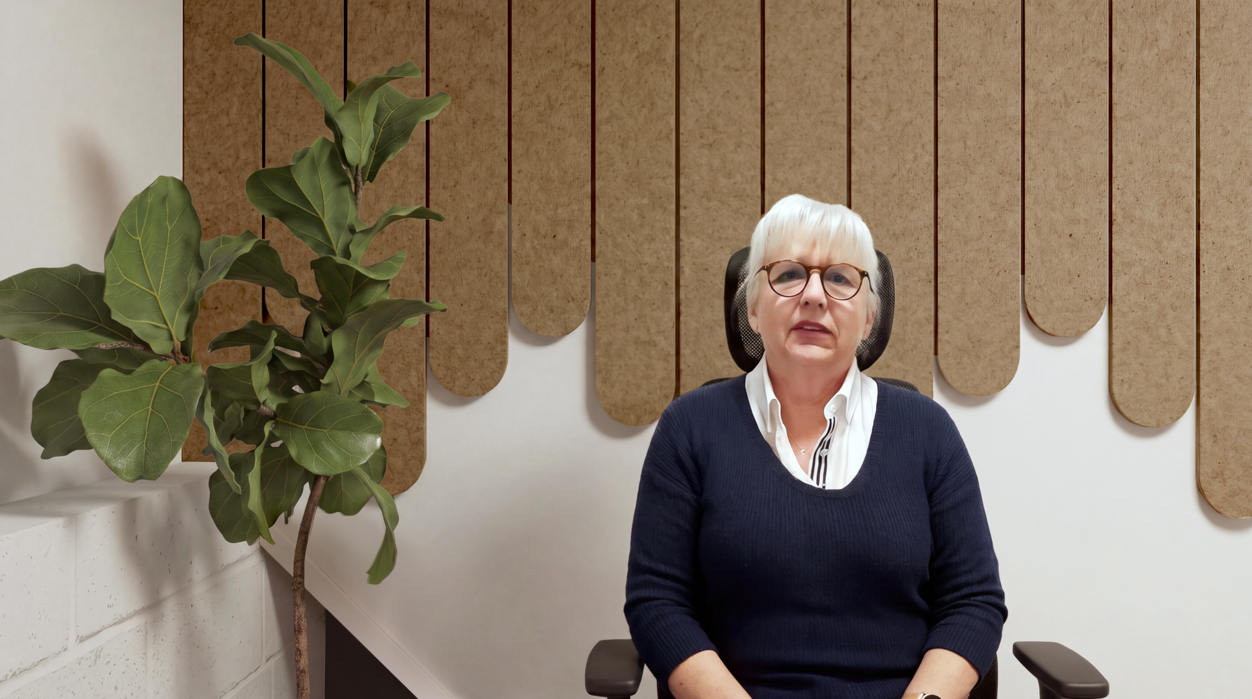
When your work happens on camera, your background matters.
For Monica, that mattered more than most.
For most people working online, the background behind them is largely aesthetic.
For Monica, it has a job to do.
Monica teaches sign language online, which means her hands and facial expressions need to remain clearly visible throughout every lesson.
That created a problem traditional virtual backgrounds couldn’t easily solve.
Zoom and Teams backgrounds can struggle with fast hand movement, sometimes blurring or partially masking fingers and hands as they move across the frame.
So Monica generally avoided them.
But that left another challenge.
She often chose dark-coloured tops because they helped make her hands more visually distinct on screen. At the same time, she worried that against the existing background, her fair hair and colouring could become washed out or visually lost.
She wanted more freedom in what she could wear.
And she wanted her teaching space to look considered and professional without compromising the thing that mattered most:
clear visual communication.
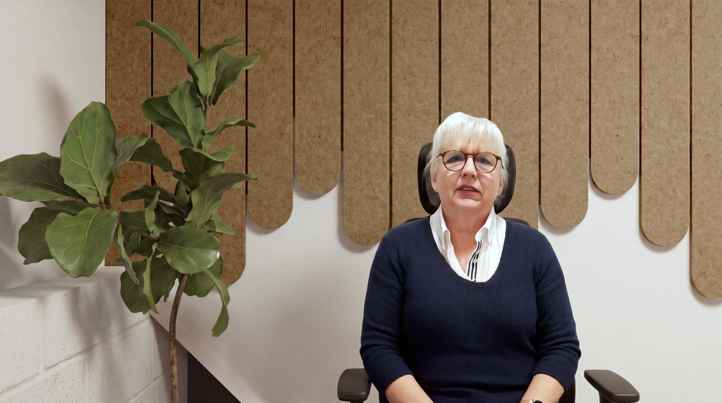
Table of Contents
The challenge
This wasn’t simply a question of:
What colour would look nice behind Monica?
The background needed to work on several levels.
It had to:
- provide useful contrast behind skin tones
- work with different clothing colours
- avoid creating excessive visual distraction
- complement the existing white walls
- work with the unusual geometry of the wall behind Monica
- remain visually interesting without competing with her hands and face
And, importantly, it had to be a real physical background rather than a digital one.
Why virtual backgrounds weren’t the answer
Virtual backgrounds are incredibly useful for many online meetings.
But sign language creates a more demanding visual situation.
Hand movement is fast, detailed and frequently moves across the body and background.
Where software is attempting to separate a person from their surroundings in real time, that can sometimes result in fingers, hands or edges becoming blurred or partially disappearing.
For Monica, that made a physical background a more appropriate option.
Rather than trying to digitally replace what was behind her, we looked at how the actual wall could work better on camera.
The DwellForms solution
Linear Feature in Warm Ochre
For Monica’s space, we recommended:
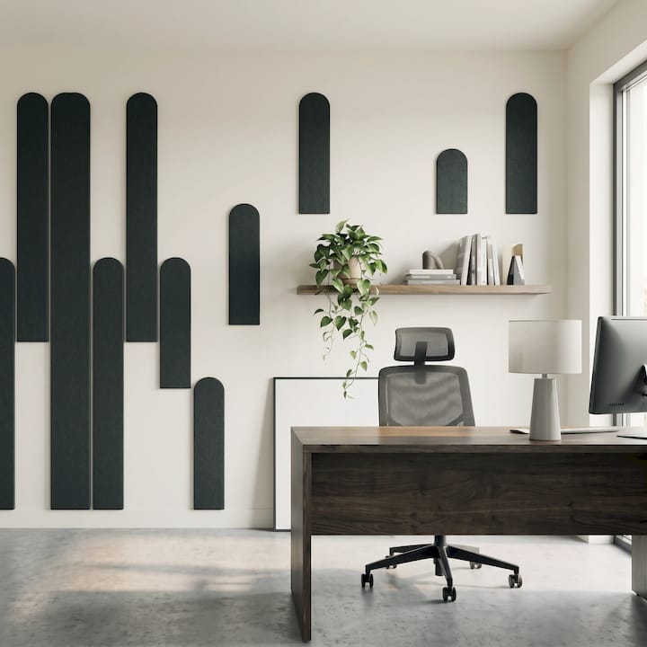
DwellForms™ Linear Feature
Colour: Warm Ochre
Warm Ochre offered a particularly useful balance.
It introduced warmth and texture to the white room without becoming visually loud.
It also worked beautifully with blue — one of the colours Monica already wore successfully on camera — while creating enough differentiation from skin tones to help her hands remain visually distinct.
The aim wasn’t to create the strongest possible contrast at any cost.
It was to create balanced contrast.
A background can be too busy just as easily as it can be too bland.
Warm Ochre gave us a middle ground: distinctive enough to frame Monica visually, but quiet enough not to compete with her signing.
Colour wasn’t the only consideration
The geometry of Monica’s wall introduced another challenge.
Behind her was a triangular niche.
One possible installation would have run the panels upward from the lower section of the wall.
Visually, it worked.
Practically, however, it would have meant cutting individual panels to precise angles to accommodate the architecture.
It would also have drawn greater attention to the triangular shape.
Instead, we recommended running the panels from the top edge downward.
Why?
Two reasons.
1. It simplified installation.
The panels could retain their original form without the need to precisely trim multiple pieces to different angles.
2. It changed what the eye noticed.
Rather than outlining and emphasising the triangular niche, the descending panels visually softened it.
Good design isn’t always about adding something.
Sometimes it’s about deciding what not to draw attention to.
The recommended layout
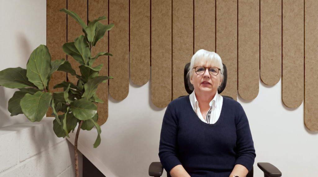
DwellForms Accent Feature in Warm Ochre, arranged from the upper edge downward to create a balanced on-camera backdrop while visually softening the niche behind Monica.
The final design creates a vertical rhythm behind Monica without placing strong shapes immediately around her head, face or hands.
The Warm Ochre sits comfortably alongside the existing white wall, while the irregular panel lengths prevent the background from feeling flat or corporate.
There’s enough happening to make the space feel designed.
But not so much that the wall becomes the star of the lesson.
That distinction mattered.
An alternative layout we considered
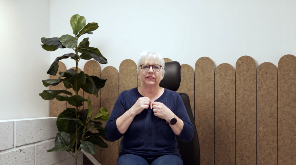
An alternative upward-running composition explored during the design process.
The alternative arrangement created a different visual effect, with the rounded ends rising upward behind Monica.
Although attractive, it presented a more complicated installation around the angled architecture and placed greater emphasis on the wall geometry.
The comparison demonstrates something important about modular design:
the same kit can solve a space differently depending on how it is arranged.
There isn’t necessarily one universal “correct” layout.
There is a layout that works best for the particular room, person and purpose.
What is the best background for online sign language teaching?
A good physical background for online sign language teaching should provide clear visual separation without excessive pattern or distraction.
In practical terms, that means considering:
- contrast between skin tone and background
- contrast between clothing and background
- lighting
- the visibility of hands throughout their movement
- visual clutter
- camera position
- background colour
- whether software-generated background effects interfere with movement
There is no single background colour that will work for every person.
Skin tone, hair colour, clothing, lighting and camera settings all influence the result.
For Monica, Warm Ochre provided an effective balance across those variables.
The result
The redesigned background gives Monica something a virtual background couldn’t:
A real backdrop designed around the way she works.
It gives her:
- a warmer and more professional-looking teaching environment
- a background that doesn’t rely on software masking
- useful visual differentiation behind her hands
- greater flexibility in clothing choices
- a wall treatment that works with, rather than fights, the existing architecture
And visually?
The room feels considerably more intentional.
This is what we mean by design solving a problem
DwellForms wasn’t created simply to cover blank walls.
The interesting part begins when you ask:
What does this wall actually need to do?
Sometimes the answer is to bring colour into a rental.
Sometimes it’s to anchor a bedroom.
Sometimes it’s to make a home office feel less like the spare room.
And in Monica’s case, the wall needed to become a better background for visual communication.
Same product.
Completely different problem.
That’s where modular design gets interesting.
Looking for a better background for your own workspace?
Whether you’re teaching, consulting, creating content or spending half your life on Teams calls, the wall behind you has become part of your workspace.
It may as well work for you.
Explore DwellForms™
Modular PET felt wall panel kits designed to bring colour, texture and form to the spaces where life actually happens.
Colour. Form. Lift.™