
TL;DR:
- Colour-led home accents use vibrant hues to influence mood and personality through strategic lighting and decor.
- Applying the 60-30-10 rule, understanding colour psychology, and matching temperature enhance overall harmony.
- Smart controls and proper layering create sophisticated, adaptable spaces that reflect intentional design choices.
Colour-led home accents are the deliberate use of vibrant hues, whether through paint, textiles, or colour-changing LED lighting, to shape the mood, depth, and personality of a room. This guide to colour-led home accents covers the foundational principles you need: the 60-30-10 colour rule, colour psychology, LED lighting types, and practical installation steps. Whether you are working with a rented flat or a home you own, the same core principles apply. Brands like Philips Hue and Govee have made dynamic, colour-responsive lighting accessible at every budget, and the results, when done with intention, are genuinely transformative.
What is the guide to colour-led home accents built on?
Every successful colour-led interior starts with a clear framework for choosing and balancing hues. The industry standard for this is the 60-30-10 rule, which divides a room’s colour into 60% dominant, 30% secondary, and 10% accent proportions. That 10% is where colour-led accents live, and it is a surprisingly powerful slice of the visual field. A single terracotta cushion, a deep teal LED strip behind a bookcase, or a sculptural lamp in burnt amber can hold an entire room together when the proportions are right.
Colour psychology and what hues actually do
Colour psychology is not abstract theory. Blues and soft greens lower perceived stress and slow the pace of a room, which is why they work so well in bedrooms and reading nooks. Reds and warm oranges raise energy and appetite, making them natural choices for dining areas and social spaces. Yellows and golds carry optimism and warmth without the aggression of red. Understanding these effects lets you choose accent colours with purpose rather than instinct alone.

Natural light is the variable most people underestimate. Bright rooms support bolder shades, while rooms with limited daylight need softer, more restrained tones to avoid a heavy, closed-in feeling. A deep plum that looks sophisticated in a north-facing room flooded with afternoon light can feel oppressive in a south-facing bedroom. Crown Paints’ Grape Escape and Candy Clay are two accent shades that demonstrate this well: both read differently depending on the light they sit in, which is why testing matters.
Pro Tip: Place paint samples or switch your LED strip to a candidate colour at three different times of day: morning, midday, and after dark with artificial light on. The colour you see at 7pm is the one you will live with most.
How do you choose the right LED colours for your home?
LED lighting for home accents falls into two main categories: RGB and RGBW. RGB strips combine red, green, and blue diodes to produce a wide spectrum of colours. RGBW adds a dedicated white diode, which produces cleaner, more natural whites that RGB alone cannot replicate. For most living spaces, RGBW is the better choice because it gives you both vibrant accent colours and a usable warm white for everyday lighting.
Understanding colour temperature
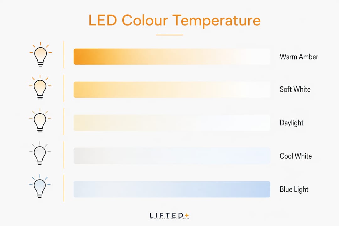
Colour temperature, measured in kelvin, determines whether a light source reads as warm or cool. Warm whites at 2700K to 3000K create cosy, inviting atmospheres suited to living rooms and bedrooms. Cool whites at 4000K and above suit kitchens, bathrooms, and home offices where clarity and focus matter. Amber tones at 1800K to 2200K are the most relaxing of all, mimicking candlelight and signalling to the body that the day is winding down.
| Colour temperature | Kelvin range | Best use |
|---|---|---|
| Warm amber | 1800K–2200K | Evening relaxation, bedrooms |
| Warm white | 2700K–3000K | Living rooms, dining areas |
| Neutral white | 3500K–4000K | Home offices, hallways |
| Cool white | 4000K–5000K | Kitchens, bathrooms, studios |
The health dimension of colour temperature is real and worth taking seriously. Avoid cool white or blue light above 5000K after 9pm, as it suppresses melatonin production and disrupts sleep. Switching to warm amber or dim red in the evening is one of the simplest, most effective changes you can make to your nightly routine.
Smart LED systems like Philips Hue, Govee, and LIFX take this further by automating colour shifts to match your circadian rhythm throughout the day. You can schedule a gradual shift from cool white in the morning to warm amber by evening, with no manual adjustment required. For renters especially, this kind of programmable flexibility means you can transform the feel of a space without touching a single wall.
Pro Tip: If you are using RGB strips in a living room, set your overhead or floor lamp to warm white and reserve the RGB strip for a secondary accent layer behind furniture or along a shelf. This is the combination that reads as sophisticated rather than gimmicky.
How do you integrate colour-led accents into your home?
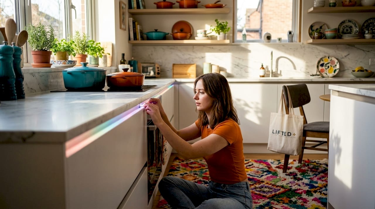
Preparation determines the outcome more than any single product choice. Before you buy a strip of LEDs or a pot of paint, walk through each room and identify the surfaces and zones that will carry the accent. Under-cabinet edges in the kitchen, the back panel of a bookcase, the perimeter of a TV unit, the cornice line of a bedroom ceiling: these are the locations where layered lighting creates depth without visual clutter.
Installation steps that prevent common mistakes
Follow this sequence for a clean, considered result:
- Measure the surface length and purchase 10% more LED strip than you think you need. Cutting a strip short mid-installation is a frustrating and avoidable problem.
- Clean the mounting surface with isopropyl alcohol before applying the adhesive backing. Dust and grease cause strips to peel within weeks.
- Use aluminium channel profiles with a frosted diffuser cover. This softens the point-source glow of individual LEDs into a continuous, diffuse line of light that reads as intentional rather than DIY.
- Connect all strips in a single zone to one smart controller. Unsynchronised LED strips across the same room create visual chaos that no amount of good furniture can overcome.
- Test the colour and brightness before committing the strip permanently. Peel back one end, power it on, and assess the effect in the room’s actual ambient light.
Pairing your LED accent colour with painted or fabric accents follows the same 60-30-10 logic. If your walls are a warm off-white (the 60%) and your sofa is a mid-tone olive (the 30%), your LED accent and decorative cushions should occupy the 10% in a complementary or contrasting hue. A deep rust orange or a muted terracotta LED glow behind the sofa would hold that palette together without competing with it.
The most common mistake in colour-led accent design is oversaturation: too many colours, too bright, with no warm white base to anchor them. Layering warm white as your base and treating RGB as a secondary layer is the single change that separates a polished result from a chaotic one.
What are the best LED decor ideas by room?
Room function should drive your colour and temperature choices. The living room is the most forgiving space for expressive colour because it serves multiple moods across a single day. Warm white base lighting with yellow or orange RGB accents creates a cosy atmosphere for evenings, while addressable LED strips behind the television can sync with media for an immersive entertainment experience. Liftedplus recommends pairing this kind of dynamic lighting with colourful accent furniture in complementary tones to build a cohesive, layered aesthetic.
The bedroom calls for restraint. Warm amber at low intensity along the base of the bed frame or behind a bedside shelf creates a sculptural glow that brings shape to the air without flooding the room with light. Avoid blue or cool white entirely in this space. The kitchen benefits from cool white under-cabinet strips for task clarity, with a warmer tone in the dining zone to shift the mood from functional to social. For home offices, cool white at 4000K to 5000K supports focus during work hours, with a green or warm accent available for break periods.
Renters have more options than they often realise. Removable LED strips with command-strip adhesive, clip-on lamp shades in bold colours, and renter-friendly decor like colourful cushions, throws, and wall-hung textiles all contribute to a colour-led scheme without permanent alteration. The key is treating portable objects as your accent layer and keeping the fixed surfaces neutral. This approach also makes it easy to update your colour palette with the seasons, which is exactly the kind of flexibility that keeps an interior feeling alive rather than static.
For entertainment spaces, addressable RGB strips that sync to music and scene changes create an immersive environment that a static light source simply cannot match. Pair these with a table lamp in a warm, grounded tone nearby so the room retains a sense of hierarchy rather than becoming a light show without a focal point.
Key takeaways
Colour-led home accents work best when the 60-30-10 rule governs your palette, warm white anchors your lighting layers, and smart controls keep your colour shifts purposeful and consistent.
| Point | Details |
|---|---|
| Use the 60-30-10 rule | Assign 60% to dominant colour, 30% to secondary, and 10% to your accent hue or LED colour. |
| Layer light intentionally | Set warm white as your base and use RGB strips as a secondary accent layer only. |
| Match temperature to room function | Use warm amber for bedrooms and evenings; cool white for kitchens and work spaces. |
| Synchronise your LED strips | Connect all strips in a zone to one smart controller to avoid mismatched, chaotic colour. |
| Test before committing | Assess your chosen LED colour or paint shade at multiple times of day before finalising placement. |
Why restraint is the real skill in colour-led design
I have seen more colour-led interiors undone by enthusiasm than by poor taste. The instinct when you first discover what RGB lighting can do is to use all of it, everywhere, at full saturation. The result is a room that pulls the eye in six directions at once and exhausts rather than delights. The spaces that genuinely hold your attention are the ones where someone made a deliberate choice to do less.
What I have found works consistently is treating colour as a conversation between surfaces. The LED strip behind the bookcase should echo something in the room, whether that is the tone of a cushion, the undertone of the timber floor, or the hue of a piece of wall art. When the colour has a reference point, it reads as considered. When it floats in isolation, it reads as an afterthought.
Smart controllers like those in the Philips Hue and Govee ecosystems are genuinely useful here, not for their novelty, but because they let you save scenes. You build the right combination once, save it, and return to it. That consistency is what makes a colour-led scheme feel like a design decision rather than a mood board experiment that never quite resolved. The technology should serve the aesthetic, not the other way around.
The other thing worth saying plainly: your colour scheme should be allowed to change. Updating your accent LED colour with the season, or swapping a cushion cover from terracotta to sage, is not indecision. It is the sign of a space that is genuinely lived in and cared for.
— Michelle
Discover Liftedplus collections for colour-led interiors
Liftedplus curates furniture, lighting, and wall art designed to work with colour-led accent schemes, not against them. Every piece in the collection is chosen for its sculptural presence and its ability to hold a room without competing with the lighting around it.
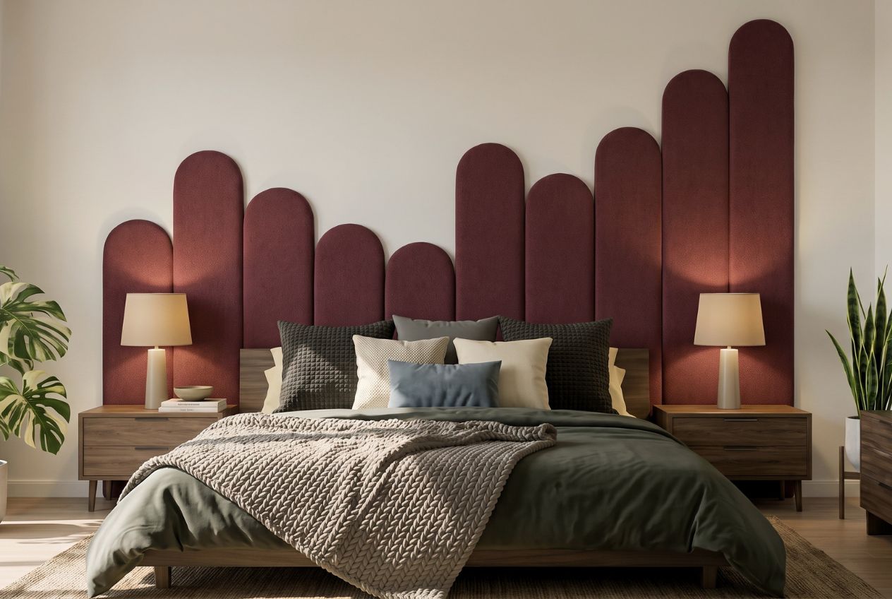
If you are building a colour-led interior from the ground up or refining a space that already has good bones, the Liftedplus modern home decor range is a strong starting point. For renters, the site includes a dedicated guide on personalising your space with colour and lighting without permanent changes. Browse the full range at liftedplus.com and use the interior styling guides to build a palette that is genuinely yours.
FAQ
What is the 60-30-10 rule in colour-led design?
The 60-30-10 rule divides a room’s colour into 60% dominant, 30% secondary, and 10% accent. In a colour-led scheme, your LED accent colour or bold decor piece occupies that 10% to create balance without overwhelming the space.
What is the difference between RGB and RGBW LED strips?
RGB strips mix red, green, and blue to produce a colour spectrum, while RGBW adds a dedicated white diode for cleaner, more natural whites. RGBW is the better choice for living spaces where you need both vibrant accent colour and usable everyday lighting.
What colour temperature should I avoid at night?
Cool white and blue light above 5000K suppresses melatonin and disrupts sleep when used after 9pm. Switch to warm amber tones between 1800K and 2200K for evening relaxation in bedrooms and living areas.
Can renters use colour-led accents without damaging walls?
Removable LED strips with command-strip adhesive, clip-on coloured lamp shades, and portable accent furniture all create a colour-led scheme without permanent alteration. The Liftedplus renter-friendly decor guide covers specific product and placement ideas suited to rental properties.
How do I stop multiple LED strips from looking chaotic?
Synchronise all strips in a single room through one smart hub and use frosted diffuser covers in aluminium channel profiles to soften the glow. Centralised control and diffused light are the two changes that separate a polished result from a cluttered one.