
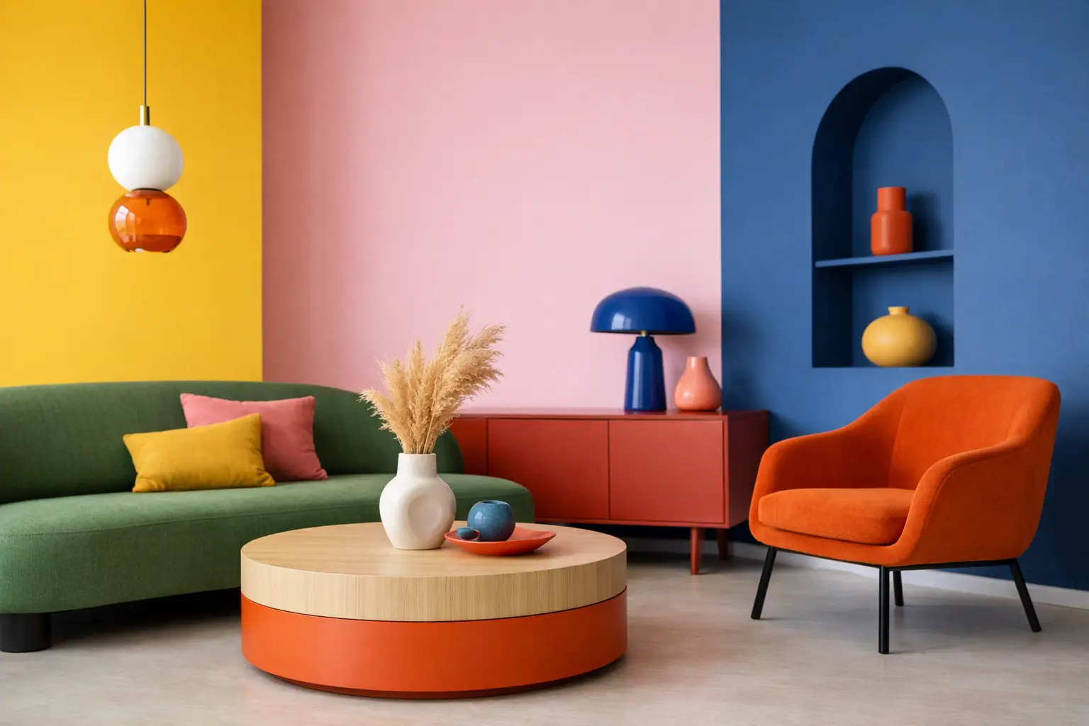
Beige had a long run. But if your room still feels flat after the right sofa, the right rug, and the right lighting, the problem may not be what is in the space. It may be the lack of contrast. This guide to colour blocking interiors is about using colour with intent – not as a finishing touch, but as a structural design move that changes how a room feels.
Colour blocking works because it gives the eye somewhere to land. It creates rhythm, tension, and clarity. Done well, it can make a small room feel more architectural, make an open-plan space feel zoned, and turn a blank wall into the thing that holds the room together.
What colour blocking actually means in interiors
In fashion, colour blocking is the use of large, defined areas of contrasting or complementary colour. In interiors, the principle is the same, but the effect is more spatial. You are not just adding colour. You are deciding where colour starts, where it stops, and what that boundary does to the room.
That could mean painting a section of wall behind a bed rather than the whole bedroom. It could mean pairing a deep cobalt chair with a rust-toned artwork and a sharply graphic lamp. It could mean setting one saturated colour against another, or using one vivid tone against a cleaner, quieter backdrop.
The key is intention. Random bright pieces do not create a colour-blocked interior. Deliberate fields of colour do.
A guide to colour blocking interiors starts with mood, not paint charts
The biggest mistake is starting with colours because they look good in isolation. A better starting point is mood. Do you want the room to feel electric, calm, playful, grounded, or slightly dramatic? Colour blocking is powerful because it shapes atmosphere fast, so the emotional direction matters more than the exact shade name.
A living room designed for conversation and energy can handle sharper contrast – think tomato with lilac, ultramarine with olive, or saffron with cherrywood tones. A bedroom usually asks for a little more restraint. Not less colour, necessarily, but softer temperature shifts, more tonal layering, or one strong block balanced with quieter surfaces.
This is where many homes in New Zealand get stuck. The architecture is often clean and light-filled, which should make bold colour easier. Instead, people default to white-on-white and add one token cushion in ochre. Colour blocking asks for more confidence than that. If you are going to use colour, let it do a proper job.
Choose one anchor first
Every strong scheme needs an anchor. In some rooms that anchor is paint, but often it is a large artwork, a sculptural light, or a statement chair. Starting with an anchor is smarter than starting with five paint swatches because it gives the room a focal point and a clear hierarchy.
If the anchor is a large-scale artwork, pull one dominant shade and one supporting tone from it. Those become the basis of the room. If the anchor is a sofa in a strong fabric, work around its weight and undertone. Once the lead piece is established, everything else becomes easier to edit.
This is also the difference between a room that feels curated and one that feels assembled from separate purchases. The anchor holds the space. The supporting colours reinforce it.
Work with blocks, not bits
Small hits of bright colour can feel nervous. Colour blocking needs scale. That does not mean every room needs a painted mural, but it does mean colour should appear in shapes large enough to read clearly.
A block might be a painted rectangle behind shelving, a full-width curtain in a single saturated tone, a generous artwork over a console, or a rug that introduces a solid geometric field. The point is visual weight. When colour is too scattered, the eye has to work too hard. When it appears in defined zones, the room feels composed.
This matters even more in open-plan homes, where colour can be used to mark different functions without adding walls. A dining area can be grounded with a dense, warm block of colour, while the adjacent sitting area stays cooler and lighter. You still want cohesion, but you do not need sameness.
Get the balance right
Bold does not mean loud everywhere. The best colour-blocked interiors know when to stop.
A useful rule is to let one colour lead, one support, and one interrupt. The lead colour takes up the most visual space. The support colour adds depth or contrast. The interrupt is the sharper note – something brighter, darker, or stranger that keeps the room from becoming too predictable.
For example, a room led by clay pink might be supported by burgundy, then interrupted by acid chartreuse in a lamp or object. A space built around ink blue and warm timber might need a flash of orange-red to stop it feeling too polished. These combinations work because they create tension. Tension is often what makes a room memorable.
That said, there is always a trade-off. High contrast brings energy, but too much can feel restless. Tonal colour blocking feels more sophisticated and easier to live with, but if every shade sits too close together, the room can lose edge. It depends on the room, the light, and your tolerance for visual intensity.
Think about surface and material
Colour never arrives alone. The finish changes everything.
A high-gloss painted block reads differently from chalky limewash. Velvet deepens colour and adds richness. Powder-coated metal can make a bright tone feel cleaner and more graphic. Timber, stone, glass, and boucle all shift the way surrounding colour is perceived. If you ignore materiality, your scheme can end up looking flatter than it should.
This is why colour blocking does not need to rely only on walls. A lacquered side table, a smoked glass lamp, a coloured linen curtain, and an oversized artwork can create enough contrast and structure without opening a paint tin. For renters, or anyone not keen on a full repaint, that approach often makes more sense.
The easiest rooms to start with
If you are new to it, start in a room that can handle personality.
Living rooms are ideal because they already rely on focal points and layered pieces. You have room to play with artwork, lighting, upholstery, and rugs without the scheme feeling forced. Home offices are another strong candidate. Colour can sharpen focus, create separation, and bring some life to a space that too often ends up looking like an afterthought.
Hallways are underrated. A single blocked wall, ceiling section, or strong artwork can turn a transitional area into a proper design moment. Smaller spaces like powder rooms also suit bolder moves because the compact scale makes intensity feel deliberate rather than overwhelming.
Bedrooms require a little more editing. Colour blocking can work brilliantly there, but it needs to support rest rather than fight it. Think one strong move – perhaps behind the bed or through oversized art – then keep the rest of the palette disciplined.
Common mistakes that make it fall apart
The first is choosing too many competing colours at the same strength. If everything shouts, nothing leads.
The second is ignoring undertones. Two colours can both look warm on a paint chip and still clash badly in a room. Red-based pinks behave differently from blue-based pinks. Greens can skew muddy or acidic. Test them in natural and evening light before committing.
The third is shrinking back halfway through. A colour-blocked room with one bold wall and everything else played safe can feel unresolved. If the concept is contrast, support it with enough scale, repetition, and shape to make it coherent.
The fourth is forgetting black, white, timber, and metal count as part of the palette. They are not neutral extras. They are active players that can sharpen or soften the entire scheme.
How to make it feel modern, not gimmicky
The answer is editing. Strong colour needs restraint somewhere else.
Keep silhouettes clean. Let fewer, better pieces do the work. Choose statement elements that can hold visual weight rather than cluttering the room with small decorative fillers. One oversized artwork, one sculptural light, and one decisive furniture colour will usually create more impact than ten minor accessories.
This is where a curated approach wins. Brands like Lifted+ understand that colour-forward interiors do not need more stuff. They need stronger choices. A room feels modern when the colour is purposeful, the forms are clear, and every piece earns its place.
Guide to colour blocking interiors: where to begin this week
Start with the piece you want the room to revolve around. Not the safest piece. The one with actual presence. From there, choose two colours that either heighten its energy or balance it. Build one large block, then repeat each tone once elsewhere in the room so the scheme feels intentional.
Stand back before you add more. Most rooms do not need another layer. They need conviction.
Colour blocking is not about being brave for the sake of it. It is about giving a room definition, mood, and a point of view. If your space has been waiting for permission to feel bolder, this is it. Let colour hold the room.