
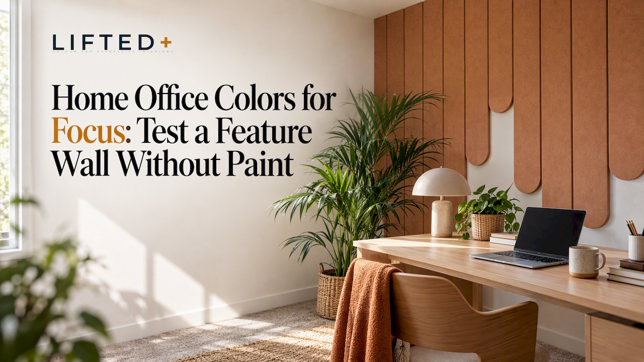
Cooler blues, muted greens and soft neutrals tend to support sustained concentration best, while brighter yellow or blue accents lift alertness and mood without overwhelming a room. The evidence is genuinely mixed, so the smartest move is testing a colour in your own light before committing. If you rent, start with removable options like sample panels rather than reaching for a paintbrush.
Key Takeaways
Choosing the right wall colour, lighting, and texture can significantly improve focus and mood in a home office, but individual preferences and environment factors are crucial.
| Point | Details |
|---|---|
| Colour impacts productivity and mood | Research shows blue and yellow colours boost positive feelings and focus more than green, but personal and environmental factors matter. |
| Test colours before committing | Use removable panels or samples to observe how different colours look in your space over time and lighting conditions. |
| Lighting and finish influence colour perception | Warmer, moderate lighting with matte finishes reduces glare and supports better concentration. |
| Support different work modes with zoning | Use dominant colours behind your desk and lighter shades on surrounding walls to balance focus and rest. |
| Lift mood with accents and texture | Adding a small yellow accent or textured panels can enhance emotional tone without overwhelming the room. |
Table of Contents
- What the evidence says about specific colours and focus
- Colour schemes and ready-to-use palette ideas for focused home offices
- How lighting and task type change which colours work best
- Zoning, accents and texture: support multiple work modes without repainting
- How to test colours at home: a quick, low-risk process
- Style examples and quick inspiration to copy
- The psychological pull of colour: mood, motivation and mindset at your desk
- Making new colour work with the furniture and décor you already own
- Choosing colours that feel like yours, not just a trend
- Saturation and brightness: the difference between focus and eye strain
- Refreshing your palette as the seasons and your work change
- Why removable colour makes more sense than we expected
- How DwellForms™ helps you test a focus wall without the risk
- FAQ
- Sources
What the evidence says about specific colours and focus
Colour psychology gets thrown around as though it were settled science, but the research tells a more layered story. An immersive virtual reality study of 60 participants measured how simulated red, blue, yellow and green workspaces affected productivity and emotional state, and found that productivity ran higher in red, blue and yellow rooms than in green, with blue and yellow both producing stronger positive affect. Red delivered a productivity lift too, but it came paired with the highest negative affect of the four hues, which matters if your focus depends on staying calm rather than wired.
The study found productivity notably higher for blue and yellow compared to green, a meaningful gap for something as simple as wall colour. That is a useful data point, not a verdict. Hue never works alone: a pale, washed blue behaves nothing like a saturated navy, and the same yellow can feel optimistic in a sunlit room and jarring under cool LED downlights. Luminance and saturation shift how any colour reads on your wall, which is why two people can disagree completely about whether “blue” helped them concentrate.
A few other limits are worth holding onto:
- Cultural and personal associations with colour vary widely, so a shade that calms one person may feel flat or cold to another.
- Laboratory and VR environments control variables that real rooms never do, including clutter, window light and furniture tone.
- Short-duration lab sessions do not capture how a colour feels after eight hours of real work, five days a week.
Given that, we treat this kind of evidence as directional rather than prescriptive. It tells you where to start looking, not which exact paint chip to buy. Pair the research with your own observation of a space before locking in anything permanent, particularly in a rented room where changes are harder to undo.
Colour schemes and ready-to-use palette ideas for focused home offices
Once you know the general direction, a workable palette turns research into something you can actually put on a wall. Each of these pairs a dominant tone with supporting neutrals and a note on where the strongest colour should sit.
- Deep navy, warm timber and off-white suits analytical, detail-heavy work; place the navy on the wall directly behind your desk so it frames you without dominating the whole room, and keep timber and off-white as the resting tones around it.
- Soft sage, sand and natural timber works well for long, restorative days where you need calm more than stimulation; use sage as the main backdrop and let sand and timber carry the trim and furniture.
- Muted slate blue, charcoal and warm metal gives a grounded, focused feel for strategic or planning work; keep the slate blue on the camera-facing wall and let charcoal sit lower, closer to the desk surface.
- Neutral backdrop with a yellow accent lifts mood during repetitive or administrative tasks without becoming a distraction; confine the yellow to a narrow strip or a single panel rather than a full wall.
A matte or low-sheen finish matters almost as much as the hue itself. High-gloss paint throws reflections back at your screen and amplifies glare under overhead light, while a matte surface absorbs it and keeps colour looking even across the day.
Pro Tip: Photograph your chosen wall at 9am, 1pm and 5pm before committing; the same colour can look three different ways as daylight shifts.
None of this requires a paint tin if you rent. A small removable panel, a framed print, or a fabric hanging gets you the same visual effect, and you can take it down without a trace when you move.
How lighting and task type change which colours work best
Wall colour and light are not separate decisions, they work together. Lighting research on mental workload found that a correlated colour temperature of around 3000 K combined with 750 lux produced lower mental workload than other combinations tested, suggesting that warmer light at moderate brightness suits sustained attention better than cold, dim or overly bright setups.
That gives you a rough target: aim for somewhere in the 300 to 750 lux range on your desk, adjusted by how much natural light your room already gets. A north-facing room flooded with daylight can carry a deeper, more saturated colour without feeling heavy, because the light balances it out. A dim, south-facing room will make the same colour look murkier and can swallow detail entirely, so lighter, higher-reflectance tones tend to work better there.
A short checklist helps before you choose anything:
- Sit in the room at your usual work hours and note where shadows fall and how warm or cool the light feels.
- Check your lamp types; warm LED bulbs (around 2700 to 3000 K) suit calmer, cooler wall tones, while cooler bulbs can wash out warm colours.
- Notice how blinds or curtains change the room across the day, since a colour that reads soft at 10am can feel stark by 3pm.
Reflectance also matters more than most people expect. A pale sage on a wall with strong natural light bounces more of that light around the room, while a deep slate blue absorbs it, which can make a small office feel more enclosed. Neither is wrong, it depends on what you are trying to achieve.
Zoning, accents and texture: support multiple work modes without repainting
A single colour rarely has to do all the work in a home office. Zoning, giving different areas distinct but related tones, lets you support focus and recovery in the same small room.
A practical approach:
- Use your strongest, most deliberate colour on the wall directly behind your desk, where it frames your attention and your video calls.
- Keep the surrounding walls lighter and calmer, so your eyes have somewhere to rest between stretches of concentration.
- If you take video calls often, treat that wall as a backdrop decision as much as a design one, since it is the colour everyone else sees too.
Texture changes how a colour behaves almost as much as light does. Soft felt panels diffuse reflections and soften the edges of a colour, which reads as calmer and more natural than the same hue in high-gloss paint. That contrast matters in a small office, where a single reflective surface can bounce screen glare straight back at you.
Modular and removable kits let you trial a navy or sage focus wall behind your desk in an afternoon, live with it for a week, and swap the layout or colour without a drill, a paint tin, or a conversation with your landlord.
Pro Tip: Start with a single DwellForms™ panel on your desk wall before committing to a full feature wall. It is the fastest way to judge how a colour feels during real work, not just at first glance.
How to test colours at home: a quick, low-risk process
Testing beats guessing every time, and it costs you an afternoon rather than a weekend of repainting.
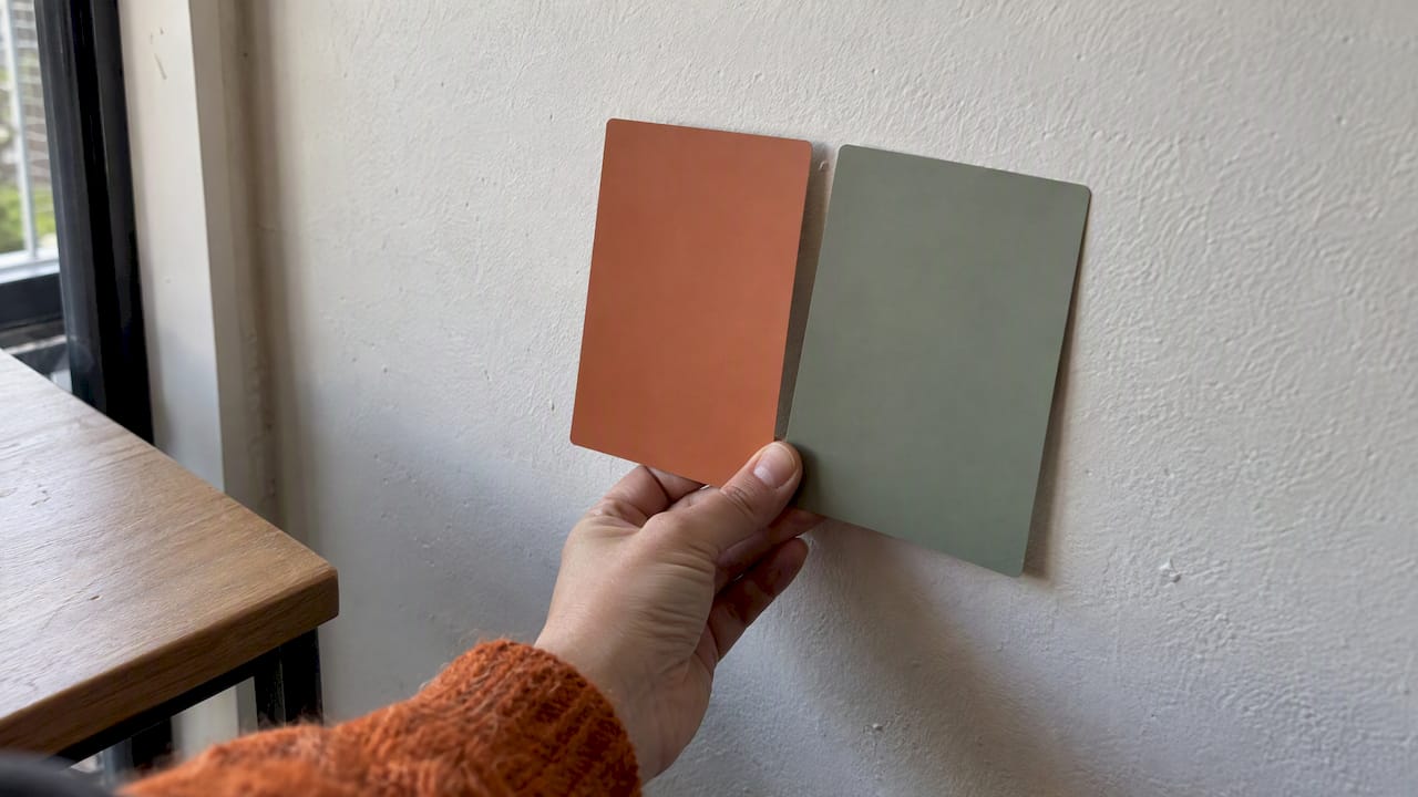
- Gather your samples, whether that is paint chips, DwellForms™ colour samples, or fabric swatches in the shades you are considering.
- Place them where you will actually see them while working, directly behind your monitor and in your peripheral sightline, not propped against a skirting board across the room.
- Leave them up across a full day, checking how they read in morning light, midday brightness and evening lamp glow.
- Run a short task test, working as normal for 30 to 60 minutes with the sample in view, and note whether you feel more settled, more alert, or distracted by glare.
Keep a simple record: subjective focus, any eye strain, and whether the colour shifted noticeably between lighting conditions. If you rent, this is the entire advantage of a removable system: test a small DwellForms™ panel behind your monitor rather than committing a whole wall to a colour you have only seen on a swatch.
Pro Tip: Test two contenders side by side rather than one at a time, direct comparison reveals preferences that testing in isolation often misses.
Style examples and quick inspiration to copy
A few combinations worth borrowing directly:
- Deep navy behind the desk, built from a small DwellForms™ kit, suits analytical or detail-heavy work and reads as considered rather than stark.
- Soft sage and sand with timber accents feels restorative across long days, particularly where the room already leans warm.
- A neutral backdrop with a single yellow accent strip or panel lifts mood without competing for attention during repetitive tasks.
Save whatever catches your eye and build a loose mood board before you buy anything. Comparing a few options side by side, rather than committing to the first colour you like, tends to produce a wall you are still happy with months later.
The psychological pull of colour: mood, motivation and mindset at your desk
Colour does more than decorate a workspace, it sets an emotional tone before you have typed a single word. The VR workspace study found that yellow and blue environments produced higher positive affect than green, while red carried the most negative affect of the four tested, even though it also lifted measured productivity. That combination, higher output alongside more tension, is worth sitting with: a colour that pushes you to work faster is not automatically the one that makes work feel good.
Design guidance echoes this nuance rather than flattening it into a single rule. Livingetc advises matching colour to the activity a room supports, recommending darker blues where concentration matters most and lighter blues where the work calls for more creative thinking. That is a more honest framework than a blanket “blue equals focus” claim, because motivation during a deadline sprint looks different to motivation during a slow, reflective planning session.
Think about what your work actually demands before you chase a mood. A colour that energises you during creative brainstorming might feel restless during close, repetitive editing. Matching tone to task, rather than chasing a single “productivity colour”, respects how differently the same hue can land depending on what you are asking your brain to do that day.
Making new colour work with the furniture and décor you already own
A striking wall colour can clash badly with existing furniture if you choose it in isolation, so it pays to work backwards from what is already in the room. Pull the undertone from your desk, shelving or flooring first. Warm timber furniture generally sits more comfortably against sage, sand or muted terracotta than against a stark cool blue, while black metal frames and grey-toned furniture tend to pair cleanly with slate blue or charcoal.
Reducing visual competition matters as much as matching tones. A home office crowded with patterned textiles, mismatched frames and a bold wall colour all at once creates more for your eyes to process, which works against the calm you are trying to build. Choosing one dominant colour statement, and letting everything else recede into neutrals, keeps the room from pulling your attention in several directions during a working day.
If you are decorating around pieces you cannot change, a rental desk, a landlord’s existing blinds, or furniture you brought from a previous home, use your wall colour as the unifying element rather than fighting the pieces you cannot swap out. A removable wall panel gives you the flexibility to test that unifying tone against your actual furniture before deciding it is right.
Choosing colours that feel like yours, not just a trend
Evidence-based guidance sets a sensible starting range, but the colour you can actually sit with every working day still has to feel personal. Cultural associations with colour vary considerably: blue reads as calm and professional in plenty of Western contexts, while other cultures attach different weight to red, white or green. There is no universal “correct” colour, only one that suits your associations and the work you do in that room.
Give weight to your own reactions over a generic rule. If navy feels sombre to you regardless of what a study reports about productivity, it is the wrong choice for your office, whatever the data says about the average participant. The research points you toward a useful shortlist; your own response to living with a colour decides the rest.
This is another place where renter-friendly testing earns its keep. Because DwellForms™ panels are removable rather than permanent, you can commit to a colour that feels distinctly yours, not a safe, landlord-approved beige, without the risk that usually comes with a bold choice. Colour without commitment means you are free to follow your own preferences rather than defaulting to whatever feels least risky to undo.
Saturation and brightness: the difference between focus and eye strain
Hue gets most of the attention in colour advice, but saturation and brightness often matter more for how a room actually feels to work in. A highly saturated colour, think a vivid cobalt or a strong mustard, demands more visual processing than a muted version of the same hue, which can tip from “energising” into “tiring” over a long working day.
Brightness works the other direction. A wall that is too dark relative to your screen creates strong contrast between what your eyes are doing when you glance up from a monitor, which contributes to eye strain over hours of switching focus. A wall that is too light and reflective, particularly in high-gloss finish, bounces glare back toward your eyes and your screen.
The safer zone sits in the middle: muted rather than fully saturated hues, and a matte or low-sheen finish that absorbs light rather than throwing it back. If you are drawn to a bold, saturated colour, confine it to an accent panel or a narrow section of wall rather than painting an entire room in it, so your eyes get a rest from it between glances.
Refreshing your palette as the seasons and your work change
A colour that suits a winter spent on deep, solitary analytical work might feel heavy by the time summer brings lighter, more collaborative projects. Static wall colour struggles to keep up with that, which is one of the quieter costs of a full repaint: it is expensive and disruptive enough that most people simply live with a colour that has stopped working for them.
Swapping accents is a lighter-touch way to track that shift. Moving from a navy accent in winter to a sage or sand tone for spring changes the emotional tone of a room considerably more than the size of the change suggests, and it costs nothing like a repaint.
This is where modular, removable options have a real advantage over paint. A DwellForms™ kit can be rearranged or swapped for a different colour combination in an afternoon, which means your home office can track a change in workload, season or simply taste without the cost or mess of redoing a wall from scratch. Texture without renovation means the refresh takes an afternoon, not a weekend with drop sheets.
Why removable colour makes more sense than we expected
A reader renting a small apartment used removable panels to build a navy focus wall behind her desk in an afternoon, with no landlord approval needed and no trace left behind. That renter-friendly feature wall is the clearest case for colour without commitment we have seen.
— Michelle
How DwellForms™ helps you test a focus wall without the risk
Testing a colour properly, in your own light, against your own furniture, is the whole point of the advice above, and it is exactly what DwellForms™ is built for. Rather than committing to a tin of paint you cannot easily undo, we let you trial the exact tone and texture on your actual wall first.
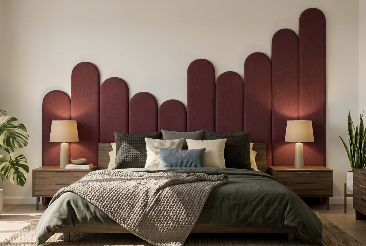
Start small and scale up as your confidence grows:
- Order a DwellForms™ colour sample to see how a shade reads behind your desk across a full day.
- Move up to a DwellForms™ Core Kit once you have settled on a tone that works, sized for the wall you are focused on.
- Add a DwellForms™ Extension Kit later if you want to grow the feature wall across a larger section of the room.
Every kit installs with tested adhesive pads rather than drilling, screws or paint, so a rented wall stays exactly as you found it whenever you decide to move. No-drill wall decor that you can take with you is the whole idea. If a colour stops suiting your work, rearrange or swap it rather than living with it for another year.
FAQ
What are good colours for offices?
Research and design guidance both point toward blue, muted green, and soft neutrals for concentration, with yellow or warm accents useful for lifting mood during repetitive tasks. An immersive VR study found higher positive affect under blue and yellow conditions compared with green, though all three outperformed green on measured productivity in that setting.
What colour is replacing beige in 2026?
There is no single, universally agreed colour replacing beige, and we have not seen a sourced ranking that names one. Design commentary increasingly favours richer, more considered neutrals, such as warm sand, sage and soft clay tones, over flat beige, chosen to pair with timber and metal accents rather than disappear into the background.
What are the 7 basic colour schemes?
Definitions vary across design sources, but a commonly cited set includes monochromatic, analogous, complementary, split-complementary, triadic, tetradic and neutral schemes. For a home office, analogous and neutral schemes tend to feel calmest, while complementary accents work well for a single energising feature.
What colours help you focus more?
Cooler blues and muted greens are most consistently linked to calm, sustained attention, while an immersive VR study found blue and yellow both associated with higher productivity and positive affect compared with green. Evidence is directional rather than definitive, so testing a colour in your own lighting remains the most reliable step.
What colour promotes focus best for analytical work?
Darker, more muted blues are generally recommended for concentration-heavy work, with lighter blues better suited to creative tasks, according to design guidance from Livingetc. Pairing that blue with warm timber and off-white keeps the effect calming rather than cold.
Sources
- Effects of workspace wall colors on productivity and emotion via immersive VR and physiological data – PMC
- What color to paint your home office, from colour psychology | Livingetc
- Lighting, colour temperature and mental workload study (s41598)
Recommended
- Renters: Test Wall Panel Color Ideas For 3 Days Without Drilling
- No Paint Needed: 8 Renter-Friendly Color Palettes For NZ Rentals
- Home Office Backdrop Wall Ideas For Remote Workers
- Renters & Makers: 3 Quick Tests To Read Warm Vs Cool Colors, No Paint
This article is for general information and inspiration only. Product performance and results may vary depending on individual circumstances, surfaces and installation.