
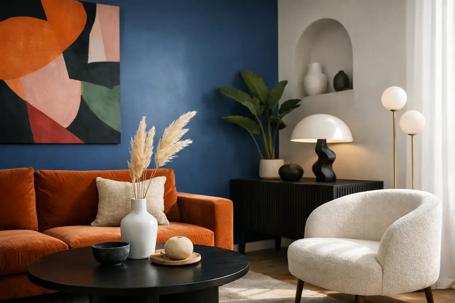
A room can be saturated with colour, loaded with character and still feel composed. That is the real question behind how to style bold interiors. Not how to make a space louder, but how to make it feel deliberate.
Too many people assume bold means chaotic. It does not. A strong interior works when every expressive move has a role – to hold the room, shift the mood or sharpen the architecture. The difference between confident and cluttered usually comes down to restraint in the right places.
How to style bold interiors starts with one clear move
If you try to make every piece a statement, nothing lands. Bold rooms need hierarchy. Start with the element that will define the space, whether that is oversized wall art, a sculptural pendant, a deeply coloured sofa or a pair of chairs in a high-impact finish.
This first move should do more than add interest. It should establish the room’s energy. A large abstract artwork might bring tension and rhythm to a pared-back living area. A glossy red lamp can inject heat into a cool architectural shell. A cobalt dining chair against timber and stone can make the whole room feel more awake.
Scale matters here. Small gestures often disappear in larger open-plan homes, particularly in contemporary New Zealand interiors where ceiling height, glazing and long sightlines can swallow timid styling. If you want a room to feel bold, the focal point needs enough presence to hold its ground.
Choose a palette with tension, not randomness
Bold interiors are rarely built on unlimited colour. They are built on edited colour. The strongest spaces usually work with two or three dominant tones, then use contrast to keep them sharp.
That contrast can take different forms. You might pair warm, electric tones with something grounded like walnut, blackened steel or off-white plaster. You might balance an acid green accent with oxblood, aubergine or smoky blue so the palette feels layered rather than sugary. Even highly expressive rooms need somewhere for the eye to rest.
A useful rule is to decide what kind of mood you want before you choose the exact shades. Bright saturated colour can feel playful, optimistic and social. Darker, denser tones tend to feel more immersive and atmospheric. Neither is better. It depends on the room, the natural light and how you want to feel inside it.
In south-facing rooms or spaces that already run cool, some colours can flatten if you are not careful. In very bright rooms, clear tones can sing. This is why colour selection is never just about what looks good on a swatch. It is about what the light does to it over a full day.
Let one tone repeat across the room
Repetition creates cohesion. If you introduce a vivid blue in a large artwork, echo it somewhere else – perhaps in a glazed object, a rug detail or the base of a lamp. The repeat does not need to match perfectly. In fact, exact matching can make a room feel staged. Related tones work better because they create rhythm without turning the room into a showroom set.
Use neutrals strategically, not apologetically
There is a difference between using neutral elements as structure and letting them dominate the whole scheme. Bold interiors still need contrast, and sometimes that contrast comes from quieter surfaces.
Walls, flooring or larger upholstery pieces can provide visual breathing room, particularly if your statement elements are sculptural or intensely coloured. But the neutral parts of the room should feel intentional. Chalky white, warm stone, pale timber and soft greige all behave differently. Some calm a room. Others drain it.
The goal is not to dilute the boldness. It is to frame it. Think of neutral surfaces as negative space in art. They help the expressive pieces read more clearly.
Mix materials so colour has depth
One of the fastest ways to make a bold room feel flat is to rely on colour alone. Great interiors use material contrast to add complexity. Gloss next to matte. Bouclé against lacquer. Marble with powder-coated metal. Linen near glass.
When the materials shift, the same colour can behave in different ways. A rust tone in velvet feels rich and soft. The same rust in a glazed ceramic reads brighter and harder. This is useful because it lets you build a palette that feels layered rather than blunt.
Materiality also helps stop bold spaces from becoming theme-driven. A room full of obvious colour can slip into novelty if every finish tells the same story. Texture interrupts that. It brings sophistication, and it makes the room more tactile to live with.
How to style bold interiors without creating clutter
Bold does not mean full. In fact, the more visual punch a piece has, the more space it needs around it. This is where many rooms lose their edge. People add impact, then keep adding.
Give statement pieces room to breathe. Let a large artwork sit cleanly on a wall without crowding it with smaller decor. Allow a sculptural floor lamp to stand as an object, not as one more layer among many. If a sofa is a strong colour and generous shape, the coffee table can be quieter. If the rug is graphic, the surrounding forms may need to simplify.
Editing matters more in expressive interiors because every element carries more weight. A good test is this: if you remove one object, does the room feel sharper? If yes, keep editing.
Resist the urge to fill every surface
Open shelves, console tables and sideboards do not need constant styling. A room with strong art, lighting and furniture often asks for less accessory clutter, not more. One object with scale will usually do more than six small ones grouped together.
This is especially true in compact flats or townhouses, where visual noise builds quickly. Bold interiors can work beautifully in smaller homes, but they need discipline. Fewer pieces. Better shapes. Stronger decisions.
Think in composition, not individual products
The most successful rooms are not built item by item in isolation. They are composed. That means looking at how colour, height, mass and line move across the space.
A tall pendant over a dining table can pull the eye upward and balance low, broad furniture. A wide artwork can stabilise a room with lots of vertical architectural lines. A curved chair can soften a space dominated by hard edges, glazing and joinery. These relationships matter just as much as the pieces themselves.
This is why curated room edits are so effective. They help you see how a focal piece, a secondary layer and a finishing object can work together without competing. You are not just buying a lamp or artwork. You are building a visual conversation.
Let architecture join in
The best bold interiors do not ignore the shell of the room. They use it. Strong styling should respond to ceiling height, window lines, materials and spatial flow.
In an architectural home with concrete, timber or steel details, bold pieces can emphasise what is already present. A graphic artwork can make a long wall feel intentional rather than empty. A coloured pendant can sharpen the geometry above an island bench. In softer villas or heritage homes, contrast often works best when modern forms are introduced cleanly rather than overly styled.
Not every room wants the same level of intensity. A dramatic living room can sit alongside a quieter bedroom if the thread between them is consistent materiality or a recurring colour family. Bold homes do not need to shout from every corner.
Confidence comes from commitment
Half-decisions are what make a room feel hesitant. If you love expressive design, commit to it properly. Choose the larger artwork. Back the coloured chair. Go for the light fitting with presence. Rooms rarely become memorable because someone played it safe with every choice.
That said, commitment is not the same as impulse. The smartest bold interiors are edited, balanced and a little ruthless. They know what they are trying to say.
If you are unsure where to begin, start with one piece that can hold a room and build around it with discipline. That is often enough to shift a space from careful to compelling. Lifted+ approaches interiors this way for a reason: one strong perspective beats a dozen safe options every time.
A bold interior should feel like a point of view you can live inside – energising in the morning, grounding at night, and never mistaken for anyone else’s home.