
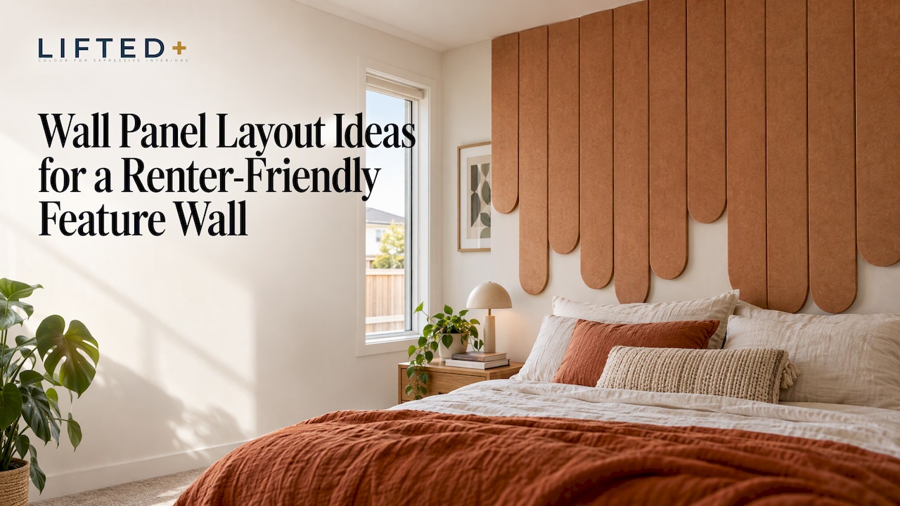
Most feature walls fail before a single panel goes up. The panels may be lovely, but the layout is a guess: a hero shape pushed too close to the window, a gap that looks like a mistake, a row that stops awkwardly at a light switch. The good news is that a layout is mostly a matter of measuring, sketching and choosing one clear idea. This guide walks through how to measure your wall, which arrangements work, how to plan around switches and corners, and how to grow a modular wall later, all with a renter-friendly, no-drill approach.
Key Takeaways
- Measure the wall in several places and draw it to scale on paper first. Mistakes are cheaper to fix with a pencil than on the wall.
- Choose one dominant idea (a centred hero, a gentle off-centre anchor, a repeating grid) and let everything else support it.
- Plan around fixed points such as doors, windows, switches and furniture, so any unevenness looks intentional.
- Felt panels have no timber edges to mitre or caulk. Finishing is about where the arrangement starts and stops.
- Start with a core kit, then add an extension kit when the wall, or your next home, asks for more.
Table of Contents
- Start With the Wall You Actually Have
- How to Measure a Wall for Panels
- Layout Ideas That Work on Real Walls
- Matching Layout to Room
- Finishing Edges and Corners
- Fixing Without Drilling
- Expanding and Rearranging Later
- Choosing Colour Before You Commit
- A Simple Planning Routine
- Our Perspective
- Ready to Plan Your Wall?
- FAQ
- Sources
Start With the Wall You Actually Have
Before you think about shapes, think about the problem. Perhaps it is a long, blank rental wall behind the sofa that landlord rules won’t let you paint. Perhaps it is a hallway that feels like a corridor in a waiting room, or a home-office wall that appears behind you on every video call. Each of these asks for a different layout, and none of them is solved by simply covering as much surface as possible.
A useful first question is not “what pattern do I like?” but “where will the eye land?” A wall behind a bed has a natural centre line. A wall beside a doorway has a natural edge. A wall with a window off to one side has a built-in imbalance that a good layout can answer rather than fight.
If you are still deciding whether a feature wall is the right move at all, our guide to why use accent walls covers the reasoning for New Zealand homes.
How to Measure a Wall for Panels
Accurate measurements are the unglamorous foundation of every good layout. The approach below borrows from timber panelling guides, because the discipline is the same whatever the material.
Measure more than once
Better Homes and Gardens Australia advises measuring the width of the room at the top, bottom and halfway up the wall, in case the wall bows. It also says to allow for the thickness of skirtings when measuring at floor level. Older New Zealand homes, with their settled framing and decades of paint, are exactly the places where a wall is not quite the rectangle the plans promised.
Write down the smallest and largest width. Plan to the smaller number, so your arrangement never feels squeezed against a corner.
Mark everything that interrupts the wall
On a sketch, note the wall’s height and width, then mark its centre point, the position of any power outlets and switches, door and window frames, and furniture you intend to keep in front of it. Sketch Australia suggests exactly this kind of reference list, and it is worth doing before you buy anything. If a switch sits in your intended pattern, our guide to panels around switches shows a clean no-drill way to handle it.
Draw it to scale
Fine Homebuilding’s Lynn Hopkins recommends starting with a scale drawing of each wall showing every door, window, outlet and switch. She also says it is better to work out layout problems on paper than in wood. For a felt kit, swap “wood” for “wall” and the advice holds. Graph paper at 1:10 is plenty. Cut paper templates for each panel shape if you want to move them around before committing.
Check the furniture line
Hold the sketch against the furniture that will sit below it. A headboard, a sofa back or a desk dictates how wide and how high the composition can reasonably be. A composition that reads well on an empty wall can look top-heavy once a sofa takes up the lower third.
Layout Ideas That Work on Real Walls
There are really only a handful of layout families. Each suits a different wall and a different mood.
The centred hero
One dominant shape sits at the centre line, flanked by smaller echoes on each side. It is calm, formal and very forgiving, which makes it a sound first choice above a bed or sofa. The hero should be wide enough to clear the furniture beneath it, and the flanking pieces should feel like a supporting chorus, not a second lead.
The off-centre anchor
This is the layout for a wall with a window or doorway to one side. A single dominant shape sits off the centre line, and smaller shapes build away from it. The trick is to make the unevenness look decided. Design around the room’s fixed points, and the asymmetry has a reason to exist. Without that reason, it just looks accidental.
Two habits keep asymmetry tidy: repeat a few dimensions so unequal shapes still share measurements, and align at least one edge in every row. If you limit yourself to two or three sizes of shape, the eye reads rhythm rather than chaos.
The repeating grid
A regular module repeating across the wall is the most architectural choice. Hopkins advises establishing a regular module that repeats as it wraps around the room, and aiming for rectangles close to a 3:5 ratio, which tends to look pleasing. In a felt kit you are working with the shapes of the kit rather than cutting your own, but the principle carries: a steady rhythm feels deliberate, and the last unit at a corner is allowed to differ from the rest.
The stepped or staggered run
Shifting each row slightly, like brickwork, adds movement to a wall that would otherwise feel static. It suits long hallways, where the eye travels, and it is a friendly way to bring energy to a narrow space without adding colour everywhere.
Colour-blocked compositions
If colour is the point, let the layout carry it. Two or three tones, grouped in zones, usually look more confident than six tones scattered evenly. Martha Stewart’s feature on panelling quotes designer Laura Botelho, who likes a pop of colour on an accent wall in a primary bedroom, using blue over a transitional panelled wall to anchor the room without it feeling dark. The idea translates well: a saturated tone on the wall behind the bed, with the rest of the room kept quieter. Our guide to colour blocking with wall panels explores this in more depth, and mixing colours in interiors helps when you are choosing a palette.
Matching Layout to Room
A layout that flatters a bedroom can overwhelm a hallway. Here is how the main spaces tend to behave.
| Room | Layout that usually suits | What to watch |
|---|---|---|
| Bedroom | Centred hero or low-contrast tonal grouping | Keep it wider than the headboard, and calm enough to sleep beside |
| Living room | Off-centre anchor or colour-blocked zones | Leave breathing room around the TV or art |
| Hallway | Stepped or staggered run | Keep depth of colour consistent so the space doesn’t feel closed in |
| Home office | Centred hero in the video-call frame | Check what the camera actually sees before you plan the rest |
| Small space | Tonal or low-contrast arrangement | One feature wall, not four |
For bedrooms in particular, our ideas for a bedroom statement wall and a low-contrast small bedroom feature wall show how far restraint can go. If you like pattern, geometric wall decor ideas gives you a dozen starting points.
Mixing panels with art
A panel arrangement does not need to fill the wall. Leaving a deliberate gap for a framed piece, or a mirror, gives the composition a pause, the way a rest does in music. You can see how that works in our guide to mixing wall panels with art, and browse wall art if you want something to sit alongside the felt.
Finishing Edges and Corners
This is where timber panelling and felt kits part ways, and it is worth being clear about it.
A timber picture-frame design, as described by Your Home and Garden New Zealand, involves cutting pieces at 45 degrees, gluing and pin-nailing them, filling the nail holes with filler and caulking the gaps around the edges. That is a project of permanent changes, and it is not what a renter-friendly feature wall asks of you.
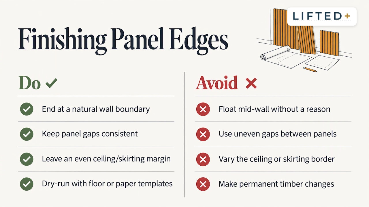
Our panels are precision cut, so there is no raw timber edge to mitre, fill or paint. Finishing is a layout decision instead. Three habits make an edge look finished:
End on a natural boundary. Let the arrangement stop at a corner, a door frame or a furniture edge, rather than floating mid-wall with no reason.
Keep gaps consistent. Whatever spacing you choose between panels, use it everywhere. Uneven gaps are the single most noticeable flaw in a modular wall.
Leave a margin from the ceiling and skirting. A small, even border reads as a frame. A border that varies reads as a mistake.
Always do a dry run on the floor or with paper templates first. Hopkins notes that it can take a few trials to find the module that gives the most pleasing corner pieces, and a flat-lay on the floor is the cheapest trial there is.
Fixing Without Drilling
The whole appeal of a renter-friendly feature wall is that nothing needs to be drilled, painted over or permanently altered. Our kits attach with adhesive pads. We tested several adhesive options and chose nano-adhesive pads because they performed significantly better in our own testing at minimising wall damage.
A word of honesty, because it matters when you are protecting a bond: no adhesive is completely damage-proof, and results depend on your wall’s paint, surface and condition. Wipe the area clean, follow the instructions that come with your kit, and if you are unsure about a delicate or older finish, try a small, low-visibility area first. Check your tenancy agreement, and ask your landlord when in doubt.
Expanding and Rearranging Later
A modular wall should grow with you. That is the point of making it modular rather than fixed.
There are three common reasons to change a layout. The wall turns out to want more width. You move furniture and the composition no longer balances. Or you move house, and the arrangement needs to fit a different wall.
The simplest way to keep options open is to plan in stages. Start with a core kit that makes a complete composition on its own. Then, when you want to extend a run, add an extension kit such as the Linear Wall Panel Extension Kit. Because the first composition was designed to stand alone, the extension reads as a development of the idea instead of a patch.
When you rearrange, photograph the current layout first. Then try one change at a time: swap two panels, shift the anchor, or open a gap for a piece of art. If you are heading to a new place, our guide on how to reuse modular wall panels in your next home covers removal and re-hanging.
Choosing Colour Before You Commit
The most common regret with a colourful wall is not the shape. It is the tone, which looked different in a photograph than it does in your light. New Zealand’s bright, clear daylight and warm evening lamps can shift a colour considerably across a day.
Order colour samples or the Colour Library Box and place them on the actual wall. Look at them in the morning, at midday and at night. Our sample kit purchases are credited towards a full kit order, so the exercise isn’t wasted. If you want a wider framework, how to use colour to lift a room is a good companion read.

A Simple Planning Routine
If you want a sequence to follow, here is one that works for most walls.
- Measure the width at top, middle and bottom, and the height at both ends.
- Sketch the wall to scale, marking switches, outlets, windows, doors and furniture.
- Choose one layout family from the ideas above.
- Cut paper templates and arrange them on the sketch or the floor.
- Check the spacing, the margin from ceiling and skirting, and the furniture line.
- Hold colour samples against the wall in different light.
- Fix the panels, working from your anchor outwards.
If you would rather be guided, the Choose My Kit tool can narrow down a starting point.
Our Perspective
Most people come to us with a wall they have been apologising for. It is blank, or beige, or it belongs to a landlord, and they have assumed that colour and character must wait until they own the place.
We disagree. A wall can be personal on day one. What it needs is a plan, and that plan does not have to be complicated: a clear idea, careful measurements and the courage to let one shape lead.
We designed DwellForms™ as a modular system because homes change. You might add to the arrangement, rearrange it, or carry it to a new address. The panels are made from 100% recycled PET felt, and they fix with adhesive pads we chose after testing several options. We still say plainly that no adhesive is damage-proof, because honesty serves you better than a promise.
Our advice is to start smaller than you think and bolder than feels safe. Choose one wall. Choose colour you will be glad to see on a grey Monday. Then let the layout do the quiet work.
Michelle
Ready to Plan Your Wall?
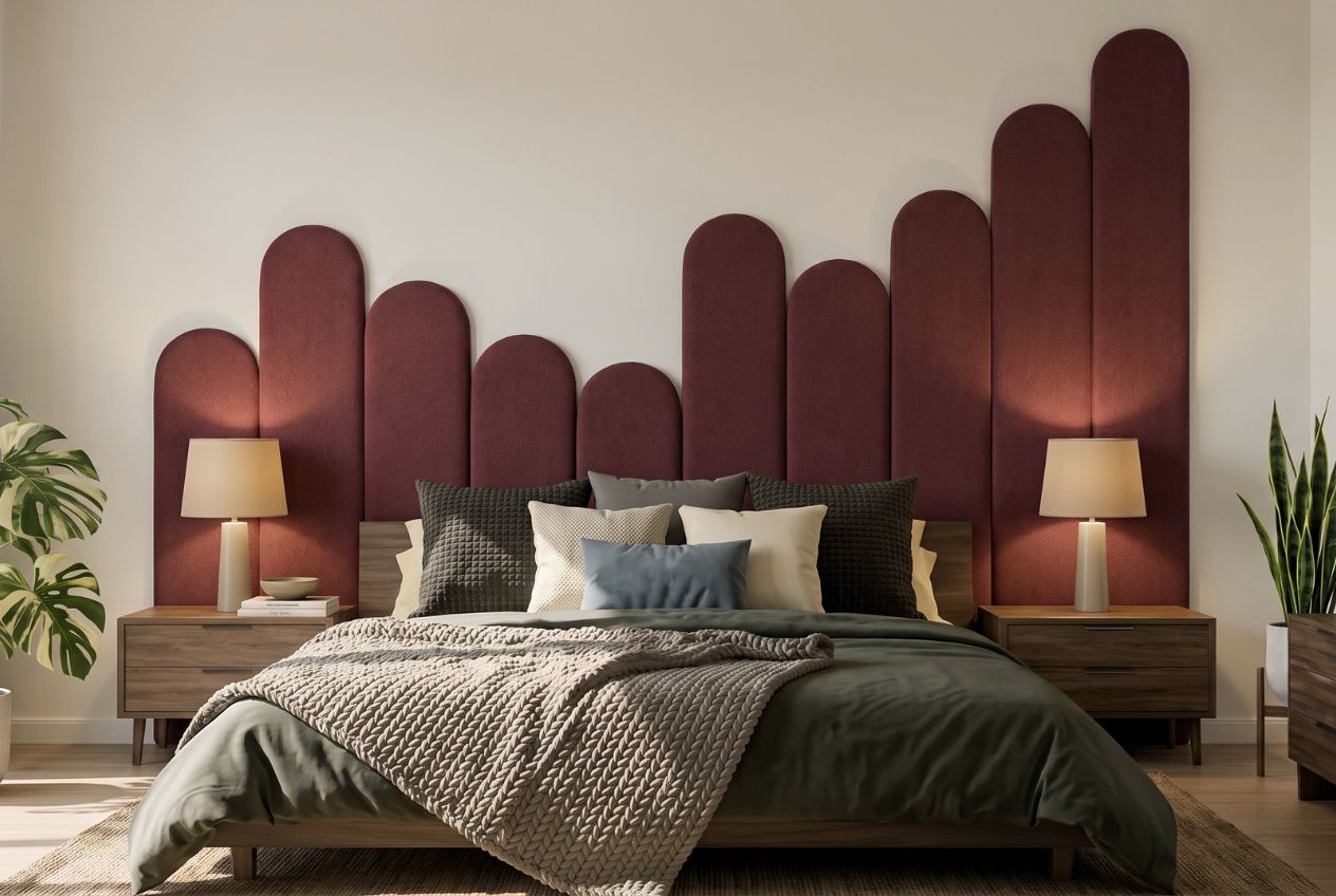
If you have your measurements and a layout in mind, our core kits are a complete starting point, and the extension kits let the design grow when you are ready. Browse the DwellForms™ Core Kits, or begin with a single composition such as the Skyline Kit.
Not sure about colour? Start with samples, which are credited towards a full kit order, and see how the tones behave on your own wall.
FAQ
How do I choose a layout for a small wall?
Keep to one idea and a limited palette. A centred hero or a tonal grouping usually suits a small wall, because it gives the eye one place to rest. Measure carefully and leave an even margin around the arrangement so it reads as a considered frame.
Can I change the layout after it is up?
Yes, that is the purpose of a modular system. Photograph the current arrangement, then adjust one element at a time. Because our panels fix with adhesive pads, take care when lifting them and follow the removal guidance that comes with your kit.
Do I need to finish the edges of felt panels?
Not in the way you would with timber panelling, which involves mitred joints, filler and caulk. Felt panels are precision cut, so finishing is about consistent spacing and ending the arrangement at a sensible boundary such as a corner or door frame.
How do I plan around light switches and power points?
Mark them on your scale drawing first, then design the arrangement so a gap or a cut-out sits naturally around them. Our guide to panels around switches describes a clean, no-drill method.
Is this suitable for rentals?
Our kits are designed to be renter-friendly, with no drilling or painting, and we chose our adhesive pads after testing. No adhesive is completely damage-proof, and results depend on your wall, so check your tenancy agreement and follow the kit instructions.
Sources
- How to Create a Stylish Timber Panel Wall, Better Homes and Gardens Australia
- Laying Out Wainscot Paneling, Fine Homebuilding
- How to easily add elegance to your home with panelled walls, Your Home and Garden New Zealand
- 22 Wall Paneling Ideas That Feel Fresh and Modern, Martha Stewart
Recommended
- Mix Wall Panels With Art For Renters Who Want Colour Without Drilling
- 7 Renter Friendly Wall Decor Ideas For 2026
- Wall Panels Vs Art Prints: Renter-friendly Feature Walls Made Easy
- 10 Best Renter Feature Walls: No-drill, Removable Ideas
This article is for general information and inspiration only. Product performance and results may vary depending on individual circumstances, surfaces and installation.
