
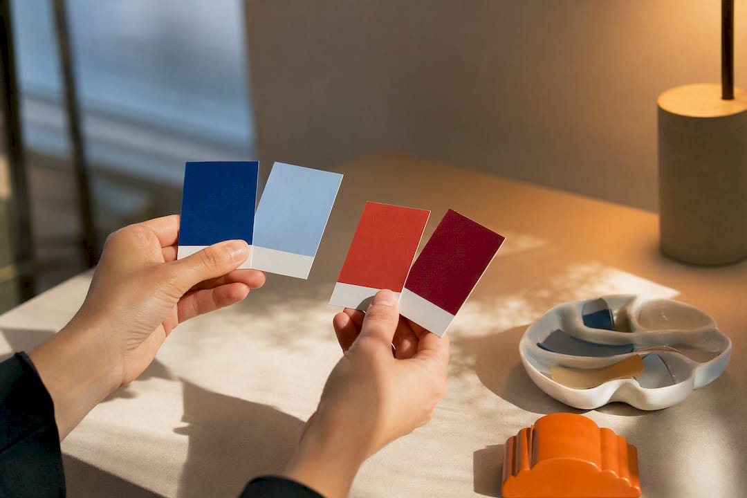
Warm colours sit on the red, orange and yellow side of the wheel; cool colours sit on the blue, green and purple side. That split holds up under scrutiny, but it’s relative, not absolute; a colour reads warm or cool partly by what sits next to it. If you’re choosing paint or pigment, the fastest fix is to check the undertone and hold your swatch against a genuinely warm and genuinely cool reference before you commit.
TL;DR:
- Small shifts in lighting, lighting angle, and adjacent colours can significantly alter how a hue appears as warm or cool in a space.
- Mixing warm and cool primaries often results in dull, muddy colours unless careful control with split-primary systems is used.
- Under different light sources, colours can change temperature perception, making testing swatches at various times of day crucial before finalizing a palette.
- Interior design benefits from using warm colours to advance and create intimacy, and cool colours to recede and expand perceived space.
- Digital hue angles can support visual assessments, but actual lighting conditions and undertones are ultimately the most reliable guides for colour temperature.
Table of Contents
- Warm vs cool colours: the basic rule and where it gets fuzzy
- How to tell if a colour is warm or cool
- Why some greens, blues and yellows won’t sit still
- How lighting and neutral undertones shift what you actually see
- Choosing warm or cool for a room or a painting
- What happens when warm and cool mix, and how to avoid mud
- What the research actually shows, and where the myths creep in
- A renter’s honest way to test warm and cool without committing
- Try warm and cool palettes without painting a single wall
- Sources
- FAQ
Warm vs cool colours: the basic rule and where it gets fuzzy
Split a colour wheel down the middle and you get two camps. Reds, oranges and yellows sit on one side and read as warm. Blues, greens and violets sit on the other and read as cool. That half-and-half rule is the one every art teacher reaches for first, and it’s a reliable starting point because it maps onto how people consistently rate colour temperature across different hues and brightness levels, according to perceptual research on the warm-cool axis.
The trouble starts at the edges. Yellow-green can tip either way depending on how much yellow versus blue it carries. Violet does the same trick, leaning warm when it’s closer to magenta and cool when it drifts toward blue. This is why designers talk about a warm-cool axis rather than two hard categories; it runs roughly from orangish-red at one extreme to greenish-blue at the other, with plenty of hues sitting in between.
Here’s a working list of prototypical members from each family:
- Warm: true red, orange, gold, amber, warm yellow, terracotta
- Cool: true blue, teal, violet, cool green, lavender, navy
- Contested middle ground: yellow-green, red-violet, magenta, and any colour close to the wheel’s north-south seam
A colour picker or a printed wheel makes this visible in seconds. Look at where a hue sits relative to the red-orange-yellow arc versus the blue-green-violet arc, and you’ve got your first answer. The nuance comes later, once you factor in undertone, saturation and what’s sitting beside it.
How to tell if a colour is warm or cool
Three checks settle most arguments about temperature, and none of them require special equipment.
- Run the neighbour comparison. Place your swatch, paint chip or digital sample between a colour you know is warm (say, a terracotta) and one you know is cool (say, a navy). The unknown colour will lean toward whichever side it shares more visual DNA with. This works because temperature is a relative judgement, not a fixed property.
- Read the undertone. Every colour has a bias hiding underneath the obvious hue. A “white” paint might carry a pink, yellow, or blue undertone that only shows up next to a true neutral. Tip a can of paint at an angle under daylight, or squint at a swatch until the main colour blurs, and the undertone usually surfaces.
- Check the hue angle if you’re working digitally. Open any colour in HSL and look at the hue value. Roughly 0 to 60 degrees (reds through yellows) trends warm; 180 to 300 degrees (cyans through violets) trends cool. This gives you a number to back up what your eye is telling you, and it’s a quick way to compare two near-identical swatches side by side.
Painters have an extra layer to work with: pigment bias. Ultramarine blue leans warm (it has a violet-red undertone), while phthalo blue leans distinctly cool (it pushes toward green). Cadmium red is a warm red with an orange cast; alizarin crimson is a cool red with a blue-violet cast. Knowing which tube you’re reaching for changes what happens the moment you start mixing.
Pro Tip: Keep a “temperature test strip” pinned near your workspace, a card with four small dabs: a warm and cool version of blue, and a warm and cool version of red. Hold any new colour against it and you’ll get an instant read, no guesswork needed.
Why some greens, blues and yellows won’t sit still
Borderline hues are borderline for a reason: they sit near the seam where the warm and cool halves of the wheel meet, so small shifts in mixing or lighting can flip how they read.
Blue is the clearest example. Ultramarine, with its violet-red undertone, feels noticeably warmer than phthalo blue, which pushes toward green and reads distinctly cooler. Put them side by side and the difference is obvious even to someone who’s never studied colour theory, according to design guidance on what makes a colour warm or cool.
Green behaves the same way. Olive green, weighted toward yellow, feels warm and earthy. Teal, weighted toward blue, feels cool and almost aquatic. Same base hue family, opposite emotional temperature, purely because of which primary dominates the mix.
- Warm blue: ultramarine, cobalt with a violet cast
- Cool blue: phthalo blue, cerulean
- Warm green: olive, sap green, chartreuse
- Cool green: teal, viridian, phthalo green
- Warm violet: red-violet, magenta-leaning purple
- Cool violet: blue-violet, true lavender
Simultaneous contrast makes this more slippery still. A mid-tone green will look warmer next to a cool blue and cooler next to a warm orange, even though the green itself hasn’t changed. This is exactly why the neighbour comparison test from the previous section matters: temperature isn’t just a property of the colour, it’s a relationship between colours in the same field of view.
How lighting and neutral undertones shift what you actually see
Light changes colour temperature before your eye even gets to judge undertone. Warm light, the kind that comes from incandescent bulbs or candlelight, sits low on the Kelvin scale and pushes every colour in a room toward yellow and orange. Cool light, from daylight-balanced LEDs or overcast sky, sits higher on the Kelvin scale and pushes colours toward blue. The same paint chip photographed under both will look like two different colours, and this is one of the most common reasons a “perfect” swatch disappoints once it’s on the wall.
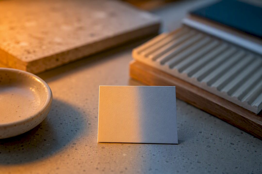
Orientation matters just as much as bulb choice. A north-facing room in the Southern Hemisphere gets cooler, flatter light through most of the day, which can make a warm beige read slightly grey. A room with strong afternoon sun gets warmer, golden light that can push a cool grey toward green or lavender. Testing a swatch only once, in one spot, at one time of day, is the single most common mistake people make when choosing colour for a room, and paint industry guidance on warm and cool colours consistently points back to testing in situ across a full day as the most reliable fix.
Neutrals are the sneaky part. “White” and “grey” are never truly neutral; they carry an undertone that only becomes obvious next to a genuinely neutral reference, which is exactly the kind of contrast check covered by guidance on using colour wisely. A warm white with a yellow undertone will make an adjacent cool blue feel harsher by contrast. A cool grey with a blue undertone will make a warm terracotta feel more saturated than it actually is.
- Test swatches at three points in the day: morning, midday, evening
- Compare under your main light source, not just daylight from a window
- Hold a true white card next to your swatch to expose hidden undertones
- Photograph the swatch on your phone; camera white balance often reveals bias faster than the naked eye
Related reading on warm lighting versus cool lighting goes deeper into how bulb choice alone can undo a careful paint decision.
Choosing warm or cool for a room or a painting
Temperature does two jobs in a finished space or a finished canvas: it sets the mood, and it plays tricks with scale.
Warm palettes suit rooms built for gathering and slowing down. Dining rooms benefit from warm tones because they flatter skin and food under most lighting. Living rooms lean warm when the goal is a cosy, conversational feel. Bedrooms aimed at a relaxed, enveloping mood often go warm too, though this depends heavily on the sleeper’s preference. Cool palettes tend to suit spaces built for focus or calm. Home offices benefit from cool blues and greens because they read as steady and non-distracting. Bathrooms lean cool because it echoes the crispness of water and tile. Bedrooms aimed at a fresher, airier feel often go cool instead.
Spatial perception shifts with temperature too, and this is the trick worth remembering above all others.
- Warm colours advance. They appear to step toward the viewer, which makes a wall feel closer and a room feel smaller and more intimate.
- Cool colours recede. They appear to step back, which makes a wall feel farther away and a room feel larger and more open.
- Use this deliberately. A small dining nook gains cosiness from a warm accent wall; a cramped home office gains a sense of breathing room from a cool one.
This advance-and-recede effect is well established in interior colour guidance and is one of the more useful things Benjamin Moore’s own notes on warm and cool paint colours cover in practical terms.
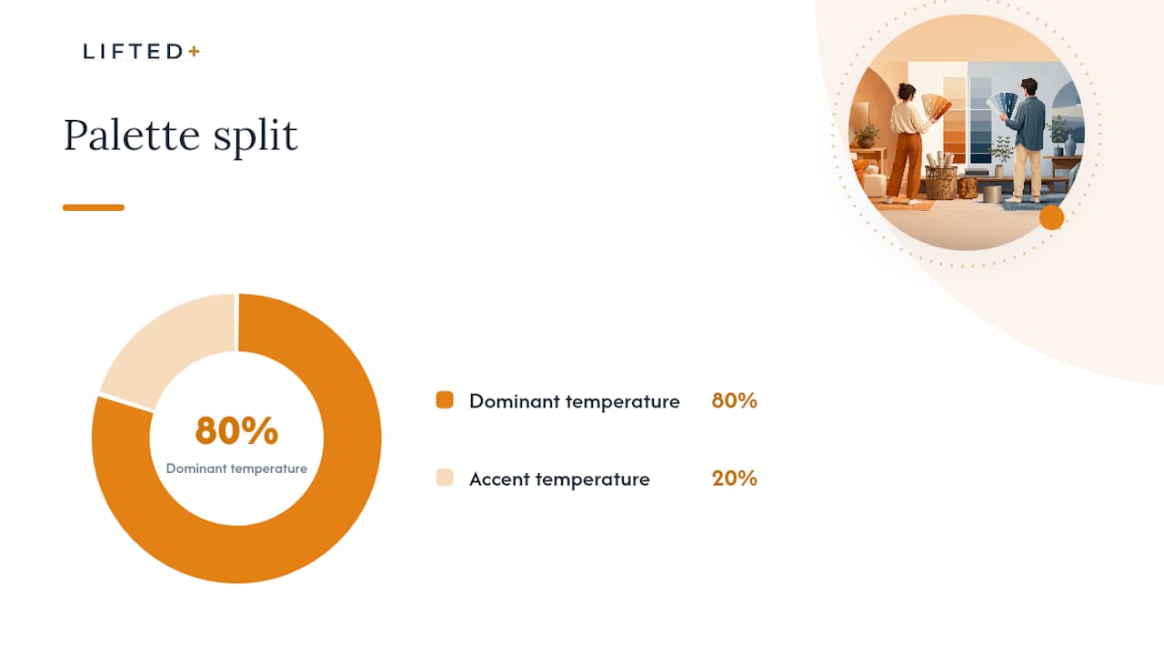
Building a workable palette usually comes down to one simple ratio: pick a dominant temperature and let it own most of the room, then add a small amount of the opposite temperature as an accent. An 80/20 split works the same way for simpler schemes. The colour psychology guide to interior design breaks this down further if you want mood-specific pairings, and this practical guide to interiors that actually work has more room-by-room examples worth studying.
What happens when warm and cool mix, and how to avoid mud
Mixing across the temperature line is where most muddy colours are born. A warm red and a cool blue, mixed directly, don’t just make purple; they partially cancel each other’s saturation because they sit on opposing sides of the colour wheel’s chroma structure. The result is a duller, greyer version of what you expected, and it’s one of the most common frustrations for anyone new to pigment mixing.
The fix painters have used for generations is the split-primary system: keep one warm and one cool version of each primary colour on the palette, rather than a single “red” or “single” blue. A warm red (cadmium) and cool red (alizarin), paired with a warm blue (ultramarine) and cool blue (phthalo), gives far more control over mixes because you can choose which bias you’re introducing rather than fighting an unwanted one. This approach, common in colour theory built around split primaries, produces cleaner secondary colours and more predictable desaturation when you do want a muted result.
The same principle applies digitally, just with different stakes. Overlaying a warm filter on a cool base image, or vice versa, will flatten contrast and chroma if you’re not watching the histogram. The practical habit is to check contrast and saturation after any warm-cool blend, digital or physical, rather than trusting your eye alone under studio lighting that might itself be warm or cool.
Pro Tip: If a mixed colour looks muddier than expected, don’t add more paint to fix it; add white or a touch of the dominant primary instead. Adding more of the opposing colour usually deepens the mud rather than clearing it. For more on this, the practical guide to mixing colours in interiors covers pigment and paint interactions in more detail.
What the research actually shows, and where the myths creep in
The warm-cool split isn’t folklore, but it’s also not a hard scientific law. Controlled experiments across multiple hues and brightness levels found that observers consistently agree on which end of the spectrum feels warm and which feels cool, and that agreement tracks closely with relative saturation, or chroma, in the CIELAB colour space rather than a simple wavelength cutoff, according to perceptual research on the warm-cool axis.
Warm-cool judgements align more closely with relative saturation than with any single physical property of light, which explains why the same hue can shift temperature depending on how saturated or muted it appears next to its neighbours.
That’s a meaningful nuance. It means warm and cool are affective and perceptual categories, built from how humans respond to colour, not a literal measure of temperature the way Kelvin measures light. It also explains why individual differences show up in research: some observers show strong warm-cool gradient sensitivity across a fine hue circle, while others show far less consistency, according to findings on warm and cool colour judgements.
The most common myth worth correcting is the idea that “all blues are cool.” Ultramarine’s violet-red undertone gives it a genuinely warmer feel than phthalo blue, even though both sit in the same named colour family. The same is true of “all greens are cool,” which ignores olive and chartreuse entirely. Temperature is a spectrum with a fuzzy middle, not two boxes with a hard wall between them.
A renter’s honest way to test warm and cool without committing
If you’ve never trusted a paint chip in a shop, you’re not alone. Order small samples and look at them in your own room, under your own light, at more than one time of day, because that’s genuinely the only way to know how a colour will behave once it’s actually on your wall.
For anyone renting or wary of a landlord’s fine print, painting a whole wall to test a theory feels like a big bet on a small guess. That’s the gap we built DwellForms™ to close: colour without commitment, in a format you can touch, rearrange and remove before you’ve made anything permanent. Texture and shape do a lot of the emotional work that colour usually carries alone, so a removable wall panel lets you trial a warm terracotta arrangement in one corner and a cool teal one in another, side by side, without a drop of paint or a single drill hole. For anyone still deciding which direction suits their space, that’s a far lower-stakes way to find out than committing to four litres of the wrong tin.
— Michelle
Try warm and cool palettes without painting a single wall
You can test colour temperature by living with a warm or cool arrangement on your wall for a few weeks before deciding anything is permanent. Modular wall panels allow you to trial a warm accent in one spot and a cool one in another using adhesive pads, with no drilling, painting, or permanent changes.
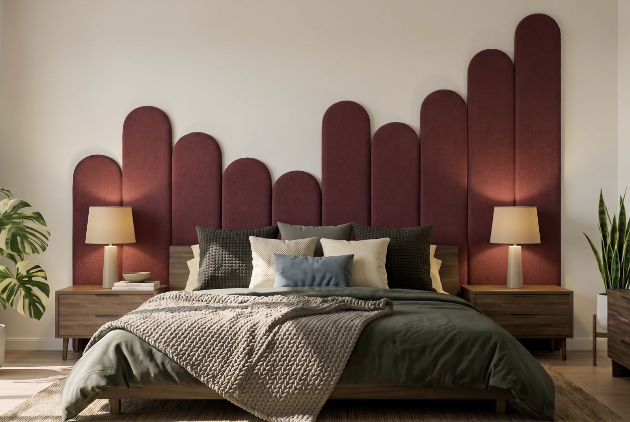
Start with the DwellForms™ Colour Samples if you want to hold real swatches against your own walls under your own light, exactly as this guide recommends. Browse the Mood Library for warm and cool arrangements you can copy directly, or go straight to a DwellForms™ Core Kit if you already know which temperature direction suits your room.
Sources
- Warm versus cool colors and their relation to color perception (PMC)
- What makes a colour ‘warm’ or ‘cool’? — ColorFYI
- Using warm & cool paint colors — Benjamin Moore
- Using colour wisely — MDN Web Docs
FAQ
How do I know if a colour is warm or cool?
Compare it beside a colour you already know is warm and one you know is cool; it will lean toward whichever side it shares more visual bias with. Checking the undertone (a red, yellow, blue or green cast hiding under the main hue) and, if you’re working digitally, the hue angle in HSL will confirm what your eye is telling you.
What are the differences between warm and cool colours?
Warm colours (reds, oranges, yellows) tend to feel energetic and appear to advance toward the viewer, while cool colours (blues, greens, purples) tend to feel calm and appear to recede, according to design guidance on warm and cool colours. This difference in perceived saturation and warmth also underpins how the two groups get used differently in mood-setting and spatial tricks in interiors.
What are 6 warm colours?
A solid list of typical warm colours includes true red, orange, gold, amber, warm yellow, and terracotta. All six sit on the red-orange-yellow arc of the colour wheel and share a bias toward advancing visually and feeling energetic in a room or painting.
What are warm and cool colours?
Warm colours sit on the red, orange and yellow side of the colour wheel, while cool colours sit on the blue, green and violet side. The distinction is relative rather than absolute: judgements are consistent across observers and tie closely to relative saturation, according to perceptual research on colour temperature, but individual hues near the boundary (certain greens, blues and violets) can shift depending on undertone and what’s beside them.